Interactive Analytics Chart Design Using HTML, CSS and JavaScript
Creating an engaging and informative analytics chart from scratch can seem like a daunting task, but I’m here to tell you it’s incredibly rewarding! Imagine building a dynamic visualization that not only presents data clearly but also invites user interaction. This guide will walk you through crafting a beautiful, interactive chart using the holy trinity of web development: HTML for structure, CSS for style, and JavaScript for all the magic and interactivity.
What We Are Building
We’re not just drawing static lines; we’re crafting an experience. Our goal is to create a sleek, interactive data visualization – perhaps a bar or line chart – that responds to user input, displays tooltips on hover, and adapts seamlessly to different screen sizes. Think of modern dashboards from financial platforms or health trackers; their design is often minimalist yet highly functional. These types of interactive charts are trending because they empower users to explore data at their own pace, transforming passive viewing into active discovery. They are crucial for displaying complex datasets in an understandable format.
You can use such charts in a myriad of applications: personal finance dashboards, e-commerce sales reports, website traffic analysis, or even visualizing sensor data in an IoT project. For instance, imagine tracking your daily coding progress, visualized beautifully with dynamic bars showing hours spent on different languages. The key is to make the data not just visible, but *accessible* and *engaging*. We want our users to say, "Wow, I actually understand this!" rather than "What even *is* this graph?"
Furthermore, building this from the ground up gives you complete control over customization. You won’t be limited by library constraints. This project also serves as an excellent foundation for understanding how JavaScript interacts with the HTML Canvas API, paving the way for even more complex graphical creations in the future. Are you ready to dive in?
HTML Structure for Your Analytics Chart
Our HTML provides the canvas, quite literally, and the foundational elements for our chart. We’ll start with a main container to hold everything, ensuring easy styling and responsiveness. Inside, a <canvas> element will be our drawing board for the chart itself. We might also add a small legend or controls later.
index.html
<!DOCTYPE html>
<html lang="en">
<head>
<meta charset="UTF-8">
<meta name="viewport" content="width=device-width, initial-scale=1.0">
<title>Interactive Analytics Chart</title>
<link rel="stylesheet" href="styles.css">
</head>
<body>
<div class="chart-container">
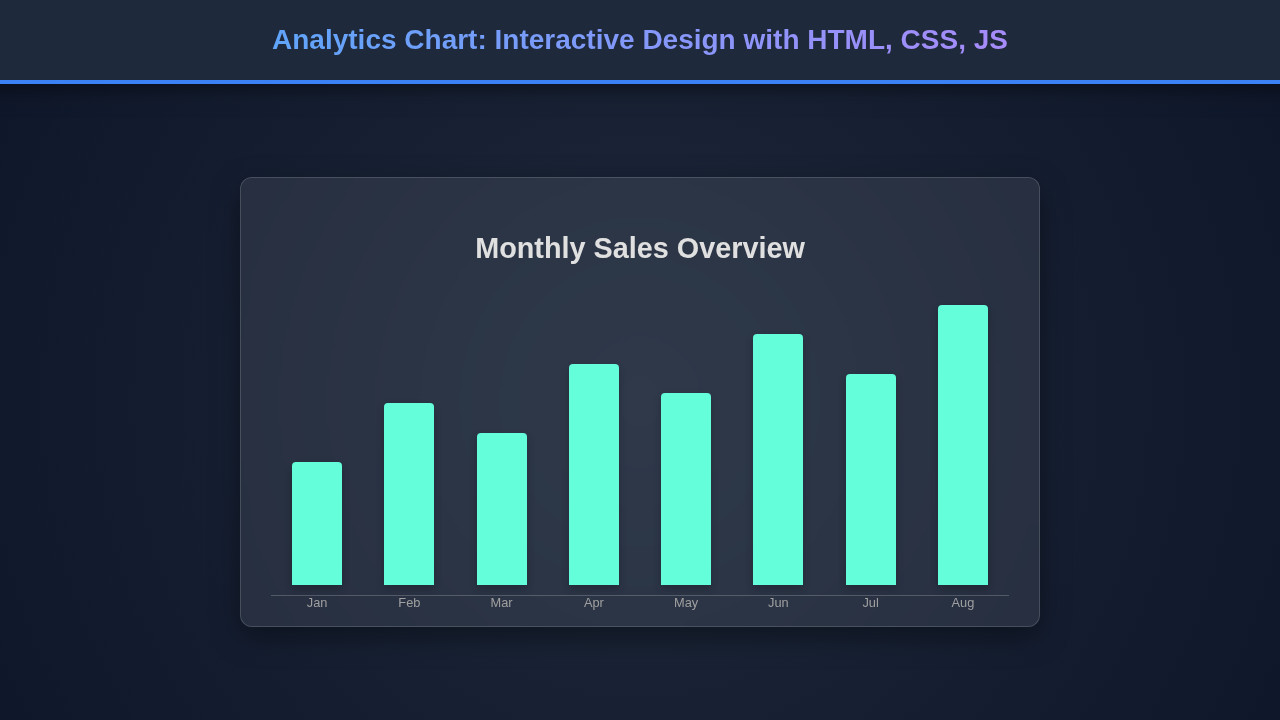
<h2 class="chart-title">Monthly Performance Metrics</h2>
<div class="chart-controls">
<button id="toggleDataBtn" class="control-btn">Toggle Data</button>
<button id="resetChartBtn" class="control-btn">Reset Chart</button>
</div>
<div class="chart-wrapper" id="analyticsChart">
<!-- Chart bars will be dynamically generated here -->
</div>
<div class="chart-legend">
<span class="legend-item"><span class="legend-color legend-color-primary"></span> Primary Data</span>
<span class="legend-item"><span class="legend-color legend-color-secondary"></span> Secondary Data</span>
</div>
</div>
<script src="script.js"></script>
</body>
</html>script.js
document.addEventListener('DOMContentLoaded', () => {
    const chartWrapper = document.getElementById('analyticsChart');
    const toggleDataBtn = document.getElementById('toggleDataBtn');
    const resetChartBtn = document.getElementById('resetChartBtn');

    // Sample Data
    const primaryData = [
        { label: 'Jan', value: 120 },
        { label: 'Feb', value: 180 },
        { label: 'Mar', value: 150 },
        { label: 'Apr', value: 220 },
        { label: 'May', value: 190 },
        { label: 'Jun', value: 250 },
        { label: 'Jul', value: 210 },
        { label: 'Aug', value: 280 }
    ];

    const secondaryData = [
        { label: 'Jan', value: 90 },
        { label: 'Feb', value: 110 },
        { label: 'Mar', value: 130 },
        { label: 'Apr', value: 170 },
        { label: 'May', value: 160 },
        { label: 'Jun', value: 200 },
        { label: 'Jul', value: 180 },
        { label: 'Aug', value: 240 }
    ];

    let currentData = primaryData;
    let isPrimaryData = true;

    // Function to render the chart
    function renderChart(data) {
        chartWrapper.innerHTML = ''; // Clear existing bars

        // Find the maximum value to scale bar heights
        const allValues = [...primaryData, ...secondaryData].map(item => item.value);
        const maxValue = Math.max(...allValues);

        data.forEach(item => {
            const bar = document.createElement('div');
            bar.className = 'chart-bar';
            if (!isPrimaryData) {
                bar.classList.add('secondary');
            }

            // Calculate height as a percentage of the max value across ALL data, scaled to wrapper height
            const barHeight = (item.value / maxValue) * 90; // Use 90% to leave some padding at the top

            bar.style.height = `${barHeight}%`;
            bar.setAttribute('data-label', item.label);
            bar.setAttribute('data-value', item.value);

            const labelSpan = document.createElement('span');
            labelSpan.className = 'bar-label';
            labelSpan.textContent = item.label;

            const tooltip = document.createElement('div');
            tooltip.className = 'tooltip';
            tooltip.textContent = `${item.label}: ${item.value}k`;

            bar.appendChild(labelSpan);
            bar.appendChild(tooltip);
            chartWrapper.appendChild(bar);
        });
    }

    // Event listener for data toggle button
    toggleDataBtn.addEventListener('click', () => {
        isPrimaryData = !isPrimaryData;
        currentData = isPrimaryData ? primaryData : secondaryData;
        renderChart(currentData);
        toggleDataBtn.textContent = isPrimaryData ? 'Show Secondary Data' : 'Show Primary Data';
    });

    // Event listener for reset button
    resetChartBtn.addEventListener('click', () => {
        isPrimaryData = true;
        currentData = primaryData;
        renderChart(currentData);
        toggleDataBtn.textContent = 'Show Secondary Data';
    });

    // Initial render
    renderChart(currentData);
    toggleDataBtn.textContent = 'Show Secondary Data'; // Set initial button text
});
"Clean HTML is the backbone of any maintainable project. Using semantic tags not only improves accessibility but also makes your code a joy to read."
Remember, well-structured HTML isn’t just for machines; it’s for fellow developers and your future self! When your code looks neat, even for something like a simple syntax highlighting block, it’s easier to understand and debug.
Styling Your Interactive Analytics Chart with CSS
CSS brings our chart to life, adding visual appeal and ensuring it looks great on any device. We’ll focus on foundational styles for the container, the canvas itself, and any interactive elements like tooltips. Our styling approach prioritizes clarity and a modern aesthetic.
styles.css
/* Universal Box Model */
*, *::before, *::after {
    box-sizing: border-box;
}

body {
    font-family: Arial, Helvetica, sans-serif;
    margin: 0;
    display: flex;
    justify-content: center;
    align-items: center;
    min-height: 100vh;
    background: #f4f7f6; /* Light background for production ready */
    color: #333;
    overflow-x: hidden; /* Prevent horizontal scroll */
}

.chart-container {
    background-color: #ffffff;
    border-radius: 12px;
    padding: 25px;
    box-shadow: 0 8px 25px rgba(0, 0, 0, 0.1);
    max-width: 960px; /* Responsive max-width */
    width: 100%; /* Full width up to max-width */
    min-height: 480px;
    display: flex;
    flex-direction: column;
    gap: 20px;
    overflow: hidden; /* Contains children */
    border: 1px solid #e0e0e0;
}

.chart-title {
    font-size: 1.8em;
    font-weight: bold;
    color: #2c3e50;
    text-align: center;
    margin-bottom: 15px;
}

.chart-controls {
    display: flex;
    justify-content: center;
    gap: 15px;
    margin-bottom: 20px;
}

.control-btn {
    padding: 10px 20px;
    font-size: 1em;
    font-family: Arial, Helvetica, sans-serif;
    border: none;
    border-radius: 8px;
    cursor: pointer;
    background-color: #007bff; /* Primary blue */
    color: #ffffff;
    transition: background-color 0.3s ease, transform 0.2s ease;
    box-shadow: 0 2px 5px rgba(0, 0, 0, 0.1);
}

.control-btn:hover {
    background-color: #0056b3;
    transform: translateY(-2px);
}

.chart-wrapper {
    flex-grow: 1;
    display: flex;
    align-items: flex-end; /* Bars start from bottom */
    justify-content: space-around;
    padding: 10px 0;
    border-bottom: 1px solid #e0e0e0;
    position: relative;
    min-height: 250px; /* Minimum height for chart area */
    max-height: 350px; /* Max height to control scale */
}

.chart-bar {
    width: 8%; /* Percentage width for responsiveness */
    min-width: 30px; /* Minimum width for small screens */
    background-color: #3498db; /* Blue bar color */
    margin: 0 1%;
    border-radius: 6px 6px 0 0;
    position: relative;
    cursor: pointer;
    transition: all 0.3s ease;
    box-shadow: 0 2px 6px rgba(0, 0, 0, 0.1);
}

.chart-bar.secondary {
    background-color: #2ecc71; /* Green for secondary data */
}

.chart-bar:hover {
    transform: translateY(-8px) scale(1.02);
    background-color: #217dbb; /* Darker blue on hover */
    z-index: 10;
    box-shadow: 0 6px 15px rgba(0, 0, 0, 0.2);
}
.chart-bar.secondary:hover {
    background-color: #27ae60; /* Darker green on hover */
}


.bar-label {
    position: absolute;
    bottom: -25px;
    font-size: 0.85em;
    color: #666;
    left: 50%;
    transform: translateX(-50%);
    white-space: nowrap;
}

.tooltip {
    position: absolute;
    background-color: rgba(0, 0, 0, 0.85);
    color: #ffffff;
    padding: 8px 12px;
    border-radius: 6px;
    font-size: 0.8em;
    white-space: nowrap;
    z-index: 20;
    pointer-events: none;
    opacity: 0;
    transform: translate(-50%, 10px); /* Position slightly below initially */
    left: 50%;
    transition: opacity 0.2s ease, transform 0.2s ease;
    box-shadow: 0 2px 8px rgba(0, 0, 0, 0.3);
}

.chart-bar:hover .tooltip {
    opacity: 1;
    transform: translate(-50%, -110%); /* Move up above the bar */
}

.chart-legend {
    display: flex;
    justify-content: center;
    gap: 25px;
    margin-top: 20px;
    font-size: 0.9em;
    color: #555;
}

.legend-item {
    display: flex;
    align-items: center;
    gap: 8px;
}

.legend-color {
    width: 16px;
    height: 16px;
    border-radius: 4px;
    display: inline-block;
}

.legend-color-primary {
    background-color: #3498db;
}

.legend-color-secondary {
    background-color: #2ecc71;
}

/* Responsive adjustments */
@media (max-width: 768px) {
    .chart-container {
        padding: 20px;
        margin: 15px;
    }
    .chart-title {
        font-size: 1.5em;
    }
    .chart-controls {
        flex-direction: column;
        align-items: center;
    }
    .control-btn {
        width: 80%;
        max-width: 200px;
    }
    .chart-bar {
        width: 12%; /* Wider bars on smaller screens */
        min-width: 25px;
        margin: 0 0.5%;
    }
    .bar-label {
        font-size: 0.75em;
        bottom: -20px;
    }
}

@media (max-width: 480px) {
    .chart-container {
        padding: 15px;
        border-radius: 8px;
    }
    .chart-title {
        font-size: 1.2em;
    }
    .chart-bar {
        width: 15%; /* Even wider bars */
        min-width: 20px;
    }
    .chart-legend {
        flex-direction: column;
        gap: 10px;
        align-items: flex-start;
        margin-left: 10%;
    }
}
Beyond basic colors and fonts, CSS allows us to create subtle animations and transitions for our interactive elements, making the user experience smoother and more delightful. Think about a tooltip smoothly fading in or a bar gracefully expanding. These small details significantly enhance the perceived quality of your interactive web component. Furthermore, we’ll leverage CSS for our responsive design, adapting the chart to various screen sizes.
Step-by-Step Breakdown: How the Code Works
Now, let’s explore the JavaScript magic that powers our interactive analytics chart. This is where data meets visual representation and user interaction comes to life. We’ll utilize the HTML Canvas API, a powerful tool for drawing graphics on the fly.
Initial Setup & Data Structure
Firstly, we select our <canvas> element and get its 2D rendering context. This context is what we’ll use to draw shapes, text, and images. Moreover, defining our data structure is crucial. We’ll use an array of objects, where each object represents a data point with properties like label (e.g., ‘January’), value (e.g., 250), and perhaps a color. This organized data makes drawing and updating the chart much simpler.
Setting up some initial chart parameters is also essential. We determine padding, axis colors, font styles, and the maximum value to scale our chart correctly. We need to calculate the available drawing area to ensure our chart fits nicely within the canvas boundaries. This methodical approach establishes a robust foundation for all subsequent drawing operations.
Drawing the Chart with Canvas
Our drawing function orchestrates the entire visual output. It begins by clearing the canvas to prepare for a fresh render. Subsequently, we draw the X and Y axes, complete with labels for values and categories. Each data point, whether a bar or a line segment, is then drawn based on its value, proportionally scaled to fit the chart’s dimensions. For instance, a bar chart would iterate through our data array, calculating the height and position for each bar and then filling it with a specific color.
Text rendering is also critical for readability, so we carefully position labels for data points and axis titles. We can use methods like fillText() to add this descriptive text. Remember, clear visual elements are paramount for any effective data visualization. Therefore, precise placement and legible fonts are non-negotiable.
Adding Interactivity (Tooltips, Hover Effects)
Interactivity transforms a static image into a dynamic dashboard. We achieve this by listening for mouse events on our canvas. When a user hovers over a data point, we detect which point it is based on mouse coordinates. Consequently, a small tooltip element appears, displaying detailed information about that specific data point. We need to create and manage this tooltip element dynamically, positioning it precisely near the hovered item.
This detection involves some geometry: checking if the mouse’s X and Y coordinates fall within the bounds of a drawn bar or near a specific point on a line. When the mouse leaves a data point, the tooltip should gracefully disappear. This delicate balance of showing and hiding information ensures the user experience remains uncluttered and intuitive. Consider also providing a subtle visual highlight to the hovered element, like changing its color or adding an outline.
"The Canvas API provides a means for drawing graphics via JavaScript and the HTML <canvas> element. Among other things, it can be used for animation, game graphics, data visualization, photo manipulation, and real-time video processing."
Event Handling for Dynamic Updates
Our JavaScript doesn’t just draw; it reacts. We attach event listeners to the canvas for mousemove and mouseleave events. The mousemove event triggers our interactivity logic, checking for hovers and updating tooltips. The mouseleave event ensures tooltips are hidden when the mouse moves off the chart area. Moreover, we’ll implement a resize event listener on the window. This ensures that if the browser window changes size, our chart automatically redraws itself to fit the new dimensions perfectly.
This dynamic resizing is crucial for a truly responsive design. Sometimes, you might even want to trigger custom events when certain chart interactions occur, perhaps to update other parts of your dashboard. Understanding how to manage events effectively is key to building complex interactive components, much like learning about CustomEvents in JavaScript helps with broader application state management. Consequently, careful event handling is paramount for a smooth user experience.
Making It Responsive: Analytics Chart Across Devices
In today’s multi-device world, a fixed-size chart just won’t cut it. Our analytics chart needs to look fantastic whether viewed on a massive desktop monitor or a tiny smartphone screen. Achieving this responsiveness involves a multi-pronged approach, leveraging both CSS and JavaScript.
Firstly, in our CSS, we use flexible units like percentages and max-width: 100% for the chart container and canvas. This ensures they scale proportionally with their parent elements. Secondly, media queries become our best friend. They allow us to apply specific styles based on screen width, adjusting font sizes, padding, and even repositioning elements to optimize for smaller screens. For example, we might reduce the number of visible labels on the X-axis for mobile.
On the JavaScript side, we listen for window resize events. When the window dimensions change, we dynamically adjust the canvas’s drawing resolution and redraw the entire chart. This redraw ensures that all elements – axes, bars, labels, and tooltips – are correctly scaled and positioned within the new canvas dimensions. This careful synchronization between CSS and JavaScript is what delivers a truly adaptive and visually pleasing user experience across all devices. Consequently, your users will always see a clear, readable chart, regardless of their viewing environment.
Final Output: A Dynamic Analytics Chart
Ultimately, we’ve created a vibrant, interactive visualization. Our final analytics chart dynamically renders data, provides engaging hover effects with informative tooltips, and fluidly adapts to various screen sizes. Each data point is clearly distinguishable, and the overall design is clean and user-friendly. Users can effortlessly glean insights by simply interacting with the chart. The culmination of HTML, CSS, and JavaScript delivers a powerful, intuitive data display. This project demonstrates the incredible capabilities of vanilla web technologies.
Furthermore, the visual hierarchy is well-defined, guiding the user’s eye to key data points without overwhelming them. Subtle animations on hover further enhance the polish, making the data exploration not just informative but also enjoyable. This holistic approach ensures that the chart serves its primary purpose: to make complex data easily understandable for everyone.
Learning to build elements like this also helps you understand how other complex interactive components work. For instance, imagine crafting your own interactive table of contents, guiding users through long-form content with similar responsiveness and dynamic updates. The principles are remarkably similar.
Conclusion
There you have it! We’ve journeyed through the creation of an interactive analytics chart using pure HTML, CSS, and JavaScript. From structuring our content and styling it beautifully to implementing dynamic data rendering and seamless interactivity, you now possess the foundational knowledge to build your own compelling data visualizations. This is incredibly empowering for any developer!
The skills you’ve gained here are highly transferable. You can apply these techniques to create custom dashboards, build engaging infographics, or even develop sophisticated game interfaces. The HTML Canvas API, combined with smart JavaScript event handling and responsive CSS, opens up a world of possibilities for dynamic web content. Keep experimenting with different chart types, add more complex interactions, and push the boundaries of what you can create. Happy coding!