A Skeleton Loader is more than just a placeholder; it’s a critical component in modern web design that dramatically enhances perceived performance. As developers, we constantly strive to deliver smooth, delightful user experiences. Imagine your users staring at a blank screen while data loads. It’s frustrating, isn’t it? That’s where a well-crafted skeleton loader comes in, offering a visual cue that content is on its way, reducing anxiety and making your application feel faster. Today, we’re diving deep into building one using only HTML and CSS.
What We Are Building: The Power of Skeleton Loaders
What exactly are we building? We’re creating an elegant, shimmering placeholder animation that mimics the layout of your actual content before it fully loads. Think of it as a wireframe coming to life briefly. This design trend isn’t just aesthetically pleasing; it’s a powerful psychological tool. Major platforms like Facebook, LinkedIn, and YouTube have popularized it, proving its effectiveness in maintaining user engagement during data fetching. When your users see a structured preview, their waiting experience improves significantly.
Why is this trending? Simply put, perceived performance matters immensely. A user’s impression of speed is often more important than actual loading time. A skeleton loader makes your app feel faster, providing continuous visual feedback instead of an abrupt, empty state. We can use these loaders virtually anywhere content takes time to appear: data-rich dashboards, e-commerce product listings, news feeds, or even complex forms. They transform a potentially frustrating wait into a seamless transition. They also serve a similar purpose to other non-blocking UI patterns, like a well-designed Toast Notification: HTML & CSS Design Guide, guiding the user rather than leaving them guessing.
HTML Structure
First things first, let’s lay the groundwork with our HTML. We’ll set up a simple container to hold our skeleton cards, and inside each card, we’ll define placeholders for an image, a title, and a few lines of text. This structure will closely mirror a typical content block, ensuring our loader looks realistic.
<div class="skeleton-container">
    <div class="skeleton-card">
        <div class="skeleton-img"></div>
        <div class="skeleton-content">
            <h3 class="skeleton-title"></h3>
            <p class="skeleton-line"></p>
            <p class="skeleton-line"></p>
            <p class="skeleton-line"></p>
        </div>
    </div>
</div>
CSS Styling
With our HTML structure in place, it’s time to bring it to life using CSS. We’ll style our skeleton elements to look like empty content blocks and then add the magical shimmering animation that makes them so engaging. We’ll focus on creating a gradient effect that moves across the elements, giving them that characteristic “loading” appearance.
/* General Body Styles (Optional, for demo purposes) */
body {
    font-family: 'Segoe UI', Tahoma, Geneva, Verdana, sans-serif;
    background-color: #f7f9fc;
    margin: 0;
    display: flex;
    justify-content: center;
    align-items: flex-start; /* Align to top instead of center */
    min-height: 100vh;
    padding: 20px; /* Add some padding around the container */
    box-sizing: border-box; /* Include padding in element's total width and height */
}

.skeleton-container {
    display: grid;
    grid-template-columns: repeat(auto-fit, minmax(280px, 1fr)); /* Adjusted minmax for better mobile fit */
    gap: 25px;
    padding: 20px;
    max-width: 1200px; /* Max width for the container */
    width: 100%; /* Ensure it takes full width up to max-width */
    box-sizing: border-box;
}

.skeleton-card {
    background-color: #ffffff;
    border-radius: 10px;
    overflow: hidden; /* Crucial for clipping the shimmer effect */
    box-shadow: 0 6px 20px rgba(0, 0, 0, 0.08);
    position: relative; /* Needed for the ::after positioning */
    display: flex;
    flex-direction: column;
}

.skeleton-img {
    width: 100%;
    height: 180px; /* Consistent image height */
    background-color: #e0e0e0;
    position: relative;
    overflow: hidden;
}

.skeleton-content {
    padding: 20px;
    flex-grow: 1; /* Allow content to grow and fill space */
    display: flex;
    flex-direction: column;
}

.skeleton-title {
    height: 26px; /* Slightly larger title for prominence */
    background-color: #e0e0e0;
    margin-bottom: 18px; /* More spacing */
    border-radius: 5px;
    width: 75%; /* Title width */
    position: relative; /* For ::after */
    overflow: hidden;
}

.skeleton-line {
    height: 18px; /* Slightly larger line height */
    background-color: #e0e0e0;
    margin-bottom: 12px;
    border-radius: 4px;
    width: 90%;
    position: relative; /* For ::after */
    overflow: hidden;
}

.skeleton-line:last-of-type { /* Use last-of-type for better targeting */
    width: 65%;
    margin-bottom: 0;
}

/* Shimmer Animation */
@keyframes shimmer {
    0% { background-position: -200% 0; }
    100% { background-position: 200% 0; }
}

/* Apply shimmer to all skeleton elements */
.skeleton-img::after,
.skeleton-title::after,
.skeleton-line::after {
    content: '';
    position: absolute;
    top: 0;
    left: 0;
    width: 100%;
    height: 100%;
    background: linear-gradient(90deg, transparent, rgba(255, 255, 255, 0.3), transparent); /* Slightly stronger shimmer */
    background-size: 200% 100%;
    animation: shimmer 1.6s infinite cubic-bezier(0.4, 0, 0.2, 1); /* Faster, smoother ease-in-out effect */
}

/* Stagger animation delay for a more dynamic look */
.skeleton-card:nth-child(1) .skeleton-img::after,
.skeleton-card:nth-child(1) .skeleton-title::after,
.skeleton-card:nth-child(1) .skeleton-line::after { animation-delay: 0s; }

.skeleton-card:nth-child(2) .skeleton-img::after,
.skeleton-card:nth-child(2) .skeleton-title::after,
.skeleton-card:nth-child(2) .skeleton-line::after { animation-delay: 0.1s; }

.skeleton-card:nth-child(3) .skeleton-img::after,
.skeleton-card:nth-child(3) .skeleton-title::after,
.skeleton-card:nth-child(3) .skeleton-line::after { animation-delay: 0.2s; }

.skeleton-card:nth-child(4) .skeleton-img::after,
.skeleton-card:nth-child(4) .skeleton-title::after,
.skeleton-card:nth-child(4) .skeleton-line::after { animation-delay: 0.3s; }

/* Responsive adjustments */
@media (max-width: 768px) {
    .skeleton-container {
        grid-template-columns: 1fr; /* Stack cards vertically on smaller screens */
        gap: 20px;
        padding: 15px;
    }

    .skeleton-img {
        height: 160px; /* Adjust image height for mobile */
    }

    .skeleton-title {
        height: 24px;
        margin-bottom: 15px;
        width: 80%;
    }

    .skeleton-line {
        height: 16px;
        margin-bottom: 10px;
        width: 95%;
    }

    .skeleton-line:last-of-type {
        width: 70%;
    }
}

@media (max-width: 480px) {
    .skeleton-content {
        padding: 15px;
    }
    .skeleton-img {
        height: 140px;
    }
    .skeleton-title {
        height: 22px;
        margin-bottom: 12px;
    }
    .skeleton-line {
        height: 14px;
        margin-bottom: 8px;
    }
    .skeleton-container {
        padding: 10px;
    }
}
Mastering the Skeleton Loader Animation: Step-by-Step Breakdown
Let’s break down how this powerful Skeleton Loader animation works. We’re leveraging fundamental CSS properties to create a smooth, compelling user experience. Each part plays a crucial role in bringing our placeholder to life, ensuring it feels dynamic and responsive.
Setting Up the Base Elements
Our HTML provides the basic boxes: a .skeleton-card, an .skeleton-img, a .skeleton-title, and .skeleton-line elements. In the CSS, we first establish a common visual style for all these elements. We give them a background-color of #e0e0e0 (a light grey), which acts as the static base for our loader. Adding a subtle border-radius softens the edges, making them appear more like actual content blocks rather than sharp, unfinished boxes. This foundational styling is crucial for making the loader visually intuitive.
The .skeleton-container uses CSS Grid (display: grid) to arrange multiple skeleton cards responsively. This means our loader can easily adapt to different screen sizes and display multiple content previews simultaneously. The gap property ensures proper spacing, and padding adds breathing room around the entire component. Each .skeleton-card gets a white background, box-shadow, and overflow: hidden. The overflow: hidden is important; it will prevent our animation from bleeding outside the card boundaries.
Crafting the Shimmer Effect with ::after and linear-gradient
This is where the real magic happens! We use the CSS ::after pseudo-element on our skeleton blocks (image, title, and lines) to create the shimmering overlay. Why ::after? It allows us to layer an additional element on top of our existing skeleton block without adding extra markup to the HTML. We absolutely position it (position: absolute; top: 0; left: 0; width: 100%; height: 100%;) to cover its parent entirely.
The background property is key here. We apply a linear gradient (90deg, transparent, rgba(255, 255, 255, 0.2), transparent). This creates a gradient that goes from fully transparent, to a semi-transparent white, and back to transparent. The rgba(255, 255, 255, 0.2) is a subtle white highlight. We then set background-size: 200% 100%. This makes our gradient twice as wide as the element it’s applied to. By doing this, we create a larger ‘band’ of light that can traverse the entire element, rather than just appearing and disappearing within its normal width.
“A well-implemented skeleton loader isn’t just about hiding loading times; it’s about making the user feel like the application is always working, always progressing, and always responsive.”
Animating the Shimmer with @keyframes
The shimmer animation brings our linear-gradient to life. We define it using @keyframes:
@keyframes shimmer {
    0% { background-position: -200% 0; }
    100% { background-position: 200% 0; }
}
This animation targets the background-position of our ::after pseudo-element. At 0%, the background is positioned at -200% 0. Remember, our gradient background-size is 200%. So, -200% means the entire gradient is positioned off to the left, completely outside the element’s view. As the animation progresses to 100%, the background-position moves to 200% 0. This pulls the gradient completely across the element, from left to right, eventually ending off to the right side. The animation: shimmer 1.5s infinite linear; line applies this animation, making it run for 1.5 seconds, continuously (infinite), and at a constant speed (linear). You can fine-tune the speed and direction to match your brand’s feel. You can read more about CSS Animations on CSS-Tricks.
For elements like the title and lines, ensuring position: relative and overflow: hidden is vital. position: relative makes sure our ::after pseudo-element is positioned relative to its parent, not the document body. overflow: hidden clips the linear-gradient as it moves, making it appear to slide in and out cleanly. Without overflow: hidden, the gradient would extend beyond the boundaries of the element, breaking the illusion.
We also apply animation-delay to subsequent cards. This creates a staggered effect, making the entire loading sequence feel more dynamic and less monotonous. It’s a small detail, but these nuances significantly improve the perceived quality of your UI. Similarly, if you’re building interactive elements, proper use of ARIA attributes (like those discussed in Accessible Tooltip: HTML, CSS & JavaScript Component) is essential for a good user experience across all abilities.
Making It Responsive
Creating a robust Skeleton Loader means it should look great and function perfectly on any device, from a large desktop monitor to a tiny smartphone screen. This is where responsive design principles come into play. Our current CSS Grid setup provides a strong foundation for responsiveness with repeat(auto-fit, minmax(280px, 1fr)), ensuring our cards adapt to available space. However, we can fine-tune things even further with media queries.
For smaller screens, the minmax(280px, 1fr) might make the cards a bit too large if the viewport is narrower than 280px. We can adjust the grid behavior or individual card sizes within media queries. The CSS provided already includes responsive adjustments:
@media (max-width: 768px) {
    .skeleton-container {
        grid-template-columns: 1fr; /* Stack cards vertically on smaller screens */
        gap: 20px;
        padding: 15px;
    }

    .skeleton-img {
        height: 160px; /* Adjust image height for mobile */
    }

    .skeleton-title {
        height: 24px;
        margin-bottom: 15px;
        width: 80%;
    }

    .skeleton-line {
        height: 16px;
        margin-bottom: 10px;
        width: 95%;
    }

    .skeleton-line:last-of-type {
        width: 70%;
    }
}

@media (max-width: 480px) {
    .skeleton-content {
        padding: 15px;
    }
    .skeleton-img {
        height: 140px;
    }
    .skeleton-title {
        height: 22px;
        margin-bottom: 12px;
    }
    .skeleton-line {
        height: 14px;
        margin-bottom: 8px;
    }
    .skeleton-container {
        padding: 10px;
    }
}
These media queries help us fine-tune spacing, font sizes, and image heights to ensure a pleasant experience for users on any device. Remember, a mobile-first approach is often best, designing for the smallest screen first and then scaling up. This is a core tenet of effective Responsive Web Design: Beginner’s Guide. Always test your loaders on various devices to ensure they perform as expected.
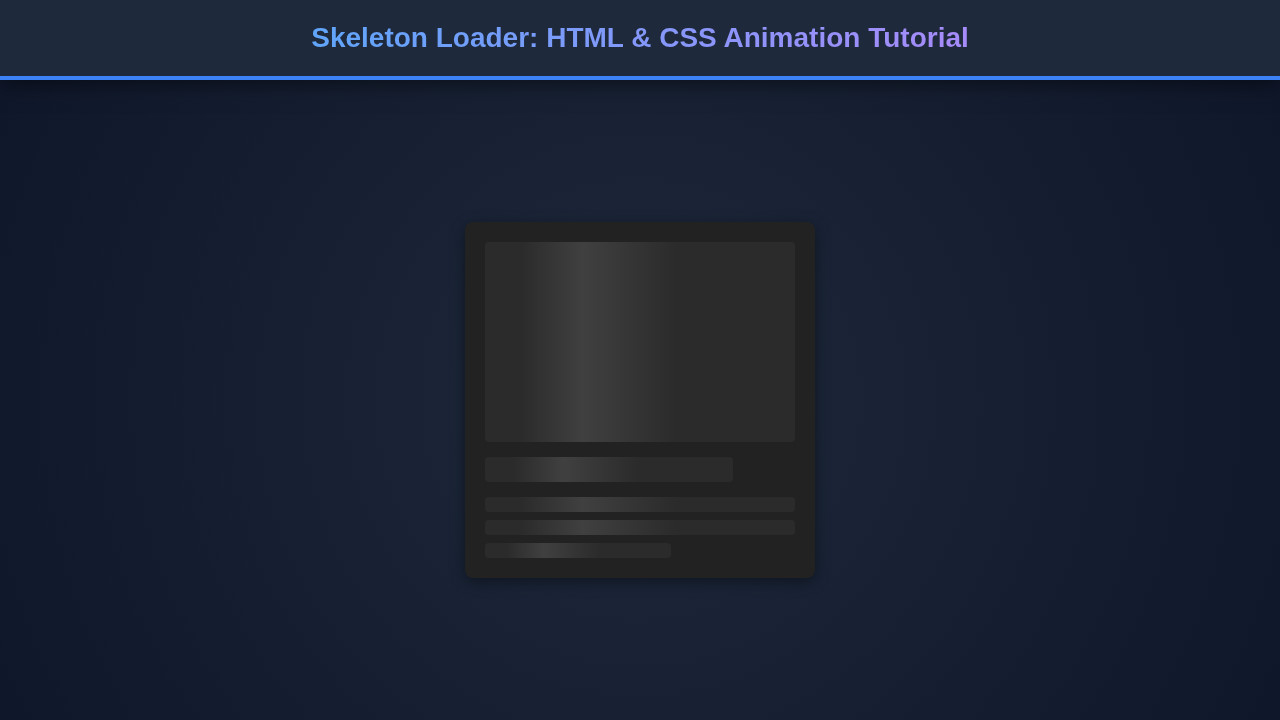
Final Output
When you put all these pieces together – the clean HTML structure, the subtle base styling, and the dynamic shimmering animation – the result is truly impressive. You’ll have a set of elegant placeholder cards that mimic your content, subtly indicating that data is being fetched. The animation is smooth and non-disruptive, creating a perception of speed and responsiveness.
The key visual elements achieved are:
- Structured Layout: The loader clearly outlines where the image, title, and text content will appear, giving users an immediate understanding of the upcoming information.
- Subtle Animation: The gentle, shimmering effect is eye-catching without being distracting. It suggests activity without overwhelming the user.
- Consistent Aesthetics: The uniform grey backgrounds and rounded corners provide a clean, modern look that integrates well with most UI designs.
- Fluid Responsiveness: The grid layout ensures that whether your users are on a desktop, tablet, or mobile phone, the skeleton loader adapts beautifully, maintaining its intended visual impact.
This isn’t just a static grey box; it’s a living, breathing component that actively communicates with your user during those crucial loading moments.
“The art of web development lies not just in what works, but in what feels good to the user. Skeleton loaders are a testament to that philosophy.”
Conclusion
Congratulations! You’ve successfully built a sophisticated Skeleton Loader animation using pure HTML and CSS. We started by understanding the psychological impact of perceived performance, structured our content with clear HTML, and then applied elegant CSS to create a mesmerizing shimmer effect. We dove deep into ::after pseudo-elements, linear-gradient backgrounds, and @keyframes animations, ensuring every pixel works towards a better user experience.
This technique is incredibly versatile. You can apply it to almost any content block that loads asynchronously: profile cards, article lists, product grids, and more. By incorporating skeleton loaders, you’re not just filling empty space; you’re building a more engaging, professional, and user-friendly web application. Go forth, experiment with different colors, animation speeds, and shapes, and make your loading experiences truly delightful!