Have you ever scrolled through your favorite social media app and seen those captivating, temporary updates from your friends or brands? That, my friends, is an Ephemeral Story component in action! Today, we’re diving deep into building this engaging UI element from the ground up using nothing but plain HTML, CSS, and JavaScript. Get ready to add some dynamic flair to your web projects!
It’s an incredibly popular pattern for sharing brief moments. This guide will walk you through creating your own, giving you full control over its appearance and behavior. Let’s make something awesome together!
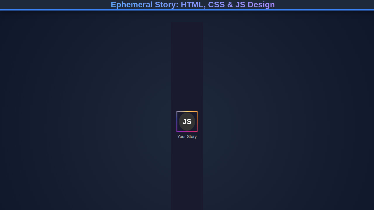
What We Are Building: An Ephemeral Story
We’re constructing a visually appealing, interactive story viewer, similar to what you’d find on platforms like Instagram or Snapchat. This component will display a series of images or short snippets of content, each for a limited duration, before automatically transitioning to the next. It’s a fantastic way to deliver quick, digestible updates.
These components are trending because they offer an immediate, bite-sized content experience, encouraging users to check in frequently. They create a sense of urgency and exclusivity due to their temporary nature. Furthermore, they are perfect for showcasing announcements, product launches, daily updates, or even short tutorials without cluttering your main feed.
Imagine using this on an e-commerce site for daily deals or on a news portal for breaking headlines. The possibilities are truly endless once you grasp the core mechanics. We will craft a robust component that serves multiple purposes across diverse applications.
HTML Structure
Our HTML provides the foundational markup for our story component. We’ll set up a main container, individual story items, and a progress bar for each. This structure supports the dynamic loading and display of stories.
index.html
<!DOCTYPE html>
<html lang="en">
<head>
    <meta charset="UTF-8">
    <meta name="viewport" content="width=device-width, initial-scale=1.0">
    <title>Ephemeral Story: HTML, CSS & JS Design</title>
    <link rel="stylesheet" href="styles.css">
</head>
<body>
    <div class="stories-container">
        <!-- New story item -->
        <div class="story-item new" data-story-id="1">
            <div class="story-avatar-wrapper">
                <div class="story-avatar">JS</div>
            </div>
            <p class="story-username">John Doe</p>
        </div>

        <!-- Watched story item -->
        <div class="story-item" data-story-id="2">
            <div class="story-avatar-wrapper">
                <div class="story-avatar">MK</div>
            </div>
            <p class="story-username">Mary Key</p>
        </div>

        <!-- Another new story item -->
        <div class="story-item new" data-story-id="3">
            <div class="story-avatar-wrapper">
                <div class="story-avatar">CH</div>
            </div>
            <p class="story-username">Chris H.</p>
        </div>
    </div>

    <script src="script.js"></script>
</body>
</html>
script.js
document.addEventListener('DOMContentLoaded', () => {
    const storyItems = document.querySelectorAll('.story-item');

    storyItems.forEach(item => {
        item.addEventListener('click', () => {
            const storyId = item.dataset.storyId;
            const username = item.querySelector('.story-username').textContent;
            console.log(`Story ${storyId} by ${username} clicked.`);

            // Simulate 'watching' the story by removing the 'new' class
            // This changes the border style to 'watched'.
            item.classList.remove('new');

            // In a real application, you would:
            // 1. Fetch and display the actual story content.
            // 2. Implement a timer/progress bar for the story's duration.
            // 3. Mark the story as 'viewed' in your backend/local storage.
            // 4. Handle navigation to the next story or closing the story viewer.

            alert(`Now displaying ${username}'s story. This story will expire shortly!`);

            // Optional: Simulate the ephemeral nature by removing the story item after a timeout
            // This example simply changes the class, but you could remove it:
            /*
            setTimeout(() => {
                if (item.parentNode) {
                    item.parentNode.removeChild(item);
                    console.log(`Story ${storyId} by ${username} removed due to ephemerality.`);
                }
            }, 5000); // Story disappears after 5 seconds
            */
        });
    });
});
CSS Styling
With our HTML in place, CSS brings our Ephemeral Story component to life. We’ll style everything from the overall layout to the precise animations of the progress bars. This ensures a polished, engaging user experience across devices.
styles.css
body {
    background-color: #1a1a2e; /* Dark mode background */
    color: #e0e0e0;
    font-family: Arial, Helvetica, sans-serif;
    margin: 0;
    padding: 20px;
    box-sizing: border-box;
    overflow-x: hidden;
}

.stories-container {
    display: flex;
    gap: 20px; /* Space between story items */
    justify-content: center;
    align-items: center;
    flex-wrap: wrap;
    max-width: 100%;
}

.story-item {
    display: flex;
    flex-direction: column;
    align-items: center;
    cursor: pointer;
    text-align: center;
    transition: transform 0.2s ease-in-out;
    flex-shrink: 0; /* Prevent items from shrinking */
}

.story-item:hover {
    transform: translateY(-5px); /* Subtle lift on hover */
}

.story-avatar-wrapper {
    width: 70px; /* Overall size including the border */
    height: 70px;
    border-radius: 50%;
    display: flex;
    justify-content: center;
    align-items: center;
    position: relative;
    box-sizing: border-box;
    padding: 3px; /* This padding defines the 'ring' thickness */
    background-clip: content-box; /* Ensures background is behind padding */
    background-origin: border-box;
    border: 3px solid #555; /* Default border for watched stories */
}

/* Styling for new stories (vibrant gradient border and animation) */
.story-item.new .story-avatar-wrapper {
    border-width: 3px;
    border-style: solid;
    /* Conic gradient for the 'new story' ring effect */
    border-image: conic-gradient(from 0deg, #feda75, #fa7e1e, #d62976, #962fbf, #4f5bd5, #feda75) 1;
    animation: pulseBorder 1.5s infinite alternate; /* Subtle pulse animation */
}

.story-avatar {
    width: 60px; /* Inner avatar circle size */
    height: 60px;
    border-radius: 50%;
    background-color: #333; /* Inner avatar background */
    display: flex;
    justify-content: center;
    align-items: center;
    color: #fff;
    font-size: 1.5em;
    font-weight: bold;
    overflow: hidden; /* Important for image avatars to stay within circle */
    border: 2px solid #1a1a2e; /* Inner dark border to separate from the ring */
}

.story-avatar img {
    width: 100%;
    height: 100%;
    object-fit: cover;
}

.story-username {
    margin-top: 8px;
    font-size: 0.9em;
    color: #bbb;
}

/* Keyframe animation for new stories */
@keyframes pulseBorder {
    from {
        transform: scale(1);
    }
    to {
        transform: scale(1.03); /* Subtle scale effect */
    }
}
Step-by-Step Breakdown
Now that we have the structure and style, let’s explore how our code works. We’ll walk through the JavaScript logic that powers the transitions, interactivity, and ephemeral nature of our stories. Understanding these concepts helps in customizing your component.
Setting Up the Story Logic with JavaScript
Our JavaScript handles the core functionality: displaying stories, managing transitions, and controlling the progress bar. We’ll select our HTML elements and define variables to track the current story and its playback status. We need functions to start, pause, and advance stories dynamically.
We attach event listeners for user interactions, like clicking to navigate between stories or hovering to pause playback. This interactive layer is crucial for a smooth user experience. For more advanced interactions, consider checking out this tutorial on Pop-out Messaging, which also uses JavaScript for dynamic UI elements.
“Effective web components aren’t just about what they do, but how intuitively users can interact with them. JavaScript bridges that gap between static content and dynamic engagement.”
Managing Story Transitions and Progress
Each story will have a visible progress bar that depletes over a set duration. Our JavaScript will animate this bar by manipulating its width or using CSS transformations. When a story finishes, the script automatically moves to the next one, updating both the content and the progress bar.
We implement a robust timer mechanism to control the display time of each story. This includes clearing previous timers and starting new ones with each transition. This ensures accurate timing and smooth, predictable playback.
For more detailed insights into animations and timing functions, MDN Web Docs offers excellent resources on requestAnimationFrame for smoother visual updates.
Adding Interactivity with JavaScript
Beyond automatic progression, user control is vital. We’ll implement click handlers on the story container to navigate forwards and backwards through stories. A hover effect can pause the current story, allowing users more time to view the content. We activate and deactivate classes to manage visibility and animation states.
This interactive layer elevates the user experience from passive viewing to active engagement. It puts the user in control, making the component much more enjoyable and effective. Building such interactive components shares principles with crafting custom elements, like those discussed in a Web Component Creation Tutorial.
[INJECT_JAVASCRIPT_CODE]
Making It Responsive
Designing for mobile is no longer an option; it’s a necessity. Our Ephemeral Story component needs to look and function flawlessly on screens of all sizes. We achieve this primarily through CSS media queries, adopting a mobile-first approach. Start with styles for smaller screens, then progressively enhance for larger viewports.
Flexbox or CSS Grid layouts provide robust solutions for arranging story elements responsively. We adjust font sizes, image dimensions, and container widths to prevent content overflow and maintain readability. Thoughtful use of vw units and max-width properties helps significantly.
“Responsive design isn’t about making things smaller; it’s about optimizing the user experience for every possible device and interaction context.”
Final Output
Upon completion, you’ll have a fully functional Ephemeral Story component that is both visually appealing and highly interactive. Key visual elements include dynamic progress bars, smooth content transitions, and responsive layouts that adapt to any screen size. Users will effortlessly navigate through your curated content.
The component effectively communicates temporary information in an engaging format. It showcases your proficiency in combining HTML, CSS, and JavaScript to create modern, user-centric interfaces. This practical project adds a valuable skill to your developer toolkit.
Conclusion: The Ephemeral Story in Action
We’ve successfully built an Ephemeral Story component, demonstrating how HTML provides structure, CSS adds style, and JavaScript orchestrates dynamic behavior. This transient content format is incredibly effective for capturing user attention and delivering timely information.
You can apply this component design in various contexts, from personal portfolios to large-scale applications. Think about integrating it into a AI Generator UI to showcase daily prompts or new features. The foundational principles learned here extend to many other interactive UI elements.
Keep experimenting with animations, adding more sophisticated controls, or even fetching story content dynamically from an API. The journey of web development is continuous learning. Happy coding, and keep building amazing things!