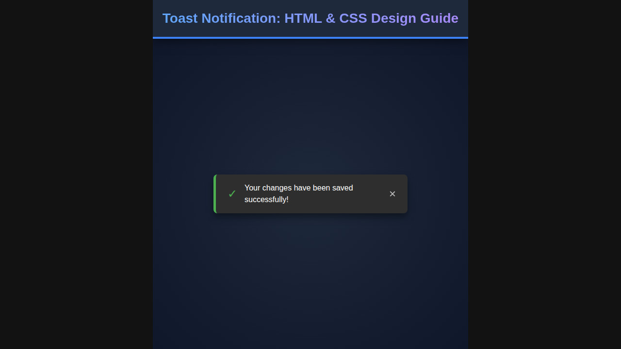
Ever noticed those small, unobtrusive messages popping up on websites to give you quick feedback? That, my friend, is a Toast Notification. These tiny, yet powerful, UI elements are crucial for a smooth user experience, gently informing users about an action’s success, a potential warning, or simply a system update without interrupting their workflow. Today, we’re going to dive deep into crafting these elegant alerts using nothing but HTML and CSS. Get ready to build something awesome!
What We Are Building: Crafting the Perfect Toast Notification
Imagine a scenario where a user successfully submits a form. Do you really want a full-page reload or a jarring alert box? Absolutely not! Instead, a subtle, dismissible message appearing at the top or bottom of the screen offers a much better experience. These fleeting messages are a hallmark of modern web applications.
They’re trending because they embody non-intrusive communication. They don’t demand immediate action, but rather provide quick, contextual feedback. We see them everywhere: successful logins, items added to a cart, preferences saved, or even just a simple “Copied to clipboard!” message. Their versatility makes them an indispensable tool in any web developer’s arsenal.
We will design a sleek, animated toast that can display different statuses like success, error, or info. It will automatically disappear after a few seconds, but also give users the option to close it manually. This design approach ensures maximum usability and a touch of polish for your web projects.
HTML Structure: The Foundation of Your Toast Notification
Every great web component starts with solid HTML. For our toast notification, we need a container to hold multiple toasts, and then individual structures for each toast, including an icon, a message, and a close button. We will use semantic HTML as much as possible.
<div class="toast-container">
    <!-- Example Toast (Success) -->
    <div class="toast toast--success">
        <div class="toast__icon">
            <svg class="icon icon-check" xmlns="http://www.w3.org/2000/svg" viewBox="0 0 24 24" fill="none" stroke="currentColor" stroke-width="2" stroke-linecap="round" stroke-linejoin="round">
                <polyline points="20 6 9 17 4 12"></polyline>
            </svg>
        </div>
        <div class="toast__content">
            <h3 class="toast__title">Success!</h3>
            <p class="toast__message">Your settings have been saved.</p>
        </div>
        <button class="toast__close-btn">
            <svg class="icon icon-x" xmlns="http://www.w3.org/2000/svg" viewBox="0 0 24 24" fill="none" stroke="currentColor" stroke-width="2" stroke-linecap="round" stroke-linejoin="round">
                <line x1="18" y1="6" x2="6" y2="18"></line>
                <line x1="6" y1="6" x2="18" y2="18"></line>
            </svg>
        </button>
    </div>

    <!-- Example Toast (Error) -->
    <div class="toast toast--error">
        <div class="toast__icon">
            <svg class="icon icon-x-circle" xmlns="http://www.w3.org/2000/svg" viewBox="0 0 24 24" fill="none" stroke="currentColor" stroke-width="2" stroke-linecap="round" stroke-linejoin="round">
                <circle cx="12" cy="12" r="10"></circle>
                <line x1="15" y1="9" x2="9" y2="15"></line>
                <line x1="9" y1="9" x2="15" y2="15"></line>
            </svg>
        </div>
        <div class="toast__content">
            <h3 class="toast__title">Error!</h3>
            <p class="toast__message">Failed to process your request.</p>
        </div>
        <button class="toast__close-btn">
            <svg class="icon icon-x" xmlns="http://www.w3.org/2000/svg" viewBox="0 0 24 24" fill="none" stroke="currentColor" stroke-width="2" stroke-linecap="round" stroke-linejoin="round">
                <line x1="18" y1="6" x2="6" y2="18"></line>
                <line x1="6" y1="6" x2="18" y2="18"></line>
            </svg>
        </button>
    </div>

    <!-- Example Toast (Info) -->
    <div class="toast toast--info">
        <div class="toast__icon">
            <svg class="icon icon-info" xmlns="http://www.w3.org/2000/svg" viewBox="0 0 24 24" fill="none" stroke="currentColor" stroke-width="2" stroke-linecap="round" stroke-linejoin="round">
                <circle cx="12" cy="12" r="10"></circle>
                <line x1="12" y1="16" x2="12" y2="12"></line>
                <line x1="12" y1="8" x2="12.01" y2="8"></line>
            </svg>
        </div>
        <div class="toast__content">
            <h3 class="toast__title">Information</h3>
            <p class="toast__message">A new update is available for download.</p>
        </div>
        <button class="toast__close-btn">
            <svg class="icon icon-x" xmlns="http://www.w3.org/2000/svg" viewBox="0 0 24 24" fill="none" stroke="currentColor" stroke-width="2" stroke-linecap="round" stroke-linejoin="round">
                <line x1="18" y1="6" x2="6" y2="18"></line>
                <line x1="6" y1="6" x2="18" y2="18"></line>
            </svg>
        </button>
    </div>
</div>
CSS Styling: Bringing Your Toast to Life
Now for the exciting part – making our toasts look fantastic! We’ll use CSS to position the toasts, style their appearance, and add subtle animations for a polished user experience. A well-designed toast is both noticeable and pleasant to interact with. Remember that every detail counts in UI design.
/* Basic Resets & Variables */
:root {
    --color-success: #4CAF50;
    --color-error: #F44336;
    --color-info: #2196F3;
    --color-background: #333;
    --color-text: #fff;
    --color-close-btn: #ccc;
    --color-close-btn-hover: #fff;
    --toast-width: 350px;
    --toast-padding: 15px;
    --toast-border-radius: 8px;
    --toast-margin-bottom: 15px;
    --toast-animation-duration: 0.3s;
    --toast-auto-hide-delay: 5s; /* For JS, not CSS directly */
}

body {
    font-family: 'Segoe UI', Tahoma, Geneva, Verdana, sans-serif;
    margin: 0;
    display: flex;
    justify-content: center;
    align-items: flex-start;
    min-height: 100vh;
    background-color: #f0f2f5;
    padding: 20px;
    box-sizing: border-box;
}

/* Toast Container */
.toast-container {
    position: fixed;
    top: 20px;
    right: 20px;
    display: flex;
    flex-direction: column;
    z-index: 1000;
    gap: var(--toast-margin-bottom); /* Better than margin-bottom for last element */
}

/* Individual Toast */
.toast {
    display: flex;
    align-items: center;
    background-color: var(--color-background);
    color: var(--color-text);
    padding: var(--toast-padding);
    border-radius: var(--toast-border-radius);
    box-shadow: 0 4px 12px rgba(0, 0, 0, 0.15);
    width: var(--toast-width);
    max-width: calc(100vw - 40px); /* Account for padding */
    box-sizing: border-box;
    position: relative;
    transform: translateX(110%); /* Start off-screen */
    animation: slideIn var(--toast-animation-duration) forwards ease-out;
}

.toast.removing {
    animation: slideOut var(--toast-animation-duration) forwards ease-in;
}

/* Toast types */
.toast--success {
    border-left: 5px solid var(--color-success);
}
.toast--success .toast__icon {
    color: var(--color-success);
}

.toast--error {
    border-left: 5px solid var(--color-error);
}
.toast--error .toast__icon {
    color: var(--color-error);
}

.toast--info {
    border-left: 5px solid var(--color-info);
}
.toast--info .toast__icon {
    color: var(--color-info);
}

/* Toast Elements */
.toast__icon {
    margin-right: 15px;
    display: flex;
    align-items: center;
}

.toast__icon .icon {
    width: 24px;
    height: 24px;
}

.toast__content {
    flex-grow: 1;
    margin-right: 15px;
}

.toast__title {
    margin: 0;
    font-size: 1.1em;
    font-weight: 600;
    line-height: 1.2;
}

.toast__message {
    margin: 5px 0 0;
    font-size: 0.9em;
    opacity: 0.9;
    line-height: 1.4;
}

.toast__close-btn {
    background: none;
    border: none;
    color: var(--color-close-btn);
    cursor: pointer;
    padding: 0;
    font-size: 1.2em;
    line-height: 1;
    transition: color 0.2s ease-in-out;
    display: flex;
    align-items: center;
    justify-content: center;
    flex-shrink: 0; /* Prevent button from shrinking */
}

.toast__close-btn:hover {
    color: var(--color-close-btn-hover);
}

.toast__close-btn .icon {
    width: 18px;
    height: 18px;
}

/* Animations */
@keyframes slideIn {
    from {
        transform: translateX(110%);
        opacity: 0;
    }
    to {
        transform: translateX(0);
        opacity: 1;
    }
}

@keyframes slideOut {
    from {
        transform: translateX(0);
        opacity: 1;
    }
    to {
        transform: translateX(110%);
        opacity: 0;
    }
}
Step-by-Step Breakdown: Unpacking the Code
Let’s dissect the code we just wrote, understanding each part’s role in creating our beautiful notifications. This section will guide you through the thought process behind the HTML structure and the detailed CSS properties. You will gain a deeper insight into modern styling techniques.
The Toast Container: Your Notification Hub
First, we have .toast-container. This element acts as the parent for all our individual toast messages. By setting its position to fixed, we ensure it stays in place regardless of scrolling. Placing it top: 20px and right: 20px elegantly positions it in the upper-right corner of the viewport. We also apply display: flex with flex-direction: column to stack multiple toasts vertically. A gap property between toasts provides neat spacing.
“Good design is obvious. Great design is transparent.” This principle perfectly applies to toast notifications – they should seamlessly integrate into the user experience, providing information without being jarring or demanding.
Individual Toast Structure: Anatomy of an Alert
Each individual toast, represented by the .toast class, is a flex item within the container. We’ve used display: flex here too, but this time to align the icon, content, and close button horizontally. Crucially, the width is set to a fixed size, with a max-width to ensure responsiveness on smaller screens. Padding and border-radius contribute to its visual appeal.
We’re also using an initial transform: translateX(110%); and opacity: 0; to hide the toast off-screen. This prepares it for a smooth entrance animation. The box-sizing: border-box property helps manage padding and width consistently. This detail significantly improves layout predictability.
Styling Variants: Success, Error, and Info
Notice the .toast--success, .toast--error, and .toast--info classes? These are modifier classes that allow us to easily change the toast’s visual theme based on its type. We achieve this by simply altering the border-left color and the icon’s color. Using CSS variables here makes theme management incredibly straightforward and maintainable. This technique keeps our CSS DRY (Don’t Repeat Yourself).
Inner Elements: Icon, Content, and Close Button
Inside each toast, you’ll find three main areas: .toast__icon, .toast__content, and .toast__close-btn. The icon, usually an SVG, provides immediate visual context. The content holds our h3 title and p message, with flex-grow: 1 ensuring it takes up available space. Finally, the close button, also containing an SVG, allows users to dismiss the toast manually. Its styling is minimal, focusing on functionality and a subtle hover effect. This approach enhances user control.
For more insights into crafting accessible interactive elements, you might find this guide on building accessible web forms with HTML5 and JavaScript extremely useful. Understanding user interactions is key!
The Magic of Animations: Slide In and Slide Out
The @keyframes slideIn and @keyframes slideOut rules are where the magic happens. When a toast appears, it smoothly slides in from off-screen (translateX(110%)) to its natural position (translateX(0)) while fading in. Conversely, the slideOut animation reverses this, making the toast gracefully disappear. The forwards keyword ensures the animation stays at its final state. You can learn more about CSS transforms and animations on MDN Web Docs, which is an excellent resource for web standards.
“Animations shouldn’t just be eye candy; they should communicate intent and improve perceived performance.” This principle guides our toast animations, making the appearance and disappearance feel natural and informative.
Making It Responsive: Toasts for Every Screen
In today’s multi-device world, responsive design isn’t optional; it’s essential. Our toast notifications need to look great and function flawlessly whether viewed on a large desktop monitor or a tiny smartphone screen. We’ve already taken a step in this direction with max-width: calc(100vw - 40px), ensuring toasts don’t overflow on very narrow screens. However, we can go further to optimize their placement and size.
For mobile devices, placing the toast at the bottom of the screen often feels more natural and less obstructive, especially when the user’s thumb interaction is considered. We can achieve this with a simple media query. This technique allows us to adapt styling based on screen dimensions.
@media (max-width: 768px) {
    .toast-container {
        top: auto; /* Remove top positioning */
        bottom: 20px; /* Position at the bottom */
        right: 50%; /* Center horizontally */
        transform: translateX(50%); /* Adjust for centering */
        align-items: center; /* Center toasts if they stack */
        width: calc(100% - 40px); /* Adjust width for mobile */
    }

    .toast {
        width: 100%; /* Take full width of container */
        margin-bottom: var(--toast-margin-bottom); /* Ensure spacing */
    }

    /* Adjust animations for vertical slide */
    @keyframes slideIn {
        from { transform: translateY(110%); opacity: 0; }
        to { transform: translateY(0); opacity: 1; }
    }

    @keyframes slideOut {
        from { transform: translateY(0); opacity: 1; }
        to { transform: translateY(110%); opacity: 0; }
    }
}
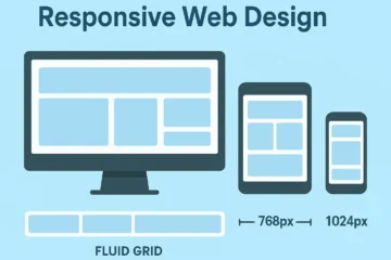
With these media queries, our .toast-container shifts from the top-right to the bottom-center on smaller screens. We also adjust the transform for the animations to slide in from the bottom instead of the right. This approach provides a much better user experience on touch devices. If you’re keen on exploring more techniques to make your designs adaptive, check out this comprehensive Responsive Web Design: Beginner’s Guide. You might also find excellent resources on CSS-Tricks for deeper dives into media query best practices and examples.
Remember, a mobile-first approach often simplifies complex responsiveness. Building for the smallest screen first often leads to cleaner, more efficient code. Consistency across devices is key to a professional web presence.
Final Output: A Polished Toast Notification Experience
What have we achieved with all this HTML and CSS magic? We’ve crafted a set of beautiful, functional, and responsive toast notifications! You now have a solid foundation for adding engaging feedback to your web applications. These toasts offer visual cues that are both appealing and highly informative to your users. They instantly enhance the perceived quality of any interactive element.
Key visual elements include distinct color coding for different message types (success, error, info), clear iconography, a concise message structure, and smooth animations for appearance and disappearance. The manual close button adds a layer of user control, while responsiveness ensures a consistent experience across all devices. This combination creates a professional and user-friendly component that truly stands out.
Conclusion: Your Journey with Toast Notifications
You’ve just built a modern, responsive Toast Notification system from the ground up using only HTML and CSS! This journey covered everything from structuring the basic elements to applying advanced styling and ensuring adaptability across various screen sizes. The power of these small pop-ups in improving user interaction cannot be overstated. They are a subtle yet effective way to communicate with your audience without being obtrusive.
Now, take these concepts and expand upon them! You could integrate JavaScript to dynamically create and manage toasts, add different animation styles, or even allow users to customize their duration. Remember, the core principles of good UI design — clarity, consistency, and non-invasiveness — remain paramount. Keep experimenting and building amazing things!
Beyond just static pages, interactive elements truly shine. For instance, creating drawing apps with a canvas element is another exciting project where you can explore web possibilities, similar to how we’ve brought our toasts to life today. Keep pushing the boundaries of what you can build on the web!