3D Flip Card CSS Tutorial: HTML, CSS & JavaScript Interaction
Hey there, future web wizard! Have you ever wanted to build a super cool 3D Flip Card but felt a bit lost? You are definitely in the right place. Today, we will craft an interactive card that flips right before your eyes. This effect adds a touch of magic to any web page. It is also a fantastic way to display information. Get ready to impress your users with this awesome project!
What We Are Building: An Amazing 3D Flip Card
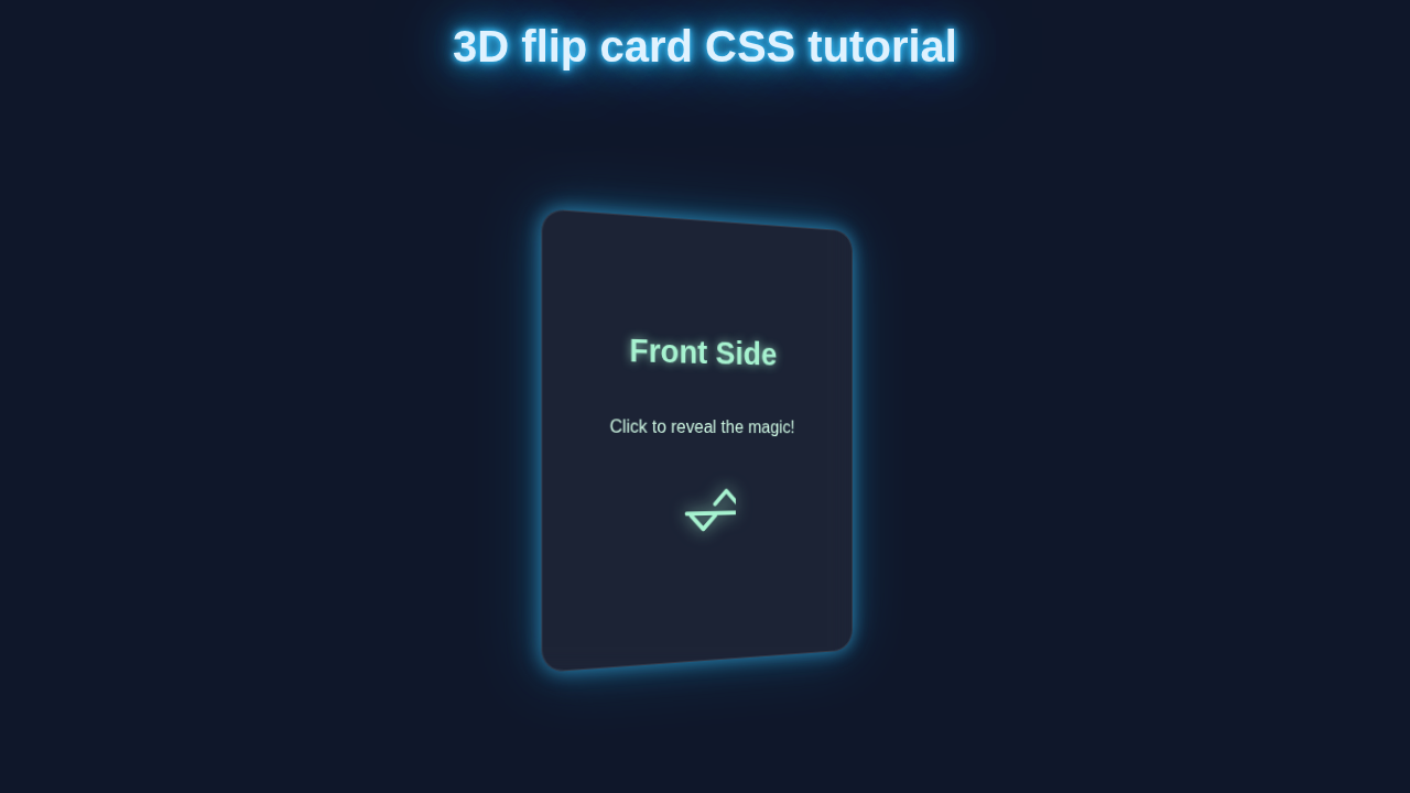
Imagine a card that shows one thing on the front. Then, with a click or hover, it smoothly rotates to reveal a whole new side! That is exactly what we are building. This interactive 3D Flip Card is perfect for portfolios. You can use it for product showcases, or even a fun quiz. It makes your website feel dynamic and professional. Plus, it teaches you some fundamental CSS concepts. You will master transform and perspective properties. Let’s dive in and create something truly special!
HTML Structure
First, we need a solid foundation for our flip card. The HTML sets up the basic container. It then defines the front and back of our card. It is straightforward and easy to follow.
index.html
<!DOCTYPE html>
<html lang="en">
<head>
    <meta charset="UTF-8">
    <meta name="viewport" content="width=device-width, initial-scale=1.0">
    <title>3D Flip Card</title>
    <link rel="stylesheet" href="styles.css">
</head>
<body>
    <!-- Main container to center the card on the page -->
    <div class="card-container">
        <!-- The flip card component itself -->
        <div class="flip-card" id="myFlipCard">
            <!-- This div is the actual element that rotates -->
            <div class="flip-card-inner">
                <!-- Front side of the card -->
                <div class="flip-card-front">
                    <h2>Front Side</h2>
                    <p>Click me to reveal the magic!</p>
                    <img class="card-icon" src="data:image/svg+xml;base64,PHN2ZyB4bWxucz0iaHR0cDovL3d3dy53My5vcmcvMjAwMC9zdmciIHdpZHRoPSIxMDAiIGhlaWdodD0iMTAwIiB2aWV3Qm94PSIwIDAgMjQgMjQiIGZpbGw9Im5vbmUiIHN0cm9rZT0iIzZkNGMxYiIgc3Ryb2tlLXdpZHRoPSIxLjUiIHN0cm9rZS1saW5lY2FwPSJyb3VuZCIgc3Ryb2tlLWxpbmVjYXA9InJvdW5kIiBzdHJva2UtbGluZWpvaW49InJvdW5kIj48cGF0aCBkPSJNOSAxN2wxLjgtNC43QTQgNCAwIDAgMSAxMy44IDIySDE1Yy0uMTEgMy0uNiA1LTEuNiA2bC0zLjQgN3oiLz48L3N2Zz4=" alt="Front Icon">
                </div>
                <!-- Back side of the card -->
                <div class="flip-card-back">
                    <h2>Back Side</h2>
                    <p>Now you see the other side!</p>
                    <img class="card-icon" src="data:image/svg+xml;base64,PHN2ZyB4bWxucz0iaHR0cDovL3d3dy53My5vcmcvMjAwMC9zdmciIHdpZHRoPSIxMDAiIGhlaWdodD0iMTAwIiB2aWV3Qm94PSIwIDAgMjQgMjQiIGZpbGw9Im5vbmUiIHN0cm9rZT0iIzU2MDBhMSIgc3Ryb2tlLXdpZHRoPSIxLjUiIHN0cm9rZS1saW5lY2FwPSJyb3VuZCIgc3Ryb2tlLWxpbmVjYXA9InJvdW5kIiBzdHJva2UtbGluZWpvaW49InJvdW5kIj48cGF0aCBkPSJNMTIgMmE5LjUyIDkuNTIgMCAwIDAgLTcuODkgNC43MiAyLjM5IDIuMzkgMCAwIDAgLjQ4IDIuMjkgMS42OSAxLjY5IDAgMCAxIC4wNSAxLjQ4TDIgMTguMzJhLjUgLjUgMCAwIDAgLjQgLjdsNS4zNSAxLjQxYy43Ny4yIDEuNjQuMDYgMi4zOS0uMzhsMi43Ni0xLjUzYy43LS40MSAxLjU4LS41NSAyLjQ1LS40MWMxLjE2LjE2IDIuMi44MiAyLjY3IDEuOTMuNDkuODYuMzYgMS44MS0uMDcgMi43MS0uMzUuNzQtLjc3IDEuMzctMS4xMiAxLjc0QzE1IDIzIDE2LjkgMjMgMTkgMjNhLjUuNSAwIDAgMCAuNS0uNWwxLjI0LTQuNzljLjI0LS45OC4wMS0xLjk5LS42Ny0yLjhjLS41Ny0uNjgtMS42OS0xLjU1LTIuNDMtMi4zNGExMi4yOCAxMi4yOCAwIDAgMCAtMS45Mi0zLjQ0Yy0uMTctLjE0LS40Ni0uMzYtLjU4LS40Ny0uMjEtLjE1LS40MS0uMzQtLjQ0LS4zNS0uMDYtLjA2LS4zNy0uMi0uNDktLjI4QzEzLjMyIDcgMTMgMiAxMiAyWiIvPjwvc3ZnPg==" alt="Back Icon">
                </div>
            </div>
        </div>
    </div>

    <script src="script.js"></script>
</body>
</html>
CSS Styling: Bringing Your 3D Flip Card to Life
Now comes the magic! CSS is where we bring our card to life. We will use CSS to position elements. Then, we will create that awesome 3D flip effect. This is the heart of our 3D Flip Card project. Get ready to see the visual transformation!
styles.css
/* General Styling & Reset */
*, *::before, *::after {
    box-sizing: border-box; /* Include padding and border in the element's total width and height */
    margin: 0;
    padding: 0;
}

body {
    font-family: Arial, Helvetica, sans-serif; /* Safe and widely available font */
    background-color: #f0f2f5; /* Light grey background for a clean look */
    color: #333; /* Dark grey text color */
    display: flex;
    justify-content: center;
    align-items: center;
    min-height: 100vh; /* Center content vertically on the page */
    overflow: hidden; /* Prevent scrollbars if content overflows */
}

.card-container {
    width: 100%;
    max-width: 400px; /* Max width for the card's containing area */
    padding: 20px;
    display: flex;
    justify-content: center;
    align-items: center;
}

/* 3D Flip Card Styles */
.flip-card {
    background-color: transparent;
    width: 300px;
    height: 400px;
    perspective: 1000px; /* This property defines the 3D perspective for the child elements */
    cursor: pointer; /* Indicate that the card is interactive */
    border-radius: 15px; /* Rounded corners for a modern aesthetic */
}

/* This inner container holds the front and back faces and is the element that rotates */
.flip-card-inner {
    position: relative;
    width: 100%;
    height: 100%;
    text-align: center;
    transition: transform 0.8s cubic-bezier(0.4, 0.0, 0.2, 1); /* Smooth 3D rotation transition */
    transform-style: preserve-3d; /* Ensures children (front/back) are positioned in 3D space */
    border-radius: 15px; /* Apply border-radius to the inner element too for consistency */
}

/* When the .flip-card has the 'flipped' class, rotate the inner container */
.flip-card.flipped .flip-card-inner {
    transform: rotateY(180deg);
}

/* Common styles for both front and back faces of the card */
.flip-card-front, .flip-card-back {
    position: absolute;
    width: 100%;
    height: 100%;
    -webkit-backface-visibility: hidden; /* Hide the back of the element when rotated away */
    backface-visibility: hidden;
    border-radius: 15px;
    box-shadow: 0 4px 15px rgba(0, 0, 0, 0.2); /* Subtle shadow for depth */
    display: flex;
    flex-direction: column;
    justify-content: center;
    align-items: center;
    padding: 20px;
    box-sizing: border-box;
}

/* Styling for the front face of the card */
.flip-card-front {
    background-color: #ffffff; /* White background */
    color: #333; /* Dark text */
}

/* Styling for the back face of the card */
.flip-card-back {
    background-color: #5600a1; /* A distinct purple background for the back */
    color: white; /* White text for contrast */
    transform: rotateY(180deg); /* Initially rotate the back side to be hidden from view */
}

/* Typography for card content */
.flip-card-front h2, .flip-card-back h2 {
    font-size: 2em;
    margin-bottom: 15px;
}

.flip-card-front p, .flip-card-back p {
    font-size: 1.1em;
    line-height: 1.6;
    margin-bottom: 20px;
}

.card-icon {
    width: 80px;
    height: 80px;
    object-fit: contain; /* Ensure SVG icons scale without distortion */
}
JavaScript for Interaction
Finally, a tiny bit of JavaScript makes our card truly interactive. It will handle the click event. This script will toggle the flip state. It is a small but powerful addition. If you want to dive deeper into how events work, check out our guide on JavaScript Event Listeners.
script.js
document.addEventListener('DOMContentLoaded', () => {
    // Get the flip card element by its ID
    const flipCard = document.getElementById('myFlipCard');

    // Check if the flipCard element exists to prevent errors
    if (flipCard) {
        // Add a click event listener to the entire card area
        flipCard.addEventListener('click', () => {
            // Toggle the 'flipped' class on the card element.
            // This class change will trigger the CSS 3D transform defined in styles.css.
            flipCard.classList.toggle('flipped');
        });
    } else {
        // Log an error if the card element isn't found, helpful for debugging
        console.error('Flip card element with ID "myFlipCard" not found.');
    }
});
How It All Works Together
Our 3D flip card is a brilliant example of how HTML, CSS, and a tiny bit of JavaScript can work together. Each piece plays a crucial role. We combine structural elements, visual styling, and interactive logic. This collaboration creates a seamless user experience. Let’s break down how it all comes together. We will understand the secret sauce behind the amazing flip. You will gain a deeper insight into these core web technologies.
The Card Container: Establishing the 3D Space
We begin with a simple div element. This element serves as our main card container. It holds everything inside it. Giving it position: relative is helpful. It allows for easy positioning of its child elements. The most crucial CSS property here is perspective.
The perspective property establishes a 3D viewing field for its child elements. Think of it as how far away the “camera” is from the card. A smaller value, like 1000px, creates a more dramatic and closer 3D effect. Without perspective applied to the parent, our rotation would look completely flat. Therefore, this property is a key ingredient for true 3D visual fidelity. You can learn more about its powerful applications on MDN Web Docs. It truly makes the difference.
The Inner Card: The Flipping Element
Inside our card-container, we place another div. This is the element that actually performs the rotation. We call it card-inner. It needs to span the full width and height of its parent. Crucially, we apply transform-style: preserve-3d to this element.
This property tells the browser an important detail. It instructs the browser that the children of card-inner should also participate in the 3D space. This ensures that when card-inner rotates, its front and back faces remain distinct. They will not collapse into a flat, two-dimensional plane. This is absolutely vital for making both sides of your card visible as it flips. You can read up on transform-style here. It is a concept worth understanding deeply.
The Front and Back Faces: Positioning and Hiding
We then have two more divs nested inside card-inner. These are card-front and card-back. Both are absolutely positioned. This makes them perfectly overlap within their parent. They occupy the exact same space.
Initially, the card-front is the side that is visible to the user. The card-back is hidden from view. We achieve this clever hiding trick with backface-visibility: hidden. This CSS property ensures that when an element is rotated to face away from the viewer, its content becomes invisible. It prevents the back content from prematurely showing through the front. The card-back also receives an initial transform: rotateY(180deg). This flips it right away. So, when the card-inner rotates, the card-back will then elegantly swing into view.
The JavaScript Interaction: Toggling the Flip
Finally, our small piece of JavaScript brings the card to life with interaction. We first select the card-inner element from our HTML. Then, we attach an event listener to the main card-container. This listener waits for a “click” event to happen.
When the card-container is clicked, a special function springs into action. Inside this function, we simply toggle a CSS class. This class is named is-flipped. It is applied to the card-inner element. The classList.toggle() method is incredibly useful here! It smartly adds the class if it is not present. Conversely, it removes the class if it already exists. This simple action controls the entire flip state. It is a powerful little snippet! If you want to dive deeper into how events work, check out our guide on JavaScript Event Listeners.
Pro Tip: Using JavaScript’s
classList.toggle()is a clean and efficient way to control CSS states. It keeps your HTML semantic and your CSS focused on presentation! This separation of concerns makes your code easier to manage and debug.
The CSS is-flipped Class: Making the Rotation Happen
The is-flipped class is truly where the animation magic unfolds. When this class is dynamically added to the card-inner element by our JavaScript, it applies a transform: rotateY(180deg).
Because we thoughtfully set a transition property on the card-inner element, this rotation does not happen instantly. Instead, it occurs smoothly over a specified duration. The transition animates the change in the transform property. This creates that beautiful, fluid flipping motion you see. Without transition, the card would simply snap from front to back without any visual flair. Therefore, the transition is essential for creating a delightful and engaging animation. It is all about timing and easing functions.
Educator’s Note: The true power of CSS transitions lies in animating property changes over time. Experiment with
transition-durationfor speed,transition-timing-functionfor acceleration, andtransition-delayfor staggered effects. Your creativity is the only limit!
Tips to Customise Your 3D Flip Card
You have built an amazing 3D Flip Card! Now, let’s make it truly yours. Customisation is where the real fun begins. Here are some ideas to take your card to the next level:
- Change the content: Instead of simple text, add images, icons, or even videos. You could create a dynamic product showcase. For complex data, you might even consider integrating it with something like a Python Web Scraper to fetch fresh content!
- Modify the flip direction: Right now, it flips along the Y-axis. Try
rotateX(180deg)for a vertical flip. Or experiment withrotateZfor a spinning effect! - Add more cards: Create a grid of these cards. Make each one unique. You could even implement a hover effect instead of a click. This means removing the JS and using
:hoverin CSS. - Enhance the styling: Play with different
backgroundcolors. Addbox-shadowfor depth. Changeborder-radiusfor softer edges. You could also explore different fonts and typography. Remember, small styling changes can make a big difference. - Integrate with a framework: If you’re building a more complex app, consider how this component might fit into a framework like React. While this tutorial focuses on pure CSS and vanilla JS, understanding component lifecycles in React, perhaps like with the useEffect hook, could help manage card states in larger applications.
Conclusion
Wow, you did it! You just built an interactive 3D Flip Card using HTML, CSS, and a little JavaScript. That is a huge accomplishment! You have gained practical experience with 3D transforms, perspectives, and smooth transitions. These are super valuable skills for any web developer.
This project showcases how powerful pure CSS can be. It also highlights how a little JavaScript can add engaging interactivity. Now you can use this technique to make your own websites shine. Go ahead, share your creation with the world! Show off your new 3D skills. We cannot wait to see what you build next. Keep coding, and keep exploring!