Hey there, fellow web adventurer! Ever felt like you are playing whack-a-mole with your font sizes? You tweak them for mobile, then they look tiny on a desktop. Then you adjust for tablets, and something else breaks. It is a common struggle for sure!
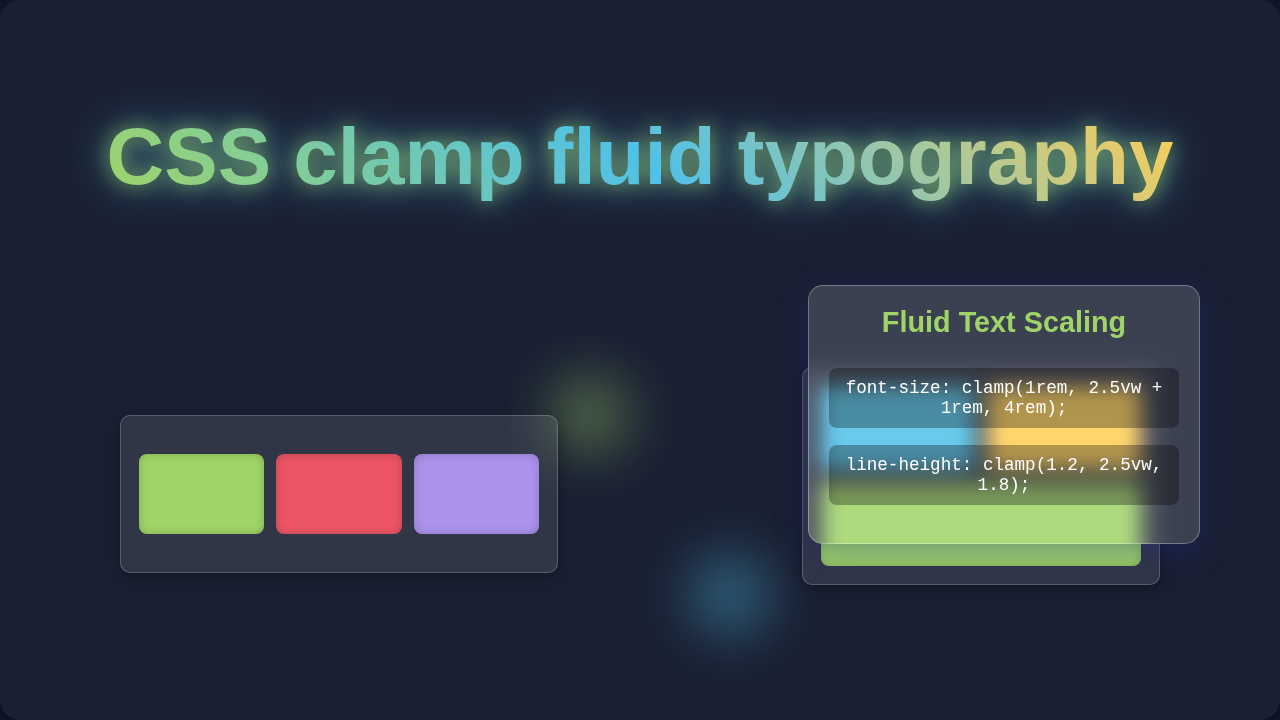
What if I told you there is a CSS superpower that lets your text flow like water? It scales perfectly, no matter the screen size. We are talking about CSS clamp fluid typography, and it is a total game-changer.
Hello, CSS Clamp Fluid Typography!
So, what exactly is this magic? Imagine your text, say a big heading, adapting its size automatically. It gets smaller on a phone. It grows larger on a massive monitor. But here is the cool part: it never goes below a minimum size you set. And it never exceeds a maximum size you define either. It just smoothly transitions in between those limits.
This means your design looks great everywhere. You do not need to write tons of separate rules for different devices. Your typography is truly ‘fluid,’ like water finding its own level in a container. Sounds pretty neat, right?
Why Fluid Typography Matters to You
You probably build websites that people view on all sorts of devices. Think about it: phones, tablets, laptops, huge desktop screens. Each one has a different width.
Before fluid typography, you relied heavily on CSS media queries. You would say, "If the screen is X pixels wide, make the font this size." Then you would add another rule for Y pixels. And another for Z. It gets complicated fast. It also creates jarring jumps in text size as you resize a browser window.
Fluid typography, especially with clamp(), fixes this. Your text scales smoothly. It provides a much better user experience. Your visitors will appreciate a consistent, readable layout. Plus, it makes your CSS much cleaner and easier to manage. You get to spend less time debugging font sizes and more time creating amazing things, like a cool Glassmorphism Card CSS Tutorial: HTML & CSS Design Guide!
Fluid typography is your secret weapon for responsive design. It ensures your content is always readable and aesthetically pleasing, no matter the viewport.
The Magic Behind clamp(): Your New Best Friend
The core of this fluidity is the CSS function called clamp(). Do not worry, it is simpler than it sounds. Think of it like a slider with three important settings.
It takes three values: a minimum value, a preferred value, and a maximum value.
- Minimum Value: This is the smallest your text will ever get. Even if the screen is tiny, your text will not shrink below this point. It prevents unreadable text on small devices.
- Preferred Value: This is the ideal size. It often uses a viewport unit, like
vw(viewport width). This makes the text scale proportionally with the browser window. For example, if your preferred value is2vw, the text will be 2% of the viewport’s width. - Maximum Value: This is the largest your text will ever grow. On huge screens, your text will not become ridiculously large. It keeps your headings from consuming the entire screen, maintaining design integrity.
The browser then looks at these three. It chooses the preferred value first. However, it makes sure that value is never smaller than your minimum. It also ensures it is never larger than your maximum. It ‘clamps’ the value right there.
Building with CSS Clamp Fluid Typography: A Practical Approach
How do you actually use this power? You apply clamp() directly to your font-size property. For instance, you could set your main heading size. Let’s say you want it to be at least 20 pixels, ideally scaling with the screen, but never exceeding 40 pixels.
This single line does the job of multiple media queries. You get smooth scaling without the extra code. It is efficient and elegant.
For even more control, you can combine clamp() with CSS Custom Properties. You can define your min, preferred, and max values as variables. Then you just plug those variables into your clamp() function. This makes your typography system incredibly flexible and easy to update. Imagine changing your base font sizes across your entire site just by adjusting a few variables!
Beyond Basics: Clearing Common Fluid Typography Questions
You might be thinking, "Is this just another trick?" Not at all! It is a robust CSS feature. Some beginners wonder if it replaces all media queries. Not quite! While it significantly reduces the need for media queries for typography, you still need them for major layout changes. For example, reorganizing columns or switching between RTL LTR CSS Layouts: A Visual Guide might still use media queries. But for font sizes? clamp() is your champion.
Remember:
clamp()handles smooth scaling between breakpoints. Media queries handle structural shifts at specific breakpoints.
Another common question is about browser support. Good news! clamp() has excellent browser support now. You can use it confidently in your projects today. It is a modern CSS tool designed for modern web development.
Key Takeaways for Mastering CSS Clamp Fluid Typography
clamp()lets you set a minimum, preferred, and maximum value for properties likefont-size.- It creates genuinely fluid and responsive text scaling.
- You can significantly reduce your reliance on media queries for typography.
- Your designs will look consistent and professional on any device.
- Combine it with CSS Custom Properties for ultimate flexibility.
This powerful function helps you build more resilient and adaptable websites. It simplifies your CSS. It improves the user experience. What is not to love about that?
Ready to Make Your Designs Sing?
See? CSS clamp fluid typography is not some abstract, complex concept. It is a practical, powerful tool you can start using today. You now understand what it is, why it matters, and how it works.
Do not be afraid to experiment! Start small. Try it on a single heading. Then expand it to your body text. You will quickly see the benefits. Your designs will thank you, and your users will too. Go out there and make some beautifully fluid web experiences!