Hey there, fellow coder!
If you’ve ever wanted to build a dynamic React Theme Switcher for your web apps but weren’t sure where to start, you’re in the perfect place. Today, we’re going to create a super cool dark/light mode toggle. This will make your applications more user-friendly and give them a professional polish. Get ready to dive into some exciting React development!
What We Are Building: A Smart Theme Toggle!
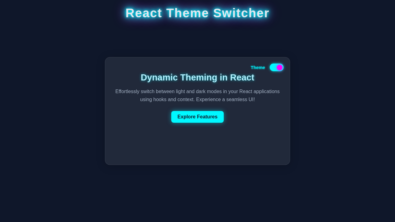
We’re crafting a beautiful and functional theme switcher. Imagine a button that instantly changes your app’s look from bright to dark, or vice versa. This isn’t just about aesthetics; it’s about giving users control. Your app will remember their preference too! It’s a fantastic feature for accessibility and personalization. We’ll use React’s Context API to manage our theme state globally. Then, we will use Local Storage to save user choices. This ensures a consistent experience every time they visit your site. You will love how easy it is to implement!
HTML Structure: The Base of Our App
Our React application will primarily render into a single HTML element. This is standard practice for single-page applications. We just need a simple root div in our index.html. React will take over from there and inject all our components. It acts as the anchor point for our entire UI. This keeps our main HTML file very clean.
public/index.html
<!DOCTYPE html>
<html lang="en">
<head>
    <meta charset="utf-8" />
    <meta name="viewport" content="width=device-width, initial-scale=1" />
    <meta name="theme-color" content="#000000" />
    <meta
        name="description"
        content="React Theme Switcher Tutorial - Light/Dark Mode"
    />
    <title>React Theme Switcher</title>
</head>
<body>
    <noscript>You need to enable JavaScript to run this app.</noscript>
    <div id="root"></div>
    <!--
        This HTML file is a template.
        If you open it directly in the browser, you will see an empty page.
        You can add webfonts, meta tags, or analytics to this file.
        The build step will place the bundled scripts into the <body> tag.
        To begin the development, run `npm start` or `yarn start`.
        To create a production bundle, use `npm run build` or `yarn build`.
    -->
</body>
</html>
CSS Styling: Making It Look Good
Styling is key to any theme switcher. We will use CSS variables (also known as custom properties) to define our theme colors. This approach makes theme switching incredibly efficient. When the theme changes, we simply update a few CSS variable values on our root element. All elements using those variables will update automatically. It’s a powerful and modern way to handle dynamic styles. We will set up light and dark mode variables.
src/index.css
/* Base styles, safe fonts, and box-sizing */
body {
    margin: 0;
    font-family: Arial, Helvetica, sans-serif; /* Safe fonts */
    -webkit-font-smoothing: antialiased;
    -moz-osx-font-smoothing: grayscale;
    box-sizing: border-box;
    /* Smooth transition for background and text color when theme changes */
    transition: background-color 0.3s ease, color 0.3s ease;
    overflow-x: hidden; /* Prevent horizontal scrollbars */
}

/* Apply box-sizing to all elements */
*, *::before, *::after {
    box-sizing: border-box;
}

/* Ensure the root element doesn't exceed 100% width */
#root {
    max-width: 100%;
}

/* =======================================
   CSS Variables for Theming
   These variables are applied to the body
   and change based on the 'light' or 'dark'
   class added by the ThemeContext.
======================================= */

/* Light Theme Variables */
body.light {
    --background-color: #f8f8f8;      /* Light grey background */
    --text-color: #333333;          /* Dark text */
    --header-bg: #ffffff;           /* White header background */
    --border-color: #e0e0e0;        /* Light grey borders */
    --accent-color: #007bff;        /* Primary accent blue */
    --button-bg: #007bff;           /* Blue button background */
    --button-text: #ffffff;         /* White button text */
    --card-bg: #ffffff;             /* White card background */
    --card-shadow: rgba(0, 0, 0, 0.05); /* Subtle shadow */
}

/* Dark Theme Variables */
body.dark {
    --background-color: #1a202c;      /* Dark slate background */
    --text-color: #e2e8f0;          /* Light grey text */
    --header-bg: #2d3748;           /* Darker slate header */
    --border-color: #4a5568;        /* Medium grey borders */
    --accent-color: #63b3ed;        /* Light blue accent */
    --button-bg: #63b3ed;           /* Light blue button */
    --button-text: #1a202c;         /* Dark button text */
    --card-bg: #2d3748;             /* Darker slate card */
    --card-shadow: rgba(0, 0, 0, 0.2);  /* More prominent shadow */
}

/* Apply variables to base elements */
body {
    background-color: var(--background-color);
    color: var(--text-color);
}
src/App.css
.app-container {
    display: flex;
    flex-direction: column;
    min-height: 100vh;
    max-width: 900px;
    margin: 0 auto;
    padding: 20px;
    box-sizing: border-box;
}

.app-header {
    display: flex;
    justify-content: space-between;
    align-items: center;
    padding: 15px 20px;
    background-color: var(--header-bg); /* Themed header background */
    border-bottom: 1px solid var(--border-color); /* Themed border */
    border-radius: 8px;
    margin-bottom: 30px;
    box-shadow: 0 2px 10px var(--card-shadow); /* Themed shadow */
    /* Smooth transitions for theme changes */
    transition: background-color 0.3s ease, border-color 0.3s ease, box-shadow 0.3s ease;
}

.app-header h1 {
    margin: 0;
    font-size: 1.8em;
    color: var(--text-color); /* Themed text color */
}

.app-main-content {
    flex-grow: 1;
    padding: 20px 0;
}

.app-main-content p {
    line-height: 1.6;
    margin-bottom: 1.5em;
}

.themed-section {
    background-color: var(--card-bg); /* Themed background */
    border: 1px solid var(--border-color); /* Themed border */
    padding: 30px;
    border-radius: 12px;
    margin-bottom: 40px;
    box-shadow: 0 4px 15px var(--card-shadow); /* Themed shadow */
    /* Smooth transitions for theme changes */
    transition: background-color 0.3s ease, border-color 0.3s ease, box-shadow 0.3s ease;
}

.themed-section h2 {
    color: var(--accent-color); /* Themed accent color */
    margin-top: 0;
    margin-bottom: 15px;
    font-size: 1.6em;
}

.themed-section p {
    color: var(--text-color); /* Themed text color */
}

.themed-button {
    background-color: var(--button-bg); /* Themed button background */
    color: var(--button-text); /* Themed button text */
    border: none;
    padding: 10px 20px;
    border-radius: 5px;
    cursor: pointer;
    font-size: 1em;
    transition: background-color 0.3s ease, color 0.3s ease;
}

.themed-button:hover {
    opacity: 0.9; /* Slight opacity change on hover */
}

.card {
    background-color: var(--card-bg); /* Themed card background */
    border: 1px solid var(--border-color); /* Themed border */
    padding: 25px;
    border-radius: 10px;
    box-shadow: 0 2px 10px var(--card-shadow); /* Themed shadow */
    /* Smooth transitions for theme changes */
    transition: background-color 0.3s ease, border-color 0.3s ease, box-shadow 0.3s ease;
}

.card h3 {
    color: var(--text-color); /* Themed text color */
    margin-top: 0;
    margin-bottom: 10px;
    font-size: 1.4em;
}

.card p {
    color: var(--text-color); /* Themed text color */
    margin-bottom: 0;
}

.app-footer {
    text-align: center;
    padding: 20px;
    border-top: 1px solid var(--border-color); /* Themed border */
    margin-top: 40px;
    color: var(--text-color); /* Themed text color */
    transition: border-color 0.3s ease, color 0.3s ease;
}

/* Responsive adjustments for smaller screens */
@media (max-width: 768px) {
    .app-header {
        flex-direction: column;
        align-items: flex-start;
        gap: 15px;
    }

    .app-header h1 {
        font-size: 1.5em;
    }

    .themed-section {
        padding: 20px;
    }

    .themed-section h2 {
        font-size: 1.4em;
    }
}
src/ThemeSwitcher.css
.theme-switcher-container {
    display: flex;
    align-items: center;
    gap: 10px;
    color: var(--text-color); /* Label text color adapts to theme */
    transition: color 0.3s ease;
}

.theme-label {
    font-size: 0.9em;
    font-weight: bold;
}

/* The switch container - the visible track */
.switch {
    position: relative;
    display: inline-block;
    width: 50px;
    height: 28px;
}

/* Hide the default HTML checkbox input */
.switch input {
    opacity: 0;
    width: 0;
    height: 0;
}

/* The slider (the track for the thumb) */
.slider {
    position: absolute;
    cursor: pointer;
    top: 0;
    left: 0;
    right: 0;
    bottom: 0;
    /* Background color for the 'off' state (light mode) */
    background-color: var(--border-color);
    transition: .4s; /* Smooth transition for background changes */
    border-radius: 28px; /* Rounded pill shape */
}

/* The slider 'thumb' (the movable circle) */
.slider:before {
    position: absolute;
    content: "";
    height: 20px;
    width: 20px;
    left: 4px;
    bottom: 4px;
    /* Background color for the thumb in 'off' state */
    background-color: var(--header-bg); /* Use a light background color for visibility */
    transition: .4s; /* Smooth transition for position and color changes */
    border-radius: 50%; /* Circular shape */
}

/* When the checkbox is checked (i.e., theme is 'dark') */
input:checked + .slider {
    /* Background color for the 'on' state (dark mode) */
    background-color: var(--accent-color);
}

/* Focus style for accessibility */
input:focus + .slider {
    box-shadow: 0 0 1px var(--accent-color);
}

/* When the checkbox is checked, move the slider thumb */
input:checked + .slider:before {
    transform: translateX(22px); /* Move thumb to the right */
    /* Background color for the thumb in 'on' state */
    background-color: var(--background-color); /* Darker background for contrast */
}
JavaScript: The React Magic!
Now for the heart of our application: the React code. We’ll build several components to make our theme switcher work seamlessly. This includes a Context Provider to manage our theme state. We will also create a custom hook for easy theme access. Plus, there will be a simple button component to toggle the theme. We will leverage React Hooks like useState and useEffect. These hooks are powerful tools for managing state and side effects. They will make our theme logic robust and clean.
Pro Tip: Understanding React Hooks like
useStateanduseEffectis super important. They let you use state and other React features without writing a class. It makes your code much more readable!
src/index.js
import React from 'react';
import ReactDOM from 'react-dom/client';
import './index.css'; // Global styles, where theme variables are defined
import App from './App';

// Create a React root to render the application
const root = ReactDOM.createRoot(document.getElementById('root'));
root.render(
  // React.StrictMode helps identify potential problems in an application.
  // It activates additional checks and warnings for its descendants.
  <React.StrictMode>
    <App />
  </React.StrictMode>
);
src/App.js
import React from 'react';
import { ThemeProvider } from './ThemeContext'; // Import the ThemeProvider
import ThemeSwitcher from './ThemeSwitcher';     // Import the ThemeSwitcher component
import './App.css';                            // Component-specific styles for the app layout

function App() {
  return (
    // Wrap the entire application with ThemeProvider to make theme context available to all children.
    <ThemeProvider>
      <div className="app-container">
        {/* Header section with the main title and theme switcher */}
        <header className="app-header">
          <h1>Welcome to the Theme Switcher App</h1>
          <ThemeSwitcher /> {/* The component to toggle between light and dark themes */}
        </header>

        {/* Main content area that will respond to theme changes */}
        <main className="app-main-content">
          <p>
            This is a demonstration of how to implement a theme switcher in React using functional components and hooks.
            The theme preference is saved in local storage, ensuring your choice persists across sessions.
          </p>

          {/* A themed section to showcase dynamic styling */}
          <section className="themed-section">
            <h2>Themed Section Heading</h2>
            <p>
              Content within this section will automatically adapt its styles based on the current theme (light or dark mode).
              Enjoy the seamless UI experience as you toggle the theme!
            </p>
            <button className="themed-button">Click Me</button>
          </section>

          {/* Another themed element example */}
          <div className="card">
            <h3>Themed Card Example</h3>
            <p>This card's appearance also respects the current theme settings, demonstrating consistent theming.</p>
          </div>
        </main>

        {/* Application footer */}
        <footer className="app-footer">
          <p>© 2023 React Theme Switcher Tutorial</p>
        </footer>
      </div>
    </ThemeProvider>
  );
}

export default App;
src/ThemeContext.js
import React, { createContext, useState, useEffect, useContext } from 'react';

// 1. Create the ThemeContext
// This context will hold the current theme ('light' or 'dark') and a function to toggle it.
const ThemeContext = createContext();

// 2. Create a custom hook to easily consume the theme context
// This hook simplifies accessing theme and toggleTheme from any functional component.
export const useTheme = () => {
  return useContext(ThemeContext);
};

// 3. Create the ThemeProvider component
// This component will manage the theme state and provide it to all its children.
export const ThemeProvider = ({ children }) => {
  // Initialize theme state:
  // - Try to get theme from localStorage (for persistence).
  // - If not found, default to 'light'.
  const [theme, setTheme] = useState(() => localStorage.getItem('theme') || 'light');

  // useEffect hook to handle side effects related to theme changes:
  // - Apply the current theme class ('light' or 'dark') to the body element.
  // - Save the current theme preference to localStorage.
  // This effect runs once on mount and every time the 'theme' state changes.
  useEffect(() => {
    document.body.className = theme; // Apply theme class to the document body
    localStorage.setItem('theme', theme); // Persist theme preference in local storage
  }, [theme]); // Re-run effect whenever 'theme' state changes

  // Function to toggle the theme between 'light' and 'dark'.
  const toggleTheme = () => {
    setTheme((prevTheme) => (prevTheme === 'light' ? 'dark' : 'light'));
  };

  // Provide the current theme and the toggleTheme function to the children components
  // via the ThemeContext.Provider.
  return (
    <ThemeContext.Provider value={{ theme, toggleTheme }}>
      {children}
    </ThemeContext.Provider>
  );
};
src/ThemeSwitcher.js
import React from 'react';
import { useTheme } from './ThemeContext'; // Import the custom hook to access theme context
import './ThemeSwitcher.css';             // Styles specific to the theme switcher component

function ThemeSwitcher() {
  // Destructure 'theme' and 'toggleTheme' from the custom useTheme hook.
  // 'theme' holds the current theme ('light' or 'dark').
  // 'toggleTheme' is the function to switch themes.
  const { theme, toggleTheme } = useTheme();

  return (
    <div className="theme-switcher-container">
      {/* Display current theme mode as text */}
      <span className="theme-label">{theme === 'light' ? 'Light Mode' : 'Dark Mode'}</span>

      {/* The actual toggle switch UI */}
      <label className="switch">
        <input
          type="checkbox"
          // The checkbox is 'checked' when the theme is 'dark'.
          checked={theme === 'dark'}
          // When the checkbox state changes, call 'toggleTheme' function.
          onChange={toggleTheme}
          aria-label="Toggle theme between light and dark mode"
        />
        <span className="slider round"></span> {/* Visual part of the switch */}
      </label>
    </div>
  );
}

export default ThemeSwitcher;
How Our React Theme Switcher Works Together
Let’s break down the magic behind our dynamic theme switcher. Each piece plays a vital role. We combine the power of React Context with browser storage. This creates a smooth and persistent user experience. You’ll see how everything clicks into place!
The Theme Context: A Global Store
First, we create a ‘context’. Think of a context as a special backpack that holds some data. Any component inside our app can reach into this backpack and grab what it needs. We define our ThemeContext using React.createContext(). This makes our theme state available everywhere. We don’t have to pass props down manually through many component levels. It simplifies our component tree significantly.
Friendly Advice: The Context API is perfect for data that many components might need. Examples include user authentication details or, like here, the current theme. It helps avoid prop drilling, which is a common issue in larger React apps.
Providing the Theme: Wrapping Our App
Next, we have our ThemeProvider component. This is like the owner of the special backpack. It decides what goes into it. Our ThemeProvider wraps around our entire application. It holds the actual theme state, like ‘light’ or ‘dark’. It also provides a function to toggle this theme. This function changes the theme state. It then updates our CSS variables accordingly. The provider passes both the current theme and the toggle function down through the context. All nested components can easily access these values.
Consuming the Theme: Using the Values
Now, any component that needs to know the theme, or change it, can ‘consume’ the context. We use the useTheme custom hook for this. This hook is a simple wrapper around useContext(ThemeContext). It makes our code cleaner. Components like our ThemeToggle button use this hook. They can read the current theme and call the toggleTheme function. When the theme changes, these components automatically re-render. This ensures they always display the correct styles. For managing state efficiently across components, this method is highly recommended. It even helps with React Performance Optimization: Master Faster UIs.
Storing Preferences with Local Storage: Remembering User Choices
What if a user switches to dark mode, then closes their browser? We want their preference to stick! That’s where Local Storage comes in. It’s like a small, simple database built right into the user’s browser. We use React’s useEffect hook to interact with Local Storage. When the theme changes, useEffect saves the new theme to Local Storage. When the app first loads, useEffect checks Local Storage. If a theme preference exists, it loads that theme. This makes our theme switcher truly persistent. Check out MDN for more on localStorage.
Tips to Customise It
You’ve built an amazing theme switcher! Now, let’s think about how you can make it even better:
- Add More Themes: Why stop at just dark and light? You could introduce a ‘sepia’ mode or a ‘high contrast’ mode. Just define more CSS variables!
- Smooth Transitions: Apply CSS transitions to properties like
background-colorandcolor. This makes theme changes feel much softer and more professional. Read more about CSS transitions on CSS-Tricks. - System Preference Detection: Use
window.matchMedia('(prefers-color-scheme: dark)'). This detects if the user’s operating system prefers dark mode. You can set the initial theme based on this! - Theme Persistence Across Domains: If you have multiple subdomains, you could store the theme in a cookie. This lets users keep their preference even across different parts of your site.
Building something like this is a great step. You can use similar principles to build other useful applications, like a React To-Do List Tutorial: Functional Components & Hooks or even a React TypeScript Tasks App Tutorial – Build a To-Do List.
Conclusion: You Did It!
Congratulations, you’ve successfully built a dynamic React Theme Switcher! You’ve learned about the Context API, Local Storage, and CSS variables. These are all essential tools for modern web development. You now have a fantastic foundation for creating more interactive and user-friendly applications. Go ahead and integrate this into your own projects! Share what you’ve made on social media. Tag us at @procoder09. We can’t wait to see your awesome creations. Keep coding, keep learning, and keep building amazing things!