Hey! If you have wanted to build an Animated Submit Button but had no idea where to start, you are in the right place. We are going to craft a button that gives instant feedback to your users. It will show loading, success, and even error states. This adds a polished, professional touch to any web form. So, let’s make something cool together!
What We Are Building
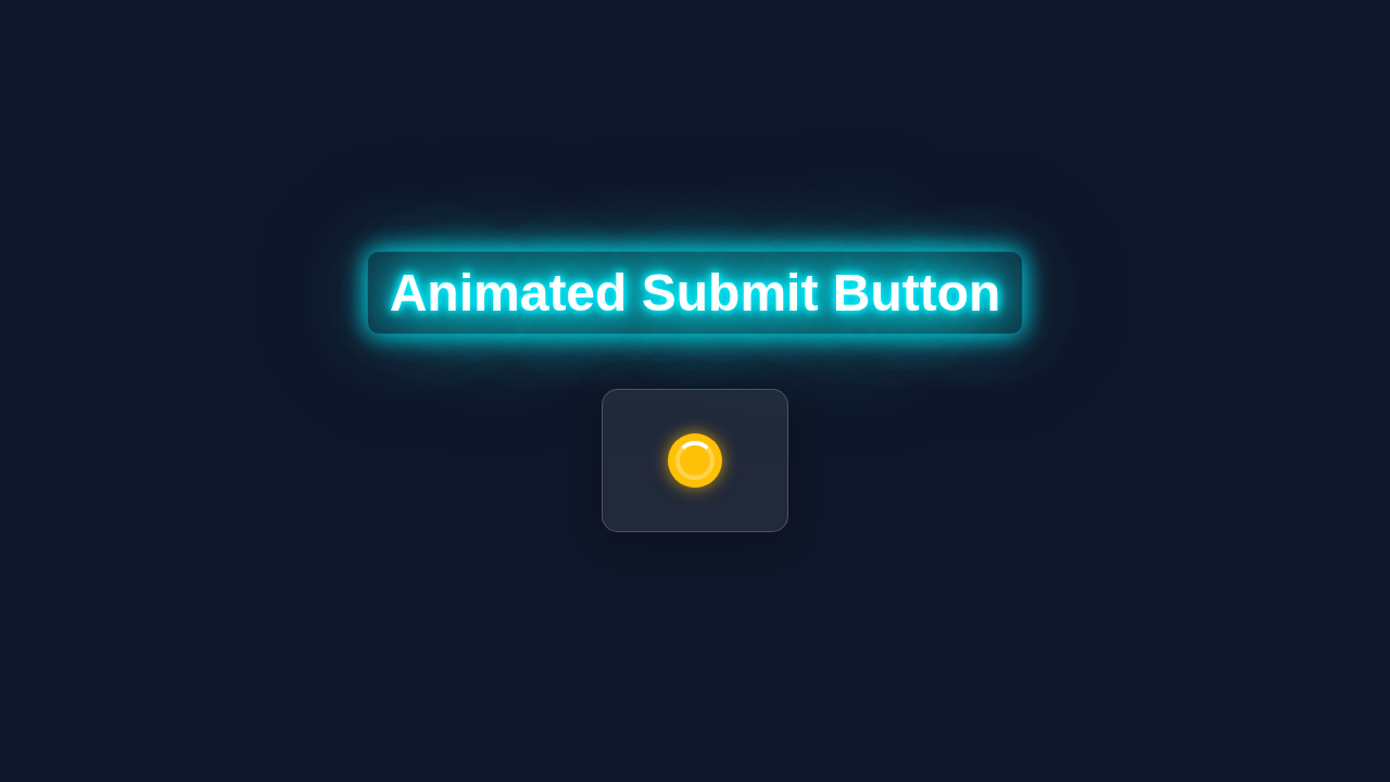
We are creating a dynamic submit button. This button will transform itself through various stages. First, it starts as a regular submit button. Next, it will shrink and display a loading spinner when clicked. This gives users immediate feedback. Then, it will change to either a success checkmark or an error ‘X’ icon. This depends on our simulated submission result. Finally, it will reset, ready for another interaction. This visual feedback vastly improves user experience. Moreover, it makes your forms feel much more responsive and modern. You’ll love seeing it in action!
HTML Structure
Our HTML provides the basic framework. We will use a simple form with our special button inside. The button will contain a span for text and an SVG for our icons. These SVGs will toggle visibility based on the button’s state. It is a straightforward setup for powerful animation.
index.html
<!DOCTYPE html>
<html lang="en">
<head>
    <meta charset="UTF-8">
    <meta name="viewport" content="width=device-width, initial-scale=1.0">
    <title>Animated Submit Button</title>
    <link rel="stylesheet" href="styles.css">
</head>
<body>
    <div class="container">
        <!-- The animated submit button component -->
        <button class="animated-button" id="submitButton">
            <span class="button-text">Submit</span>
            <div class="spinner"></div>
            <div class="success-icon">
                <!-- SVG Checkmark icon for success state -->
                <svg viewBox="0 0 24 24" fill="none" xmlns="http://www.w3.org/2000/svg">
                    <path d="M9 16.17L4.83 12L3.41 13.41L9 19L21 7L19.59 5.59L9 16.17Z" fill="currentColor"/>
                </svg>
            </div>
        </button>
    </div>

    <script src="script.js"></script>
</body>
</html>
CSS Styling
The CSS is where the magic truly happens. We will style our button, its text, and the SVG icons. Furthermore, we will define all the transition and animation effects. These styles will make our button shrink, expand, and show different icons smoothly. We will use CSS variables for easy customization too. Therefore, changing colors or sizes will be a breeze.
styles.css
/* Global Styles & Body Reset */
body {
    margin: 0;
    font-family: Arial, Helvetica, sans-serif; /* Safe font stack */
    background-color: #f0f2f5; /* Light background for the tutorial example */
    display: flex;
    justify-content: center;
    align-items: center;
    min-height: 100vh;
    overflow: hidden; /* Prevent scrollbars */
    box-sizing: border-box;
}

.container {
    display: flex;
    justify-content: center;
    align-items: center;
    width: 100%;
    max-width: 100%; /* Ensure container respects width constraints */
    padding: 20px;
    box-sizing: border-box;
}

/* Animated Button Component Styles */
.animated-button {
    position: relative; /* Essential for positioning child elements */
    width: 220px; /* Initial width of the button */
    height: 50px;
    border: none;
    border-radius: 25px; /* Creates a pill shape */
    background-color: #007bff; /* Default primary blue color */
    color: white;
    font-size: 1.1em;
    font-weight: bold;
    cursor: pointer;
    overflow: hidden; /* Hides content that moves outside the button bounds */
    /* Smooth transitions for size, color, and shadow changes */
    transition: all 0.3s ease-in-out, background-color 0.5s ease-in-out;
    display: flex; /* Used for centering content within the button */
    align-items: center;
    justify-content: center;
    box-sizing: border-box; /* Includes padding and border in the element's total width and height */
    box-shadow: 0 4px 15px rgba(0, 123, 255, 0.4); /* Subtle shadow for depth */
}

/* Hover effect for the initial state (disabled during loading/success) */
.animated-button:not(.loading):not(.success):hover {
    background-color: #0056b3; /* Darker blue on hover */
    box-shadow: 0 6px 20px rgba(0, 123, 255, 0.6); /* Enhanced shadow on hover */
}

/* Styling for the text, spinner, and success icon common properties */
.button-text, .spinner, .success-icon {
    position: absolute; /* Allows overlaying elements */
    transition: opacity 0.3s ease-in-out, transform 0.3s ease-in-out;
    /* Prevents interaction with hidden elements and text selection */
    pointer-events: none;
    user-select: none;
}

.button-text {
    opacity: 1; /* Visible by default */
    transform: translateY(0); /* Default position */
}

.spinner, .success-icon {
    opacity: 0; /* Hidden by default */
    transform: scale(0); /* Start scaled down to animate in */
}

/* Loading State Styles */
.animated-button.loading {
    width: 50px; /* Shrinks the button to a square */
    border-radius: 50%; /* Makes the button a perfect circle */
    background-color: #ffc107; /* Yellow color for loading state */
    box-shadow: 0 4px 15px rgba(255, 193, 7, 0.5); /* Loading state shadow */
    cursor: default; /* Changes cursor to indicate non-clickable state */
}

.animated-button.loading .button-text {
    opacity: 0; /* Hides the button text */
    transform: translateY(-20px); /* Moves the text out of view */
}

.animated-button.loading .spinner {
    opacity: 1; /* Shows the spinner */
    transform: scale(1); /* Scales the spinner up to full size */
}

/* Spinner Animation */
.spinner {
    width: 28px;
    height: 28px;
    border: 4px solid rgba(255, 255, 255, 0.3); /* Semi-transparent border for the outer ring */
    border-top-color: #fff; /* White color for the spinning part of the border */
    border-radius: 50%;
    animation: spin 0.8s linear infinite; /* Applies a continuous spin animation */
}

@keyframes spin {
    to { transform: rotate(360deg); } /* Rotates 360 degrees */
}

/* Success State Styles */
.animated-button.success {
    background-color: #28a745; /* Green color for success state */
    box-shadow: 0 4px 15px rgba(40, 167, 69, 0.5); /* Success state shadow */
    cursor: default;
}

.animated-button.success .spinner {
    opacity: 0; /* Hides the spinner */
    transform: scale(0); /* Scales the spinner down out of view */
}

.animated-button.success .success-icon {
    opacity: 1; /* Shows the success icon */
    transform: scale(1); /* Scales the success icon up to full size */
    color: white; /* Ensures the SVG icon inherits white color */
}

/* Optional: Error State (can be added similarly with a red background and an X icon) */
/*
.animated-button.error {
    background-color: #dc3545;
    box-shadow: 0 4px 15px rgba(220, 53, 69, 0.5);
    cursor: default;
}
*/
JavaScript
JavaScript brings our button to life with interaction. It will handle the click event. Then, it will manage adding and removing CSS classes based on button states. We will simulate an API call to demonstrate loading times. Finally, it will update the button’s appearance accordingly. This ensures a realistic user experience.
script.js
document.addEventListener('DOMContentLoaded', () => {
    const submitButton = document.getElementById('submitButton');

    // Attach a click event listener to the button
    submitButton.addEventListener('click', () => {
        // Prevent further clicks if the button is already animating or in a final state
        if (submitButton.classList.contains('loading') || submitButton.classList.contains('success')) {
            return; // Exit if already in a special state
        }

        // Step 1: Transition the button to a loading state
        submitButton.classList.add('loading');

        // Simulate an asynchronous operation, like an API call or form submission.
        // In a real application, this setTimeout would be replaced by your actual fetch/axios call.
        setTimeout(() => {
            // Step 2: After the 'operation' completes, remove the loading state
            submitButton.classList.remove('loading');

            // Step 3: Transition the button to a success state
            submitButton.classList.add('success');

            // Step 4: After a short display, revert the button to its original state
            setTimeout(() => {
                submitButton.classList.remove('success');
                // The button's width and background color will smoothly transition back
                // to its initial state due to the CSS transitions defined.
            }, 1500); // Display the success icon for 1.5 seconds

        }, 2500); // Simulate an asynchronous operation taking 2.5 seconds
    });
});
How It All Works Together
Let’s break down how these pieces combine. We combine HTML, CSS, and JavaScript. They work in harmony to create this amazing effect. Each part plays a vital role. Consequently, we get a highly interactive and engaging button.
The Initial State
Our button starts in a simple, clickable state. It has its default width and text. The HTML defines its basic structure. Meanwhile, the CSS provides its initial look. The SVG icons for loading, success, and error are present but hidden. They are ready to appear when needed. Therefore, the button is waiting for user interaction. It looks clean and inviting. This is the calm before the interactive storm!
The Loading State
When you click the button, JavaScript takes over. First, it prevents the default form submission. This is important for our custom animation. Then, it adds a CSS class, like is-loading, to the button. This class triggers a series of CSS animations. The button’s text fades out, and its width shrinks. Simultaneously, a loading spinner (our SVG icon) fades in and rotates. This visual cue tells the user that something is happening. For more on CSS transitions, check out the MDN Web Docs on the transition property. They are very helpful!
Pro Tip: Always prevent default form submission when handling client-side animations. This gives you full control over the user experience.
The Success State
After a simulated delay (our ‘API call’), JavaScript decides the outcome. If the submission is successful, JS removes the is-loading class. Then, it adds an is-success class. This change triggers more CSS animations. The spinner fades out, and the success checkmark icon fades in. The button might briefly expand slightly before settling. This provides a satisfying visual confirmation. Therefore, the user instantly knows their action succeeded. This clear feedback builds trust. You can learn more about backend communication in our Flask Blog API Tutorial: Python Backend & Automation Script.
The Error State
What if something goes wrong? Our button handles errors gracefully too. JavaScript, upon detecting an error, removes is-loading. Instead, it adds an is-error class. This class makes the error ‘X’ icon animate into view. Just like the success state, the button gives clear, immediate feedback. Users appreciate knowing what happened. This prevents frustration. Furthermore, it guides them on what to do next. Good UI/UX always considers failure scenarios. You can explore more UI concepts in our Tailwind Music Player: Build with HTML & Tailwind CSS Utility.
Resetting the Button
After displaying success or error, the button eventually resets. JavaScript sets a timeout for this. After a few seconds, it removes the is-success or is-error class. The button returns to its original state. The text reappears, and its width reverts. It is then ready for another submission. This complete cycle ensures a smooth and repeatable experience. Consequently, your users can interact with your forms confidently. Remember state management is key, as seen in our React To-Do List Tutorial: Functional Components & Hooks.
Encouragement: Don’t be afraid to experiment with different timings and easing functions for your animations. Small tweaks can make a big difference!
Tips to Customise It
This Animated Submit Button is a fantastic starting point. You can make it truly your own! Here are some ideas:
- Change the Colors and Fonts: Update the CSS variables to match your brand. You can easily switch out the primary color or font family.
- Experiment with Icons: Find different SVG icons for loading, success, and error. There are many free icon libraries available.
- Integrate with a Real API: Replace the simulated API call in JavaScript. Connect it to your actual backend endpoint. This will make it fully functional.
- Add More Animation States: Perhaps a “warning” state or a “processing” state with a different animation. Use CSS
transformproperty for more complex movements!
Conclusion
You did it! You just built an amazing Animated Submit Button with loading, success, and error states. This button is not just functional; it is a delight to use. You have used HTML for structure, CSS for stunning animations, and JavaScript for seamless interaction. This project truly elevates the user experience on any form. Share your creation online, try new customizations, and keep building awesome things. Happy coding, future pro!