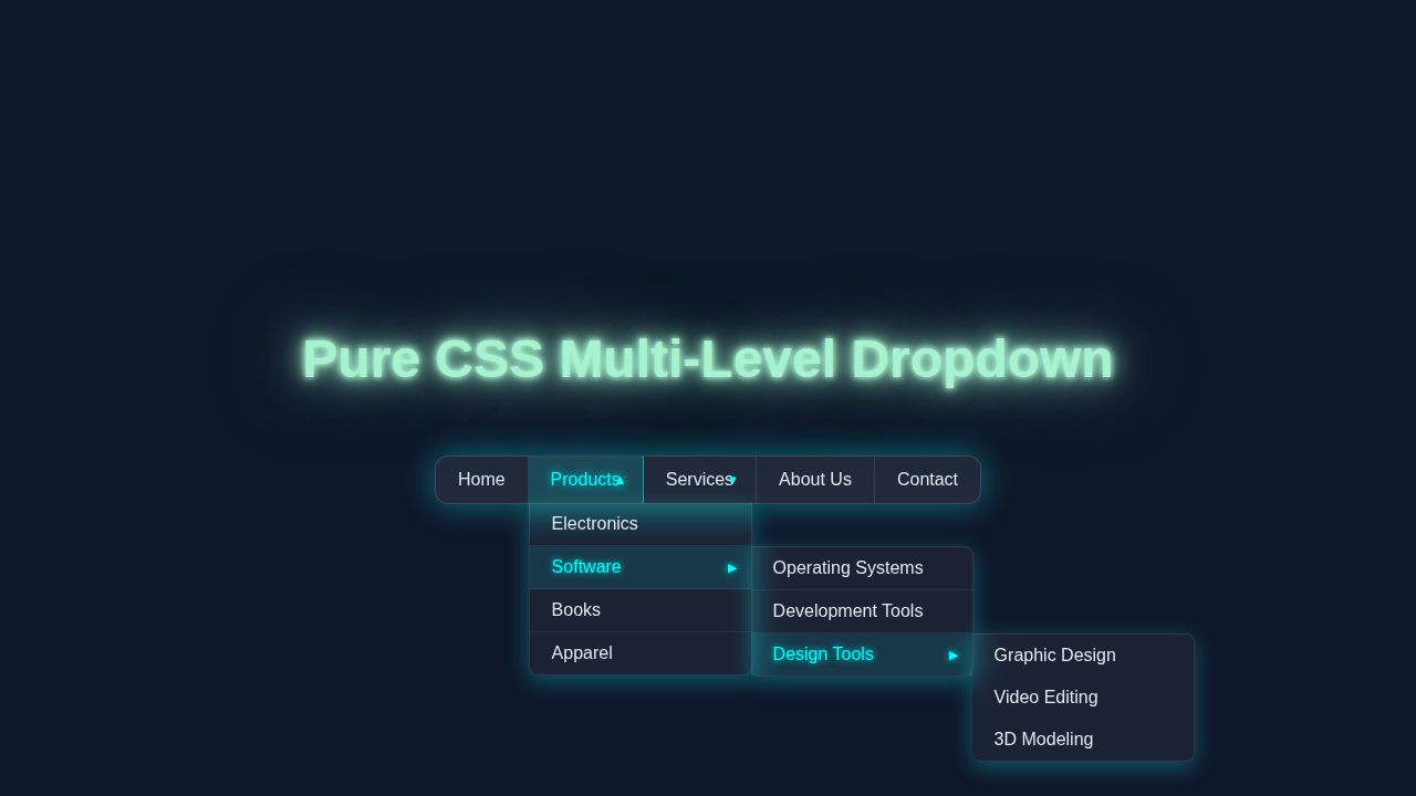
Hey there, fellow coder! If you’ve ever wanted to build a really slick CSS Multi-Level Dropdown menu for your website, but felt unsure where to start, you’re in the perfect spot. Today, we’re going to craft a fully functional, purely CSS-powered multi-level navigation system. It’s going to make your site look super professional. Plus, you won’t need a single line of JavaScript!
What We Are Building: A Responsive CSS Multi-Level Dropdown
Imagine a navigation menu that just works. That’s what we are building! We’ll create a beautiful menu that expands with sub-menus when you hover over items. This isn’t just any menu; it’s a responsive one, too. This means it looks great on any screen size. You can add as many sub-levels as you need. This powerful CSS Multi-Level Dropdown elevates user experience. Your visitors will easily find their way around your site!
HTML Structure: The Foundation of Our Menu
Our HTML provides the semantic backbone for our menu. We will use an unordered list (<ul>) for the main menu. Then, we will nest more <ul> elements inside list items (<li>) for our sub-menus. This is a very clean and logical way to structure navigation. You can learn more about basic dropdowns in our CSS Dropdown Menu: Pure HTML & CSS Navigation Tutorial. Here’s how our HTML looks:
index.html
<!DOCTYPE html>
<html lang="en">
<head>
    <meta charset="UTF-8">
    <meta name="viewport" content="width=device-width, initial-scale=1.0">
    <title>Pure CSS Multi-Level Dropdown</title>
    <link rel="stylesheet" href="styles.css">
</head>
<body>
    <header>
        <h1>Pure CSS Multi-Level Dropdown Navigation</h1>
        <p>Hover over menu items to explore the multi-level dropdown.</p>
    </header>

    <!-- The Multi-Level Dropdown Component -->
    <nav class="dropdown-nav">
        <ul>
            <li><a href="#">Home</a></li>
            <li class="has-submenu">
                <a href="#">Products</a>
                <ul class="submenu">
                    <li><a href="#">Electronics</a></li>
                    <li class="has-submenu">
                        <a href="#">Software</a>
                        <ul class="submenu">
                            <li><a href="#">Operating Systems</a></li>
                            <li><a href="#">Development Tools</a></li>
                            <li class="has-submenu">
                                <a href="#">Design Tools</a>
                                <ul class="submenu">
                                    <li><a href="#">Graphic Design</a></li>
                                    <li><a href="#">Video Editing</a></li>
                                    <li><a href="#">3D Modeling</a></li>
                                </ul>
                            </li>
                        </ul>
                    </li>
                    <li><a href="#">Books</a></li>
                    <li><a href="#">Apparel</a></li>
                </ul>
            </li>
            <li class="has-submenu">
                <a href="#">Services</a>
                <ul class="submenu">
                    <li><a href="#">Consulting</a></li>
                    <li><a href="#">Support</a></li>
                    <li><a href="#">Training</a></li>
                </ul>
            </li>
            <li><a href="#">About Us</a></li>
            <li><a href="#">Contact</a></li>
        </ul>
    </nav>

    <main>
        <p>This is a demonstration of a multi-level dropdown menu built exclusively with HTML and CSS.</p>
        <p>It leverages CSS `position: relative`, `position: absolute`, and the `:hover` pseudo-class for interactivity, providing a smooth user experience without any JavaScript.</p>
    </main>

</body>
</html>
CSS Styling: Bringing Our Multi-Level Dropdown to Life
Now for the really exciting part: the CSS! We’ll style everything from the main navigation bar to the hidden sub-menus. We will use properties like position, display, and opacity. Don’t worry, we’ll explain each key rule. This makes our menu appear and disappear smoothly. Get ready to add some pure CSS magic!
styles.css
/* General Reset & Body Styles */
* {
    box-sizing: border-box; /* Include padding and border in the element's total width and height */
    margin: 0;
    padding: 0;
}

body {
    font-family: Arial, Helvetica, sans-serif; /* Safe, widely available fonts */
    line-height: 1.6;
    color: #333;
    background-color: #f4f4f4;
    display: flex;
    flex-direction: column;
    align-items: center;
    min-height: 100vh;
    padding: 20px;
}

/* Header for demonstration page */
header {
    text-align: center;
    margin-bottom: 30px;
    padding: 20px;
    background-color: #fff;
    border-radius: 8px;
    box-shadow: 0 4px 10px rgba(0,0,0,0.1);
    max-width: 800px;
    width: 100%;
}

header h1 {
    color: #0056b3;
    margin-bottom: 10px;
}

/* Main content for demonstration page */
main {
    max-width: 800px;
    width: 100%;
    padding: 20px;
    background-color: #fff;
    border-radius: 8px;
    box-shadow: 0 4px 10px rgba(0,0,0,0.1);
    margin-top: 30px;
}

/* Main Navigation Container */
.dropdown-nav {
    background: #007bff; /* Primary blue background */
    max-width: 100%; /* Ensure it doesn't overflow parent */
    border-radius: 8px; /* Slightly rounded corners for the main nav bar */
    box-shadow: 0 4px 15px rgba(0, 0, 0, 0.2); /* Subtle shadow for depth */
}

.dropdown-nav ul {
    list-style: none; /* Remove bullet points */
    text-align: center;
    display: flex; /* Arrange main menu items horizontally */
    padding: 0;
    margin: 0;
}

.dropdown-nav ul li {
    position: relative; /* Crucial for absolute positioning of submenus */
    flex-grow: 1; /* Distribute space evenly among main menu items */
}

.dropdown-nav ul li a {
    display: block;
    padding: 12px 20px;
    color: #ffffff; /* White text for contrast */
    text-decoration: none; /* Remove underline from links */
    white-space: nowrap; /* Prevent text wrapping inside menu items */
    transition: background-color 0.3s ease; /* Smooth transition on hover */
    border-right: 1px solid rgba(255, 255, 255, 0.2); /* Visual separator */
}

.dropdown-nav ul li:last-child a {
    border-right: none; /* No separator for the last item */
}

.dropdown-nav ul li a:hover {
    background-color: #0056b3; /* Darker blue on hover */
    border-color: #0056b3; /* Match border color on hover */
}

/* Submenu Styling */
.dropdown-nav .submenu {
    /* Default hidden state */
    opacity: 0;
    visibility: hidden;
    transform: translateY(10px); /* Slightly offset to slide in */
    transition: opacity 0.3s ease, visibility 0.3s ease, transform 0.3s ease; /* Smooth reveal */

    display: block; /* Use block to occupy space for transition */
    position: absolute; /* Position relative to parent li */
    top: 100%; /* Position directly below the parent menu item */
    left: 0; /* Align left edge with parent */
    background: #0056b3; /* Darker blue background for submenus */
    min-width: 200px; /* Ensure sufficient width for submenu items */
    z-index: 1000; /* Ensure submenu appears above other content */
    box-shadow: 0 5px 15px rgba(0, 0, 0, 0.3); /* Shadow for depth */
    border-radius: 0 0 8px 8px; /* Rounded bottom corners */
}

/* Individual submenu list item styles */
.dropdown-nav .submenu li {
    display: block; /* Stack submenu items vertically */
    text-align: left;
    flex-grow: unset; /* Override flex-grow from parent ul */
}

.dropdown-nav .submenu li a {
    padding: 10px 20px;
    color: #ffffff;
    border-right: none; /* No vertical separator in submenus */
    border-bottom: 1px solid rgba(255, 255, 255, 0.1); /* Separator between submenu items */
}

.dropdown-nav .submenu li:last-child a {
    border-bottom: none; /* No separator for the last submenu item */
}

.dropdown-nav .submenu li a:hover {
    background-color: #003f80; /* Even darker blue on submenu item hover */
}

/* Multi-level submenu positioning */
.dropdown-nav .submenu .submenu {
    top: 0; /* Align top edge with its parent submenu item */
    left: 100%; /* Position to the right of the parent submenu item */
    border-radius: 0 8px 8px 8px; /* Rounded corners for nested submenus */
    border-top: 1px solid rgba(255, 255, 255, 0.1); /* Add top border for visual separation */
    border-left: none; /* No left border needed */
    transform: translateX(10px); /* Slightly offset to slide in from the side */
}

/* Show submenu on hover */
.dropdown-nav ul li:hover > .submenu {
    opacity: 1;
    visibility: visible;
    transform: translateY(0); /* Slide into place for top-level submenus */
}

.dropdown-nav .submenu li:hover > .submenu {
    opacity: 1;
    visibility: visible;
    transform: translateX(0); /* Slide into place for nested submenus */
}

/* Add indicators for items with submenus (optional, but good for UX) */
.has-submenu > a {
    position: relative; /* Needed for positioning the ::after pseudo-element */
    padding-right: 35px; /* Make space for the indicator icon */
}

.has-submenu > a::after {
    content: '\25B6'; /* Right-pointing triangle (▶) - default for nested */
    font-size: 0.7em;
    position: absolute;
    right: 15px;
    top: 50%;
    transform: translateY(-50%);
    color: #ffffff;
    transition: transform 0.2s ease;
}

/* Specific style for top-level dropdown indicator */
.dropdown-nav > ul > li.has-submenu > a::after {
    content: '\25BC'; /* Down-pointing triangle (▼) */
}

.dropdown-nav > ul > li.has-submenu:hover > a::after {
    content: '\25B2'; /* Up-pointing triangle (▲) on hover */
    transform: translateY(-50%) scale(1.1); /* Slight emphasis on hover */
}

/* For multi-level submenus, the arrow remains right-pointing */
.dropdown-nav .submenu .has-submenu:hover > a::after {
    transform: translateY(-50%) translateX(2px); /* Slight movement on hover for feedback */
}
JavaScript: Not Needed Here!
Here’s the cool part: we won’t be writing any JavaScript today! This entire CSS Multi-Level Dropdown works purely with HTML and CSS. This makes our menu lightweight and fast. It’s a fantastic example of what you can achieve with modern CSS alone. Plus, it means fewer dependencies for your project. That’s a win for performance and simplicity!
How It All Works Together: Unpacking Our CSS Multi-Level Dropdown
Let’s break down the mechanics behind our elegant menu. It might seem complex at first glance. However, each CSS rule plays a specific role. Understanding these roles will help you customize and debug your own menus. This pure CSS approach relies on simple, yet powerful, interactions.
The Base Menu Layout
First, we reset some default browser styles. We set margin and padding to zero. This gives us a clean slate. Then, we style the main .nav-menu. We use display: flex; to arrange our main menu items horizontally. This creates a neat, even spread. Each list item .nav-item also becomes a flex container. This helps with vertical alignment. Finally, we style the links themselves. We add padding and remove underlines. This creates clear, clickable areas for your users.
Crafting the Sub-Menus
The magic for sub-menus happens with careful positioning. We target the nested .dropdown-menu. Initially, we set its display to none. This keeps it completely hidden from view. We also use position: absolute; for these sub-menus. This removes them from the normal document flow. Consequently, they won’t push other content around. We give them a background color and some padding. This ensures they stand out visually. We also apply a box-shadow for a subtle depth effect.
Pro Tip: Using
position: relative;on the parent<li>is crucial. This makes the absolutely positioned sub-menu move relative to its parent item, not the entire page!
To create the multi-level effect, subsequent sub-menus are positioned. We place them next to their parent menu item. Specifically, we use left: 100%; and top: 0; for nested dropdowns. This makes them appear to the right of their parent link. Learn more about CSS positioning on MDN. This careful placement ensures a smooth, intuitive multi-level experience. We also use transition properties. This makes the menus fade in and out gracefully.
Revealing Menus on Hover
The real trick lies in the :hover pseudo-class. When you hover over a .nav-item that contains a sub-menu, we change its child .dropdown-menu. We switch its display from none to block. We also adjust its opacity from 0 to 1. This makes the sub-menu visible. The transition property then handles the smooth fade-in. This responsive behavior is all thanks to CSS. It’s similar to how we achieved Pure CSS Popovers. You just hover, and the content appears! It’s an elegant solution without any JavaScript overhead.
Tips to Customise It: Make It Yours!
You’ve built a solid foundation. Now, let’s think about how you can make this menu truly unique. Customization is key to any great project!
- Animations: Experiment with different CSS transitions. Try a slide-in effect instead of just a fade. You could even add a slight bounce!
- Color Schemes: Change the background colors, text colors, and hover effects. Match it to your website’s branding. Use a color palette generator for inspiration.
- Icons: Integrate SVG icons or Font Awesome icons next to your menu items. This can improve readability and visual appeal.
- Responsiveness: For smaller screens, you might want to switch to a ‘hamburger’ menu. You can do this with media queries. Then, use CSS to toggle its visibility. Check out CSS-Tricks for responsive navigation techniques for more ideas.
Remember: The best way to learn is by doing. Don’t be afraid to tweak the code. Break it, fix it, and make it your own!
Conclusion: You Just Built a Pure CSS Multi-Level Dropdown!
Amazing job, future web developer! You just crafted a complete CSS Multi-Level Dropdown menu using only HTML and CSS. You now have a powerful, versatile, and lightweight navigation system. This skill will serve you well in many projects. It proves the incredible capabilities of modern CSS. Share your creation with us on social media. We would love to see what you built! Keep coding, keep creating, and never stop learning.