Hey there, future web wizard!
If you’ve ever wanted to build a slick CSS Dropdown Menu but felt a bit lost, you are definitely in the right place today. We’re going to craft a beautiful, interactive navigation component. The best part? We’ll use only pure HTML and CSS. No JavaScript needed at all! This means a lighter, faster, and simpler solution for your projects. Get ready to impress!
What We Are Building: Your Interactive CSS Dropdown Menu
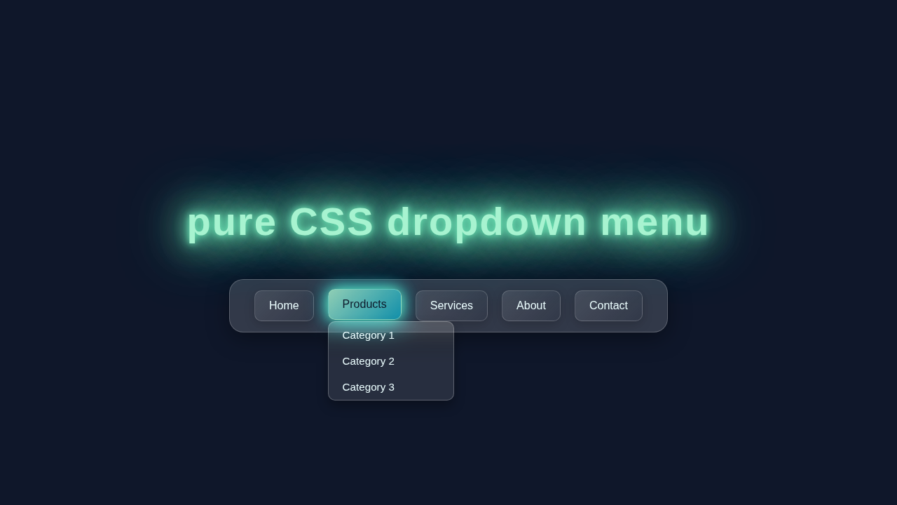
Imagine a clean navigation bar for your website. When a user hovers over a main link, a list of related sub-links smoothly appears. This is exactly what we will create together! It is a crucial element for good user experience. A well-organized menu helps visitors find content easily. Plus, it looks super professional. Our menu will be fully responsive and accessible. We are building functionality and style, hand-in-hand.
HTML Structure
First things first, let’s lay down the foundation with some solid HTML. We’ll use an unordered list (<ul>) for our navigation. This is semantic and makes perfect sense for a list of links. Each main menu item will then contain its own nested list for the dropdown. It’s pretty straightforward, really!
index.html
<!DOCTYPE html>
<html lang="en">
<head>
    <meta charset="UTF-8">
    <meta name="viewport" content="width=device-width, initial-scale=1.0">
    <title>Pure CSS Dropdown Menu</title>
    <link rel="stylesheet" href="styles.css">
</head>
<body>
    <header>
        <h1>Pure CSS Dropdown Menu Example</h1>
        <p>Hover over "Products" or "Services" to see the dropdown.</p>
    </header>

    <nav class="dropdown-menu">
        <ul>
            <li><a href="#">Home</a></li>
            <li class="has-dropdown">
                <a href="#">Products</a>
                <ul class="dropdown">
                    <li><a href="#">Category 1</a></li>
                    <li><a href="#">Category 2</a></li>
                    <li><a href="#">Category 3</a></li>
                    <li><a href="#">Category 4</a></li>
                </ul>
            </li>
            <li class="has-dropdown">
                <a href="#">Services</a>
                <ul class="dropdown">
                    <li><a href="#">Web Design</a></li>
                    <li><a href="#">SEO Optimization</a></li>
                    <li><a href="#">Consulting</a></li>
                </ul>
            </li>
            <li><a href="#">About Us</a></li>
            <li><a href="#">Contact</a></li>
        </ul>
    </nav>

    <main>
        <section style="margin-top: 50px; text-align: center; padding: 20px; max-width: 800px; margin-left: auto; margin-right: auto;">
            <h2>Welcome to our Pure CSS Dropdown Demo!</h2>
            <p>This is a fully functional navigation menu built exclusively with HTML and CSS. No JavaScript is needed for the dropdown functionality. It's designed to be clean, accessible, and easy to integrate into your projects.</p>
            <p>The menu items and sub-menu items are responsive, adapting to different screen sizes for an optimal user experience.</p>
        </section>
    </main>
</body>
</html>
CSS Styling
Now comes the exciting part: bringing our menu to life with CSS! We will style our navigation to look clean and modern. Then, we will carefully hide the dropdowns by default. Finally, we’ll make them appear smoothly on hover using clever CSS techniques. This will ensure a great interactive experience without any JavaScript.
styles.css
/* Universal Box-Sizing for consistency */
*, *::before, *::after {
    box-sizing: border-box;
}

/* Basic Body Styles */
body {
    font-family: Arial, Helvetica, sans-serif; /* Safe font stack */
    margin: 0;
    padding: 0;
    background-color: #f0f2f5; /* Light background */
    color: #333;
    line-height: 1.6;
}

/* Header for demonstration */
header {
    background-color: #333;
    color: #fff;
    padding: 20px 0;
    text-align: center;
    margin-bottom: 20px;
}

header h1 {
    margin: 0;
    font-size: 2em;
}

header p {
    margin: 5px 0 0;
    font-size: 0.9em;
    opacity: 0.8;
}

/* Dropdown Menu Container */
.dropdown-menu {
    background-color: #4a6fa5; /* A pleasant blue for the main nav */
    max-width: 100%; /* Ensure it doesn't overflow */
    overflow: hidden; /* Recommended for general block-level elements */
    box-shadow: 0 2px 5px rgba(0, 0, 0, 0.2);
}

.dropdown-menu ul {
    list-style: none; /* Remove bullet points */
    margin: 0;
    padding: 0;
    display: flex; /* Arrange main menu items horizontally */
    justify-content: center; /* Center the menu items */
    flex-wrap: wrap; /* Allow items to wrap on smaller screens */
}

.dropdown-menu li {
    position: relative; /* Crucial for positioning the dropdown */
    margin: 0;
}

/* Main Menu Links */
.dropdown-menu a {
    display: block; /* Make the entire link area clickable */
    padding: 15px 20px;
    text-decoration: none; /* Remove underline */
    color: #fff; /* White text for contrast */
    text-align: center;
    transition: background-color 0.3s ease, color 0.3s ease; /* Smooth transitions */
    white-space: nowrap; /* Prevent text wrapping */
}

.dropdown-menu a:hover,
.dropdown-menu a:focus { /* Focus for accessibility */
    background-color: #6a9acb; /* Lighter blue on hover/focus */
    color: #fff;
    outline: none; /* Remove default focus outline */
}

/* Dropdown Sub-menu */
.dropdown {
    display: none; /* Hidden by default */
    position: absolute; /* Position relative to the parent li */
    top: 100%; /* Position right below the parent link */
    left: 0;
    background-color: #ffffff; /* White background for sub-menu */
    min-width: 180px; /* Minimum width for sub-menu items */
    box-shadow: 0 8px 16px rgba(0, 0, 0, 0.2); /* Soft shadow */
    z-index: 1000; /* Ensure dropdown appears above other content */
    list-style: none;
    padding: 0;
    margin: 0;
    border-radius: 0 0 4px 4px; /* Rounded bottom corners */
    opacity: 0; /* For fade-in effect */
    visibility: hidden; /* For fade-in effect (better than display:none for transitions) */
    transform: translateY(10px); /* For slide-down effect */
    transition: opacity 0.3s ease, transform 0.3s ease, visibility 0.3s ease; /* Smooth animation */
    box-sizing: border-box; /* Ensures padding/border don't affect width */
    overflow: hidden; /* Keep content within bounds */
}

/* Sub-menu Item Links */
.dropdown li a {
    color: #333; /* Darker text for sub-menu */
    padding: 12px 20px;
    background-color: #fff; /* White background for individual items */
    text-align: left; /* Align text to the left */
    border-bottom: 1px solid #eee; /* Subtle separator */
    border-radius: 0; /* Reset border-radius from parent link style */
}

.dropdown li:last-child a {
    border-bottom: none; /* No separator for the last item */
    border-radius: 0 0 4px 4px; /* Apply bottom radius to last item */
}

.dropdown li a:hover,
.dropdown li a:focus {
    background-color: #e9ecef; /* Lighter background on sub-menu hover */
    color: #007bff; /* Highlight color for sub-menu text */
}

/* Show the dropdown on hover of the parent .has-dropdown li */
.has-dropdown:hover > .dropdown,
.has-dropdown:focus-within > .dropdown { /* focus-within for keyboard navigation */
    display: block; /* Make it visible */
    opacity: 1; /* Fade in */
    visibility: visible; /* Make visible */
    transform: translateY(0); /* Slide up to final position */
}

/* Responsive considerations */
@media (max-width: 768px) {
    .dropdown-menu ul {
        flex-direction: column; /* Stack main menu items vertically */
        align-items: stretch; /* Stretch items to full width */
    }

    .dropdown-menu li {
        width: 100%; /* Full width for main menu items */
        border-bottom: 1px solid rgba(255, 255, 255, 0.1); /* Separator */
    }

    .dropdown-menu li:last-child {
        border-bottom: none;
    }

    .dropdown-menu a {
        text-align: left; /* Align text to left for mobile */
        padding-left: 30px; /* Indent for better readability */
    }

    /* For mobile, we make dropdowns flow with the document, not absolutely positioned */
    .dropdown {
        position: static; /* Flows with content */
        width: 100%; /* Full width dropdown */
        box-shadow: none; /* Remove shadow */
        border-radius: 0; /* No rounded corners */
        opacity: 1; /* Always visible if parent is open (via hover/focus) */
        visibility: visible;
        transform: translateY(0);
        background-color: #f8f9fa; /* Lighter background for nested items */
        border-top: 1px solid #e0e0e0; /* Separator for dropdown from parent */
    }

    .dropdown li a {
        padding-left: 50px; /* Further indent for sub-items */
        background-color: #f8f9fa;
        border-bottom: 1px solid #e9ecef;
    }

    .dropdown li:last-child a {
        border-bottom: none;
    }

    /* For pure CSS mobile dropdowns without JavaScript or complex hacks (like checkbox hack),
       the hover effect is maintained for larger touch devices. For smaller touch screens,
       this might mean a tap is needed to reveal the dropdown, and another tap on an item.
       A true 'click-to-toggle' for mobile without JS is beyond a simple hover-based pure CSS menu. */
}
How It All Works Together
Let’s break down how our awesome CSS dropdown menu comes to life. We will go through each key part. Understanding these steps will help you customize it later. It’s like seeing all the gears turn in a well-oiled machine.
The Basic Navigation Setup
Our HTML uses a <nav> element. This wraps our entire menu. Inside, we have an unordered list (<ul>) with the class main-nav. Each <li> directly under main-nav is a primary menu item. These are your top-level links. If an item has a dropdown, it will contain another <ul> inside its <li>. This nested structure is key for our CSS to target things correctly. For example, your “Products” link might have a nested list for “Category A” and “Category B”. This hierarchical setup is very standard for navigation.
Styling the Main Menu
We start by styling the main-nav. It gets display: flex; to align items horizontally. This makes our navigation bar clean. We also add padding and a background color for visual appeal. Each main-nav > li > a (your main links) is styled as a block. This ensures they are clickable over their whole area. We remove underlines and set text color for a sleek look.
Pro Tip: Using
display: flexfor navigation is a modern and powerful technique. It gives you incredible control over item alignment and spacing. Experiment withjustify-contentandalign-itemsfor different layouts!
Hiding and Showing Dropdowns
This is where the magic truly happens! We initially set opacity: 0;, visibility: hidden;, and max-height: 0; on our .dropdown-menu. This completely hides them from view and screen readers. We also add overflow: hidden; to clip any content that might escape during the transition. When a user hovers over a main-nav li that has a dropdown, we target its nested .dropdown-menu. We change its opacity to 1 and visibility to visible. We also smoothly transition its max-height to a value like 200px (or fit-content if you want it to adjust automatically). This creates that lovely sliding effect. We use position: absolute; on .dropdown-menu. This takes it out of the normal document flow. Consequently, it floats above other content. Remember to set position: relative; on the parent <li> element. This anchors the dropdown menu to its parent item. It ensures the dropdown appears directly beneath its main link. You can learn more about CSS positioning on MDN.
Styling Dropdown Items
Each item within our .dropdown-menu also gets its own styling. We ensure these links are block-level. This provides a generous clickable area. We give them some padding for good spacing. A slightly different background color can help distinguish them from the main menu. We also add a subtle hover effect to individual dropdown links. This gives users clear visual feedback.
Accessibility Considerations
Even without JavaScript, we aim for accessibility. Our use of semantic HTML (<nav>, <ul>, <li>, <a>) is a great start. Screen readers understand this structure. We rely on the hover state for interaction. This works well for mouse users. For keyboard users, they can typically tab through the main navigation. However, pure CSS dropdowns can sometimes be less friendly for keyboard-only navigation compared to JavaScript solutions. For more advanced keyboard navigation, consider exploring ARIA attributes. These can enhance the experience further. If you’re keen on making sure all users can interact with your forms easily, check out our post on Real-Time Form Validation with HTML & CSS Only – No JavaScript.
Smooth Transitions
We add transition properties to our dropdowns. This smooths out the appearance and disappearance. Instead of an abrupt pop, the menu gracefully slides into view. We transition opacity, visibility, and max-height. This makes the user experience much more pleasant. It’s a small detail that makes a big difference.
Responsive Design Basics
Our CSS will include some basic responsive adjustments. We want our menu to look good on all screen sizes. This is crucial for any modern website. For simpler menus, flexbox adapts quite well by default. For more complex layouts or mobile-specific changes, you might use media queries. You can explore CSS Media Queries on CSS-Tricks for deeper insights. We’ll ensure our main menu items stack vertically on smaller screens, if needed. This makes them easier to tap with fingers. Thinking about responsive design from the start is a best practice. It saves you headaches later on.
Pro Tip: Responsive design isn’t just about shrinking elements. It’s about rethinking the user experience for different devices. Always test your menus on actual mobile devices or using browser developer tools!
Tips to Customise It
You just built an amazing CSS dropdown menu! Now, let’s make it truly yours. Here are some ideas for customization:
- Change the Animation: Experiment with different
transition-property,duration, andtiming-functionvalues. Try atransform: translateY()for a subtle slide-down effect. - Add Icons: Incorporate small icons next to your menu items. Font Awesome is perfect for this. They add visual cues and polish.
- Multi-Level Dropdowns: Can you make a dropdown item have its own dropdown? This involves nesting even further! It’s a fun challenge for your CSS skills.
- Accessibility Enhancements: Research ARIA attributes like
aria-haspopupandaria-expanded. While this tutorial focuses on pure CSS, adding these with a tiny bit of JS would significantly boost keyboard navigation. If you enjoyed building this, you might also like learning about Pure CSS Popovers: HTML & CSS Tooltips & Dialogs (No JS) for other interactive elements. You could also explore Accessible Responsive Tables HTML & CSS Tutorial to level up your table game.
Conclusion: You Just Built a CSS Dropdown Menu!
Amazing job, fellow coder! You have successfully built a fully functional and elegant CSS Dropdown Menu. You did it using only HTML and CSS. Give yourself a big pat on the back! This project proves that you don’t always need JavaScript for interactivity. You now have a powerful tool for your web development arsenal. Keep experimenting with the code. Share your creations with us on social media! We love seeing what you build. Happy coding, and keep exploring the amazing world of pure CSS possibilities!