Real-Time Form Validation with HTML & CSS Only – No JavaScript
Hey! If you have wanted to build a beautiful and functional form with real-time CSS Form Validation but had no idea where to start, you are in the right place. We are diving deep into the world of web forms. You will learn to give immediate feedback to your users. No more submitting forms only to find errors! This tutorial focuses on HTML and CSS only. You won’t need JavaScript for this project. It’s truly amazing what we can achieve without it!
What We Are Building
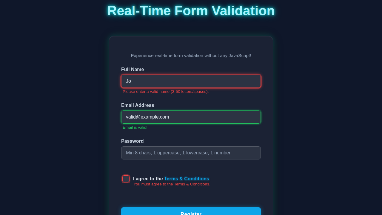
Today, we’re crafting a sleek, user-friendly sign-up form. This form will have essential fields like name, email, and password. The really cool part? It provides instant validation feedback. Imagine a user typing their email. If it’s wrong, they see it right away. If it’s correct, a clear visual cue confirms it. We will show clear visual cues like green for valid inputs. Red will mean there’s an error. This kind of immediate feedback makes forms much more user-friendly. It greatly improves the overall user experience.
HTML Structure for Our Form
First, we need a solid foundation for our form. We start with a <form> element. Inside, we’ll use <label> and <input> pairs for each field. Furthermore, we’ll add crucial HTML5 validation attributes. These attributes are the real magic behind our pure CSS validation. Think about required, type="email", minlength, and pattern. These simple attributes tell the browser exactly what to check. Here’s the cool part, our HTML perfectly sets the stage for dynamic styling. Below is the basic structure you will use.
index.html
<!DOCTYPE html>
<html lang="en">
<head>
    <meta charset="UTF-8">
    <meta name="viewport" content="width=device-width, initial-scale=1.0">
    <title>Real-Time Form Validation (HTML & CSS Only)</title>
    <link rel="stylesheet" href="styles.css">
</head>
<body>
    <div class="container">
        <h1>Sign Up for Our Service</h1>
        <p>Experience real-time form validation without any JavaScript!</p>

        <form action="#" method="post" class="validation-form">
            <!-- Full Name Field -->
            <div class="form-group">
                <label for="name">Full Name</label>
                <input type="text" id="name" name="name" required
                       pattern="[A-Za-z\s]{3,50}"
                       placeholder="e.g., John Doe"
                       title="Name must be 3-50 letters and spaces."
                       aria-describedby="name-error name-success">
                <div class="validation-feedback">
                    <span id="name-error" class="error-message" aria-live="polite">Please enter a valid name (3-50 letters/spaces).</span>
                    <span id="name-success" class="success-message" aria-live="polite">Name looks good!</span>
                </div>
            </div>

            <!-- Email Field -->
            <div class="form-group">
                <label for="email">Email Address</label>
                <input type="email" id="email" name="email" required
                       placeholder="your@example.com"
                       title="Please enter a valid email address."
                       aria-describedby="email-error email-success">
                <div class="validation-feedback">
                    <span id="email-error" class="error-message" aria-live="polite">Please enter a valid email address.</span>
                    <span id="email-success" class="success-message" aria-live="polite">Email is valid!</span>
                </div>
            </div>

            <!-- Password Field -->
            <div class="form-group">
                <label for="password">Password</label>
                <input type="password" id="password" name="password" required
                       pattern="(?=.*\d)(?=.*[a-z])(?=.*[A-Z]).{8,}"
                       placeholder="Min 8 chars, 1 uppercase, 1 lowercase, 1 number"
                       title="Password must be at least 8 characters long and include at least one uppercase letter, one lowercase letter, and one number."
                       aria-describedby="password-error password-success">
                <div class="validation-feedback">
                    <span id="password-error" class="error-message" aria-live="polite">Password must be 8+ chars, with upper, lower, and number.</span>
                    <span id="password-success" class="success-message" aria-live="polite">Strong password!</span>
                </div>
            </div>

            <!-- Terms and Conditions Checkbox -->
            <div class="form-group checkbox-group">
                <input type="checkbox" id="terms" name="terms" required
                       aria-describedby="terms-error terms-success">
                <label for="terms">I agree to the <a href="#terms-link">Terms & Conditions</a></label>
                <div class="validation-feedback">
                    <span id="terms-error" class="error-message" aria-live="polite">You must agree to the Terms & Conditions.</span>
                    <span id="terms-success" class="success-message" aria-live="polite">Terms accepted!</span>
                </div>
            </div>

            <button type="submit">Register</button>
        </form>
    </div>
</body>
</html>
Beautiful CSS Styling for Form Validation
This is where the visual magic truly happens. We will style our form inputs dynamically. We will focus heavily on powerful CSS pseudo-classes. Specifically, we’ll use :valid and :invalid. These pseudo-classes change styles automatically. They react based on the input’s current validation status. We’ll use clear colors for feedback. Green means everything is good. Red indicates something is wrong. Don’t worry about this part; it’s much easier than you think. We will also add a nice transition for smooth visual changes. Remember our CSS Variables: Master Dynamic Styling | Blog Thumbnail post for even more dynamic styling ideas! The CSS below brings our form to life.
styles.css
/* Global Reset & Box-Sizing */
*, *::before, *::after {
    box-sizing: border-box;
}

body {
    font-family: Arial, Helvetica, sans-serif;
    margin: 0;
    padding: 20px;
    background-color: #f4f7f6;
    color: #333;
    display: flex;
    justify-content: center;
    align-items: flex-start; /* Align to top for longer forms */
    min-height: 100vh;
}

.container {
    background-color: #ffffff;
    padding: 40px;
    border-radius: 8px;
    box-shadow: 0 4px 15px rgba(0, 0, 0, 0.1);
    max-width: 500px;
    width: 100%;
    overflow: hidden; /* Ensure content doesn't overflow rounded corners */
}

h1 {
    text-align: center;
    color: #2c3e50;
    margin-bottom: 20px;
}

p {
    text-align: center;
    color: #7f8c8d;
    margin-bottom: 30px;
}

.validation-form {
    display: flex;
    flex-direction: column;
}

.form-group {
    margin-bottom: 25px;
}

.form-group label {
    display: block;
    margin-bottom: 8px;
    font-weight: bold;
    color: #34495e;
}

.form-group input:not([type="checkbox"]) {
    width: 100%;
    padding: 12px 15px;
    border: 1px solid #ccc;
    border-radius: 5px;
    font-size: 1em;
    transition: all 0.3s ease;
    outline: none; /* Remove default focus outline */
}

/* Base styles for feedback messages (hidden by default) */
.validation-feedback {
    min-height: 20px; /* Reserve space to prevent layout shifts */
    margin-top: 5px;
    font-size: 0.85em;
}

.error-message, .success-message {
    display: block; /* Ensures messages take up full width */
    opacity: 0;
    max-height: 0;
    overflow: hidden;
    transition: opacity 0.3s ease, max-height 0.3s ease, color 0.3s ease;
    padding: 0 5px; /* Slight padding for messages */
}

/* Styles for default input state (focus) */
.form-group input:not([type="checkbox"]):focus {
    border-color: #3498db; /* Blue for focus */
    box-shadow: 0 0 0 3px rgba(52, 152, 219, 0.2);
}

/* Styles for invalid state when input is touched/not placeholder-shown */
.form-group input:not([type="checkbox"]):invalid:not(:focus):not(:placeholder-shown) {
    border-color: #e74c3c; /* Red border */
    box-shadow: 0 0 0 3px rgba(231, 76, 60, 0.2);
}

.form-group input:not([type="checkbox"]):invalid:not(:focus):not(:placeholder-shown) + .validation-feedback .error-message {
    opacity: 1;
    max-height: 50px; /* Sufficient height for message */
    color: #e74c3c; /* Red text for error */
}

/* Styles for invalid state when input is focused */
.form-group input:not([type="checkbox"]):invalid:focus {
    border-color: #e74c3c; /* Red border */
    box-shadow: 0 0 0 3px rgba(231, 76, 60, 0.4);
}

.form-group input:not([type="checkbox"]):invalid:focus + .validation-feedback .error-message {
    opacity: 1;
    max-height: 50px;
    color: #e74c3c;
}

/* Styles for valid state when input is touched/not placeholder-shown */
.form-group input:not([type="checkbox"]):valid:not(:focus):not(:placeholder-shown) {
    border-color: #27ae60; /* Green border */
    box-shadow: 0 0 0 3px rgba(39, 174, 96, 0.2);
}

.form-group input:not([type="checkbox"]):valid:not(:focus):not(:placeholder-shown) + .validation-feedback .success-message {
    opacity: 1;
    max-height: 50px;
    color: #27ae60; /* Green text for success */
}

/* Styles for valid state when input is focused */
.form-group input:not([type="checkbox"]):valid:focus {
    border-color: #27ae60; /* Green border */
    box-shadow: 0 0 0 3px rgba(39, 174, 96, 0.4);
}

.form-group input:not([type="checkbox"]):valid:focus + .validation-feedback .success-message {
    opacity: 1;
    max-height: 50px;
    color: #27ae60;
}

/* Checkbox specific styles */
.checkbox-group {
    display: flex;
    align-items: center;
    margin-bottom: 25px;
}

.checkbox-group input[type="checkbox"] {
    appearance: none; /* Hide default checkbox */
    -webkit-appearance: none;
    width: 20px;
    height: 20px;
    border: 2px solid #ccc;
    border-radius: 4px;
    cursor: pointer;
    margin-right: 10px;
    position: relative;
    display: flex;
    justify-content: center;
    align-items: center;
    transition: all 0.2s ease;
    outline: none;
}

.checkbox-group input[type="checkbox"]:checked {
    background-color: #27ae60;
    border-color: #27ae60;
}

.checkbox-group input[type="checkbox"]:checked::after {
    content: '✔';
    color: #fff;
    font-size: 14px;
    font-weight: bold;
}

/* Checkbox focus style */
.checkbox-group input[type="checkbox"]:focus {
    box-shadow: 0 0 0 3px rgba(52, 152, 219, 0.2);
}

/* Checkbox invalid state */
.checkbox-group input[type="checkbox"]:invalid:not(:checked) {
    border-color: #e74c3c;
    box-shadow: 0 0 0 3px rgba(231, 76, 60, 0.2);
}

/* Selectors for checkbox feedback: input -> label -> .validation-feedback */
.checkbox-group input[type="checkbox"]:invalid:not(:checked) + label + .validation-feedback .error-message {
    opacity: 1;
    max-height: 50px;
    color: #e74c3c;
    margin-left: 30px; /* Indent message to align with label text */
    margin-top: -10px; /* Adjust vertical position */
}

.checkbox-group input[type="checkbox"]:valid:checked + label + .validation-feedback .success-message {
    opacity: 1;
    max-height: 50px;
    color: #27ae60;
    margin-left: 30px;
    margin-top: -10px;
}

/* Hide success message for checkbox initially if unchecked */
.checkbox-group input[type="checkbox"]:not(:checked) + label + .validation-feedback .success-message {
    opacity: 0;
    max-height: 0;
}

.checkbox-group label {
    margin-bottom: 0; /* Override default label margin */
    cursor: pointer;
    flex-grow: 1; /* Allow label to take available space */
}

.checkbox-group label a {
    color: #3498db;
    text-decoration: none;
}

.checkbox-group label a:hover {
    text-decoration: underline;
}

button[type="submit"] {
    background-color: #3498db;
    color: white;
    padding: 12px 20px;
    border: none;
    border-radius: 5px;
    font-size: 1.1em;
    cursor: pointer;
    transition: background-color 0.3s ease, transform 0.2s ease;
    margin-top: 20px;
}

button[type="submit"]:hover {
    background-color: #2980b9;
    transform: translateY(-2px);
}

button[type="submit"]:active {
    transform: translateY(0);
}

/* Disabled state for submit button */
button[type="submit"]:disabled {
    background-color: #bdc3c7;
    cursor: not-allowed;
    transform: none;
}
How Our CSS Form Validation Works Together
Let’s break down how this elegant, JavaScript-free validation system operates. It’s a clever dance between HTML5’s built-in capabilities and precise CSS styling. We leverage native browser features. This makes our form incredibly efficient and accessible. There are no heavy libraries. Only clean code!
The Power of HTML5 Validation Attributes
HTML5 gives us amazing tools right out of the box. These are called validation attributes. The required attribute ensures a field is never left empty. The browser handles this check automatically. The type="email" attribute verifies that the input looks like a valid email address. This is super handy for common inputs! We also use minlength and maxlength. These set character limits for text fields, like passwords. Finally, the pattern attribute allows for complex validation using regular expressions. This is perfect for strong password requirements or specific formats. Therefore, these attributes form the crucial foundation. They instruct the browser on exactly what to validate.
CSS Pseudo-classes: Our Visual Feedback Loop
This is where our CSS takes center stage. The :valid pseudo-class applies when an input perfectly meets its validation rules. We style this input with a lovely green border! Conversely, :invalid applies when an input fails its specified rules. We clearly style this with a red border and text. We also use :focus. This combines with :invalid to highlight errors clearly when a user is actively typing. Furthermore, :not(:placeholder-shown):invalid is a key combination. It prevents error messages on empty, untouched fields. This ensures an error only shows once you’ve typed something and it’s actually invalid. Finally, :focus:not(:placeholder-shown):invalid ~ .error-message selects an adjacent error message. It makes the message visible only when the invalid field is focused. This provides very precise, on-demand feedback to the user.
Pro Tip: Using
:not(:placeholder-shown)is a game-changer! It stops:invalidstyles from showing up on empty, pristine fields. This makes your form much less intimidating for users right from the start.
Real-Time Feedback without JavaScript
The best part about this approach? It’s all real-time, without a single line of JavaScript. The browser constantly checks the input status as the user types. This is a native behavior. As you type, the browser updates whether the input matches :valid or :invalid. Our CSS then reacts instantly to these changes. There’s no script to load, no complex event listeners. It’s all incredibly performant. Moreover, it’s very accessible by default, leveraging built-in browser features. This makes the user experience incredibly smooth. Check out the MDN documentation on Constraint Validation HTML for even more in-depth details. For enhancing accessibility in all your projects, remember our Accessible Responsive Tables HTML & CSS Tutorial. Accessibility is crucial for all web elements, not just forms!
Tips to Customise It
You’ve built a fantastic foundation. Now it’s time to make it your own! Here are some ideas to extend or personalise your project.
- More Input Types: Explore other HTML5 input types. Try adding
type="number"ortype="date"to your forms. Each has its own validation quirks! - Custom Error Messages: While we avoided JavaScript for validation, you can still use it for truly custom error messages. Alternatively, with pure CSS, you can show/hide adjacent elements for more specific textual warnings.
- Fancy Animations: Add subtle but engaging animations. Animate borders on focus. Or, add a subtle shake for invalid states. Learn more about CSS Transitions to make your forms truly pop!
- Password Strength Indicator: Combine the
patternattribute with more complex CSS selectors. You can show a visual password strength indicator as the user types. You might want to review CSS Library vs Architecture: Layout Preview & Design to think about organizing more complex styling effectively.
Encouragement: Don’t be afraid to experiment! Changing colors, fonts, and even adding playful animations can make your forms truly unique and engaging. Your creativity is the only limit!
Conclusion
Wow, you did it! You just built a fully functional, real-time form validation system. And you accomplished this with pure HTML and CSS! No heavy JavaScript libraries were needed for this robust solution. This skill is incredibly valuable for any web developer’s toolkit. You now empower your users with instant, clear feedback. This greatly enhances their experience. Go forth and build amazing, user-friendly forms for all your projects! We encourage you to share what you’ve built on social media. Don’t forget to tag us and show off your new skills!