What We Are Building: A Sleek Tailwind Dark Mode Switch
Hey there, fellow coder! Ever wished your website could magically switch between light and dark themes? Building a dynamic Tailwind Dark Mode toggle is simpler than you think. And it adds so much value! Today, we’re going to create one together. This feature makes your site much more user-friendly. It’s a fantastic way to level up your front-end skills. Get ready to make your website truly shine, day or night!
What We Are Building: A Sleek Tailwind Dark Mode Switch
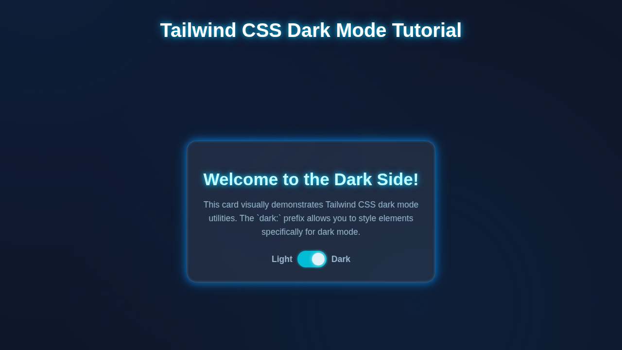
We’re crafting a super elegant dark mode toggle. Imagine a button that instantly flips your entire website’s theme. Light theme to dark theme, just like that! This isn’t just about aesthetics, though. It’s about giving users control. They can choose their preferred viewing experience. This enhances overall usability. We will use Tailwind CSS for all the styling. A little JavaScript will handle the logic. It’s a fantastic feature for any modern website. Your users will definitely appreciate this thoughtfulness! Providing options is always a win.
HTML Structure: The Foundation of Our Toggle
First, let’s lay down the basic HTML. This structure will hold our toggle and some example content. We need a main container for our entire page. This keeps everything neatly organized. Then, we’ll create a button specifically for switching modes. This setup keeps things clean and semantic. We’ll also include a div for our main content. This lets us see the dark mode in action. It’s the skeleton of our project.
index.html
<!DOCTYPE html>
<html lang="en">
<head>
    <meta charset="UTF-8">
    <meta name="viewport" content="width=device-width, initial-scale=1.0">
    <title>Tailwind CSS Dark Mode Tutorial</title>
    <!-- Link to the compiled Tailwind CSS file -->
    <!-- Make sure to compile your CSS using the Tailwind CLI: `npx tailwindcss -i ./styles.css -o ./dist/output.css` -->
    <link href="./dist/output.css" rel="stylesheet">
    <style>
        /* Safe fonts for universal compatibility */
        body { font-family: Arial, Helvetica, sans-serif; margin: 0; box-sizing: border-box; overflow-x: hidden; }
        html { box-sizing: border-box; }
        *, *::before, *::after { box-sizing: inherit; }
    </style>
</head>
<body class="bg-gray-100 dark:bg-gray-900 text-gray-900 dark:text-gray-100 transition-colors duration-500 ease-in-out min-h-screen flex items-center justify-center">

    <div class="container mx-auto p-4 max-w-lg">
        <div class="bg-white dark:bg-gray-800 shadow-lg rounded-xl p-8 transition-colors duration-500 ease-in-out border border-gray-200 dark:border-gray-700">
            <h1 class="text-3xl font-bold mb-4 text-center">Dark Mode with Tailwind CSS</h1>
            <p class="mb-6 text-center text-gray-700 dark:text-gray-300">
                Toggle the switch below to experience the power of Tailwind CSS dark mode utilities.
            </p>

            <div class="flex justify-center items-center mb-6">
                <span class="mr-3 text-sm font-medium text-gray-900 dark:text-gray-300">Light</span>
                <label for="dark-mode-toggle" class="relative inline-flex items-center cursor-pointer">
                    <input type="checkbox" id="dark-mode-toggle" class="sr-only peer">
                    <div class="w-11 h-6 bg-gray-200 peer-focus:outline-none peer-focus:ring-4 peer-focus:ring-blue-300 dark:peer-focus:ring-blue-800 rounded-full peer dark:bg-gray-700 peer-checked:after:translate-x-full peer-checked:after:border-white after:content-[''] after:absolute after:top-[2px] after:left-[2px] after:bg-white after:border-gray-300 after:border after:rounded-full after:h-5 after:w-5 after:transition-all dark:border-gray-600 peer-checked:bg-blue-600"></div>
                </label>
                <span class="ml-3 text-sm font-medium text-gray-900 dark:text-gray-300">Dark</span>
            </div>

            <div class="p-4 bg-gray-50 dark:bg-gray-700 rounded-lg text-sm text-gray-600 dark:text-gray-200 transition-colors duration-500 ease-in-out border border-gray-100 dark:border-gray-600">
                This is a sample text block. Its background and text color will also adapt to the selected theme, demonstrating nested dark mode styling.
            </div>
        </div>
    </div>

    <script>
        // Get references to the HTML element and the dark mode toggle
        const htmlElement = document.documentElement;
        const darkModeToggle = document.getElementById('dark-mode-toggle');

        // Function to apply the theme to the HTML element and update the toggle switch
        function applyTheme(theme) {
            if (theme === 'dark') {
                htmlElement.classList.add('dark');
                if (darkModeToggle) darkModeToggle.checked = true;
            } else {
                htmlElement.classList.remove('dark');
                if (darkModeToggle) darkModeToggle.checked = false;
            }
            // Store the user's preference in local storage
            localStorage.setItem('theme', theme);
        }

        // Initialize theme on page load
        // 1. Check if user has a preference stored in local storage
        const userTheme = localStorage.getItem('theme');
        // 2. If not, check the system's preferred color scheme
        const systemPrefersDark = window.matchMedia('(prefers-color-scheme: dark)').matches;

        if (userTheme) {
            // Apply user's stored preference
            applyTheme(userTheme);
        } else if (systemPrefersDark) {
            // Apply system preference if no user preference is set
            applyTheme('dark');
        } else {
            // Default to light mode if neither is set
            applyTheme('light');
        }

        // Add event listener for the toggle switch
        if (darkModeToggle) {
            darkModeToggle.addEventListener('change', (event) => {
                if (event.target.checked) {
                    applyTheme('dark');
                } else {
                    applyTheme('light');
                }
            });
        }

        // Listen for changes in system preference (e.g., user changes OS theme setting)
        // Only update if the user hasn't manually set a preference via the toggle.
        window.matchMedia('(prefers-color-scheme: dark)').addEventListener('change', (event) => {
            if (!localStorage.getItem('theme')) {
                applyTheme(event.matches ? 'dark' : 'light');
            }
        });
    </script>
</body>
</html>
CSS Styling: Tailwind’s Magic for Our Dark Mode
You’ll notice something amazing here. We won’t write much custom CSS! That’s the incredible power of Tailwind CSS. We will apply utility classes directly in our HTML. Tailwind handles all the heavy lifting. It uses a special dark: prefix. This prefix defines how elements look in dark mode. We simply tell it what to do for each state. No more messy, sprawling stylesheets! This approach keeps our CSS file tiny. It also makes our styling highly maintainable. It’s a game-changer for speed.
styles.css
/*
This file serves as the input for Tailwind CSS.
It imports Tailwind's base, components, and utilities layers.

To compile your CSS, run the following command in your terminal
from the root of your project (where styles.css is located):
`npx tailwindcss -i ./styles.css -o ./dist/output.css --watch`
This command will watch for changes and recompile automatically.
*/
@tailwind base;
@tailwind components;
@tailwind utilities;

/*
Any custom CSS not handled by Tailwind utilities can be added here.
For this tutorial, we primarily use Tailwind's utility classes.
*/
JavaScript: Bringing Our Tailwind Dark Mode Toggle to Life
Now for the exciting part! JavaScript makes our toggle truly interactive. It will listen for clicks on our switch button. Then, it will update the document.documentElement element. This element is actually your <html> tag. We will add or remove the ‘dark’ class from it. This simple class change tells Tailwind to apply dark mode styles. It instantly transforms your site. JavaScript acts as the brains behind the entire operation. It remembers your choice too! This creates a consistent experience.
tailwind.config.js
/** @type {import('tailwindcss').Config} */
module.exports = {
  // Configure dark mode to switch based on the 'dark' class on the html element
  darkMode: 'class',
  // Scan these files for Tailwind classes
  content: ["./index.html"],
  theme: {
    extend: {
      // Custom colors or other theme extensions can go here
      // For this tutorial, we'll rely mostly on default Tailwind colors
    }
  },
  plugins: []
};
How It All Works Together: The Dark Mode Symphony
Let’s really break down the magic. This section shows how HTML, Tailwind, and JavaScript collaborate beautifully. Each piece plays a vital and interconnected role. You’ll see the complete picture unfold before your eyes. Understanding this flow is key. It helps you build even more complex features.
HTML: The Starting Point
Our HTML provides the basic layout for our page. It gives us a clear button to click. It also includes the content we want to style. Most importantly, it sets up elements ready for Tailwind’s classes. The <html> tag is especially crucial here. It acts as the global switch. It will dynamically receive or lose the ‘dark’ class from our JavaScript. This single class on the <html> element controls everything. It tells Tailwind which theme to display.
Tailwind CSS: Smart Styling for Any Theme
Tailwind CSS is incredibly clever in its approach. It features a built-in dark: prefix for styling. We use this prefix for any styles that should only apply when dark mode is active. For example, dark:bg-gray-800 means a dark gray background only when the <html> tag has the ‘dark’ class. If that class is absent, Tailwind uses your default (light mode) styles. This system is super efficient. You style components once, covering both modes. It truly speeds up your development workflow! Want to learn more about creating responsive layouts with Tailwind? Check out our guide on building a Responsive Navbar with Tailwind CSS: HTML & JavaScript Tutorial. It will expand your Tailwind knowledge.
Pro Tip: Tailwind’s
dark:variant makes managing themes a complete breeze. Define your light mode styles normally, then simply adddark:prefixes for all your dark mode overrides. It’s that intuitive and powerful!
JavaScript: The Theme Orchestrator and Memory Keeper
Our JavaScript snippet performs several key functions. First, it smartly checks the user’s system preference. Does their operating system prefer dark mode? If so, we respect that choice. We apply dark mode immediately upon loading. Next, it attaches an event listener to our toggle button. This listener waits for a click. When clicked, it adds or removes the ‘dark’ class from the <html> element. This action instantly updates the visual theme. Crucially, it also updates local storage. This remembers the user’s preference. So, their chosen theme persists even after they navigate away and return to your site. This creates a beautifully smooth and consistent user experience. You can see more about building interactive elements and managing state in our Responsive Navbar Tailwind CSS: Build a Modern HTML Menu tutorial.
Heads Up! Local storage is a fantastic, client-side way to remember user preferences across sessions. It helps keep things consistent and personalized for your visitors without needing a server!
Tips to Customise It: Make Your Tailwind Dark Mode Unique
You’ve built a functional dark mode toggle! That’s a huge achievement. Now, let’s explore ways to make it truly yours. Personalization is key for unique projects.
- Change the Toggle Icon: Instead of simple text, consider using an SVG icon for the sun/moon. This makes it far more visually appealing. Icon libraries like Heroicons or Font Awesome work great here.
- Add More Themes: Extend the JavaScript logic to support multiple themes. Don’t stop at just light and dark! Imagine a “sepia” or “high contrast” option for users. This offers even greater personalization.
- Animate the Transition: Add CSS
transitionproperties to your background colors and text colors. This makes the theme change smooth and delightful. A subtle fade makes a huge visual difference. You can learn more about elegant CSS transitions on MDN Web Docs. - Theme Switcher Component: Encapsulate the toggle logic and HTML into a reusable component. This is excellent practice for larger projects. It keeps your code modular and tidy.
- Accessibility Enhancements: Always think about accessibility! Add
aria-labelattributes to your toggle button. This improves usability for screen reader users. They will understand the button’s purpose better. Find more about accessibility best practices on CSS-Tricks.
Conclusion: You Just Mastered Tailwind Dark Mode!
Awesome job, pro coder! You just built a fully functional Tailwind Dark Mode toggle from scratch. You integrated HTML, Tailwind CSS, and JavaScript seamlessly. That’s a huge accomplishment for any beginner or intermediate developer! You learned about powerful utility classes. You also mastered dynamic theme switching. This skill is incredibly valuable in today’s web development landscape. Your projects will now offer a better, more thoughtful user experience. Go ahead and show off your new creation! Share it with your friends and fellow learners. Keep building amazing things! We are so proud of your continued progress. Don’t forget to check out our other tutorials, like the one on Tailwind Dark Mode Toggle: HTML & CSS Tutorial for another perspective on achieving this fantastic dark mode feature!