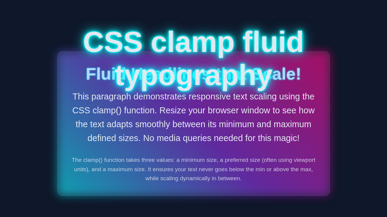
CSS Clamp Fluid Typography Tutorial: HTML & CSS Only
Hey there, future web wizard! If you’ve ever wanted to build a beautiful, responsive typography system but had no idea where to start, you are in the right place. Today, we’re diving deep into CSS Clamp Typography to create truly fluid text. Imagine your text magically resizing itself for every screen size. That’s what clamp() lets us do! We’ll build a simple, yet powerful, fluid typography system using just HTML and CSS. Get ready to make your designs shine on any device!
What We Are Building: Your Ultimate Fluid Text System with CSS Clamp Typography
We are going to craft a super cool system. This system will make your text effortlessly adapt. It will look perfect on phones, tablets, and huge desktop screens. Forget endless media queries for every font size! Instead, we will use the amazing clamp() CSS function. This function helps your text grow and shrink smoothly. It stays within comfortable minimum and maximum sizes. It’s a game-changer for responsive design. You’ll build a solid foundation for all your future projects. This method saves you so much time. It also makes your code much cleaner.
Setting Up Our HTML Structure
First things first, let’s lay down our basic HTML. This structure will be simple and clean. It will give us a canvas for our fluid typography. We will use standard semantic elements. This helps with accessibility and organization. Don’t worry about complex layouts right now. We’re focusing purely on the text magic!
index.html
<!DOCTYPE html>
<html lang="en">
<head>
    <meta charset="UTF-8">
    <meta name="viewport" content="width=device-width, initial-scale=1.0">
    <title>CSS clamp Fluid Typography</title>
    <link rel="stylesheet" href="styles.css">
</head>
<body>
    <div class="container">
        <h1>Fluid Typography with CSS clamp()</h1>
        <p>This tutorial demonstrates how to implement fluid typography using the CSS <code>clamp()</code> function. Resize your browser window to observe the text adapting smoothly across different screen sizes.</p>

        <section class="example-section">
            <h2>Adaptive Heading Example</h2>
            <p class="main-paragraph">This main paragraph utilizes <code>clamp()</code> to ensure readability on both small mobile screens and large desktop monitors. The text size will scale proportionally without requiring explicit media queries.</p>
            <p class="small-paragraph">Even smaller text elements can benefit from <code>clamp()</code>, maintaining legibility while gracefully adjusting their size based on the viewport width.</p>
        </section>

        <footer>
            <p>© 2023 Fluid Typography Demo</p>
        </footer>
    </div>
</body>
</html>
Styling Our Fluid Typography with CSS
Now for the exciting part: the CSS! This is where we bring our fluid typography to life. We will use the clamp() function extensively. It will manage our font sizes beautifully. We’ll set up a base font size. Then we’ll apply clamp() to our headings and paragraphs. This ensures everything scales just right.
styles.css
/*
 * CSS clamp Fluid Typography Tutorial Styles
 * Learn how to create responsive text sizes with no media queries.
 *
 * Safe fonts: Arial, Helvetica, sans-serif
 * Production-ready: box-sizing, max-width, overflow:hidden where applicable
 */

/* Basic Reset & Global Styles */
*, *::before, *::after {
    box-sizing: border-box; /* Ensure consistent box model */
    margin: 0;
    padding: 0;
}

body {
    font-family: Arial, Helvetica, sans-serif; /* Safe, widely available font */
    line-height: 1.6;
    color: #333; /* Dark gray for good contrast */
    background-color: #f4f7fa; /* Light background */
    display: flex;
    justify-content: center;
    align-items: flex-start; /* Align to top for longer content */
    min-height: 100vh; /* Full viewport height */
    padding: 20px; /* Padding around the content */
    overflow-x: hidden; /* Prevent horizontal scrollbars */
}

.container {
    max-width: 960px; /* Max width for content */
    width: 100%; /* Ensure it takes full width up to max-width */
    background-color: #fff;
    border-radius: 8px;
    box-shadow: 0 4px 12px rgba(0, 0, 0, 0.1);
    padding: 30px;
    margin-top: 20px; /* Space from top */
    text-align: center;
}

/*
 * Fluid Typography with CSS clamp()
 *
 * clamp(MIN_SIZE, PREFERRED_SIZE, MAX_SIZE)
 * - MIN_SIZE: The smallest font size allowed.
 * - PREFERRED_SIZE: The ideal font size, often using viewport units (vw)
 *   combined with a base unit (rem) for accessibility and better scaling.
 * - MAX_SIZE: The largest font size allowed.
 *
 * The browser will calculate the font size. If the PREFERRED_SIZE is less
 * than MIN_SIZE, MIN_SIZE is used. If PREFERRED_SIZE is greater than MAX_SIZE,
 * MAX_SIZE is used. Otherwise, PREFERRED_SIZE is used.
 */

h1 {
    /*
     * Example: clamp(2rem, 5vw + 1rem, 4.5rem)
     * Min: 2rem (approx 32px)
     * Preferred: 5% of viewport width + 1rem (16px)
     * Max: 4.5rem (approx 72px)
     */
    font-size: clamp(2rem, 5vw + 0.5rem, 4.5rem);
    color: #0056b3; /* Dark blue for main heading */
    margin-bottom: 25px;
    line-height: 1.2;
}

h2 {
    /*
     * Example: clamp(1.5rem, 3vw + 0.5rem, 3rem)
     * Min: 1.5rem (approx 24px)
     * Preferred: 3% of viewport width + 0.5rem (8px)
     * Max: 3rem (approx 48px)
     */
    font-size: clamp(1.5rem, 3vw + 0.5rem, 3rem);
    color: #007bff; /* Medium blue for subheadings */
    margin-top: 30px;
    margin-bottom: 20px;
    line-height: 1.3;
}

p {
    /*
     * Example: clamp(1rem, 1.8vw + 0.3rem, 1.4rem)
     * Min: 1rem (approx 16px)
     * Preferred: 1.8% of viewport width + 0.3rem (4.8px)
     * Max: 1.4rem (approx 22.4px)
     */
    font-size: clamp(1rem, 1.8vw + 0.2rem, 1.4rem);
    margin-bottom: 15px;
    color: #555;
}

.main-paragraph {
    font-weight: bold; /* Highlight the main paragraph */
    color: #444;
}

.small-paragraph {
    font-size: clamp(0.85rem, 1.5vw + 0.1rem, 1.1rem); /* Slightly smaller base for specific text */
    color: #666;
    opacity: 0.9;
}

.example-section {
    background-color: #e9ecef; /* Light gray background for section */
    border-radius: 6px;
    padding: 25px;
    margin-top: 30px;
    border-left: 5px solid #007bff; /* Accent border */
    text-align: left; /* Align text left inside section */
}

footer {
    margin-top: 40px;
    padding-top: 20px;
    border-top: 1px solid #eee;
    color: #777;
    font-size: clamp(0.75rem, 1vw, 0.9rem); /* Small, fixed-ish footer text */
}

/* Ensure no content overflows for smaller viewports */
@media (max-width: 480px) {
    .container {
        padding: 20px;
    }
    body {
        padding: 15px;
    }
}
How It All Works Together: Unpacking the CSS Clamp Typography Magic
You’ve got the HTML, and the CSS is in place. Now, let’s break down exactly what’s happening. This section will explain the core concepts. We’ll understand how clamp() makes your text so adaptable.
Understanding clamp() and Its Benefits
The clamp() CSS function is the star of our show. It takes three values. First, a minimum size. Second, a preferred size. Third, a maximum size.
clamp(minimum, preferred, maximum): This is its basic syntax.
The browser uses the preferred value whenever possible. However, it will never go below minimum. It will also never go above maximum. This gives us incredible control. Your text always looks good. This means better readability. It also means less manual tweaking. You define the range, and the browser does the rest. It is super efficient.
Pro Tip: Think of
clamp()as a smart guardrail for your font sizes. It keeps your text within a readable range, no matter the screen width! This ensures a consistent user experience.
The Power of vw Units for Fluidity
In our preferred value, you might have noticed vw units. vw stands for “viewport width.” One vw is 1% of the viewport’s width. So, 3vw means 3% of the screen width. This is key for fluidity. As the screen gets wider, 3vw gets bigger. As it shrinks, 3vw gets smaller. This makes your text adapt dynamically. It’s truly responsive. Using vw creates a smooth, continuous scaling effect. It eliminates abrupt size changes. This makes your design feel more natural.
Combining rem and vw for Robustness
You’ll see rem units for our minimum and maximum values. rem stands for “root em.” One rem equals the font size of the root HTML element. This is usually 16px by default. Using rem for min/max provides a stable base. It ensures readability. The vw unit then provides the fluid scaling between these fixed points. This combination is powerful. It balances fluidity with control. It also ensures accessibility. Users can still zoom their browser. The rem values provide a reliable base. You can learn more about these fascinating units on MDN Web Docs. It’s important to understand them fully.
Our clamp() Formula in Action for Headings
Let’s look at an example from our CSS:
font-size: clamp(2rem, 3vw + 1rem, 4rem);Here, 2rem is our minimum size. The text will never be smaller than 2rem. This ensures readability on small screens.
4rem is our maximum size. The text will never be larger than 4rem. This prevents oversized headings on very large displays.
3vw + 1rem is the preferred size. This is where the magic happens.
As the screen width changes, 3vw adjusts. The 1rem part acts as a solid base. It prevents the vw from making the text too small on tiny screens. This formula ensures your headings smoothly scale up and down. They always stay within our defined boundaries. This single line of CSS replaces many media queries. It simplifies your stylesheet.
Fluidity for Paragraphs and Other Elements
We’ve applied similar clamp() logic to paragraphs. Small text usually needs less dramatic scaling. Therefore, our vw value for paragraphs might be smaller. This maintains good visual hierarchy. You can apply clamp() to other elements too. Think about line-height, padding, or even margins. This creates a truly integrated fluid design system. You could even apply it to buttons or navigation links. This comprehensive approach makes your entire site feel cohesive.
Remember: Consistent application of
clamp()across your typography ensures a harmonious and professional look on all devices! Your users will appreciate the seamless experience.
This approach also significantly reduces the need for media queries. Instead of defining font sizes at multiple breakpoints, clamp() handles the in-between sizes automatically. This makes your CSS cleaner and easier to manage. You are building a more robust and future-proof design. Consider using clamp() for other properties as well. For instance, you could use it for fluid line-height or spacing. This creates a truly responsive layout. You can find more inspiration on CSS-Tricks about fluid typography techniques.
Tips to Customise Your CSS Clamp Typography System
You’ve just built an amazing fluid typography system! But don’t stop here. Here are some ideas to make it truly your own.
- Experiment with
vwvalues: Try differentvwpercentages. See how they impact the scaling speed. A highervwmakes text grow faster. Adjust these values to match your specific design aesthetic. Play around until it feels just right. - Add more semantic elements: Apply
clamp()to other HTML tags. Think<blockquote>,<li>,details, or even custom classes. This expands your system. For example, check out how semantic elements are used in this Accessible HTML Accordion: Pure CSS Details Element Design. You can apply similar styling principles there. - Use CSS Custom Properties (Variables): Define your min, preferred, and max values as CSS variables. This makes your system incredibly easy to manage. You can change values in one spot. For instance:
:root {
  --fluid-heading-min: 2rem;
  --fluid-heading-preferred: 3vw + 1rem;
  --fluid-heading-max: 4rem;
}
h1 {
  font-size: clamp(var(--fluid-heading-min), var(--fluid-heading-preferred), var(--fluid-heading-max));
}
This is powerful for large projects. It helps keep things organized. It also promotes consistency across your site.
- Explore Fluid Spacing and Layout:
clamp()isn’t just for font sizes! You can use it for padding, margins, and gaps. This creates a truly responsive layout. It perfectly complements your fluid typography. Dive deeper into fluid design concepts with this article on CSS Clamp, Fluid Typography & Responsive Text Design. This ensures your layout adjusts alongside your text. - Consider Container Queries: While
clamp()is excellent,container-queriesoffer another level of responsiveness. They allow elements to react to their parent container’s size, not just the viewport. This is super useful for component-based design. Check out our CSS Container Queries Tutorial: Responsive Design with HTML & CSS for more details. They work really well together!
Conclusion: You’re a Fluid Typography Master!
Wow, you did it! You just built a fantastic fluid typography system. You harnessed the power of CSS Clamp Typography. Your web content will now look amazing on any device. You’ve stepped up your responsive design game. This skill is invaluable for any web developer.
Feel proud of what you’ve accomplished! Your websites will be more user-friendly and beautiful. Keep experimenting with clamp(). It’s a versatile tool. Share your projects with us and the community. We can’t wait to see what you create! Happy coding!