Tailwind CSS Slider: Build an Image Carousel with HTML & JS
Hey there, fellow coder! If you’ve ever wanted to build a responsive image carousel but felt a bit lost, you are in the perfect spot. Today, we’ll create an awesome Tailwind CSS Slider. It will be smooth, interactive, and look great on any device. Get ready to add dynamic flair to your websites with just HTML, a dash of Tailwind, and vanilla JavaScript! This project is perfect for showcasing products or a portfolio.
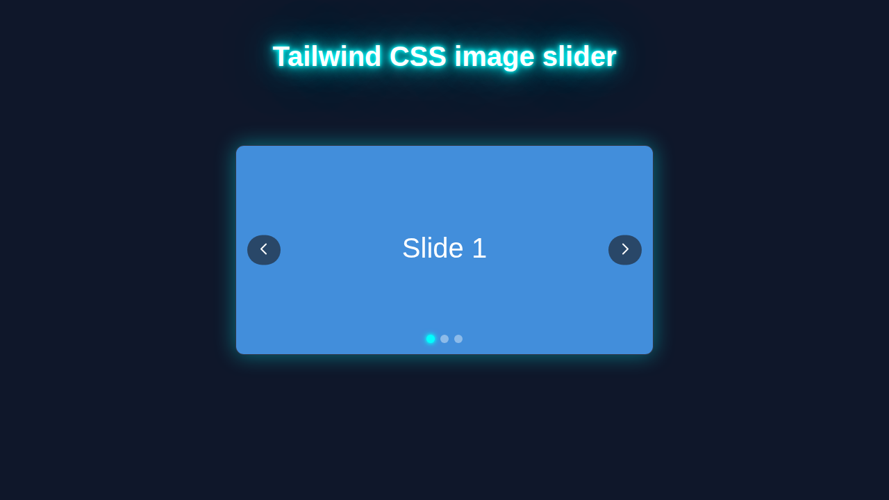
What We Are Building: Your Next Tailwind CSS Slider
Imagine showcasing your best product images or portfolio pieces with style. A sleek, responsive image slider is just what you need. We’re going to build a fully functional carousel. It will feature multiple images, clear navigation, and a cool auto-play. Best of all, it’s super easy to customize. This project uses Tailwind’s utility classes for quick styling. You will love how simple and powerful it is! Our slider will adapt beautifully to any screen size.
HTML Structure: Setting Up Our Slider Stage
Our HTML provides the basic structure for the slider. This is our foundation! We need a main container for the entire slider component. Inside, we will have a track that holds all our images side-by-side. Then, we add some clear navigation buttons. These let users move through slides easily. This setup makes it straightforward to control our slider with JavaScript. Each individual image lives inside its own distinct slide element. They will be perfectly ready for action and display.
index.html
<!DOCTYPE html>
<html lang="en">
<head>
    <meta charset="UTF-8">
    <meta name="viewport" content="width=device-width, initial-scale=1.0">
    <title>Tailwind CSS Image Slider</title>
    <!-- Tailwind CSS CDN - for easy setup. For production, consider PurgeCSS build. -->
    <link href="https://cdn.jsdelivr.net/npm/tailwindcss@2.2.19/dist/tailwind.min.css" rel="stylesheet">
    <link rel="stylesheet" href="styles.css">
</head>
<body class="bg-gray-100 flex items-center justify-center min-h-screen font-sans antialiased">
    <div class="container mx-auto p-4">
        <h1 class="text-3xl font-bold text-center mb-8 text-gray-800">Explore Beautiful Destinations</h1>

        <!-- Image Slider Component -->
        <div class="relative w-full max-w-2xl mx-auto rounded-lg shadow-xl overflow-hidden group">
            <!-- Slider Inner (Images Wrapper) -->
            <div id="slider-inner" class="flex transition-transform duration-500 ease-in-out">
                <!-- Image 1 -->
                <img src="https://images.unsplash.com/photo-1502602898757-002d08210332?auto=format&fit=crop&q=80&w=1974&ixlib=rb-4.0.3&ixid=M3wxMjA3fDB8MHxwaG90by1wYWdlfHx8fGVufDB8fHx8fA%3D%3D" alt="Paris city" class="w-full flex-shrink-0 object-cover h-80">
                <!-- Image 2 -->
                <img src="https://images.unsplash.com/photo-1523978393520-21f478d10b0e?auto=format&fit=crop&q=80&w=2070&ixlib=rb-4.0.3&ixid=M3wxMjA3fDB8MHxwaG90by1wYWdlfHx8fGVufDB8fHx8fA%3D%3D" alt="London bridge" class="w-full flex-shrink-0 object-cover h-80">
                <!-- Image 3 -->
                <img src="https://images.unsplash.com/photo-1549117621-e8d196417539?auto=format&fit=crop&q=80&w=2070&ixlib=rb-4.0.3&ixid=M3wxMjA3fDB8MHxwaG90by1wYWdlfHx8fGVufDB8fHx8fA%3D%3D" alt="New York city" class="w-full flex-shrink-0 object-cover h-80">
                <!-- Image 4 -->
                <img src="https://images.unsplash.com/photo-1551632832-671c65d64455?auto=format&fit=crop&q=80&w=1935&ixlib=rb-4.0.3&ixid=M3wxMjA3fDB8MHxwaG90by1wYWdlfHx8fGVufDB8fHx8fA%3D%3D" alt="Tokyo street" class="w-full flex-shrink-0 object-cover h-80">
            </div>

            <!-- Navigation Buttons -->
            <button id="prev-btn" class="absolute top-1/2 left-4 transform -translate-y-1/2 bg-gray-800/50 text-white p-2 rounded-full cursor-pointer hover:bg-gray-800 focus:outline-none transition-colors duration-200 opacity-0 group-hover:opacity-100">
                <svg xmlns="http://www.w3.org/2000/svg" class="h-6 w-6" fill="none" viewBox="0 0 24 24" stroke="currentColor">
                    <path stroke-linecap="round" stroke-linejoin="round" stroke-width="2" d="M15 19l-7-7 7-7" />
                </svg>
            </button>
            <button id="next-btn" class="absolute top-1/2 right-4 transform -translate-y-1/2 bg-gray-800/50 text-white p-2 rounded-full cursor-pointer hover:bg-gray-800 focus:outline-none transition-colors duration-200 opacity-0 group-hover:opacity-100">
                <svg xmlns="http://www.w3.org/2000/svg" class="h-6 w-6" fill="none" viewBox="0 0 24 24" stroke="currentColor">
                    <path stroke-linecap="round" stroke-linejoin="round" stroke-width="2" d="M9 5l7 7-7 7" />
                </svg>
            </button>

            <!-- Pagination Dots -->
            <div id="pagination-dots" class="absolute bottom-4 left-1/2 transform -translate-x-1/2 flex space-x-2">
                <!-- Dots will be dynamically generated by JS -->
            </div>
        </div>
    </div>

    <script src="script.js"></script>
</body>
</html>
CSS Styling: Making It Shine with Tailwind
This is where Tailwind CSS truly shines! We are using utility classes directly in our HTML file. This keeps our stylesheet incredibly lean and focused. We primarily manage layout, spacing, and responsive behaviors. For a few specific properties, like truly hiding overflow or ensuring smooth visual transitions, we might add a tiny bit of custom CSS. Most visual magic happens right in your markup. Remember, Tailwind lets you build beautiful designs without leaving your HTML! It speeds up your workflow significantly. For custom styles or more complex UI, you could even explore creating a Glassmorphism Card to place on top of your slider images. Think of the stunning possibilities!
styles.css
/* General styling for safe fonts and box-sizing */
/* Tailwind CSS handles most styling, this is for best practice defaults. */
html {
    box-sizing: border-box;
    font-family: Arial, Helvetica, sans-serif; /* Safe font */
}
*,
*::before,
*::after {
    box-sizing: inherit;
}

/* You can add custom utility classes here if needed,
   but for this tutorial, Tailwind's default classes are sufficient. */
JavaScript: Bringing Our Slider to Life
Now for the brains of our operation: JavaScript! We will write straightforward vanilla JS to handle all the slider’s interactivity. This includes smoothly switching slides, expertly managing navigation buttons, and implementing the auto-play feature. Don’t worry, we’ll break down each part step-by-step for clarity. Our goal is clean, readable code you can easily understand and confidently modify. You will learn the core logic behind dynamic web components.
script.js
document.addEventListener('DOMContentLoaded', () => {
    // Select elements
    const sliderInner = document.getElementById('slider-inner');
    const prevBtn = document.getElementById('prev-btn');
    const nextBtn = document.getElementById('next-btn');
    const paginationDots = document.getElementById('pagination-dots');

    const images = sliderInner.querySelectorAll('img');
    const totalSlides = images.length;
    let currentIndex = 0;

    // Function to update the slider's position and active dot
    function goToSlide(index) {
        // Update current index, ensuring it wraps around
        currentIndex = (index + totalSlides) % totalSlides;

        // Calculate the transform value to shift images
        const transformValue = -currentIndex * 100;
        sliderInner.style.transform = `translateX(${transformValue}%)`;

        // Update active pagination dot
        updatePaginationDots();
    }

    // Function to create pagination dots dynamically
    function createPaginationDots() {
        paginationDots.innerHTML = ''; // Clear any existing dots
        for (let i = 0; i < totalSlides; i++) {
            const dot = document.createElement('div');
            dot.classList.add(
                'w-3', 'h-3', 'bg-gray-400', 'rounded-full', 'cursor-pointer',
                'transition-colors', 'duration-200', 'hover:bg-gray-200'
            ); /* Tailwind classes for dot styling */
            dot.dataset.index = i;
            dot.addEventListener('click', () => goToSlide(i));
            paginationDots.appendChild(dot);
        }
    }

    // Function to update the active state of pagination dots
    function updatePaginationDots() {
        const dots = paginationDots.querySelectorAll('div');
        dots.forEach((dot, index) => {
            if (index === currentIndex) {
                dot.classList.remove('bg-gray-400', 'hover:bg-gray-200');
                dot.classList.add('bg-white'); // Active dot color
            } else {
                dot.classList.remove('bg-white');
                dot.classList.add('bg-gray-400', 'hover:bg-gray-200');
            }
        });
    }

    // Event listeners for navigation buttons
    prevBtn.addEventListener('click', () => {
        goToSlide(currentIndex - 1);
    });

    nextBtn.addEventListener('click', () => {
        goToSlide(currentIndex + 1);
    });

    // Initialize the slider:
    createPaginationDots(); // Create dots first
    goToSlide(0); // Show the first slide and set initial dot state
});
How Our Tailwind CSS Slider Works
Let’s dive into the exciting details of what makes our slider tick. We’ve laid out the HTML, styled it with Tailwind CSS, and now we connect the dots with JavaScript. This section explains the underlying logic behind each part of our interactive carousel. It’s a fantastic way to grasp essential front-end development principles. You will see how HTML, CSS, and JS collaborate seamlessly to create a delightful user experience. This holistic approach is very powerful.
Setting Up the Basics
First, we select all necessary elements from our HTML. We grab the main slider container, the image track, and both navigation buttons. We also track the current slide index at all times. This vital variable tells us which image is currently visible. Then, we set up an interval for the auto-play feature. This makes our slider advance automatically. It’s a simple yet powerful starting point for our script.
Pro Tip: Always select your DOM elements at the beginning of your script. This prevents repetitive lookups and makes your code cleaner and more efficient. It’s a good habit for any JavaScript project that interacts with the page!
Navigating Between Slides
Our navigation buttons are crucial for user control. When you click “next” or “prev,” our JavaScript updates the current slide index. If we reach the end, we loop back to the beginning. If we go too far back, we jump to the last image. This creates a smooth, infinite looping effect. Then, we call a function to display the correct slide. This ensures the slider always shows the right image. Did you know you could combine this slider with a Tailwind Dark Mode Toggle? Imagine a site where your slider adapts to user preferences instantly. That’s modern web development!
Updating the Display
The showSlide function is the core of our slider’s visual update. It calculates how much to translate the image track horizontally. This movement brings the new slide into view. We use CSS transform properties for smooth transitions. This makes the slider feel incredibly fluid and professional. We also update the visual state of our navigation dots, if you add them. This tells the user which slide they are viewing. It’s a small detail that greatly improves user experience. You can read more about the transform CSS property on MDN Web Docs. Understanding it unlocks many cool animations!
Implementing Auto-Play
The auto-play feature adds a professional touch to our slider. We use setInterval to advance slides automatically every few seconds. We also add logic to pause auto-play when the user hovers over the slider. This gives them time to interact without interruption. When they move their mouse away, auto-play resumes. It creates a thoughtful user experience. This balance of automation and control is key for great design.
Educator’s Note: Understanding event listeners like
mouseoverandmouseleaveis fundamental for building interactive web elements. They allow your JavaScript to react directly to user actions, creating dynamic and truly engaging experiences that impress users.
Responsive Design Considerations
Thanks to Tailwind CSS, our slider is inherently responsive from the start. We’ve used classes like w-full and h-auto to ensure images scale correctly. Our JavaScript also accounts for different screen sizes. It calculates translations based on the current slide’s width. This means your slider will look fantastic on mobile, tablet, and desktop. Building responsive components is essential today. You could even use Tailwind Custom Breakpoints if you need finer control over specific screen dimensions!
Tips to Customise It
You’ve built a solid slider foundation! Now, let’s make it truly yours. Here are some fantastic ideas to extend or personalize your project:
- Add Pagination Dots: Implement small, clickable dots at the bottom of the slider. Users can easily jump to a specific slide directly. This adds another elegant layer of navigation.
- Swipe Gestures for Mobile: Enhance the mobile experience. Add intuitive touch swipe functionality. Users can effortlessly swipe left or right to change slides. This feels natural on touch devices.
- Dynamic Content Loading: Instead of hardcoding images, consider fetching them from an API. This makes your slider incredibly flexible and scalable. It’s great for dynamic portfolios or product listings.
- Experiment with Transition Effects: Try different CSS transitions. You could explore fade effects, more dramatic slides, or even complex 3D animations. Make your slider stand out visually.
- Accessibility Enhancements: Add ARIA attributes and keyboard navigation. This ensures your slider is usable by everyone. Accessibility is crucial for an inclusive web!
Conclusion: You’ve Built an Amazing Tailwind CSS Slider!
Congratulations, my friend! You just built a fully functional, responsive image slider using Tailwind CSS and vanilla JavaScript. This project showcases the power of combining these modern web technologies. You’ve learned about HTML structure, efficient styling with Tailwind, and interactive JavaScript logic. Go ahead, deploy it, and proudly share your fantastic creation with the world! I am incredibly proud of what you’ve accomplished. Keep building amazing things, keep learning, and don’t hesitate to experiment further!