Tailwind Custom Theme: Extend & Personalize CSS with HTML
Hey there, fellow coders! If you’ve ever dreamed of building truly unique web projects, then understanding a **Tailwind Custom Theme** is your secret weapon. We are going to build something super cool today. You will learn how to make your website colors and fonts dynamic. This means easy personalization for you and your users!
Forget static designs! This tutorial shows you how to bring your interfaces to life. We will use CSS variables and Tailwind CSS together. Get ready to unleash your creativity!
What We Are Building: A Dynamic Theme Switcher
We are crafting a sleek web page. It will feature a live theme switcher. You can change primary colors instantly. You can also swap out fonts on the fly. This isn’t just a gimmick, it’s incredibly useful!
Imagine building a client website. They can pick their brand colors themselves. Or think about your own portfolio. You can showcase different vibes effortlessly. This project gives you powerful control. It makes your web development work stand out.
HTML Structure: The Canvas for Our Theme
First, we need a basic HTML setup. This will be our canvas. We’ll include buttons to trigger theme changes. There will also be a content area. This area will display our dynamic styling. We will link our CSS and JavaScript files here too.
Don’t worry about the specific content too much. The main goal is the structure. It needs to hold our interactive elements. It also needs to show the theme changes.
index.html
<!DOCTYPE html>
<html lang="en">
<head>
<meta charset="UTF-8">
<meta name="viewport" content="width=device-width, initial-scale=1.0">
<title>Tailwind CSS Custom Theme Example</title>
<!-- Link to the compiled Tailwind CSS file -->
<!-- This 'output.css' file will be generated by running the Tailwind CLI build command -->
<link href="./output.css" rel="stylesheet">
</head>
<!--
Apply custom theme classes directly to the body or main container.
- bg-darkbg: Uses our custom dark background color.
- text-white: Default text color.
- font-sans: Uses our custom sans-serif font stack.
- flex, items-center, justify-center, min-h-screen: For centering content.
- p-card-gap: Uses our custom spacing for padding.
- box-border, overflow-hidden: Essential for layout and preventing scrollbars.
-->
<body class="bg-darkbg text-white font-sans flex items-center justify-center min-h-screen p-card-gap box-border overflow-hidden">
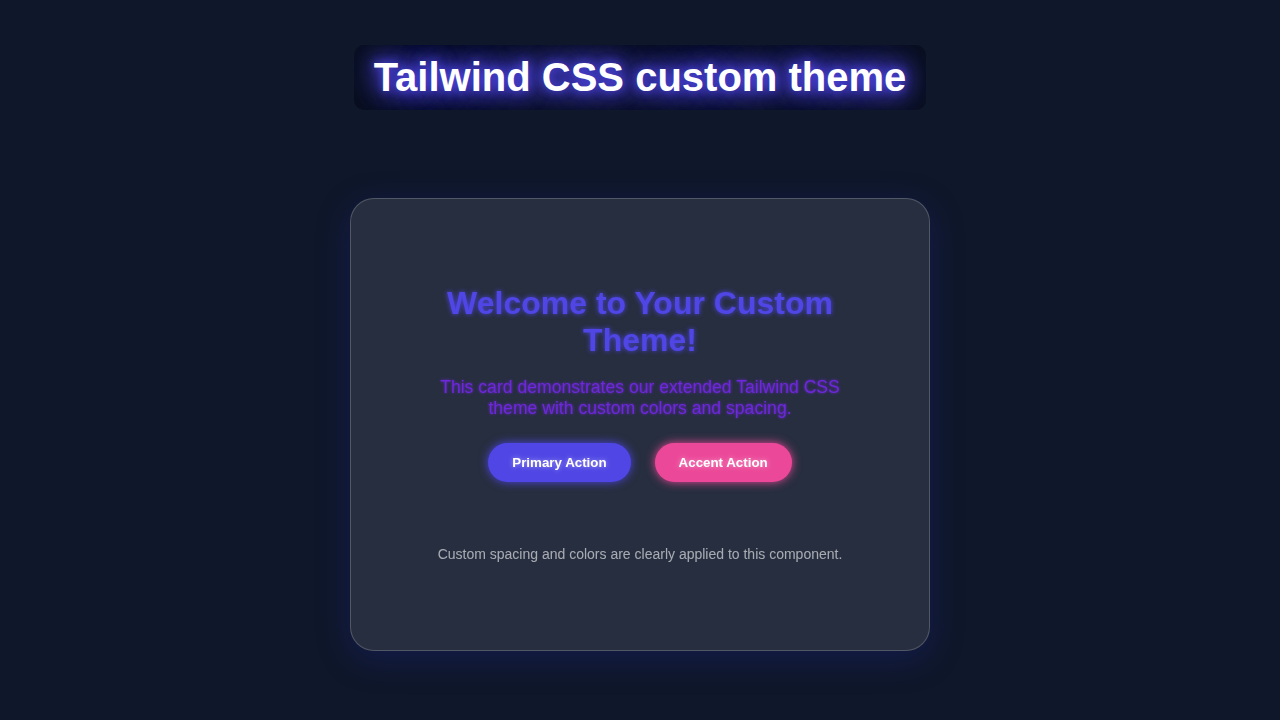
<div class="max-w-md mx-auto bg-gray-800/60 rounded-xl-plus shadow-xl p-section text-center border border-gray-700 backdrop-blur-md">
<!--
h1 uses custom text-primary color and custom font stack.
- text-3xl, font-bold: Standard Tailwind text size and weight.
- text-primary: Our custom primary color.
- mb-4: Standard Tailwind margin-bottom.
-->
<h1 class="text-3xl font-bold text-primary mb-4">Welcome to Your Custom Theme!</h1>
<!--
p uses custom text-secondary color.
- text-lg, mb-6: Standard Tailwind text size and margin.
- text-secondary: Our custom secondary color.
-->
<p class="text-secondary text-lg mb-6">This card demonstrates our extended Tailwind CSS theme with custom colors and spacing.</p>
<div class="flex flex-col md:flex-row justify-center gap-card-gap">
<!--
Buttons using custom bg-primary and bg-accent colors, and rounded-xl-plus border-radius.
- bg-primary, hover:bg-primary/90: Uses our custom primary color with a hover effect.
- text-white, font-bold: Standard text styles.
- py-3, px-6: Standard padding.
- rounded-xl-plus: Our custom larger border radius.
-->
<button class="bg-primary hover:bg-primary/90 text-white font-bold py-3 px-6 rounded-xl-plus transition-colors duration-200">
Primary Action
</button>
<button class="bg-accent hover:bg-accent/90 text-white font-bold py-3 px-6 rounded-xl-plus transition-colors duration-200">
Accent Action
</button>
</div>
<!--
Small note using mt-section custom spacing.
- mt-section: Uses our custom large top margin.
- text-gray-400, text-sm: Standard Tailwind text color and size.
-->
<p class="mt-section text-gray-400 text-sm">Custom spacing <code class="text-primary">p-section</code> and colors <code class="text-primary">bg-primary</code>, <code class="text-primary">text-secondary</code>, <code class="text-primary">bg-accent</code> are applied.</p>
</div>
</body>
</html>CSS Styling: Bringing Variables to Life with Tailwind Custom Theme Magic
Now, for the really exciting part! We will use CSS variables. These variables will define our custom colors and fonts. Tailwind CSS will then magically consume these variables. It’s truly a powerful combination for customization!
We will set up default values first. Then, we will create special classes for different themes. This allows us to switch themes easily. It’s efficient and very scalable. Get ready to see the power of modern CSS!
postcss.config.js
module.exports = {
  plugins: {
    // PostCSS plugins are run before Tailwind processes your CSS
    tailwindcss: {},
    autoprefixer: {},
  },
};
input.css
/* This file is the entry point for Tailwind CSS */
/* It contains the Tailwind directives that inject Tailwind's base, components, and utility styles */

@tailwind base;
@tailwind components;
@tailwind utilities;

/* You can add your own custom CSS here if needed,
 * but the goal with Tailwind is to use utilities first.
 */
JavaScript: The Brains Behind the Dynamic Theme
This is where the interactivity comes in. Our JavaScript will listen for user clicks. Specifically, it watches our theme-switching buttons. When a button is clicked, our script updates the CSS variables. This changes your website’s look instantly!
It’s a simple script, but incredibly powerful. You will love how responsive your theme feels. This makes the user experience much better. It also shows off your dynamic coding skills!
package.json
{
  "name": "tailwind-custom-theme-tutorial",
  "version": "1.0.0",
  "description": "A tutorial for extending Tailwind CSS themes.",
  "scripts": {
    "build:css": "tailwindcss -i ./input.css -o ./output.css --minify",
    "watch:css": "tailwindcss -i ./input.css -o ./output.css --watch"
  },
  "devDependencies": {
    "autoprefixer": "^10.4.19",
    "postcss": "^8.4.38",
    "tailwindcss": "^3.4.3"
  }
}
tailwind.config.js
/** @type {import('tailwindcss').Config} */
module.exports = {
  // Configure files to scan for Tailwind classes
  content: [
    "./index.html",
    // You can add more paths here if you have components in subfolders, e.g., "./src/**/*.{html,js}"
  ],
  theme: {
    // The `extend` section is where you add your custom values without overriding Tailwind's defaults
    extend: {
      // Custom color palette
      colors: {
        primary: '#4F46E5', // A vibrant indigo
        secondary: '#6D28D9', // A deep purple
        accent: '#EC4899', // A bright pink
        darkbg: '#1A202C', // A custom dark background color
      },
      // Custom spacing scale
      spacing: {
        'section': '4rem',    // Large spacing for sections
        'card-gap': '1.5rem', // Spacing for gaps within cards or components
      },
      // Custom font families (ensure safe fonts)
      fontFamily: {
        sans: ['Arial', 'Helvetica', 'sans-serif'], // Overrides Tailwind's default sans font stack
      },
      // Custom border radius values
      borderRadius: {
        'xl-plus': '1.5rem', // A slightly larger border-radius
      },
      // You can extend other properties like screens, animation, etc.
    },
  },
  // Add Tailwind plugins here
  plugins: [],
}
How It All Works Together: A Step-by-Step Breakdown
Let’s break down the magic piece by piece. Understanding each component is key. You’ll see how CSS variables, Tailwind, and JavaScript collaborate. This creates a truly dynamic experience.
Setting Up Your Tailwind Config
The very first step is to configure your tailwind.config.js file. This is where we tell Tailwind about our custom theme. We use the extend property here. This allows us to add new colors and fonts. We also keep all of Tailwind’s defaults. For colors, we point to our CSS variables. For example, 'primary': 'var(--color-primary)'. We do the same for font families.
Tailwind then generates utility classes for us. These classes use our custom CSS variables. It’s super efficient. This approach gives you flexibility. You can then use classes like bg-primary or font-display.
Pro Tip: Always extend Tailwind’s default configuration. Never overwrite it completely. This way, you keep all of Tailwind’s amazing utility classes! It also makes your setup more robust.
Defining CSS Variables
Next, we define our actual CSS variables. We place these usually in the :root pseudo-class. This makes them globally available. For our default theme, we set primary, secondary, and accent colors. We also define our base font families. For instance, --color-primary: #3490dc;. These are our starting values. Then, for different themes, we override these variables. We do this inside theme-specific classes, like .theme-dark.
CSS variables are incredibly powerful. They allow us to update values dynamically. This happens without rewriting entire stylesheets. Learn more about CSS Custom Properties (Variables) on MDN. It’s a fundamental concept for dynamic theming.
Applying Tailwind Classes
With our config and CSS variables in place, applying themes is easy. You simply use the Tailwind classes. These classes reference your custom variables. For example, <div class="bg-primary text-secondary font-display">. Tailwind processes your HTML. It then generates the corresponding CSS. This CSS uses the values from your variables. So, if --color-primary is blue, bg-primary will be blue. If it changes to red, it updates immediately!
This seamless integration is fantastic. It means less manual CSS writing. It also ensures consistency across your project. This is a core benefit of using a Tailwind Custom Themes: Building with HTML & Tailwind CSS approach. Tailwind simplifies complex styling tasks.
Dynamic Theme Switching with JavaScript
The JavaScript is the interactive glue. We select our theme buttons. We then attach event listeners to them. When a button is clicked, our function runs. This function accesses the document.documentElement. This represents the <html> tag. We use element.style.setProperty('--variable-name', 'new-value'). This changes the CSS variable. For example, clicking ‘Red Theme’ sets --color-primary to red.
The changes happen in real-time. There is no page reload needed. This makes for a smooth user experience. It’s an elegant way to handle user preferences. If you’re curious about more dynamic theming, check out our guide on Tailwind Dark Mode Tutorial: HTML & CSS for Dynamic Themes. You can also explore updating a CSS Variable with JavaScript on CSS-Tricks.
A Glimpse into Customization
This setup is incredibly flexible. You can combine different fonts with different colors. You could even introduce new variable types. Think about spacing or border radii. The power is truly in your hands now. This flexibility is a hallmark of a robust Tailwind Custom Theme approach. It enables endless design possibilities.
Encouragement: Don’t be afraid to experiment! That’s how you truly learn and make amazing things. Your creativity is the only limit here. Try adding your own unique color palettes and font combinations.
Tips to Customise Your Tailwind Custom Theme
You have built a fantastic foundation! Now, let’s explore ways to make it even better. Here are a few ideas to expand your project:
- More Color Palettes: Add more diverse color schemes. Create a wide range of options for your users. Think about seasonal themes or mood-based palettes.
- Advanced Font Pairings: Experiment with more font combinations. Use Google Fonts or Adobe Fonts. Good typography truly elevates a design.
- Persist Theme Choice: Use
localStorageto remember the user’s last chosen theme. This makes their experience even smoother. They won’t have to re-select their theme on every visit. - Integrate with Components: Apply this dynamic theming to complex components. Maybe a header, footer, or an entire card layout. See how it works when building a full Tailwind Admin Dashboard: Sleek UI with HTML & CSS Utilities.
Conclusion: You’ve Mastered Dynamic Theming!
Wow, you made it! You’ve just created a powerful, dynamic **Tailwind Custom Theme**. You learned to use CSS variables with Tailwind. You also added interactivity with JavaScript. This skill is invaluable for modern web development. You now have the power to create truly personalized experiences!
I’m so excited for you! Go ahead and share your amazing creation. Show it off on Twitter or in a developer community. Keep building, keep learning, and keep experimenting. The web is your playground!