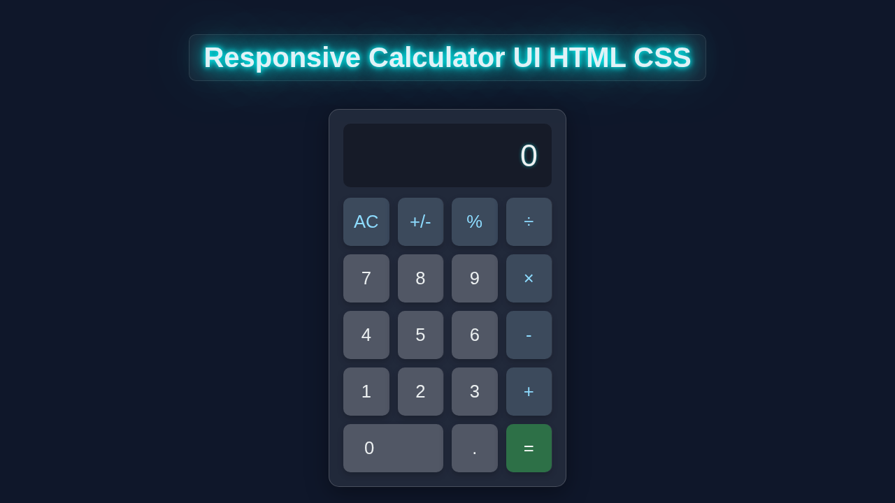
Hey there, awesome coder! If you’ve been wanting to build a Responsive Calculator UI but felt unsure where to start, you’ve landed in the perfect spot. Today, we’re going to create a super sleek and functional calculator interface using just HTML and CSS. It will look fantastic on any screen size, from tiny phones to large monitors. Get ready to build something truly cool!
What We Are Building
We’re crafting a beautiful, modern calculator interface. Imagine a calculator that feels intuitive and looks polished. It won’t just be pretty; it will also be fully responsive. This means its layout will adjust automatically to fit any device your users are on. We’ll focus on a clean design, clear buttons, and a professional display area. This project is a fantastic way to sharpen your HTML structure and CSS styling skills, especially with responsive techniques.
HTML Structure
First, we need to lay down the foundation with HTML. Our HTML will define the main container for the calculator. Then we’ll add a display area and all the individual buttons. It’s a straightforward setup that makes styling with CSS much easier later on. Here’s what our basic structure will look like:
index.html
<!DOCTYPE html>
<html lang="en">
<head>
    <meta charset="UTF-8">
    <meta name="viewport" content="width=device-width, initial-scale=1.0">
    <title>Responsive Calculator UI</title>
    <link rel="stylesheet" href="styles.css">
</head>
<body>
    <!-- Wrapper for centering the calculator on the page -->
    <div class="calculator-wrapper">
        <div class="calculator">
            <!-- Calculator Display Area -->
            <div class="calculator-display">0</div>

            <!-- Calculator Buttons Grid -->
            <div class="calculator-buttons">
                <!-- Top row of control buttons -->
                <button class="btn operator" data-action="clear">AC</button>
                <button class="btn operator" data-action="negate">+/-</button>
                <button class="btn operator" data-action="percent">%</button>
                <button class="btn operator" data-action="divide">÷</button>

                <!-- Number row 7, 8, 9 and Multiply -->
                <button class="btn number">7</button>
                <button class="btn number">8</button>
                <button class="btn number">9</button>
                <button class="btn operator" data-action="multiply">×</button>

                <!-- Number row 4, 5, 6 and Subtract -->
                <button class="btn number">4</button>
                <button class="btn number">5</button>
                <button class="btn number">6</button>
                <button class="btn operator" data-action="subtract">-</button>

                <!-- Number row 1, 2, 3 and Add -->
                <button class="btn number">1</button>
                <button class="btn number">2</button>
                <button class="btn number">3</button>
                <button class="btn operator" data-action="add">+</button>

                <!-- Bottom row: 0, decimal, and equals -->
                <button class="btn number zero">0</button>
                <button class="btn number decimal">.</button>
                <button class="btn operator equals" data-action="equals">=</button>
            </div>
        </div>
    </div>
</body>
</html>
CSS Styling
Now for the fun part: making our calculator look amazing! We’ll use CSS to style everything, from the overall layout to the individual buttons. We’ll ensure it’s responsive and visually appealing. Get ready to use Flexbox and Grid, which are powerful tools for creating dynamic layouts. We will also dive into CSS Variables: Unlock Dynamic Styles & Layouts to make our design easily customizable.
styles.css
/*
 * Responsive Calculator UI HTML CSS
 *
 * This stylesheet creates a modern, responsive calculator interface
 * using only HTML and CSS. It features a glassmorphism aesthetic
 * and uses CSS Grid for the button layout.
 */

/* Global Resets and Base Styles */
* {
    box-sizing: border-box; /* Ensures padding and border are included in the element's total width and height */
    margin: 0;
    padding: 0;
}

body {
    font-family: Arial, Helvetica, sans-serif; /* Safe, universally available font */
    background-color: #f0f2f5; /* Light background for general use */
    min-height: 100vh; /* Full viewport height */
    overflow: hidden; /* Prevent scrollbars if content overflows */
    color: #333; /* Default text color */
}

/* Wrapper to center the calculator and apply basic page styling */
.calculator-wrapper {
    display: flex;
    justify-content: center;
    align-items: center;
    width: 100%;
    min-height: 100vh;
    background-color: #f0f2f5; /* Light background */
    padding: 20px; /* Add some padding around the calculator */
}

/* Calculator Container Styling */
.calculator {
    width: 100%; /* Take full width of its container */
    max-width: 320px; /* Maximum width for the calculator on larger screens */
    background: rgba(255, 255, 255, 0.7); /* Semi-transparent white for glassmorphism effect */
    box-shadow: 0 8px 32px 0 rgba(0, 0, 0, 0.1); /* Subtle shadow for depth */
    backdrop-filter: blur(8px); /* Blur effect for glassmorphism */
    -webkit-backdrop-filter: blur(8px); /* Safari support */
    border-radius: 15px; /* Rounded corners for the calculator body */
    border: 1px solid rgba(255, 255, 255, 0.3); /* Light border */
    padding: 20px; /* Inner padding */
    display: flex;
    flex-direction: column;
    gap: 15px; /* Space between display and buttons */
    overflow: hidden; /* Ensure nothing spills out of rounded corners */
}

/* Calculator Display Area */
.calculator-display {
    background: rgba(0, 0, 0, 0.05); /* Slightly darker background for display */
    border-radius: 10px;
    padding: 15px 20px;
    font-size: 2.5em; /* Large font size for readability */
    text-align: right; /* Align text to the right */
    color: #333;
    overflow: hidden; /* Prevent text from overflowing */
    white-space: nowrap; /* Keep text on a single line */
    text-overflow: ellipsis; /* Add ellipsis if text overflows */
    min-height: 70px; /* Minimum height for consistent display */
    display: flex; /* Use flex for vertical centering */
    align-items: center; /* Center content vertically */
    justify-content: flex-end; /* Align content to the right */
}

/* Calculator Buttons Grid */
.calculator-buttons {
    display: grid;
    grid-template-columns: repeat(4, 1fr); /* 4 columns, each taking equal space */
    gap: 10px; /* Space between buttons */
}

/* Individual Button Styles */
.btn {
    background: rgba(255, 255, 255, 0.6); /* Semi-transparent white button background */
    border: none;
    border-radius: 10px;
    padding: 18px 0; /* Vertical padding */
    font-size: 1.5em;
    color: #333;
    cursor: pointer;
    transition: all 0.2s ease-in-out; /* Smooth transitions for hover effects */
    outline: none; /* Remove outline on focus */
    box-shadow: 0 2px 5px rgba(0, 0, 0, 0.1); /* Subtle shadow for buttons */
    -webkit-tap-highlight-color: transparent; /* Remove tap highlight on mobile */
    max-width: 100%; /* Ensure button doesn't exceed its grid cell */
}

.btn:hover {
    background: rgba(255, 255, 255, 0.8); /* Lighter on hover */
    box-shadow: 0 4px 10px rgba(0, 0, 0, 0.15); /* More prominent shadow on hover */
    transform: translateY(-1px); /* Slight lift effect */
}

.btn:active {
    background: rgba(255, 255, 255, 0.9); /* Even lighter when active */
    box-shadow: inset 0 2px 5px rgba(0, 0, 0, 0.2); /* Inset shadow for press effect */
    transform: translateY(0); /* Reset lift effect */
}

/* Specific Button Styles */
.btn.operator {
    background: rgba(200, 200, 200, 0.6); /* Greyer background for operators */
    color: #555;
    font-weight: bold;
}

.btn.operator:hover {
    background: rgba(200, 200, 200, 0.8);
}

.btn.equals {
    background: #007bff; /* Primary blue for equals button */
    color: #fff;
    font-weight: bold;
    grid-column: span 2; /* Make equals button span two columns */
}

.btn.equals:hover {
    background: #0056b3; /* Darker blue on hover */
}

.btn.zero {
    grid-column: span 2; /* Zero button spans two columns */
    text-align: left; /* Align '0' to the left within its merged cell */
    padding-left: 25px; /* Adjust padding to visually center '0' */
}

/* Responsive Adjustments */
@media (max-width: 480px) {
    .calculator {
        max-width: 95%; /* Make calculator take more width on small screens */
        padding: 15px;
    }
    .calculator-display {
        font-size: 2em; /* Smaller font size for display */
        padding: 12px 15px;
        min-height: 60px;
    }
    .btn {
        font-size: 1.3em; /* Smaller font size for buttons */
        padding: 15px 0;
        border-radius: 8px; /* Slightly less rounded corners */
    }
    .btn.zero {
        padding-left: 20px; /* Adjust padding for smaller zero button */
    }
}

@media (max-width: 320px) {
    .calculator {
        padding: 10px;
    }
    .calculator-display {
        font-size: 1.8em;
        min-height: 50px;
    }
    .btn {
        font-size: 1.2em;
        padding: 12px 0;
    }
    .btn.zero {
        padding-left: 15px;
    }
}
JavaScript Functionality (Just a Peek!)
For this specific tutorial, we are laser-focused on the UI – how our calculator looks. However, to make it actually perform calculations, you’d add JavaScript. This JS would handle button clicks, update the display, and process mathematical operations. We’re setting the stage perfectly for you to add that interactive logic later. For now, we celebrate our beautiful front-end!
How It All Works Together: Building Your Responsive Calculator UI
Let’s break down how our HTML and CSS combine to create this awesome Responsive Calculator UI. Every piece plays a vital role. Understanding this synergy is key to mastering web development.
The Container and Basic Setup
We start with a main .calculator container. This element wraps around everything. It gives us a central point for styling our entire calculator. We use a bit of clever centering with Flexbox or Grid on the body to place our calculator neatly in the middle of the screen. This ensures it’s always the star of the show. Then, we apply basic styling like a background color and a subtle shadow. This makes it pop off the page a little.
Pro Tip: Using a
box-shadowadds depth and a professional touch to your elements. You can even create cool effects, similar to what you’d see when mastering CSS Pixel Art Box-Shadow: Master HTML & CSS Techniques!
The Display Area
Next, we build the .display area. This is where all the numbers and results will appear. We give it a distinct background and some generous padding. This makes the numbers easy to read. A large font size and right-aligned text are crucial here. They mimic real calculators. It creates a familiar user experience. We also ensure the text color contrasts well with the background. This improves readability.
Crafting the Buttons with CSS Grid
Here’s the cool part: arranging our buttons! We use CSS Grid for the .buttons container. Grid is fantastic for creating complex, two-dimensional layouts. We define columns and rows. Each button then slots perfectly into place. This makes our calculator layout neat and organized. Specific buttons, like the zero, might span multiple columns. Grid handles this with ease using grid-column: span 2;. This is what makes our layout so flexible.
Button Styling and Responsiveness
Each .button element gets a baseline style. We add a nice background color and text color. We also give them a subtle border or border-radius. This makes them look like actual physical buttons. When you hover over them, we add a slight color change. This provides visual feedback to the user. For responsiveness, the Grid layout automatically adjusts column widths. This means our calculator looks good on any device. Furthermore, using relative units like em or rem for font sizes helps buttons scale proportionally. This provides a consistent look.
Encouragement: Don’t be afraid to experiment with different button styles! Think about the look and feel of a custom element, much like you would when building a Custom Checkbox Radio Buttons Tutorial HTML CSS Only. Your creativity makes the project truly yours.
To deepen your understanding of responsive design, consider checking out MDN Web Docs on Media Queries. They are fundamental for adapting layouts to various screen sizes. Also, for more advanced CSS Grid techniques, CSS-Tricks has an excellent guide.
Tips to Customise It
You’ve built an amazing Responsive Calculator UI! Now, make it uniquely yours:
- Theme Switcher: Add a dark mode! Use CSS variables to easily swap between light and dark themes with a single toggle.
- Different Button Shapes: Experiment with different
border-radiusvalues. Make your buttons perfectly round, slightly rounded, or even sharper and more angular. - Animations: Add subtle hover effects or button press animations. A slight scaling or color shift can make the UI feel more alive and interactive.
- Custom Fonts: Change the font family for the display and buttons. A unique typeface can dramatically alter the calculator’s personality and aesthetic.
Conclusion
You did it! You just built a fantastic Responsive Calculator UI using HTML and CSS. You now have a solid understanding of structuring your HTML, styling with modern CSS techniques like Grid, and ensuring your designs adapt beautifully to any device. This project is a huge step in your web development journey. Now, take pride in what you’ve created! Tweak it, show it off, and keep building. Your coding skills are growing with every line of code you write. We can’t wait to see what you make next!