CSS Variables: Unlock Dynamic Styles & Layouts
Hey there, fellow web adventurer! Have you ever built a cool website, felt super proud, then realized you needed to change one tiny color? You know, that primary blue you used everywhere? So, you dive back into your stylesheets. You scroll and scroll. Then you find it. You change it. But wait, you used that same blue in three other places. You change those too. And maybe in a custom button component. Sound familiar? This endless hunt-and-peck can be truly exhausting. It feels like a real styling treadmill. What if I told you there’s a better way? A way to manage your styles like a pro, without the headaches? That’s exactly where CSS variables come into play. They are a game-changer for responsive and dynamic web design.
Ever Feel Stuck Updating Your Styles?
We’ve all been there, right? You build a beautiful navigation bar. You set its background color. Then you move to a hero section and use the same color for an accent. Perhaps a button shares that exact shade. Your project grows. Soon, you have dozens, maybe hundreds, of lines of CSS. Each line potentially hardcoding the same color value. Or the same padding measurement. You want to make a global change. Suddenly, that simple color tweak becomes a huge task. It feels like you need to be a detective just to track down every instance. This repetitive work is not just annoying. It introduces risks. You might miss one. Or accidentally change the wrong one. Then your design looks inconsistent. This leads to frustration, believe me.
The Endless Search-and-Replace Nightmare
Why does this happen, though? Historically, CSS wasn’t built for easy variable management. You typed in exact values. A specific hex code for a color. A precise pixel value for spacing. These values were “static.” They were fixed right where you wrote them. If you needed to change something, you had to manually update every single instance. Imagine you’re building a house. You decide all doors should be a specific shade of green. Instead of telling the painter “paint all doors this custom green,” you’d have to physically mix that green for every single door. Each time. That’s a lot of extra effort! Especially as your project gets bigger. You might even start wondering if there’s a better way to handle repetitive UI elements, like those custom checkbox and radio buttons you built. Well, there is.
Enter CSS Variables: Your Style Superpower
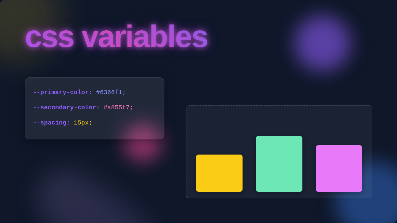
This is where the lightbulb moment truly hits. What if you could store a value once? Then refer to it by a friendly name everywhere else? That’s precisely what CSS variables (also known as custom properties) let you do. Think of them like little containers. You put a color, a font size, or a spacing value inside. Then, you give that container a meaningful name. Maybe --primary-color or --spacing-md. When you need that value, you just call the name. The browser then looks up what’s inside your named container. It applies that value. The cool part is, if you ever change what’s in the container, every place you used that name updates automatically. It’s like magic! You update one spot, and your entire website transforms. Suddenly, you have much more control over your design system. You avoid those repetitive updates.
Tip from a Pro: CSS variables are not just for colors! Use them for font sizes, spacing, animation durations, or even complex CSS pixel art component dimensions. The possibilities are truly endless.
How CSS Variables Actually Work (No Code, I Promise!)
So, how do you actually make these containers work? You declare a CSS variable just like any other CSS property. But with a key difference: they start with two hyphens. For example, you might tell your stylesheet: “Hey, I want to create a variable called --brand-blue, and its value will be a specific shade of blue.” You typically put these at the very top of your stylesheet, inside the :root selector. The :root selector represents the highest level of your HTML document. This makes your variable available globally. Every element on your page can access it. However, you can also declare variables locally. You could say: “Inside this specific button, I want a variable named --button-bg to be green.” That variable would only exist within that button. It cannot be accessed by other parts of your page. This concept is called “scoping.” It gives you incredible flexibility. For more detailed insights on how they inherit and cascade, you can always check out the excellent MDN Web Docs on Custom Properties.
Using these variables is just as simple. Anywhere you’d normally put a static value, you instead use the var() function. Inside those parentheses, you put the name of your variable. Like saying, “I want the background color of this element to be whatever is stored in --brand-blue.” What if a variable isn’t found? Maybe you misspelled it. Or it’s out of scope. You can provide a fallback value. This means if the variable doesn’t exist, your browser will use a default value instead. This prevents broken designs. It’s like having a backup plan built right into your styles. Truly clever, right?
Unlocking Dynamic Styles with CSS Variables
The real power of CSS variables shines when you want dynamic changes. Imagine creating a dark mode theme for your website. Before variables, you’d need two entirely separate stylesheets. One for light, one for dark. Or, you would write many lines of JavaScript to swap out individual class names. It was complicated and messy. With CSS variables, it’s a breeze! You just define your colors once. For example, --text-color and --bg-color. Then, when a user switches to dark mode, you simply change the values of those two variables, maybe within a body.dark-mode selector. Suddenly, every element using --text-color or --bg-color instantly updates! Your entire site switches themes with minimal effort. This approach is also fantastic for responsive design. You can change variable values at different breakpoints. Maybe your --spacing-md is 16px on desktop, but 8px on mobile. You change it once inside a media query, and everything using that variable adjusts. It’s incredibly efficient. This makes managing complex layouts, like a CSS Grid Masonry Gallery, much simpler too.
Pro-Tip for Efficiency: Consider using CSS variables to manage your color palettes, typography scales, and spacing units. This creates a cohesive design system that’s easy to maintain and scale. You can even use them to define responsive fluid typography, as explained beautifully in this CSS-Tricks guide on custom properties.
Think about how much more readable your CSS becomes. Instead of seeing background-color: #3498db; everywhere, you see background-color: var(--primary-blue);. It tells you immediately what that color represents in your design system. This clarity is invaluable for team projects. It also helps your future self when you revisit old projects. You will thank yourself later for this small change. Plus, it pushes you to think more systematically about your styles. You start categorizing your design elements. This is a fundamental step towards becoming a truly advanced front-end developer.
Your Next Steps with CSS Variables
You’ve seen the struggle. You’ve discovered the solution. Now it’s time to put it into action! Start small. Maybe try to define your primary and secondary brand colors using CSS variables. Then replace those hardcoded values throughout one of your smaller projects. See how quickly you can change the entire mood of your site with just a few edits. Experiment with different scopes. Try a global variable for your main font size. Then create a local variable for a unique button’s padding. Play around with fallback values. Break things! That’s how we learn best, after all. Don’t worry if it doesn’t click instantly. Keep practicing. Soon, you’ll wonder how you ever lived without them.
CSS variables aren’t just a new trick; they’re a fundamental shift in how we approach styling. They empower you to build more robust, flexible, and maintainable websites. You’re now equipped with a powerful tool. Go forth and create amazing, dynamic web experiences!