Hey! If you have wanted to build a Custom Checkbox Radio but had no idea where to start, you are in the right place.
What We Are Building
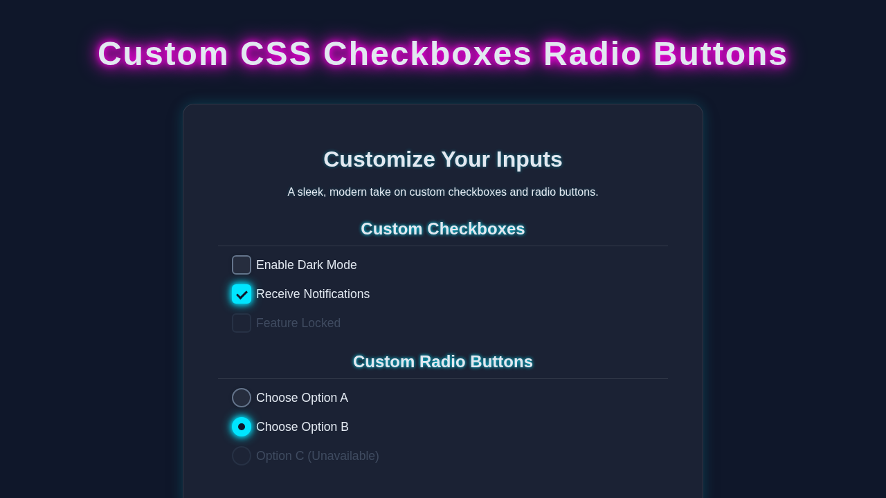
We are building custom checkboxes and radio buttons.
They are useful for forms.
HTML Structure
HTML is simple.
We use input tags.
index.html
<!DOCTYPE html>
<html lang="en">
<head>
    <meta charset="UTF-8">
    <meta name="viewport" content="width=device-width, initial-scale=1.0">
    <title>Custom Checkboxes & Radio Buttons</title>
    <!-- Link to the external stylesheet -->
    <link rel="stylesheet" href="styles.css">
</head>
<body>
    <div class="container">
        <h1>Custom Checkboxes and Radio Buttons</h1>
        <p>Learn how to create accessible and beautifully styled custom form controls using HTML and CSS only.</p>

        <!-- Section for Custom Checkboxes -->
        <section class="control-group">
            <h2>Custom Checkboxes</h2>
            <div class="custom-control-wrapper">
                <div class="custom-control">
                    <!-- The actual input is visually hidden but focusable -->
                    <input type="checkbox" id="myCheckbox1" name="option1" class="custom-input">
                    <!-- The label acts as the clickable area for the custom visual -->
                    <label for="myCheckbox1" class="custom-label">
                        <!-- This span will be styled to look like the checkbox indicator -->
                        <span class="custom-indicator"></span>
                        Enable Feature A
                    </label>
                </div>

                <div class="custom-control">
                    <input type="checkbox" id="myCheckbox2" name="option2" class="custom-input" checked>
                    <label for="myCheckbox2" class="custom-label">
                        <span class="custom-indicator"></span>
                        Enable Feature B (Checked)
                    </label>
                </div>

                <div class="custom-control">
                    <input type="checkbox" id="myCheckbox3" name="option3" class="custom-input">
                    <label for="myCheckbox3" class="custom-label">
                        <span class="custom-indicator"></span>
                        Subscribe to Newsletter
                    </label>
                </div>

                <div class="custom-control">
                    <input type="checkbox" id="myCheckbox4" name="option4" class="custom-input" disabled>
                    <label for="myCheckbox4" class="custom-label">
                        <span class="custom-indicator"></span>
                        Disabled Checkbox
                    </label>
                </div>
            </div>
        </section>

        <!-- Section for Custom Radio Buttons -->
        <section class="control-group">
            <h2>Custom Radio Buttons</h2>
            <div class="custom-control-wrapper">
                <div class="custom-control">
                    <input type="radio" id="myRadio1" name="myRadioGroup" class="custom-input" value="option1">
                    <label for="myRadio1" class="custom-label">
                        <span class="custom-indicator"></span>
                        Select Option 1
                    </label>
                </div>

                <div class="custom-control">
                    <input type="radio" id="myRadio2" name="myRadioGroup" class="custom-input" value="option2" checked>
                    <label for="myRadio2" class="custom-label">
                        <span class="custom-indicator"></span>
                        Select Option 2 (Checked)
                    </label>
                </div>

                <div class="custom-control">
                    <input type="radio" id="myRadio3" name="myRadioGroup" class="custom-input" value="option3">
                    <label for="myRadio3" class="custom-label">
                        <span class="custom-indicator"></span>
                        Select Option 3
                    </label>
                </div>

                <div class="custom-control">
                    <input type="radio" id="myRadio4" name="myRadioGroup" class="custom-input" value="option4" disabled>
                    <label for="myRadio4" class="custom-label">
                        <span class="custom-indicator"></span>
                        Disabled Radio Button
                    </label>
                </div>
            </div>
        </section>
    </div>
</body>
</html>
CSS Styling
CSS does the magic.
We use pseudo-elements.
styles.css
/*
    Custom CSS Checkboxes & Radio Buttons
    Author: Elite UI/UX Developer
    Description: Styles for custom-designed checkboxes and radio buttons using HTML and CSS only.
    Fonts: Safe fonts (Arial, Helvetica, sans-serif) - no external fonts.
    Accessibility: Hidden inputs are still focusable and clickable via their labels.
*/

/* --- Base Styles & Resets --- */
* {
    box-sizing: border-box; /* Ensure padding and border are included in the element's total width and height */
    margin: 0;
    padding: 0;
}

body {
    font-family: Arial, Helvetica, sans-serif; /* Safe font stack */
    line-height: 1.6;
    background-color: #f4f7f6; /* Light background for the tutorial */
    color: #333;
    padding: 20px;
    display: flex;
    justify-content: center;
    align-items: flex-start; /* Align to start for content flow */
    min-height: 100vh;
}

.container {
    max-width: 800px;
    width: 100%; /* Ensure container takes full width up to max-width */
    background-color: #fff;
    padding: 30px 40px;
    border-radius: 8px;
    box-shadow: 0 4px 15px rgba(0, 0, 0, 0.1);
}

h1 {
    color: #2c3e50;
    text-align: center;
    margin-bottom: 20px;
}

h2 {
    color: #34495e;
    margin-top: 30px;
    margin-bottom: 15px;
    border-bottom: 1px solid #eee;
    padding-bottom: 5px;
}

p {
    margin-bottom: 20px;
    text-align: center;
}

.control-group {
    margin-bottom: 30px;
}

.custom-control-wrapper {
    display: flex;
    flex-direction: column;
    gap: 15px; /* Spacing between custom controls */
}

/* --- Custom Input Styling --- */

/* Visually hide the native checkbox/radio input */
.custom-input {
    position: absolute;
    opacity: 0; /* Makes it completely transparent */
    width: 1px;
    height: 1px;
    overflow: hidden;
    clip: rect(0, 0, 0, 0); /* Even better for screen readers than display: none; */
    white-space: nowrap; /* Prevents text from wrapping if it somehow appears */
}

/* Style the custom label that acts as the visible control */
.custom-label {
    display: inline-flex; /* Allows custom indicator and text to align */
    align-items: center; /* Vertically align text with the custom indicator */
    cursor: pointer; /* Indicates it's clickable */
    user-select: none; /* Prevents text selection on the label */
    position: relative; /* Needed for positioning the custom-indicator */
    padding-left: 30px; /* Space for the custom indicator on the left */
    min-height: 20px; /* Ensures label has enough height for indicator */
}

/* Focus style for accessibility: When the hidden input is focused, style its adjacent label */
.custom-input:focus + .custom-label {
    outline: 2px solid #007bff; /* Standard blue focus outline */
    outline-offset: 3px; /* Space between the outline and the label */
    border-radius: 4px; /* Soften outline corners */
}

/* Style for the custom indicator (the visual box/circle) */
.custom-indicator {
    position: absolute;
    left: 0;
    top: 50%;
    transform: translateY(-50%); /* Center vertically */
    width: 20px;
    height: 20px;
    border: 2px solid #ced4da; /* Light gray border */
    background-color: #f8f9fa; /* Off-white background */
    display: inline-block; /* Ensure it respects width/height */
    transition: all 0.2s ease-in-out; /* Smooth transitions for state changes */
}

/* --- Checkbox Specific Styles --- */

/* Shape for checkboxes (square corners) */
.custom-input[type="checkbox"] + .custom-label .custom-indicator {
    border-radius: 4px;
}

/* Styling the indicator when the checkbox is checked */
.custom-input[type="checkbox"]:checked + .custom-label .custom-indicator {
    background-color: #007bff; /* Primary blue for checked state */
    border-color: #007bff;
}

/* Add a checkmark inside the checkbox indicator when checked */
.custom-input[type="checkbox"]:checked + .custom-label .custom-indicator::after {
    content: ''; /* Essential for pseudo-elements */
    position: absolute;
    left: 6px; /* Position the checkmark */
    top: 2px;
    width: 6px;
    height: 12px;
    border: solid #fff; /* White checkmark */
    border-width: 0 3px 3px 0; /* Bottom and right borders to form the L-shape */
    transform: rotate(45deg); /* Rotate to create a checkmark angle */
    opacity: 1; /* Make it visible */
}

/* --- Radio Button Specific Styles --- */

/* Shape for radio buttons (circle) */
.custom-input[type="radio"] + .custom-label .custom-indicator {
    border-radius: 50%; /* Perfect circle */
}

/* Styling the indicator when the radio button is checked */
.custom-input[type="radio"]:checked + .custom-label .custom-indicator {
    background-color: #007bff; /* Primary blue for checked state */
    border-color: #007bff;
}

/* Add an inner dot inside the radio button indicator when checked */
.custom-input[type="radio"]:checked + .custom-label .custom-indicator::after {
    content: ''; /* Essential for pseudo-elements */
    position: absolute;
    left: 50%; /* Center horizontally */
    top: 50%; /* Center vertically */
    transform: translate(-50%, -50%); /* Adjust for its own size */
    width: 8px; /* Size of the inner dot */
    height: 8px;
    background-color: #fff; /* White inner dot */
    border-radius: 50%; /* Make it circular */
    opacity: 1; /* Make it visible */
}

/* --- Disabled State Styling --- */

/* Styling for both disabled checkboxes and radio buttons */
.custom-input:disabled + .custom-label {
    opacity: 0.6; /* Dim the label text and indicator */
    cursor: not-allowed; /* Indicate it's not interactive */
}

.custom-input:disabled + .custom-label .custom-indicator {
    background-color: #e9ecef; /* Lighter background for disabled indicator */
    border-color: #dee2e6; /* Lighter border for disabled indicator */
}

/* Ensure the checkmark/dot is still visible but dimmed if already checked when disabled */
.custom-input[type="checkbox"]:disabled:checked + .custom-label .custom-indicator::after,
.custom-input[type="radio"]:disabled:checked + .custom-label .custom-indicator::after {
    opacity: 0.5; /* Dim the checkmark/dot */
}
JavaScript
No JS needed.
We keep it simple.
How It All Works Together
Step 1
We create a checkbox.
We style it with CSS.
Step 2
We create a radio button.
We style it with CSS.
Step 3
We add custom styles.
We use pseudo-elements.
Pro tip: Use CSS Grid for complex layouts like a CSS Grid Masonry Gallery.
Tips to Customise It
We can change colors.
We can add animations.
We can use different shapes.
Remember, practice makes perfect. Try building a CSS Pixel Art Box-Shadow to improve your skills.
Conclusion
We built it!
We are proud.
Share your creation and check out MDN for more CSS resources or CSS-Tricks for more tutorials.
Try building a Tailwind Responsive Navbar next.