Hey there, future web wizard! Ever wanted to build something awesome for the web but felt overwhelmed? You’re in the right place! Today, we’re going to create a fantastic Responsive Landing Page using HTML and the super-powerful Tailwind CSS. It’s truly a game-changer for front-end development.
This project will teach you how to craft beautiful, mobile-first designs with incredible ease. We’ll use Tailwind’s intuitive utility classes to style everything from layout to colors. Furthermore, you’ll see just how quickly a professional-looking page comes together. Get ready to build something you can be truly proud of and boost your coding skills!
What We Are Building: Your Next Professional Responsive Landing Page
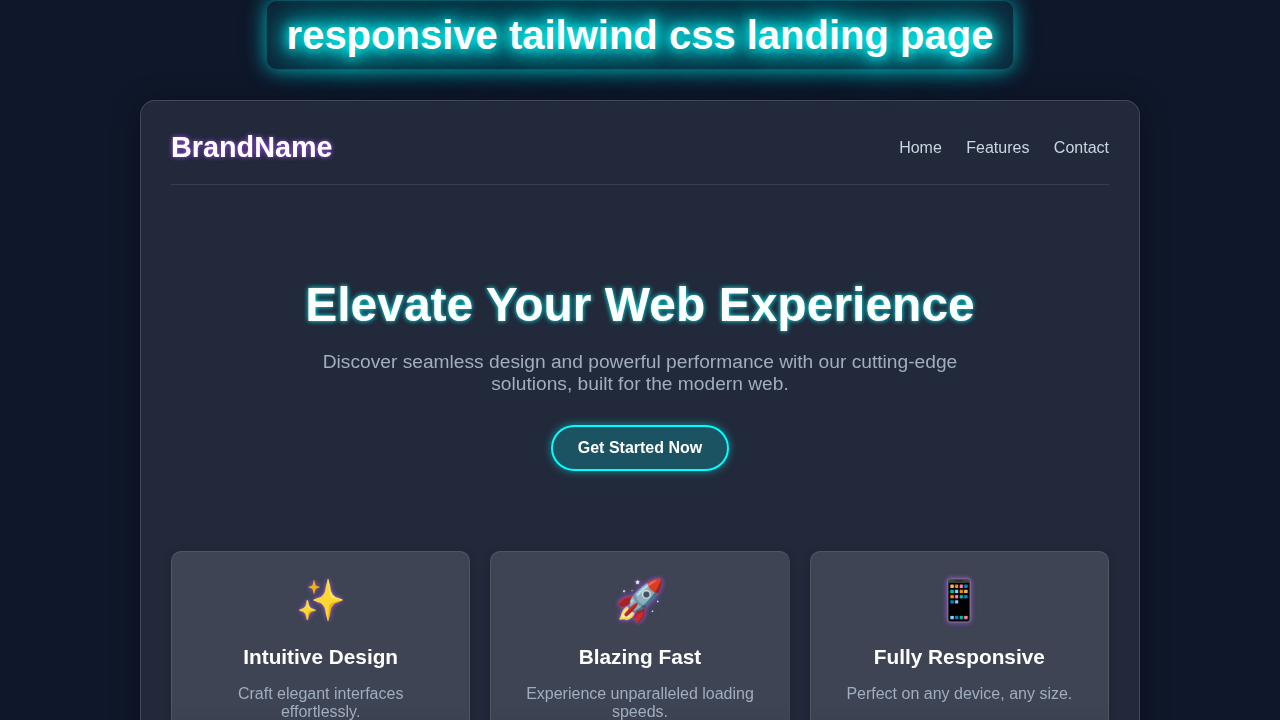
We are going to build a sleek, modern landing page that really pops! This page will look absolutely amazing on any device, large or small. Imagine a vibrant hero section, clear and engaging feature descriptions, and a compelling call-to-action button. Our design prioritizes user experience from the start. We will design it from the ground up to be fully responsive. This means it adapts perfectly and gracefully from tiny phone screens to expansive desktop monitors. A great Responsive Landing Page is absolutely essential for any personal project, portfolio, or business online. It showcases your ideas and offerings effectively and professionally to everyone.
HTML Structure: The Solid Blueprint of Our Page
Our HTML will provide the strong backbone of our entire landing page. We’ll use clear, semantic tags like <header>, <main>, and <footer> for better organization. This approach makes our code easy to read and wonderful for accessibility tools. Indeed, well-structured HTML is the foundation of a great website. We’ll organize content logically within these main sections. Each distinct section will serve a specific, important purpose on our page. This thoughtful structure helps both developers and search engines understand our content.
index.html
<!DOCTYPE html>
<html lang="en">
<head>
    <meta charset="UTF-8">
    <meta name="viewport" content="width=device-width, initial-scale=1.0">
    <title>Responsive Tailwind CSS Landing Page</title>
    <!--
        Link to Tailwind CSS CDN for quick development.
        For a production environment, it's recommended to install Tailwind CSS
        via npm and use a PostCSS setup for full optimization (e.g., JIT compilation, purging unused styles).
    -->
    <script src="https://cdn.tailwindcss.com"></script>
    <!-- Configure Tailwind to use safe fonts globally -->
    <script>
        tailwind.config = {
            theme: {
                extend: {
                    fontFamily: {
                        sans: ['Arial', 'Helvetica', 'sans-serif'],
                    }
                }
            }
        }
    </script>
    <!-- Link to your custom styles.css for any overrides or specific base styles -->
    <link rel="stylesheet" href="styles.css">
</head>
<body class="font-sans antialiased text-gray-100 bg-gray-900 leading-normal tracking-wide overflow-x-hidden">
    <!--
        Header Section:
        - Responsive navigation with a toggle for mobile.
        - Glassmorphism effect using Tailwind's `bg-opacity`, `backdrop-blur`.
        - Sticky positioning for a fixed header on scroll.
    -->
    <header class="bg-gray-800 bg-opacity-70 backdrop-blur-sm p-4 sticky top-0 z-50 shadow-lg">
        <nav class="container mx-auto flex justify-between items-center flex-wrap">
            <!-- Logo -->
            <a href="#" class="text-2xl font-bold text-white hover:text-blue-400 transition-colors duration-300">Brand</a>

            <!-- Mobile Navigation Toggle Button -->
            <div class="block lg:hidden">
                <button class="flex items-center px-3 py-2 border rounded text-gray-200 border-gray-400 hover:text-white hover:border-white" id="nav-toggle">
                    <svg class="fill-current h-3 w-3" viewBox="0 0 20 20" xmlns="http://www.w3.org/2000/svg"><title>Menu</title><path d="M0 3h20v2H0V3zm0 6h20v2H0V9zm0 6h20v2H0v-2z"/></svg>
                </button>
            </div>

            <!-- Navigation Content (Hidden on mobile by default, shown via JS toggle) -->
            <div class="w-full lg:flex lg:items-center lg:w-auto hidden" id="nav-content">
                <div class="text-sm lg:flex-grow">
                    <a href="#" class="block mt-4 lg:inline-block lg:mt-0 text-white hover:text-blue-400 mr-4 transition-colors duration-300">Home</a>
                    <a href="#" class="block mt-4 lg:inline-block lg:mt-0 text-white hover:text-blue-400 mr-4 transition-colors duration-300">Features</a>
                    <a href="#" class="block mt-4 lg:inline-block lg:mt-0 text-white hover:text-blue-400 mr-4 transition-colors duration-300">Pricing</a>
                    <a href="#" class="block mt-4 lg:inline-block lg:mt-0 text-white hover:text-blue-400 transition-colors duration-300">Contact</a>
                </div>
                <!-- Call to Action Button in Nav -->
                <div>
                    <a href="#" class="inline-block text-sm px-4 py-2 leading-none border rounded text-white border-white hover:border-transparent hover:text-blue-500 hover:bg-white mt-4 lg:mt-0 transition-all duration-300">Sign Up</a>
                </div>
            </div>
        </nav>
    </header>

    <!--
        Hero Section:
        - Full viewport height on larger screens, responsive padding.
        - Centered content with bold headline and descriptive paragraph.
        - Call-to-action buttons with subtle hover effects.
        - Animated background 'blob' shapes for visual interest (requires custom CSS in styles.css).
    -->
    <section class="relative bg-gradient-to-br from-gray-900 to-gray-800 text-center text-white min-h-screen flex items-center justify-center py-20 overflow-hidden">
        <div class="container mx-auto px-4 relative z-10">
            <h1 class="text-4xl md:text-6xl font-extrabold text-white mb-4 leading-tight">
                Craft Stunning <span class="text-blue-400">Responsive</span> Designs
            </h1>
            <p class="text-lg md:text-xl text-gray-300 mb-8 max-w-3xl mx-auto">
                Build modern, mobile-first websites with ease using the power of Tailwind CSS.
            </p>
            <div class="flex flex-col sm:flex-row justify-center space-y-4 sm:space-y-0 sm:space-x-4">
                <a href="#" class="bg-blue-600 hover:bg-blue-700 text-white font-bold py-3 px-8 rounded-full shadow-lg transition-all duration-300 transform hover:scale-105">
                    Get Started
                </a>
                <a href="#" class="bg-gray-700 hover:bg-gray-600 text-white font-bold py-3 px-8 rounded-full shadow-lg transition-all duration-300 transform hover:scale-105">
                    Learn More
                </a>
            </div>
        </div>
        <!-- Background blob/shape for visual interest (animated via styles.css) -->
        <div class="absolute top-1/4 left-[10%] w-64 h-64 bg-purple-500 rounded-full mix-blend-multiply filter blur-xl opacity-30 animate-blob"></div>
        <div class="absolute top-1/2 right-[10%] w-64 h-64 bg-blue-500 rounded-full mix-blend-multiply filter blur-xl opacity-30 animate-blob animation-delay-2000"></div>
        <div class="absolute bottom-1/4 left-[40%] w-64 h-64 bg-pink-500 rounded-full mix-blend-multiply filter blur-xl opacity-30 animate-blob animation-delay-4000"></div>
    </section>

    <!--
        Features Section:
        - Grid layout for features, responsive for different screen sizes.
        - Feature cards with glassmorphism-like styling and hover effects.
    -->
    <section class="py-16 bg-gray-900">
        <div class="container mx-auto px-4 text-center">
            <h2 class="text-3xl md:text-4xl font-bold text-white mb-12">Powerful Features</h2>
            <div class="grid grid-cols-1 md:grid-cols-2 lg:grid-cols-3 gap-8">
                <!-- Feature Card 1 -->
                <div class="bg-gray-800 bg-opacity-70 backdrop-blur-lg p-8 rounded-lg shadow-xl border border-gray-700 hover:border-blue-500 transition-all duration-300 transform hover:-translate-y-2 group">
                    <div class="text-blue-400 text-5xl mb-4 group-hover:text-blue-300 transition-colors duration-300">💡</div>
                    <h3 class="text-xl font-semibold text-white mb-2">Intuitive Design</h3>
                    <p class="text-gray-300">
                        Easily create beautiful, user-friendly interfaces with well-structured code.
                    </p>
                </div>
                <!-- Feature Card 2 -->
                <div class="bg-gray-800 bg-opacity-70 backdrop-blur-lg p-8 rounded-lg shadow-xl border border-gray-700 hover:border-blue-500 transition-all duration-300 transform hover:-translate-y-2 group">
                    <div class="text-blue-400 text-5xl mb-4 group-hover:text-blue-300 transition-colors duration-300">⚡</div>
                    <h3 class="text-xl font-semibold text-white mb-2">Lightning Fast</h3>
                    <p class="text-gray-300">
                        Optimize your website's performance with efficient Tailwind CSS utilities.
                    </p>
                </div>
                <!-- Feature Card 3 -->
                <div class="bg-gray-800 bg-opacity-70 backdrop-blur-lg p-8 rounded-lg shadow-xl border border-gray-700 hover:border-blue-500 transition-all duration-300 transform hover:-translate-y-2 group">
                    <div class="text-blue-400 text-5xl mb-4 group-hover:text-blue-300 transition-colors duration-300">📱</div>
                    <h3 class="text-xl font-semibold text-white mb-2">Fully Responsive</h3>
                    <p class="text-gray-300">
                        Ensure your site looks great on any device, from mobile to desktop.
                    </p>
                </div>
            </div>
        </div>
    </section>

    <!--
        Call to Action Section:
        - Engaging background gradient.
        - Prominent headline and description with a clear CTA button.
    -->
    <section class="py-20 bg-gradient-to-tr from-blue-700 to-purple-800 text-white text-center">
        <div class="container mx-auto px-4">
            <h2 class="text-3xl md:text-4xl font-bold mb-4">Ready to Transform Your Web Development?</h2>
            <p class="text-lg md:text-xl mb-8 max-w-2xl mx-auto">
                Join thousands of developers building amazing projects with our streamlined approach.
            </p>
            <a href="#" class="bg-white hover:bg-gray-100 text-blue-600 font-bold py-3 px-8 rounded-full shadow-lg transition-all duration-300 transform hover:scale-105">
                Start Your Free Trial
            </a>
        </div>
    </section>

    <!--
        Footer Section:
        - Basic copyright and navigation links.
        - Glassmorphism effect consistent with the header.
    -->
    <footer class="bg-gray-800 bg-opacity-70 backdrop-blur-sm py-8 text-center text-gray-400">
        <div class="container mx-auto px-4">
            <p>© 2023 BrandName. All rights reserved. Built with Tailwind CSS.</p>
            <div class="mt-4 space-x-4">
                <a href="#" class="hover:text-white transition-colors duration-300">Privacy Policy</a>
                <a href="#" class="hover:text-white transition-colors duration-300">Terms of Service</a>
            </div>
        </div>
    </footer>

    <!--
        JavaScript for Interactive Elements:
        - Mobile navigation toggle functionality.
        - (Optional) Smooth scroll for internal links.
    -->
    <script>
        // Mobile navigation toggle functionality
        const navToggle = document.getElementById('nav-toggle');
        const navContent = document.getElementById('nav-content');
        if (navToggle && navContent) {
            navToggle.addEventListener('click', function () {
                navContent.classList.toggle('hidden');
            });
        }

        // Optional: Smooth scroll for internal links
        document.querySelectorAll('a[href^="#"]').forEach(anchor => {
            anchor.addEventListener('click', function (e) {
                e.preventDefault();
                const targetId = this.getAttribute('href');
                if (targetId && targetId !== '#') {
                    document.querySelector(targetId).scrollIntoView({
                        behavior: 'smooth'
                    });
                }
            });
        });
    </script>
</body>
</html>
CSS Styling: Powering Up with Tailwind CSS Utility Classes
Here’s the really cool part about this tutorial: all our styling comes from Tailwind CSS utility classes! We won’t write a single line of traditional CSS in a separate stylesheet. Instead, we’ll apply powerful classes directly in our HTML tags. Tailwind makes styling incredibly fast and remarkably efficient. We will use classes for everything: colors, spacing, typography, and complex responsive layouts. This utility-first approach helps us build completely custom designs at an astonishing pace. It keeps your styling right where your content is, which is super handy!
styles.css
/*
    This file is primarily for base styles, custom utility classes, and any custom CSS
    not directly covered by Tailwind's utility-first approach.

    For a production setup, you would typically use a PostCSS configuration to compile
    your Tailwind CSS, allowing you to define custom components or utilities here
    using `@apply` or `@layer` directives.
*/

/* Base styles for consistent rendering across browsers */
html, body {
    /* Ensure Arial/Helvetica are the primary sans-serif fonts */
    font-family: Arial, Helvetica, sans-serif;
    /*
        Use border-box for easier layout calculations.
        This is typically handled by Tailwind's preflight, but explicit for clarity.
    */
    box-sizing: border-box;
    /* Prevents horizontal scrollbars, crucial for responsive designs */
    max-width: 100%;
}

/* Inherit box-sizing for all elements for consistent behavior */
*, *::before, *::after {
    box-sizing: inherit;
}

/*
    Custom Keyframe Animations:
    These 'blob' animations create a subtle, organic movement for background elements
    in the hero section, enhancing visual depth and interest.
    They are applied via Tailwind classes `animate-blob`, `animation-delay-2000`, etc.
*/
@keyframes blob {
    0% {
        transform: translate(0px, 0px) scale(1);
    }
    33% {
        transform: translate(30px, -50px) scale(1.1);
    }
    66% {
        transform: translate(-20px, 20px) scale(0.9);
    }
    100% {
        transform: translate(0px, 0px) scale(1);
    }
}

.animate-blob {
    animation: blob 7s infinite ease-in-out;
}

/* Animation delays to offset the start times of different blobs */
.animation-delay-2000 {
    animation-delay: 2s;
}

.animation-delay-4000 {
    animation-delay: 4s;
}

/*
    Responsive Adjustments for Mobile Navigation (if not fully handled by Tailwind classes):
    These styles are specific to the mobile navigation menu, ensuring it looks good
    when expanded on smaller screens. Tailwind's `hidden` and `lg:flex` handle
    visibility, but these provide additional styling for the mobile view's layout.
*/
@media (max-width: 1023px) { /* Equivalent to Tailwind's `lg` breakpoint */
    #nav-content {
        padding-top: 1rem; /* Add some space above menu items */
        border-top: 1px solid rgba(255, 255, 255, 0.1); /* Separator line */
        margin-top: 1rem;
    }
    #nav-content a {
        text-align: center; /* Center text for mobile menu items */
        padding: 0.75rem 0;
    }
}
JavaScript: Adding a Touch of Dynamic Interactivity
Our stunning landing page will benefit from a small, elegant dose of JavaScript. We’ll primarily use it to create a simple yet crucial mobile navigation toggle. This allows users on smaller screens to easily open and close the menu links. It’s a common, expected, and very useful feature on modern websites. Don’t worry, we will keep the JavaScript minimal and straightforward to understand. It just adds that extra polished touch without requiring complex coding knowledge. This little script brings our mobile menu to life!
How It All Works Together: Crafting Our Responsive Landing Page Experience
Let’s break down exactly how our HTML, Tailwind CSS, and a tiny bit of JavaScript magically combine to create our awesome page. Each section plays a vital role in the overall user experience. We’ll explore them piece by piece, seeing how they contribute to a truly responsive design.
The Header and Navigation
Our page’s header immediately greets visitors. It contains the site’s logo and primary navigation links. We leverage Tailwind’s Flexbox utilities to align these items beautifully. On mobile screens, however, we cleverly hide the main desktop navigation. Instead, we display a clear hamburger menu icon. Clicking this icon then smoothly reveals the navigation menu. This design choice makes for a clean, efficient, and highly functional mobile experience. For even more detail on building robust responsive navigation, be sure to check out our comprehensive guide on Responsive Navbar Tailwind CSS: HTML & Utility Classes Tutorial. It will deepen your understanding!
The Hero Section
This is the very first thing your visitors will see. Therefore, it needs to make a big impact! It features a bold, catchy headline and a compelling call-to-action. We use large text sizes and prominent, inviting colors to grab attention. Tailwind’s padding and margin classes create ample breathing room around your content. A strong, well-designed hero section grabs attention immediately and holds it. It effectively invites users to explore further into your page. This initial impression is absolutely crucial for any successful landing page. You want to make a statement here!
Feature Blocks
Next, we move on to highlighting our key product or service features. We arrange these important details in a beautifully responsive grid layout. On larger screens, the features appear side-by-side, creating a neat arrangement. On smaller screens, they gracefully stack neatly on top of each other. Each individual feature block will typically have an engaging icon, a clear title, and a concise description. Tailwind’s powerful grid and gap classes make this complex layout surprisingly simple to achieve. This clear structure helps convey valuable information clearly and concisely to your audience.
Pro Tip for Responsiveness: Tailwind CSS embraces a mobile-first philosophy. This means you write base styles for mobile screens first. Then, you add larger screen specific styles using prefixes like
sm:,md:, andlg:. This intelligent approach ensures your design works flawlessly on all devices!
The Call-to-Action (CTA)
Every truly effective landing page needs a clear, prominent Call-to-Action. This crucial section actively encourages visitors to take the very next, desired step. It might be signing up for a newsletter, learning more about a product, or even making a purchase. We use a prominent button with a contrasting, eye-catching color to make it stand out. We also add a simple hover effect for a touch of interactivity and feedback. A well-designed, strategic CTA significantly boosts user engagement and conversions. It expertly guides your users toward your primary goal.
The Footer
Our page’s footer provides all the essential supporting information. This typically includes copyright details, quick navigation links, and possibly social media icons. Tailwind’s Flexbox utilities once again help us arrange these elements neatly. It keeps the footer organized, tidy, and professional. A good footer provides necessary secondary navigation and crucial legal information. It effectively completes the page design and reinforces brand presence. Consider adding links to privacy policies or terms of service here. CSS-Tricks offers a fantastic guide to Flexbox if you want to master responsive layouts even further!
Making It Truly Responsive
The true magic of our responsive design comes directly from Tailwind’s powerful utility prefixes. We use sm:, md:, lg:, and xl: to apply distinct styles at different screen breakpoints. For instance, md:flex makes an element a flex container only on medium screens and larger. This provides incredibly precise control over every layout change. You can adjust element widths, text alignment (e.g., text-center for mobile, md:text-left for desktop), and even visibility (hidden vs md:block). Your complete page will adapt seamlessly and beautifully to any device your users might have. This fluid adaptability is the core strength and beauty of our Responsive Landing Page design.
Educator’s Note: Mastering CSS layout tools like Flexbox and Grid is super important for modern web design. Dive deeper into MDN Web Docs on Flexbox to truly understand these powerful layout tools. They are absolutely fundamental for creating robust responsive layouts!
Tips to Customise It: Make Your Landing Page Uniquely Yours
You’ve built a fantastic, responsive foundation! Now, it’s time to make your landing page truly unique and reflect your personal style or brand. Here are a few exciting ideas to extend and personalize your new creation:
- Refine Colors and Fonts: Dive into Tailwind’s configuration file (
tailwind.config.js). You can easily define your own custom color palette, font families, and even spacing scales. This allows you to match any brand’s style guide or your personal aesthetic perfectly. For a deeper dive into setup and configuration, check out our guide: Tailwind CSS v4 Configuration: Setup Guide & Features. - Add More Dynamic Sections: Expand your page with more engaging content! Think about adding a testimonials carousel, an “About Us” narrative, a detailed pricing table, or an FAQ section. Remember to use the same Tailwind techniques you learned here to keep it responsive. Keep practicing those versatile utility classes!
- Integrate a Functional Contact Form: Replace the simple CTA button with a fully functional contact form. You can style all the form inputs, text areas, and submission buttons beautifully with Tailwind. This adds a powerful interaction point for your users.
- Implement Subtle Animations and Transitions: Give your page a more dynamic feel. Add subtle animations for elements entering the viewport on scroll or elegant transitions on hover effects. Tailwind offers some fantastic built-in animation classes. You can also craft custom animations for a truly unique look.
- Add a Dark Mode Toggle: Offer your users the choice to switch between light and dark themes! This is a popular feature that enhances user experience. Learn exactly how to implement this in our dedicated tutorial: Tailwind Dark Mode Toggle with HTML & JS: A Complete Tutorial. It’s easier than you think!
Conclusion: You Just Built an Amazing Responsive Landing Page!
Wow, give yourself a huge pat on the back – you just built a complete and beautiful Responsive Landing Page! You successfully used HTML for solid structure, Tailwind CSS for amazing and efficient styling, and even added a touch of JavaScript for crucial interactivity. That’s a truly significant achievement in your web development journey! This project provides you with an incredibly strong foundation for all your future web development endeavors. Keep experimenting with new layouts and styles. Most importantly, share your awesome creation with friends, family, and on social media! We absolutely can’t wait to see what incredible things you build next. Happy coding!