Hey! If you have wanted to build a Dim Cards Hover but had no idea where to start, you are in the right place.
What We Are Building
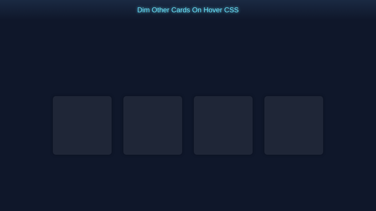
We are building a cool dimmable card component using pure CSS.
It’s useful for highlighting important content.
Dim Cards Hover CSS
Let’s create a dimmable card with a hover effect.
Here’s the cool part: we use CSS only.
HTML Structure
We start with simple HTML.
Don’t worry about this part, it’s easy.
index.html
<!DOCTYPE html><html><head><link rel='stylesheet' href='styles.css'></head><body><div class='card-container'><div class='card'></div><div class='card'></div><div class='card'></div><div class='card'></div></div></body></html>CSS Styling
Now we add some CSS magic.
Let me explain what’s happening here: we use CSS transitions.
styles.css
body { background-color: #0f172a; overflow: hidden; margin: 0; padding: 0; font-family: Arial, sans-serif; box-sizing: border-box; } .card-container { display: flex; justify-content: center; align-items: center; height: 100vh; } .card { width: 200px; height: 200px; margin: 20px; background-color: #2f3545; border-radius: 10px; box-shadow: 0 0 10px rgba(0, 0, 0, 0.5); transition: transform 0.2s ease-in-out; } .card:hover { transform: scale(1.1); z-index: 1; } .card:not(:hover) { opacity: 0.5; }How It All Works Together
Step 1: Create the Card
We create a card with a nice background.
Step 2: Add the Hover Effect
We add a hover effect to make it dim.
Step 3: Add Some Text
We add some text to make it more interesting.
Tips to Customise It
You can change the background color.
You can add more text or images.
You can use different fonts.
Pro tip: experiment with different styles to make it your own.
Dim Cards Hover Inspiration
Check out this example on MDN for more inspiration.
Also, take a look at CSS-Tricks for more CSS tricks.
And, don’t forget to check out our other tutorials like Sparkly Spoiler Text Effect with Pure HTML & CSS and CSS Breakpoint Units.
Conclusion
Congratulations, you just built a dimmable card component using pure CSS!
Remember, practice makes perfect, so keep building and experimenting.
Share your creation with us and don’t forget to check out our other tutorial on CSS Progress Circle Tutorial: HTML & Pure CSS Only.