Ever wanted to create a survey that just feels right? An Adaptive Survey Form isn’t just a collection of questions; it’s a dynamic, intuitive experience that guides users smoothly through their input. Today, we’re diving deep into building one using the core web technologies we all love: HTML for structure, CSS for stunning looks, and JavaScript to bring it all to life with intelligent interactions. You’ll learn how to craft a form that not only collects data efficiently but also adapts beautifully to different user inputs and screen sizes, making your surveys a joy to complete.
As developers, we know that user experience can make or break any application. A clunky, static form often leads to frustration and high abandonment rates. By making our forms adaptive, we essentially create a conversation with the user, presenting questions based on previous answers, offering immediate feedback, and ensuring a seamless flow. It’s about building a better digital handshake.
What We Are Building: An Adaptive Survey Form Experience
Imagine a survey that adjusts itself as you go, showing only relevant questions and hiding unnecessary ones. That’s the power of the Adaptive Survey Form we’re about to construct. Our design inspiration comes from modern onboarding flows and interactive wizards, where user engagement is paramount. We aim for a clean, minimalist aesthetic with clear calls to action and visual cues that help users understand their progress.
This type of form is incredibly trending because it dramatically boosts user completion rates. Traditional long forms can feel overwhelming, but an adaptive approach breaks down complex questionnaires into manageable, bite-sized steps. You’ll find these forms invaluable in various scenarios: collecting customer feedback, onboarding new users, conducting market research, or even creating interactive quizzes. Any time you need to gather information efficiently and pleasantly, an adaptive form is your go-to solution.
We’re not just building a form; we’re crafting an intelligent UI component. It responds to user choices, provides immediate validation, and ensures that the journey from start to submission is as smooth as possible. We’ll focus on accessibility and responsiveness, making sure our form looks and functions great for everyone, regardless of their device.
HTML Structure: The Semantic Foundation
Our HTML serves as the semantic backbone for the survey. We’ll use a main container for the entire form, then separate sections for each question or step. This modular approach makes it easy to manage content and allows JavaScript to dynamically show and hide elements.
index.html
<!DOCTYPE html>
<html lang="en">
<head>
<meta charset="UTF-8">
<meta name="viewport" content="width=device-width, initial-scale=1.0">
<title>Adaptive Survey Form</title>
<link rel="stylesheet" href="styles.css">
</head>
<body>
<div class="form-container">
<div class="progress-bar-container">
<div class="progress-bar" style="width: 33.3%;"></div>
</div>
<div class="form-steps">
<form id="surveyForm">
<!-- Step 1 -->
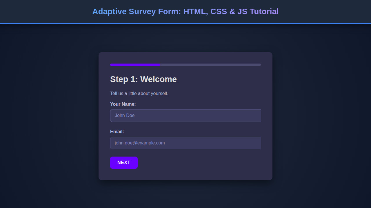
<div class="form-step active" data-step="1">
<h2>Step 1: Welcome</h2>
<p>Tell us a little about yourself.</p>
<div class="form-group">
<label for="name">Your Name:</label>
<input type="text" id="name" name="name" placeholder="John Doe">
</div>
<div class="form-group">
<label for="email">Email:</label>
<input type="email" id="email" name="email" placeholder="john.doe@example.com">
</div>
<button type="button" class="btn btn-next">Next</button>
</div>
<!-- Step 2 -->
<div class="form-step" data-step="2">
<h2>Step 2: Your Preferences</h2>
<div class="form-group">
<label>How often do you use web forms?</label>
<div class="radio-group">
<label><input type="radio" name="frequency" value="daily"> Daily</label>
<label><input type="radio" name="frequency" value="weekly"> Weekly</label>
<label><input type="radio" name="frequency" value="monthly"> Monthly</label>
</div>
</div>
<div class="form-group">
<label for="feedback">Any initial feedback?</label>
<textarea id="feedback" name="feedback" rows="4" placeholder="Your thoughts..."></textarea>
</div>
<div class="form-navigation">
<button type="button" class="btn btn-prev">Previous</button>
<button type="button" class="btn btn-next">Next</button>
</div>
</div>
<!-- Step 3 -->
<div class="form-step" data-step="3">
<h2>Step 3: Confirmation</h2>
<p>Thank you for participating! Review your answers before submitting.</p>
<div class="summary">
<p><strong>Name:</strong> <span id="summary-name"></span></p>
<p><strong>Email:</strong> <span id="summary-email"></span></p>
<p><strong>Frequency:</strong> <span id="summary-frequency"></span></p>
<p><strong>Feedback:</strong> <span id="summary-feedback"></span></p>
</div>
<div class="form-navigation">
<button type="button" class="btn btn-prev">Previous</button>
<button type="submit" class="btn btn-submit">Submit Survey</button>
</div>
</div>
</form>
</div>
</div>
<script src="script.js" defer></script>
</body>
</html>script.js
document.addEventListener('DOMContentLoaded', () => {
    const formSteps = document.querySelectorAll('.form-step');
    const progress = document.querySelector('.progress-bar');
    const totalSteps = formSteps.length;
    let currentStep = 0;

    function updateFormSteps() {
        formSteps.forEach((step, index) => {
            step.classList.toggle('active', index === currentStep);
            // Adjust position for animation direction
            if (index === currentStep) {
                step.style.transform = 'translateX(0)';
            } else if (index < currentStep) {
                step.style.transform = 'translateX(-100%)'; // Move previous steps to the left
            } else {
                step.style.transform = 'translateX(100%)'; // Keep next steps to the right
            }
        });
        updateProgressBar();
        updateSummary();
    }

    function updateProgressBar() {
        const percent = ((currentStep + 1) / totalSteps) * 100;
        progress.style.width = `${percent}%`;
    }

    function updateSummary() {
        if (currentStep === totalSteps - 1) { // Only update on the last step
            document.getElementById('summary-name').textContent = document.getElementById('name').value || 'N/A';
            document.getElementById('summary-email').textContent = document.getElementById('email').value || 'N/A';
            const frequencyRadios = document.querySelectorAll('input[name="frequency"]');
            let selectedFrequency = 'N/A';
            for (const radio of frequencyRadios) {
                if (radio.checked) {
                    selectedFrequency = radio.value;
                    break;
                }
            }
            document.getElementById('summary-frequency').textContent = selectedFrequency;
            document.getElementById('summary-feedback').textContent = document.getElementById('feedback').value || 'N/A';
        }
    }

    document.querySelectorAll('.btn-next').forEach(button => {
        button.addEventListener('click', () => {
            // Basic validation for current step before moving next
            if (currentStep === 0) { // Step 1 validation
                const name = document.getElementById('name');
                const email = document.getElementById('email');
                if (!name.value.trim() || !email.value.trim()) {
                    alert('Please fill in your Name and Email.');
                    return;
                }
                if (!/\S+@\S+\.\S+/.test(email.value)) {
                    alert('Please enter a valid Email address.');
                    return;
                }
            }

            if (currentStep < totalSteps - 1) {
                currentStep++;
                updateFormSteps();
            }
        });
    });

    document.querySelectorAll('.btn-prev').forEach(button => {
        button.addEventListener('click', () => {
            if (currentStep > 0) {
                currentStep--;
                updateFormSteps();
            }
        });
    });

    document.getElementById('surveyForm').addEventListener('submit', (e) => {
        e.preventDefault();
        alert('Survey Submitted! Thank you for your feedback.');
        const formData = new FormData(e.target);
        const data = Object.fromEntries(formData.entries());
        console.log(data);
        // In a real application, you'd send this data to a server
        // Example: fetch('/api/submit-survey', { method: 'POST', body: JSON.stringify(data) })
    });

    updateFormSteps(); // Initialize the form when DOM is loaded
});
CSS Styling: Bringing Design to Life
With a solid HTML structure in place, CSS steps in to give our form its appealing visual identity. We’ll leverage modern CSS techniques like Flexbox and CSS Grid for layout, ensuring our form is robust and responsive. Custom properties (CSS variables) will help us maintain a consistent design system, allowing for easy theming and adjustments.
styles.css
body {
    font-family: Arial, Helvetica, sans-serif;
    background-color: #1a1a2e; /* Dark background */
    color: #e0e0e0; /* Light text */
    display: flex;
    justify-content: center;
    align-items: center;
    min-height: 100vh;
    margin: 0;
    overflow: hidden;
    box-sizing: border-box;
}

.form-container {
    background-color: #2e2e4a; /* Slightly lighter dark card */
    padding: 40px;
    border-radius: 12px;
    box-shadow: 0 10px 30px rgba(0, 0, 0, 0.5); /* Cinematic shadow */
    width: 100%;
    max-width: 600px;
    box-sizing: border-box;
    overflow: hidden;
    position: relative;
}

h2 {
    color: #e0e0e0;
    margin-top: 0;
    margin-bottom: 20px;
    font-size: 1.8em;
}

p {
    color: #b0b0d0;
    line-height: 1.6;
}

.progress-bar-container {
    width: 100%;
    height: 8px;
    background-color: #4a4a6e;
    border-radius: 4px;
    margin-bottom: 30px;
    overflow: hidden;
}

.progress-bar {
    height: 100%;
    background-color: #6a00ff; /* Vibrant progress color */
    border-radius: 4px;
    transition: width 0.3s ease-in-out;
}

.form-steps {
    position: relative;
    overflow: hidden;
}

.form-step {
    opacity: 0;
    transform: translateX(100%);
    position: absolute;
    top: 0;
    left: 0;
    width: 100%;
    transition: opacity 0.4s ease-in-out, transform 0.4s ease-in-out;
    visibility: hidden;
}

.form-step.active {
    opacity: 1;
    transform: translateX(0);
    position: relative;
    visibility: visible;
}

.form-group {
    margin-bottom: 25px;
}

label {
    display: block;
    margin-bottom: 8px;
    color: #c0c0e0;
    font-weight: bold;
}

input[type="text"],
input[type="email"],
textarea {
    width: 100%;
    padding: 12px 15px;
    border: 1px solid #5a5a8e;
    border-radius: 8px;
    background-color: #3a3a5e;
    color: #e0e0e0;
    font-family: Arial, Helvetica, sans-serif;
    font-size: 1em;
    transition: border-color 0.3s ease, box-shadow 0.3s ease;
}

input[type="text"]::placeholder,
input[type="email"]::placeholder,
textarea::placeholder {
    color: #8a8ac0;
}

input[type="text"]:focus,
input[type="email"]:focus,
textarea:focus {
    border-color: #6a00ff;
    box-shadow: 0 0 0 3px rgba(106, 0, 255, 0.4);
    outline: none;
}

.radio-group label {
    display: inline-flex;
    align-items: center;
    margin-right: 20px;
    margin-bottom: 10px;
    cursor: pointer;
}

.radio-group input[type="radio"] {
    margin-right: 8px;
    appearance: none;
    width: 18px;
    height: 18px;
    border: 2px solid #6a00ff;
    border-radius: 50%;
    background-color: #3a3a5e;
    position: relative;
    cursor: pointer;
    transition: background-color 0.2s ease;
}

.radio-group input[type="radio"]:checked {
    background-color: #6a00ff;
}

.radio-group input[type="radio"]:checked::before {
    content: '';
    display: block;
    width: 8px;
    height: 8px;
    background-color: #e0e0e0;
    border-radius: 50%;
    position: absolute;
    top: 50%;
    left: 50%;
    transform: translate(-50%, -50%);
}

.btn {
    padding: 12px 25px;
    border: none;
    border-radius: 8px;
    font-size: 1em;
    cursor: pointer;
    transition: background-color 0.3s ease, transform 0.2s ease;
    font-weight: bold;
    text-transform: uppercase;
    letter-spacing: 0.5px;
}

.btn-next {
    background-color: #6a00ff; /* Primary action */
    color: #ffffff;
}

.btn-next:hover {
    background-color: #8c3aff;
    transform: translateY(-2px);
}

.btn-prev {
    background-color: #4a4a6e; /* Secondary action */
    color: #e0e0e0;
    margin-right: 15px;
}

.btn-prev:hover {
    background-color: #5a5a8e;
    transform: translateY(-2px);
}

.btn-submit {
    background-color: #00bf75; /* Success/Submit action */
    color: #ffffff;
}

.btn-submit:hover {
    background-color: #00e08c;
    transform: translateY(-2px);
}

.form-navigation {
    display: flex;
    justify-content: flex-end;
    margin-top: 30px;
}

.form-step:first-child .btn-prev {
    display: none;
}
.summary {
    background-color: #3a3a5e;
    border-radius: 8px;
    padding: 20px;
    margin-top: 20px;
    border: 1px dashed #6a00ff;
}

.summary p {
    margin-bottom: 10px;
    color: #e0e0e0;
}

.summary p:last-child {
    margin-bottom: 0;
}

.summary strong {
    color: #6a00ff;
}
Step-by-Step Breakdown: The Adaptive Survey Form in Action
Now for the exciting part: understanding how JavaScript weaves through our HTML and CSS to create a truly adaptive experience. This section dives into the ‘how’ behind making your Adaptive Survey Form intelligent and user-friendly. We’ll explore the core JavaScript logic that drives the form’s dynamic behavior, from managing steps to validating input and providing real-time feedback.
Initial Setup and Form Container
At the very beginning, JavaScript needs to grab references to our form elements. This involves selecting the main form, individual question sections, navigation buttons, and any progress indicators. We often store these in variables for easy access. We’ll also define an initial state for our survey, such as which step is currently active and what data has been collected so far. Think of this as setting up your control panel.
When the page loads, JavaScript can ensure only the first question section is visible, keeping other sections hidden initially. This provides a clean start for the user, preventing them from being overwhelmed by all questions at once. It’s about a gradual unveiling of the content.
Dynamic Question Rendering
This is where the ‘adaptive’ magic truly shines. Based on a user’s answer to a previous question, JavaScript decides which subsequent question to display. For instance, if a user selects “Yes” to “Do you own a pet?”, the form might then show a question asking “What kind of pet?”. If they select “No”, that pet-related question is skipped entirely.
We achieve this by setting up a mapping of question IDs to their dependencies or conditional logic. When an input’s value changes, our script checks these rules and updates the visibility of the next relevant question section. This dynamic flow ensures users only see questions pertinent to them, significantly improving the survey’s efficiency and relevance.
Input Handling and Validation
As users interact with input fields, JavaScript continuously monitors their activity. We attach event listeners to form elements (like input, change, and click) to capture user responses in real-time. This immediate feedback loop is crucial for an adaptive form. For example, if a required text field is left empty, we can instantly display an error message rather than waiting for submission. Validating user input before moving to the next step or submitting the form helps maintain data quality and reduces user frustration.
“A well-validated input isn’t just about data integrity; it’s about guiding the user towards correct and complete information, enhancing their overall satisfaction with the form.”
For more advanced data processing or structured input, exploring LLM JSON Parsing: JavaScript Tutorial could offer insights into handling and transforming complex data formats effectively, especially useful if your survey responses need to be sent to an API.
Navigation Between Steps
Our form won’t just leap from one question to the next; it will provide clear navigation. JavaScript manages the “Next” and “Previous” buttons. When “Next” is clicked, the script first validates the current step’s inputs. If valid, it hides the current question and reveals the next appropriate one based on our adaptive logic. The “Previous” button simply reverses this, taking the user back to the prior step, allowing them to review or change answers.
We often use CSS classes to manage the visibility of different question steps, toggling them with JavaScript. For instance, an active class could show a section, while its absence keeps it hidden. This approach keeps our visual states clean and predictable, ensuring smooth transitions between questions.
Progress Visualization
Nobody likes filling out a form without knowing how much longer it will take! A visual progress indicator, often a bar or a series of dots, provides essential feedback. JavaScript calculates the user’s progress based on the number of completed steps versus the total (or remaining) steps. As the user advances, the script updates the width of a progress bar or changes the styling of progress dots.
This visual cue significantly improves user experience by managing expectations and motivating users to complete the survey. You might even use something like the Intersection Observer API: JS Explained with Real Examples to enhance animations or trigger events when specific sections become visible in more complex layouts.
Form Submission and Feedback
Once all questions are answered, the final step involves submitting the collected data. JavaScript handles the form’s submit event. Instead of a traditional page refresh, we’ll often prevent the default form submission and use AJAX (Asynchronous JavaScript and XML) to send the data to a server in the background. This provides a snappier, more modern user experience.
After submission, we offer immediate feedback to the user: a “Thank You” message, a summary of their responses, or a redirect to a confirmation page. This confirms that their effort was successful and provides a satisfying conclusion to their interaction with your adaptive survey.
“Immediate, clear feedback post-submission transforms a mere data entry task into a gratifying interaction for the user.”
Making It Responsive: Adapting to Every Screen
A truly adaptive survey isn’t just about dynamic questions; it’s also about looking great on any device. We adopt a mobile-first approach, designing and styling for smaller screens first, then progressively enhancing for larger viewports using CSS media queries. This ensures a solid base experience for mobile users, who often make up a significant portion of web traffic.
Media queries allow us to apply different styles based on screen width, height, or even orientation. For instance, on a small screen, we might stack elements vertically, while on a desktop, they could be side-by-side. Using relative units like percentages, em, rem, and viewport units (vw, vh) also helps our design fluidly scale. Always test your form across various devices and use your browser’s developer tools to simulate different screen sizes. Learn more about responsive design principles on MDN Web Docs.
Final Output: A Polished, Interactive Form
When you put all these pieces together, the final output is a slick, interactive survey that feels intuitive and professional. Users experience a form where questions appear logically, progress is clearly visible, and input is validated on the fly. The design is clean and responsive, adapting effortlessly from a smartphone screen to a large desktop monitor. Accessibility is also key; ensuring proper Color Contrast Tool: HTML, CSS & JS Accessibility Guide is met helps everyone use your form easily.
Visual elements like subtle transitions for showing/hiding questions, engaging button styles, and clear typography all contribute to a premium user experience. It’s a testament to how HTML, CSS, and JavaScript, when used together thoughtfully, can create truly engaging web components.
Conclusion: Beyond Basic Forms
You’ve seen how powerful an Adaptive Survey Form can be, transforming a potentially tedious task into an engaging interaction. By combining semantic HTML, flexible CSS, and dynamic JavaScript, we empower users with a guided, personalized journey through data collection. This approach isn’t just a nicety; it’s a necessity for modern web applications that prioritize user satisfaction and efficient data gathering.
The principles learned here – dynamic content, real-time validation, responsive design, and clear progress indication – extend far beyond surveys. You can apply these concepts to multi-step registration forms, interactive wizards, product configurators, or even educational quizzes. The ability to create web experiences that respond intelligently to user input is a fundamental skill for any web developer. Keep experimenting, keep building, and keep making the web a more interactive and user-friendly place!