Ever notice that little icon on your favorite social media platforms or productivity apps? That’s the Notification Bell, a ubiquitous element in modern web design! It’s an essential part of user experience, quietly signaling new activity and keeping us informed without overwhelming us. Today, we’re going to demystify this seemingly complex component and build our very own, step-by-step, using just HTML, CSS, and JavaScript.
What We Are Building
We’re crafting a beautiful and functional notification bell UI, complete with an interactive dropdown for displaying messages and a dynamic badge to show unread counts. Think of platforms like Facebook, Twitter, or even GitHub – they all feature a version of this bell. Our version will be clean, intuitive, and responsive, ready to integrate into any project you’re working on.
Why are notification bells trending? They’re a cornerstone of engagement. They provide instant feedback, drawing users back into an application and highlighting important updates. Whether it’s a new message, a friend request, or a system alert, a well-implemented bell enhances user retention and ensures critical information isn’t missed. This small UI element holds significant power in shaping user behavior.
You can use this notification bell in various scenarios: e-commerce sites for order updates, social platforms for interactions, dashboards for system alerts, or even personal portfolio sites to announce new content. The possibilities are truly endless. Building this will equip you with foundational skills in interactivity and modern UI patterns.
HTML Structure
Our HTML provides the basic semantic structure for the bell, the count badge, and the dropdown menu. It’s clean and accessible, forming the backbone of our notification system.
<div class="notification-bell-container">
    <button class="notification-bell" aria-label="Notifications">
        <!-- Bell SVG Icon -->
        <svg class="bell-icon" viewBox="0 0 24 24" fill="currentColor">
            <path d="M12 22c1.1 0 2-.9 2-2h-4c0 1.1.9 2 2 2zm6-6v-5c0-3.07-1.63-5.64-4.5-6.32V4c0-.83-.67-1.5-1.5-1.5s-1.5.67-1.5 1.5v.68C7.63 5.36 6 7.93 6 11v5l-2 2v1h16v-1l-2-2zm-2 1H8v-6c0-2.48 1.51-4.5 4-4.5s4 2.02 4 4.5v6z"/>
        </svg>
        <span class="notification-count">3</span>
    </button>
    <div class="notification-dropdown">
        <ul>
            <li>New message from Alex!</li>
            <li>Your post received 2 new likes.</li>
            <li>Reminder: Meeting at 3 PM.</li>
        </ul>
        <button class="clear-notifications">Clear All</button>
    </div>
</div>
CSS Styling
Our CSS will transform raw HTML into an elegant notification bell. We’ll manage its position, visual appearance, and hide the dropdown until activated. We’ll also add subtle transitions for a smoother user experience.
/* Basic Resets & Body Styling (for demo purposes) */
body {
    font-family: 'Segoe UI', Tahoma, Geneva, Verdana, sans-serif;
    display: flex;
    justify-content: center;
    align-items: flex-start; /* Align to top for better visibility */
    min-height: 100vh;
    background-color: #f0f2f5;
    margin: 20px;
    padding: 0;
}

/* Notification Bell Container */
.notification-bell-container {
    position: relative;
    display: inline-block;
    margin-top: 50px;
}

/* The Bell Button Itself */
.notification-bell {
    background-color: #ffffff;
    border: none;
    border-radius: 50%;
    width: 50px;
    height: 50px;
    display: flex;
    justify-content: center;
    align-items: center;
    cursor: pointer;
    box-shadow: 0 2px 5px rgba(0, 0, 0, 0.1);
    position: relative;
    transition: background-color 0.3s ease, transform 0.2s ease;
}

.notification-bell:hover {
    background-color: #e6e6e6;
    transform: translateY(-2px);
}

.notification-bell:active {
    transform: translateY(0);
}

/* Bell Icon SVG */
.bell-icon {
    width: 24px;
    height: 24px;
    color: #333;
}

/* Notification Count Badge */
.notification-count {
    position: absolute;
    top: -5px;
    right: -5px;
    background-color: #ff4d4f; /* Red */
    color: white;
    font-size: 12px;
    font-weight: bold;
    border-radius: 50%;
    padding: 4px 7px;
    min-width: 20px;
    text-align: center;
    box-shadow: 0 1px 3px rgba(0, 0, 0, 0.2);
    opacity: 1;
    transform: scale(1);
    transition: opacity 0.3s ease, transform 0.3s ease;
}

.notification-count.hidden {
    opacity: 0;
    transform: scale(0);
    pointer-events: none;
}

/* Notification Dropdown */
.notification-dropdown {
    position: absolute;
    top: 60px; /* Position below the bell */
    right: 0;
    background-color: #ffffff;
    border-radius: 8px;
    box-shadow: 0 5px 15px rgba(0, 0, 0, 0.15);
    width: 300px;
    max-height: 350px;
    overflow-y: auto;
    z-index: 1000;
    padding: 10px 0;
    opacity: 0;
    visibility: hidden;
    transform: translateY(-10px);
    transition: opacity 0.3s ease, transform 0.3s ease, visibility 0.3s ease;
}

.notification-dropdown.active {
    opacity: 1;
    visibility: visible;
    transform: translateY(0);
}

.notification-dropdown ul {
    list-style: none;
    padding: 0;
    margin: 0;
}

.notification-dropdown li {
    padding: 12px 20px;
    border-bottom: 1px solid #eee;
    color: #333;
    font-size: 14px;
    line-height: 1.4;
}

.notification-dropdown li:last-child {
    border-bottom: none;
}

.notification-dropdown li:hover {
    background-color: #f5f5f5;
}

.notification-dropdown .clear-notifications {
    display: block;
    width: calc(100% - 40px); /* Adjust for padding */
    margin: 10px auto 10px auto;
    padding: 10px 15px;
    background-color: #007bff;
    color: white;
    border: none;
    border-radius: 5px;
    cursor: pointer;
    font-size: 14px;
    text-align: center;
    transition: background-color 0.3s ease;
}

.notification-dropdown .clear-notifications:hover {
    background-color: #0056b3;
}

/* Empty state styling */
.notification-dropdown.empty ul {
    display: flex;
    justify-content: center;
    align-items: center;
    min-height: 100px;
    color: #666;
    font-style: italic;
}

.notification-dropdown.empty .clear-notifications {
    display: none; /* Hide clear button if empty */
}
Step-by-Step Breakdown
Let’s walk through how each piece of our notification bell comes together, from its foundational HTML to its dynamic JavaScript behavior.
Setting Up the HTML
The core of our component is the .notification-bell-container, which acts as a wrapper for both the button and the dropdown. Inside, a <button> with the class .notification-bell houses our SVG bell icon and a <span> for the dynamic count. Using a <button> is crucial for accessibility, allowing users to interact with it using keyboards or assistive technologies. The SVG icon is a common practice, ensuring scalability without loss of quality. We also include an aria-label for screen readers, enhancing accessibility. Finally, a .notification-dropdown div holds our unordered list of notifications and a ‘Clear All’ button.
Accessibility is not just a feature; it’s a fundamental requirement for inclusive web development. Always consider how your UI interacts with all users.
Basic Bell Styling
First, we center our content for demonstration. The .notification-bell-container is set to position: relative, which is essential for positioning its child elements, like the dropdown, absolutely within its boundaries. The .notification-bell button gets a circular shape, a subtle shadow, and a pointer cursor to indicate interactivity. We use Flexbox to perfectly center the SVG icon inside the button. Transitions are added to hover states, providing a smooth visual feedback when a user interacts with the bell.
Adding the Badge & Animations
The .notification-count span is absolutely positioned to appear as an overlay badge on the top-right of the bell. We give it a bold red background, white text, and a circular shape. Crucially, we use opacity and transform: scale() for its visibility and an engaging pop-in/pop-out effect. When the count is zero or notifications are cleared, we’ll add a .hidden class to this badge via JavaScript, triggering its smooth disappearance. This animation makes the Notification Bell feel much more alive!
Similarly, the .notification-dropdown starts as opacity: 0 and visibility: hidden, along with a slight translateY for a subtle slide-down animation when it appears. The .active class, toggled by JavaScript, will bring it into view. Lists within the dropdown are styled plainly, and each list item gets a bottom border for separation. The ‘Clear All’ button is styled to be prominent and easy to click. For more complex list UIs, you might explore components like our Accessible Tabs tutorial to organize content.
JavaScript Interactivity
Here’s where the magic happens! We’ll use JavaScript to toggle the visibility of the notification dropdown when the bell is clicked. We’ll also handle updating the notification count.
document.addEventListener('DOMContentLoaded', () => {
    const notificationBell = document.querySelector('.notification-bell');
    const notificationDropdown = document.querySelector('.notification-dropdown');
    const notificationCount = document.querySelector('.notification-count');
    const clearNotificationsBtn = document.querySelector('.clear-notifications');
    const notificationList = notificationDropdown.querySelector('ul');

    // Toggle dropdown visibility
    notificationBell.addEventListener('click', (event) => {
        event.stopPropagation(); // Prevent document click from immediately closing
        notificationDropdown.classList.toggle('active');
        // Optional: Add/remove 'active' class on bell for visual feedback
        notificationBell.classList.toggle('active');
    });

    // Close dropdown when clicking outside
    document.addEventListener('click', (event) => {
        if (!notificationBell.contains(event.target) && !notificationDropdown.contains(event.target)) {
            notificationDropdown.classList.remove('active');
            notificationBell.classList.remove('active');
        }
    });

    // Clear notifications
    clearNotificationsBtn.addEventListener('click', () => {
        notificationList.innerHTML = '<li>No new notifications.</li>';
        notificationDropdown.classList.add('empty');
        updateNotificationCount(0);
        // Optional: Keep dropdown open after clearing or close it
        // notificationDropdown.classList.remove('active');
    });

    // Function to update the notification count
    function updateNotificationCount(count) {
        if (count > 0) {
            notificationCount.textContent = count;
            notificationCount.classList.remove('hidden');
            notificationDropdown.classList.remove('empty');
        } else {
            notificationCount.classList.add('hidden');
            // Ensure dropdown shows empty message if cleared
            if (notificationList.children.length === 0 || notificationList.children[0].textContent === 'No new notifications.') {
                 notificationDropdown.classList.add('empty');
            }
        }
    }

    // Initial setup: check if there are notifications
    if (notificationList.children.length === 1 && notificationList.children[0].textContent === 'No new notifications.') {
        updateNotificationCount(0);
    } else {
        updateNotificationCount(notificationList.children.length);
    }
});
We attach an event listener to the notificationBell. When clicked, it toggles the .active class on the notificationDropdown, making it visible or hidden. We also add a listener to the document to close the dropdown if the user clicks anywhere outside of the bell or its dropdown. The clearNotificationsBtn clears the notification list and updates the count. Note the stopPropagation() method; this is vital to prevent the document’s click listener from immediately closing the dropdown after it’s opened. You can also imagine fetching data with the `fetch` API to dynamically load notifications, a technique covered in our GraphQL Fetching guide.
Good JavaScript elevates user experience. Focus on seamless interactions and intuitive controls.
Making It Responsive
Ensuring our Notification Bell looks great on all devices is paramount. Our current design is quite flexible by default due to relative sizing and positioning. However, for a fully responsive approach, especially if the dropdown content becomes extensive or its width needs adjustment on smaller screens, we can employ media queries.
For instance, on mobile devices, you might want the dropdown to span a greater width or even take up the full width of the screen for a better reading experience. Consider this basic example:
@media (max-width: 768px) {
    .notification-dropdown {
        width: 90vw; /* Occupy 90% of viewport width */
        right: 5vw; /* Center it roughly */
        left: auto; /* Reset left property if any */
    }
}

@media (max-width: 480px) {
    .notification-bell {
        width: 45px;
        height: 45px;
    }

    .bell-icon {
        width: 20px;
        height: 20px;
    }

    .notification-count {
        font-size: 10px;
        padding: 3px 6px;
        min-width: 18px;
    }
}
By using percentages and viewport units, the dropdown scales gracefully. Additionally, we might slightly reduce the bell’s size and the badge’s padding on very small screens to ensure it doesn’t feel too large. This mobile-first approach ensures that the fundamental layout works well on the smallest screens before progressively enhancing it for larger viewports. Sometimes, even the simplest components, like a custom dropdown, require careful responsive considerations, as detailed in our Custom Select Dropdown tutorial.
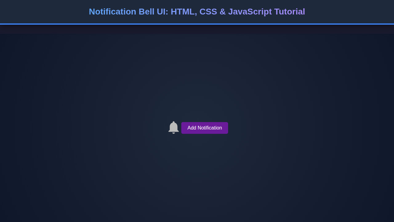
Final Output
With HTML defining the structure, CSS providing the aesthetics and animations, and JavaScript adding dynamic interaction, we’ve successfully built a fully functional notification bell. You have a sleek, circular bell button, a vibrant red badge indicating new notifications, and a smoothly animating dropdown displaying recent alerts. When there are no notifications, the badge cleverly disappears, signaling a clear inbox. The ‘Clear All’ button provides quick management, enhancing user control.
The transitions for both the badge and the dropdown add a professional polish, making the UI feel modern and responsive. The implementation focuses on best practices, including accessibility considerations for the button and semantic HTML. This component is now ready to be integrated into your web projects.
Conclusion
And there you have it! From a simple idea to a fully functional UI element, you’ve learned how to construct an interactive Notification Bell using core web technologies. We covered semantic HTML for structure, elegant CSS for styling and animations, and practical JavaScript for dynamic behavior and accessibility. This project reinforces important frontend development principles, from managing component states to ensuring responsiveness.
Implementing a notification bell elevates user engagement and provides crucial feedback in applications. Feel free to customize its appearance, add more complex notification logic (like fetching data from an API, perhaps using Fetch API), or experiment with different animation styles. You could even integrate a real-time system using WebSockets for live updates! Keep experimenting, keep building, and keep pushing the boundaries of what you can create on the web. Happy coding!