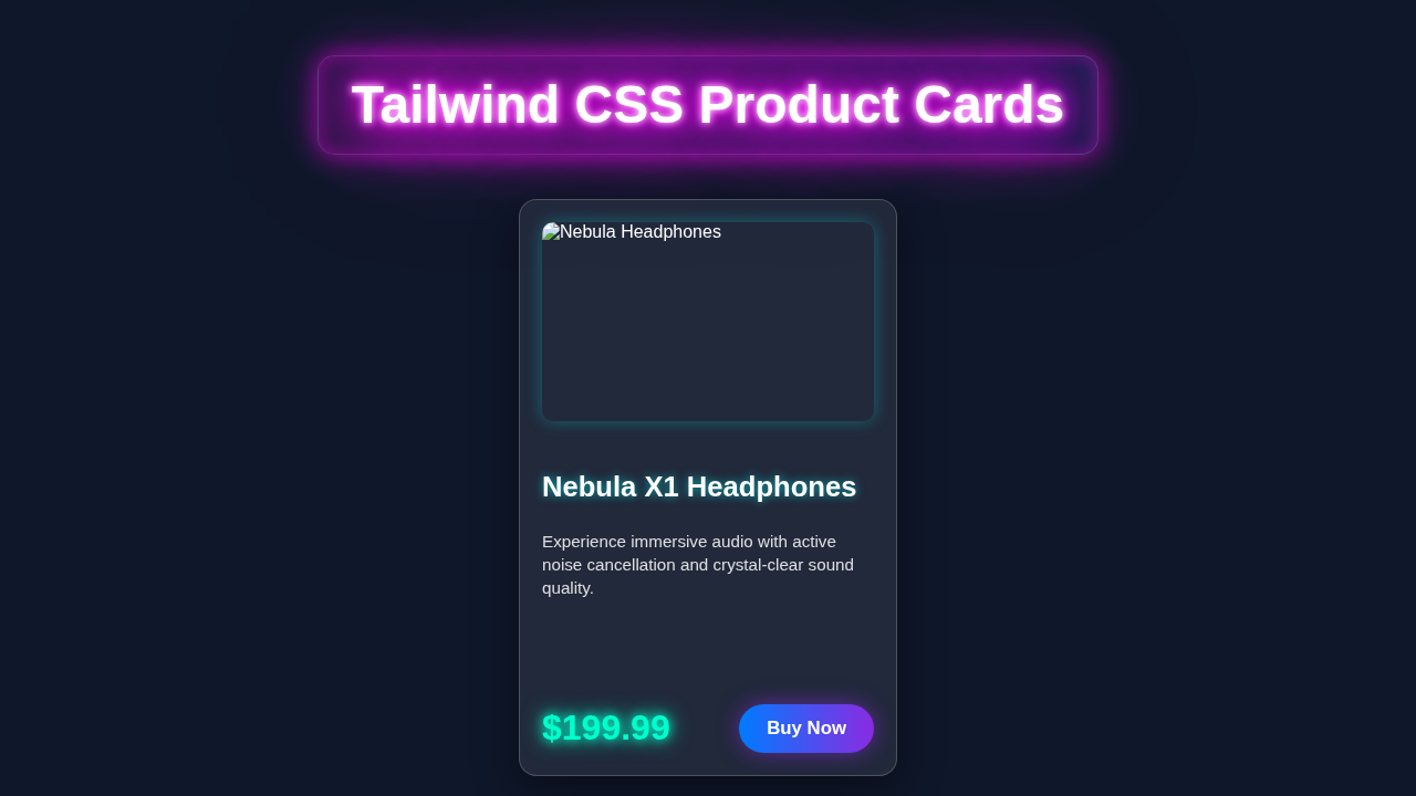
Hey there, awesome dev! If you have wanted to build a stunning, responsive Tailwind Product Card but had no idea where to start, you are in the right place. Today, we’re going to build something super useful. We’ll craft a beautiful product card component step-by-step. It will look great on any screen size. Get ready to add some serious style to your projects!
We’ll use the magic of Tailwind CSS. This means less custom CSS and more utility classes. You will love how quickly you can bring designs to life. Let’s dive in and create something amazing together!
What We Are Building: Your Next Tailwind Product Card
Imagine showcasing your products with flair! That’s exactly what we are doing. We’ll build a versatile product card. It will feature an eye-catching image, a clear product title, a brief description, the price, and a compelling “Add to Cart” button. It’s a complete package!
The best part? It’s fully responsive. This means your card will automatically adapt. It will look perfect on mobile phones, tablets, and large desktop monitors. We’ll design it to be clean and modern. This component is perfect for e-commerce sites, portfolios, or any page needing to display items beautifully. It’s truly a fundamental building block for many web projects.
HTML Structure: The Foundation of Our Card
First, we need the basic skeleton for our product card. This HTML provides the content. It gives us places for the image, text, and buttons. We’ll keep it semantic and clean. Each part has a specific role. This helps Tailwind CSS work its magic later. Don’t worry about the styling yet; we are just setting up the pieces!
index.html
<!DOCTYPE html>
<html lang="en">
<head>
    <meta charset="UTF-8">
    <meta name="viewport" content="width=device-width, initial-scale=1.0">
    <title>Tailwind CSS Product Card</title>
    <!--
        Link to Tailwind CSS CDN - For quick development and tutorials.
        For production, it is highly recommended to install Tailwind CSS locally
        and use a build process (e.g., PostCSS, Vite) to purge unused CSS for optimal performance.
    -->
    <script src="https://cdn.tailwindcss.com"></script>
    <!--
        Link to your custom styles.css file.
        This file is minimal as Tailwind CSS handles most styling.
        Use it for global resets or custom CSS not achievable with Tailwind utility classes.
    -->
    <link rel="stylesheet" href="styles.css">
    <style>
        /*
            Ensure safe fallback font usage directly in HTML for immediate rendering
            and to override any potential browser defaults before custom CSS loads.
        */
        body {
            font-family: Arial, Helvetica, sans-serif;
        }
    </style>
</head>
<body class="bg-gray-100 flex items-center justify-center min-h-screen p-4">

    <!--
        Product Card Component
        This component showcases a simple, responsive product card
        built entirely with Tailwind CSS utility classes.
    -->
    <div class="
        max-w-xs mx-auto
        bg-white
        shadow-xl
        rounded-lg
        overflow-hidden
        transform transition-all duration-300 hover:scale-105
        border border-gray-200
    ">
        <!-- Product Image -->
        <img
            class="w-full h-48 object-cover object-center"
            src="https://via.placeholder.com/400x300/FCA5A5/FFFFFF?text=Product+Image"
            alt="Stylish Product Image"
        >

        <div class="p-5">
            <!-- Product Title -->
            <h3 class="text-gray-900 font-bold text-xl mb-2">
                Premium Wireless Earbuds
            </h3>

            <!-- Product Description -->
            <p class="text-gray-600 text-sm mb-4">
                Immerse yourself in high-fidelity sound with superior comfort and long-lasting battery life.
            </p>

            <div class="flex items-center justify-between">
                <!-- Product Price -->
                <span class="text-gray-900 font-extrabold text-2xl">
                    $129.99
                </span>

                <!-- Add to Cart Button -->
                <button class="
                    bg-blue-600 hover:bg-blue-700
                    text-white
                    font-semibold
                    py-2 px-4
                    rounded-full
                    transition duration-300 ease-in-out
                    shadow-md hover:shadow-lg
                    focus:outline-none focus:ring-2 focus:ring-blue-500 focus:ring-opacity-75
                ">
                    Add to Cart
                </button>
            </div>
        </div>
    </div>

</body>
</html>
CSS Styling: Bringing Our Tailwind Product Card to Life
Now, for the fun part! We’ll use Tailwind CSS utility classes to style our card. This approach saves a lot of time. Instead of writing custom CSS, we apply pre-defined classes directly in our HTML. We’ll handle everything from layout to colors and responsiveness. You’ll see how easy it is to make things look fantastic. Prepare to be amazed by Tailwind’s power!
styles.css
/*
    styles.css

    This file is intentionally minimal as Tailwind CSS handles most of the styling.
    You can add custom CSS here if you need to override Tailwind defaults
    or implement styles that cannot be achieved with utility classes alone.

    For this tutorial, we ensure consistent box-sizing.
*/

/*
    Important: If you are using a local Tailwind CLI setup,
    you would typically @import your Tailwind directives here:

    @tailwind base;
    @tailwind components;
    @tailwind utilities;
*/

/* Ensure box-sizing is border-box for all elements for consistent layout behavior */
html {
    box-sizing: border-box;
}

*,
*::before,
*::after {
    box-sizing: inherit;
}

/*
    A safe fallback font family is set directly in the <head> of index.html for immediate effect.
    Tailwind's default font stack already includes system fonts that often resolve to Arial/Helvetica
    on most operating systems, ensuring broad compatibility.
*/
JavaScript: Adding Interactivity (Optional)
For this specific tutorial, we are focusing on building the responsive UI of the Tailwind Product Card using HTML and CSS. You won’t need any JavaScript for the core card structure and styling! However, you could always add JS later. This might be for “Add to Cart” functionality, image carousels, or dynamic content loading. For now, let’s appreciate the power of pure HTML and CSS!
How It All Works Together: Dissecting Our Responsive Design
Let’s break down the magic behind our beautiful product card. We’ll look at each section. You’ll understand why each class is there. This way, you can easily tweak it later. It’s all about combining Tailwind’s utility classes effectively.
The Card Container: Our Responsive Wrapper
We wrap everything in a main div. This container sets the stage. We use classes like bg-white and rounded-lg for its look. The shadow-md class adds a nice depth effect. On small screens, it might be a single column. As screens grow, we want multiple cards to appear in a grid. This is where responsive utility classes shine. We use md:grid-cols-2 and lg:grid-cols-3. These make our cards arrange themselves automatically. Isn’t that clever? You can learn more about creating beautiful layouts with Tailwind in this responsive landing page guide.
The Product Image: Visual Appeal
Every product card needs a great image. We make sure it fills its space nicely. The w-full class makes it take up the full width. h-48 gives it a fixed height. We use object-cover to ensure the image looks good without distortion. It smartly crops the image if needed. We also add rounded-t-lg to match the card’s overall rounded corners. This creates a visually cohesive unit. It helps the image blend perfectly with the card’s design. Remember to always use high-quality images!
Pro Tip: Always optimize your images for the web! Large images can slow down your page. Tools like TinyPNG or online image compressors can help a lot. Faster load times mean happier users!
The Content Area: Text and Details
This is where all the product information lives. We give it some padding using p-4. This creates breathing room around our text. We use flex and flex-col to stack items vertically. This ensures the title, description, and price are neatly organized. We also apply justify-between. This pushes the price/button section to the bottom. It helps create a balanced layout. The text colors like text-gray-800 make everything easy to read. This attention to detail makes a big difference. For a deeper dive into how Flexbox works, you can check out A Complete Guide to Flexbox on CSS-Tricks.
Product Title and Description: Clear Information
The product title stands out with font-bold and text-xl. This makes it easily noticeable. We use a slightly smaller text size for the description with text-gray-600 and text-sm. A cool trick here is using line-clamp-2. This limits the description to just two lines. If it’s longer, it adds an ellipsis. This keeps your cards uniform and clean. It’s a great way to manage varying content lengths. You can adjust the number after line-clamp- to fit your needs. Check out the MDN documentation on -webkit-line-clamp for more details.
Price and Button: Call to Action
The price gets its own special treatment. We make it prominent with text-lg and font-semibold. A distinct color like text-blue-600 helps it stand out. The “Add to Cart” button is crucial. We style it with a background color like bg-blue-500 and text-white. Adding hover:bg-blue-600 creates a nice interactive effect. When the user hovers, the button changes color slightly. It provides good visual feedback. Also, rounded-md softens the button’s edges. This creates a friendly and inviting look. You can also explore adding dark mode styles to your buttons for a more complete UI experience.
Pro Tip: Good contrast is key for accessibility! Ensure your text colors have enough contrast against their backgrounds. Tailwind provides a wide range of shades to help you achieve this easily.
Tips to Customise It: Make It Your Own!
You’ve built a fantastic Tailwind Product Card! Now, how about making it even more unique? Tailwind makes customization a breeze. Here are a few ideas to get your creative juices flowing:
-
Add a “Favorite” or “Wishlist” Icon: Include a small heart icon in the corner. You could toggle its fill color with JavaScript. This lets users save products for later. Consider placing it in the top right corner of the image!
-
Implement a “Quick View” Button: Add another button or icon. When clicked, it could open a modal with more product details. This keeps users on the page. It provides a faster browsing experience. This is common in e-commerce.
-
Stock Status Indicator: Display “In Stock” or “Out of Stock” clearly. Use different colors for each status. A green badge for in stock and a red one for out of stock. This informs users at a glance. It helps manage expectations.
-
Product Variations (Size/Color): If your product has options, add small swatches or a dropdown. Users can select their preferred variation. This makes the card more interactive. It offers a richer user experience. Remember to check out how to implement dynamic classes for states like dark mode to style these variations!
Conclusion: You Did It!
Wow, you just built a responsive and beautiful Tailwind Product Card from scratch! You’ve learned how to structure your HTML and apply powerful Tailwind CSS utility classes. This project gives you a solid foundation. You can now create amazing UI components. You should be super proud of this accomplishment!
Keep experimenting with different styles and layouts. Tailwind CSS opens up a world of possibilities. Don’t be afraid to tweak the colors, fonts, or spacing. Share your creations with us! We love seeing what our community builds. Happy coding, and keep pushing those pixels!