Tailwind Product Filter: Build with HTML & Tailwind CSS Utilities
Hey! If you’ve wanted to build a Tailwind Product Filter but felt a bit overwhelmed, you are definitely in the right place. We are going to build something super cool today. Together, we will create a dynamic product filter UI. This project uses just HTML, Tailwind CSS, and vanilla JavaScript. You will learn how to make your product listings interactive. Get ready to add an awesome skill to your web development toolkit!
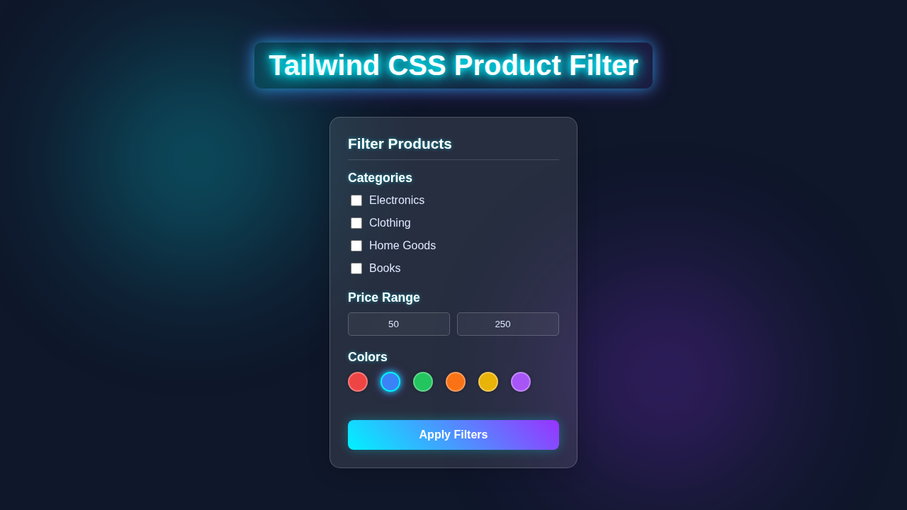
What We Are Building: A Dynamic Tailwind Product Filter UI
Imagine a sleek online store. It has many products. How do users find what they need? With a powerful filter, of course! We are building exactly that. Our project will display a grid of products. Users can click category buttons to see only relevant items. They can also type into a search bar for real-time results. This means a fantastic user experience. Plus, we will style everything beautifully with Tailwind CSS utilities. This makes our UI look professional without writing a single line of traditional CSS!
Pro Tip: Building interactive UIs like this helps users find what they want faster. This improves their experience significantly! Think about your favorite e-commerce sites. They all use filters!
HTML Structure: The Foundation of Our Filter
Our HTML sets up the stage. We will create a main container to hold everything. Inside, there will be buttons for different product categories. A search input will sit at the top. Below that, we’ll have a grid where our products will appear. We keep our HTML clean and semantic. Tailwind CSS classes will handle all the visual magic directly within these elements. Here’s our basic HTML scaffold:
index.html
<!DOCTYPE html>
<html lang="en">
<head>
    <meta charset="UTF-8">
    <meta name="viewport" content="width=device-width, initial-scale=1.0">
    <title>Tailwind CSS Product Filter</title>
    <!-- Link to your compiled Tailwind CSS file -->
    <!-- In a real project, this would be generated by a build process (e.g., `npx tailwindcss -i ./styles.css -o ./dist/output.css`) -->
    <link href="./styles.css" rel="stylesheet">
    <style>
        /* Ensure safe fonts and consistent box-sizing */
        body {
            font-family: Arial, Helvetica, sans-serif;
            margin: 0;
            padding: 0;
            box-sizing: border-box;
        }
        *, *::before, *::after {
            box-sizing: inherit;
        }
    </style>
</head>
<!--
    The `dark` class is toggled on the `html` element for dark mode support.
    For this demo, we'll force it on `body` for consistent preview (or you can remove it).
    In a real app, you might use a toggle or system preference to add/remove this class on the <html> tag.
-->
<body class="bg-gray-100 dark:bg-gray-900 text-gray-900 dark:text-gray-100 min-h-screen flex items-center justify-center p-4">

    <!-- Product Filter Container -->
    <div class="w-full max-w-sm bg-white dark:bg-gray-800 rounded-lg shadow-xl p-6 transition-colors duration-300">
        <h2 class="text-2xl font-bold mb-6 text-center dark:text-white">Filter Products</h2>

        <!-- Categories Section -->
        <div class="mb-6">
            <h3 class="text-lg font-semibold mb-3 border-b pb-2 border-gray-200 dark:border-gray-700 dark:text-gray-50">Categories</h3>
            <div class="space-y-2">
                <!-- Checkbox for Electronics -->
                <label class="flex items-center cursor-pointer text-gray-700 dark:text-gray-300 hover:text-blue-600 dark:hover:text-blue-400">
                    <input type="checkbox" name="category" value="electronics" class="h-5 w-5 accent-blue-600 dark:accent-blue-500 mr-2 rounded">
                    Electronics
                </label>
                <!-- Checkbox for Clothing -->
                <label class="flex items-center cursor-pointer text-gray-700 dark:text-gray-300 hover:text-blue-600 dark:hover:text-blue-400">
                    <input type="checkbox" name="category" value="clothing" class="h-5 w-5 accent-blue-600 dark:accent-blue-500 mr-2 rounded">
                    Clothing
                </label>
                <!-- Checkbox for Home Goods -->
                <label class="flex items-center cursor-pointer text-gray-700 dark:text-gray-300 hover:text-blue-600 dark:hover:text-blue-400">
                    <input type="checkbox" name="category" value="home-goods" class="h-5 w-5 accent-blue-600 dark:accent-blue-500 mr-2 rounded">
                    Home Goods
                </label>
                <!-- Checkbox for Books -->
                <label class="flex items-center cursor-pointer text-gray-700 dark:text-gray-300 hover:text-blue-600 dark:hover:text-blue-400">
                    <input type="checkbox" name="category" value="books" class="h-5 w-5 accent-blue-600 dark:accent-blue-500 mr-2 rounded">
                    Books
                </label>
            </div>
        </div>

        <!-- Price Range Section -->
        <div class="mb-6">
            <h3 class="text-lg font-semibold mb-3 border-b pb-2 border-gray-200 dark:border-gray-700 dark:text-gray-50">Price Range</h3>
            <div class="flex items-center space-x-4">
                <!-- Minimum Price Input -->
                <input type="number" placeholder="Min" class="w-1/2 p-2 border border-gray-300 dark:border-gray-600 rounded-md bg-gray-50 dark:bg-gray-700 dark:text-white focus:ring-blue-500 focus:border-blue-500" value="50">
                <span class="text-gray-500 dark:text-gray-400">-</span>
                <!-- Maximum Price Input -->
                <input type="number" placeholder="Max" class="w-1/2 p-2 border border-gray-300 dark:border-gray-600 rounded-md bg-gray-50 dark:bg-gray-700 dark:text-white focus:ring-blue-500 focus:border-blue-500" value="250">
            </div>
        </div>

        <!-- Colors Section -->
        <div class="mb-6">
            <h3 class="text-lg font-semibold mb-3 border-b pb-2 border-gray-200 dark:border-gray-700 dark:text-gray-50">Colors</h3>
            <div class="flex flex-wrap gap-3">
                <!-- Color options. The 'selected' state is handled by JavaScript,
                     adding/removing multiple Tailwind utility classes directly. -->
                <button class="color-option w-8 h-8 rounded-full bg-red-500 border-2 border-transparent hover:border-blue-400 focus:outline-none focus:ring-2 focus:ring-blue-500 focus:ring-offset-2 transition-all duration-200" style="background-color: #ef4444;" title="Red"></button>
                <button class="color-option w-8 h-8 rounded-full bg-blue-500 border-2 border-transparent hover:border-blue-400 focus:outline-none focus:ring-2 focus:ring-blue-500 focus:ring-offset-2 transition-all duration-200" style="background-color: #3b82f6;" title="Blue"></button>
                <button class="color-option w-8 h-8 rounded-full bg-green-500 border-2 border-transparent hover:border-blue-400 focus:outline-none focus:ring-2 focus:ring-blue-500 focus:ring-offset-2 transition-all duration-200" style="background-color: #22c55e;" title="Green"></button>
                <button class="color-option w-8 h-8 rounded-full bg-orange-500 border-2 border-transparent hover:border-blue-400 focus:outline-none focus:ring-2 focus:ring-blue-500 focus:ring-offset-2 transition-all duration-200" style="background-color: #f97316;" title="Orange"></button>
                <button class="color-option w-8 h-8 rounded-full bg-yellow-500 border-2 border-transparent hover:border-blue-400 focus:outline-none focus:ring-2 focus:ring-blue-500 focus:ring-offset-2 transition-all duration-200" style="background-color: #eab308;" title="Yellow"></button>
                <button class="color-option w-8 h-8 rounded-full bg-purple-500 border-2 border-transparent hover:border-blue-400 focus:outline-none focus:ring-2 focus:ring-blue-500 focus:ring-offset-2 transition-all duration-200" style="background-color: #a855f7;" title="Purple"></button>
            </div>
        </div>

        <!-- Apply Filters Button -->
        <button class="w-full py-3 bg-blue-600 hover:bg-blue-700 text-white font-bold rounded-md transition-colors duration-200 focus:outline-none focus:ring-2 focus:ring-blue-500 focus:ring-offset-2 dark:focus:ring-offset-gray-800">
            Apply Filters
        </button>
    </div>

    <script>
        document.addEventListener('DOMContentLoaded', () => {
            const colorOptions = document.querySelectorAll('.color-option');

            // Function to remove selected styling classes
            const removeSelectedClasses = (element) => {
                element.classList.remove('border-blue-500', 'dark:border-blue-400', 'ring-2', 'ring-blue-500', 'dark:ring-blue-400', 'ring-offset-2', 'ring-offset-white', 'dark:ring-offset-gray-800');
            };

            // Function to add selected styling classes
            const addSelectedClasses = (element) => {
                element.classList.add('border-blue-500', 'dark:border-blue-400', 'ring-2', 'ring-blue-500', 'dark:ring-blue-400', 'ring-offset-2', 'ring-offset-white', 'dark:ring-offset-gray-800');
            };

            colorOptions.forEach(option => {
                option.addEventListener('click', () => {
                    // Remove 'selected' styling from all options first
                    colorOptions.forEach(opt => removeSelectedClasses(opt));

                    // Add 'selected' styling to the clicked option
                    addSelectedClasses(option);
                });
            });

            // Set an initial selected color (e.g., Blue) for demonstration
            const initialSelectedColor = document.querySelector('.color-option[title="Blue"]');
            if (initialSelectedColor) {
                addSelectedClasses(initialSelectedColor);
            }
        });
    </script>
</body>
</html>
CSS Styling: Harnessing Tailwind CSS
For this project, Tailwind CSS does most of the heavy lifting for styling. We apply utility classes directly to our HTML elements. This means no separate CSS file for visual styles! Any CSS in the block below would be for very specific, non-utility driven customizations. However, for our dynamic product filter, Tailwind’s inline classes are incredibly powerful and efficient. This approach keeps our styles organized and easy to manage.
styles.css
/* styles.css */

/*
    This file is for importing Tailwind's base, components, and utilities layers.
    In a typical Tailwind setup, you would compile this file using PostCSS
    and the Tailwind CLI (e.g., `npx tailwindcss -i ./styles.css -o ./dist/output.css --watch`).
    The generated `output.css` would then be linked in your HTML.
*/

@tailwind base;
@tailwind components;
@tailwind utilities;

/*
    These are minimal base styles to ensure consistent box-sizing
    and prevent default browser margins/paddings that Tailwind's
    preflight doesn't cover for `body` in some scenarios.
*/
body {
    box-sizing: border-box;
    margin: 0;
    padding: 0;
}
*, *::before, *::after {
    box-sizing: inherit;
}
JavaScript: Bringing Our Filter to Life
Now for the exciting part! JavaScript makes our UI interactive. It will handle button clicks and search input changes. Our script dynamically displays products based on user selections. It grabs product data and renders it into our HTML grid. This truly makes our Tailwind product filter responsive and dynamic. Let’s dive into the code that powers our filter:
How It All Works Together: Making Our Tailwind Product Filter Interactive
Let’s break down the JavaScript magic. We have several key pieces working in harmony. Each piece plays a vital role. This ensures our filter responds perfectly to user actions. It’s a step-by-step process. You will see how simple it is!
Our Product Data
First, we need something to filter! We store our products in a simple JavaScript array. Each product is an object. It has properties like id, name, category, price, and an image URL. This array acts as our ‘database’ for the frontend. It’s a fundamental part of our application. We use this data to populate our product grid. This makes everything dynamic from the start.
Grabbing Our HTML Elements
Next, our JavaScript needs to ‘talk’ to our HTML. We use document.querySelector and document.querySelectorAll. These methods help us get references to specific HTML elements. We target the filter buttons, the search input field, and the main product container. Having these references lets us manipulate them. We can add event listeners or change their content. This is a crucial first step for any interactive script.
Dynamically Displaying Products
We have a function called displayProducts. This function takes an array of products as an argument. It then creates HTML for each product. We use template literals for this. The function clears any previously displayed products first. Then, it inserts the new product HTML into our product-grid container. This ensures only the correct products are always visible. It’s super efficient and clean.
Filtering by Category
This is where the filtering action happens! We attach event listeners to each category button. When a user clicks a button, we check its data attribute for the category name. If the category is ‘All’, we display all products. Otherwise, we filter our main products array. We keep only products that match the selected category. Finally, we call displayProducts with this newly filtered array. This instantly updates the UI. It’s incredibly responsive!
Learning Moment: Event listeners are core to interactive web pages. They wait for user actions, then execute specific code. Learn more about them on MDN Web Docs!
Searching by Text Input
Our search bar provides instant feedback. We attach an input event listener to it. Every time the user types, this event fires. We grab the current value from the search bar. Then, we filter our products. We look for product names that include the search term. The search is case-insensitive. Just like with category filtering, we then call displayProducts with the filtered results. This gives users a powerful way to find items quickly!
Tips to Customise It: Make It Your Own!
You have built a fantastic Tailwind product filter! But why stop here? Here are some ideas to make it even better:
- Add a Price Range Slider: Implement an input slider to filter products by price. This adds another layer of control for users.
- Implement Sorting: Add buttons to sort products. Users could sort by price (high to low, low to high) or alphabetically by name.
- Pagination: If you have hundreds of products, display them in pages. This keeps your UI clean and fast.
- Integrate with a Backend API: Instead of a static JavaScript array, fetch product data from a real API. This makes your project production-ready!
- Enhance Styling: Explore more advanced Tailwind CSS features. Perhaps you’d like to integrate this into a larger project, maybe with a responsive navigation bar? For more advanced styling ideas, check out our Glassmorphism Sidebar tutorial. Thinking about keeping your Tailwind CSS project tidy as it grows? We have a great piece on Tailwind CSS Scalability.
Conclusion: You Did It!
Wow! You just built a fully functional and dynamic Tailwind Product Filter. Give yourself a huge pat on the back! You mastered working with HTML, Tailwind CSS for beautiful styling, and vanilla JavaScript for interactivity. This project taught you essential front-end development skills. You can now build powerful filtering interfaces for any product display. Keep experimenting, keep building, and don’t forget to share your amazing creations with the community!