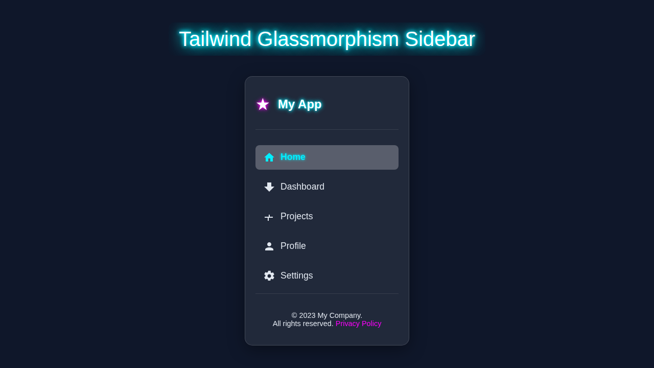
Glassmorphism Sidebar with HTML & Tailwind CSS – Complete Tutorial
Hey there, pro-coder-to-be! If you’ve wanted to build a beautiful, modern Glassmorphism Sidebar but felt unsure where to start, you are absolutely in the right place. We’re diving deep today! We will craft an awesome, responsive sidebar. It uses that cool frosted glass effect you see everywhere. Plus, we’ll make it fully interactive with the power of Tailwind CSS and Alpine.js. Get ready to add some serious style to your web projects!
What We Are Building
Today, we are building a truly eye-catching component. Imagine a sidebar that looks like frosted glass. It blurs content behind it. This is the Glassmorphism effect. Our sidebar will also be super responsive. It will look great on any screen size. On small screens, it will be a mobile menu. It will slide open with a click. On larger screens, it will sit neatly on the side. This project is perfect for dashboards or modern landing pages. It’s practical, stylish, and a fantastic way to level up your UI skills.
HTML Structure for Our Glassmorphism Sidebar
First, we need the basic skeleton for our sidebar. We will use simple, semantic HTML elements. This ensures good accessibility. Our main HTML will include a container for the page. It will also have our sidebar element. Plus, we will add a toggle button. This button opens and closes the sidebar on smaller screens. Don’t worry, we’ll explain each piece.
index.html
<!DOCTYPE html>
<html lang="en">
<head>
    <meta charset="UTF-8">
    <meta name="viewport" content="width=device-width, initial-scale=1.0">
    <title>Tailwind Glassmorphism Sidebar</title>
    <!--
        Link to Tailwind CSS.
        For quick setup, you can use the Play CDN.
        In a production environment, you would typically install Tailwind CSS
        and compile your styles using a build tool (e.g., PostCSS, Webpack, Vite).
    -->
    <script src="https://cdn.tailwindcss.com"></script>

    <!-- Link to your custom styles for Glassmorphism effects and active states -->
    <link rel="stylesheet" href="styles.css">

    <style>
        /* Ensure safe fonts are used throughout the document */
        body { font-family: Arial, Helvetica, sans-serif; }
        /* Apply universal box-sizing for consistent layout behavior */
        *, *::before, *::after { box-sizing: border-box; }
        /* Prevent horizontal scroll issues */
        body { overflow-x: hidden; }
        /* Ensure images and other content scale correctly */
        img { max-width: 100%; height: auto; }
    </style>
</head>
<body class="bg-slate-900 text-slate-200 min-h-screen flex items-center justify-center p-4">
    <!--
        Main container for the sidebar.
        - `sidebar-glassmorphism`: Custom class from styles.css for blur and transparent background.
        - `relative`: Important for potential child positioning if needed.
        - `w-full max-w-xs`: Full width on small screens, max 320px width on larger.
        - `h-[90vh] max-h-[600px]`: Occupy 90% viewport height, with a max height limit.
        - `p-6`: Padding around content.
        - `flex flex-col justify-between`: Flexbox for vertical layout, pushing header/nav/footer apart.
        - `overflow-hidden`: Ensures glassmorphism border radius clips content.
        - `rounded-xl`: Rounded corners.
        - `border border-white/[0.15]`: Subtle white border for definition.
        - `shadow-xl`: Large shadow for depth.
    -->
    <aside class="sidebar-glassmorphism relative w-full max-w-xs h-[90vh] max-h-[600px] p-6 flex flex-col justify-between overflow-hidden rounded-xl border border-white/[0.15] shadow-xl">
        <!-- Sidebar Header -->
        <div class="mb-8 pb-4 border-b border-white/[0.1]">
            <a href="#" class="flex items-center text-white text-2xl font-bold">
                <!-- Star icon with a subtle purple glow effect via text-purple-400 -->
                <span class="mr-3 text-3xl text-purple-400 drop-shadow-[0_0_5px_rgba(192,132,252,0.7)]">★</span>
                My App
            </a>
        </div>

        <!-- Navigation Links -->
        <nav class="flex-grow"> <!-- `flex-grow` makes this section take up available space -->
            <ul>
                <li>
                    <!--
                        Navigation Link structure:
                        - `flex items-center`: Align icon and text horizontally.
                        - `p-3 mb-3`: Padding and bottom margin.
                        - `text-lg rounded-lg`: Text size and rounded corners.
                        - `hover:bg-white/[0.15] hover:text-cyan-400`: Hover effects for background and text color.
                        - `transition-all duration-300`: Smooth transitions.
                        - `active-nav-link`: Custom class for the active state from styles.css.
                    -->
                    <a href="#" class="flex items-center p-3 mb-3 text-lg rounded-lg hover:bg-white/[0.15] hover:text-cyan-400 transition-all duration-300 active-nav-link">
                        <!-- Home Icon (inline SVG) -->
                        <svg class="w-6 h-6 mr-4 fill-current" xmlns="http://www.w3.org/2000/svg" viewBox="0 0 24 24"><path d="M10 20v-6h4v6h5v-8h3L12 3 2 12h3v8z"/></svg>
                        Home
                    </a>
                </li>
                <li>
                    <a href="#" class="flex items-center p-3 mb-3 text-lg rounded-lg hover:bg-white/[0.15] hover:text-cyan-400 transition-all duration-300">
                        <!-- Dashboard Icon (inline SVG) -->
                        <svg class="w-6 h-6 mr-4 fill-current" xmlns="http://www.w3.org/2000/svg" viewBox="0 0 24 24"><path d="M16 11V3H8v8H2l10 10 10-10z"/></svg>
                        Dashboard
                    </a>
                </li>
                <li>
                    <a href="#" class="flex items-center p-3 mb-3 text-lg rounded-lg hover:bg-white/[0.15] hover:text-cyan-400 transition-all duration-300">
                        <!-- Projects Icon (inline SVG) -->
                        <svg class="w-6 h-6 mr-4 fill-current" xmlns="http://www.w3.org/2000/svg" viewBox="0 0 24 24"><path d="M19 14v-2h-6V8h-2v4H3v2h6v6h2v-6h6z"/></svg>
                        Projects
                    </a>
                </li>
                <li>
                    <a href="#" class="flex items-center p-3 mb-3 text-lg rounded-lg hover:bg-white/[0.15] hover:text-cyan-400 transition-all duration-300">
                        <!-- Profile Icon (inline SVG) -->
                        <svg class="w-6 h-6 mr-4 fill-current" xmlns="http://www.w3.org/2000/svg" viewBox="0 0 24 24"><path d="M12 12c2.21 0 4-1.79 4-4s-1.79-4-4-4-4 1.79-4 4 1.79 4 4 4zm0 2c-2.67 0-8 1.34-8 4v2h16v-2c0-2.66-5.33-4-8-4z"/></svg>
                        Profile
                    </a>
                </li>
                <li>
                    <a href="#" class="flex items-center p-3 text-lg rounded-lg hover:bg-white/[0.15] hover:text-cyan-400 transition-all duration-300">
                        <!-- Settings Icon (inline SVG) -->
                        <svg class="w-6 h-6 mr-4 fill-current" xmlns="http://www.w3.org/2000/svg" viewBox="0 0 24 24"><path d="M19.43 12.98c.04-.32.07-.64.07-.98s-.03-.66-.07-.98l2.11-1.65c.19-.15.24-.42.12-.64l-2-3.46c-.12-.22-.39-.3-.61-.22l-2.49 1c-.52-.4-1.09-.7-1.71-.98L14.82 2.1c-.06-.2-.25-.33-.45-.33h-4c-.2 0-.39.13-.45.33L9.1 4.5c-.62.28-1.19.58-1.71.98l-2.49-1c-.22-.08-.49 0-.61.22l-2 3.46c-.12.22-.07.49.12.64l2.11 1.65c-.04.32-.07.65-.07.98s.03.66.07.98l-2.11 1.65c-.19.15-.24.42-.12.64l2 3.46c.12.22.39.3.61.22l2.49-1c.52.4 1.09.7 1.71.98l.37 2.39c.06.2.25.33.45.33h4c.2 0 .39-.13.45-.33l.37-2.39c.62-.28 1.19-.58 1.71-.98l2.49 1c.22.08.49 0 .61-.22l2-3.46c.12-.22.07-.49-.12-.64l-2.11-1.65zM12 15.5c-1.93 0-3.5-1.57-3.5-3.5s1.57-3.5 3.5-3.5 3.5 1.57 3.5 3.5-1.57 3.5-3.5 3.5z"/></svg>
                        Settings
                    </a>
                </li>
            </ul>
        </nav>

        <!-- Sidebar Footer -->
        <div class="mt-8 pt-4 border-t border-white/[0.1] text-center text-sm">
            <p>© 2023 My Company. <br>All rights reserved. <a href="#" class="text-purple-400 hover:text-cyan-400 transition-colors duration-300">Privacy Policy</a></p>
        </div>
    </aside>
</body>
</html>
Styling Our Glassmorphism Sidebar with Tailwind CSS
Now for the fun part: making it beautiful! We’re using Tailwind CSS for all our styling. This means most of our “CSS” will live right in our HTML classes. Tailwind helps us build custom designs quickly. We will apply utility classes for layout, colors, and, of course, that gorgeous glass effect. We’ll use backdrop-filter to create the blur. This is key for Glassmorphism. If you’re curious about the difference between Tailwind CSS and plain CSS, check out our detailed comparison!
styles.css
/*
    styles.css
    Custom CSS for Glassmorphism effects and specific component styles
    that extend beyond basic Tailwind utility classes.
*/

/* Custom class for the Glassmorphism effect on the sidebar */
.sidebar-glassmorphism {
    /*
        Apply backdrop-filter for the blur effect.
        -webkit-backdrop-filter is for Safari browser compatibility.
    */
    backdrop-filter: blur(15px);
    -webkit-backdrop-filter: blur(15px);

    /* Set a semi-transparent background color */
    background-color: rgba(255, 255, 255, 0.08); /* 8% white for transparency */

    /*
        Optional: Add a subtle box-shadow for more depth, enhancing the floating effect.
        This is in addition to the Tailwind 'shadow-xl' in index.html for a layered shadow effect.
    */
    box-shadow: 0 8px 32px 0 rgba(0, 0, 0, 0.37);
}

/*
    Custom styles for the active navigation link.
    This provides a distinct visual feedback for the currently selected item.
*/
.active-nav-link {
    background-color: rgba(255, 255, 255, 0.2); /* Slightly more opaque background */
    color: #22d3ee; /* Tailwind's cyan-400 for a vibrant active color */
    font-weight: bold;

    /* Optional: Add a subtle text shadow for a glowing effect on the active link */
    text-shadow: 0 0 5px rgba(34, 211, 238, 0.5); /* Semi-transparent cyan glow */
}

/*
    Ensure the SVG icon within the active link also inherits the active color.
    'fill: currentColor' in HTML already helps, but this explicitly sets it.
*/
.active-nav-link svg {
    fill: #22d3ee; /* Match the text color for the icon */
}

/*
    Universal box-sizing reset for all elements.
    This helps ensure consistent padding and border calculations across browsers.
*/
*, *::before, *::after {
    box-sizing: border-box;
}

/*
    Ensure no horizontal scrollbar appears due to content overflow on the body.
    Vertical scroll is often desired, but horizontal usually indicates layout issues.
*/
body {
    overflow-x: hidden;
}
Adding Interactivity with Alpine.js
A beautiful sidebar is good, but an interactive one is even better! We will bring our sidebar to life with Alpine.js. Alpine is a lightweight JavaScript framework. It’s perfect for adding simple interactivity directly in your HTML. We will use it to manage the sidebar’s open/closed state. This means the sidebar will slide in and out smoothly. You’ll be amazed at how little code it takes to add dynamic behavior.
How It All Works Together
You have seen the code. Now, let’s connect the dots. We’ve combined HTML, Tailwind CSS, and Alpine.js. Each part plays a vital role. This creates our responsive and interactive Glassmorphism sidebar. Here’s a breakdown of how everything clicks.
The Glassy Effect in Action
The core of our Glassmorphism look comes from one CSS property: backdrop-filter. We apply this with Tailwind’s utility classes. Specifically, we use classes like backdrop-blur-xl and bg-opacity-30. These work together. The backdrop-blur property blurs whatever is behind the element. The bg-opacity makes the background semi-transparent. This lets the blurred content show through. It creates that signature frosted glass appearance. You can learn more about this cool property on MDN Web Docs. It’s a game-changer for modern UI!
Making It Responsive with Tailwind
Responsiveness is built-in with Tailwind CSS. We use classes like sm:hidden and lg:flex. These control element visibility based on screen size. For small screens, our sidebar starts hidden. A hamburger icon toggles it open. For larger screens, it’s always visible. It docks to the left of the main content. This ensures a great user experience on any device. Tailwind’s mobile-first approach makes this very straightforward to implement. It helps you design once, deploy everywhere.
Sidebar Toggle with Alpine.js
Alpine.js handles the magic of opening and closing the sidebar. We use x-data="{ sidebarOpen: false }" to create a state variable. This variable tracks if the sidebar is open or closed. When you click the toggle button, x-on:click="sidebarOpen = !sidebarOpen" flips this state. The sidebar itself has x-show="sidebarOpen". This conditionally displays or hides it. Alpine makes complex interactions simple. It keeps your JavaScript minimal and easy to understand. Plus, x-transition adds those lovely smooth slide animations!
Pro Tip: Alpine.js is fantastic for small, isolated UI components. It’s a great choice when you need a little interactivity without a full-blown framework like React or Vue. Just drop it in and go!
Integrating with Dark Mode (Optional but Cool!)
Our Glassmorphism sidebar looks amazing. It can look even better with a dark mode theme! You can easily extend this project. Add classes like dark:bg-gray-800 or dark:text-white to your elements. This makes your sidebar adapt to the user’s preference. If you want to learn more about setting up Dark Mode with Tailwind CSS, we have a complete guide. Or, if you need a toggle, check out our Tailwind CSS Dark Mode Toggle: HTML & JS Tutorial. These resources can help you integrate themes seamlessly.
Tips to Customise It
You have built a solid foundation. Now, make this Glassmorphism sidebar uniquely yours! Here are some ideas to get your creative juices flowing:
- Change Colors and Gradients: Experiment with different background colors. Try subtle linear gradients within the sidebar. This can give it a unique personality.
- Add More Navigation Items: Extend the list of links. You could include icons next to each item. This improves visual clarity.
- Integrate a Different Icon Library: Replace the basic hamburger icon. Use icons from Font Awesome or Heroicons. This adds a professional touch.
- Make It an ‘Always Open’ Desktop Sidebar: Adjust the Tailwind breakpoints. Keep the sidebar always visible on desktop screens. This is great for admin panels.
- Add User Profile or Search Bar: Integrate a small user avatar. Or add a search input field at the top. This makes it more functional.
Remember: The best way to learn is by doing. Don’t be afraid to break things and experiment. That’s how innovation happens in web development!
Conclusion
Wow, you did it! You have successfully built a responsive, interactive Glassmorphism Sidebar using HTML, Tailwind CSS, and Alpine.js. That’s a huge achievement! You now understand key modern web development techniques. You’ve mastered styling, responsiveness, and basic interactivity. Go ahead and show off your new creation. Deploy it on a personal project. Share it on social media. Tag us if you do! Keep coding, keep building, and keep learning. We can’t wait to see what you create next!