Hey there, future web wizard! If you’ve ever wanted to build a sleek Product Card Tailwind component but weren’t quite sure where to begin, you’ve landed in the perfect spot. Today, we’re diving deep into creating an absolutely awesome product card. It will be fully responsive across all devices. Plus, it supports a dazzling dark mode! This project will seriously level up your UI skills. So, get ready to code.
What We Are Building: A Dynamic Product Card Tailwind
We’re going to build a truly beautiful, interactive product card today. Think of it like a mini-showcase for any item you want to display on your website. This card will gracefully adapt to different screen sizes. It will look fantastic on both large desktop monitors and small mobile phones. Furthermore, we’re adding a super cool dark mode toggle. This makes our card user-friendly day or night! It’s incredibly practical for e-commerce sites. It’s also perfect for portfolio showcases. You’ll love the final result.
HTML Structure: The Blueprint for Your Product Card Tailwind
First things first, we’ll lay down the foundational HTML. This creates the basic elements for our product card. It’s like sketching out the rooms before building the house. We’ll use semantic HTML tags where possible. This improves accessibility for all users. It also helps with search engine optimization. Don’t worry, it’s straightforward and easy to follow! Each part serves a clear purpose.
index.html
<!DOCTYPE html>
<html lang="en">
<head>
<meta charset="UTF-8">
<meta name="viewport" content="width=device-width, initial-scale=1.0">
<title>Tailwind CSS Product Card</title>
<!--
Include the Tailwind CSS CDN for quick setup.
For production, it's recommended to install Tailwind CSS via npm
and build your CSS for better performance and customization.
-->
<script src="https://cdn.tailwindcss.com"></script>
<!--
Link to your custom stylesheet if you have any additional CSS.
For this tutorial, styles.css will be empty as all styling is handled by Tailwind utility classes.
-->
<link rel="stylesheet" href="styles.css">
<style>
/*
Ensure box-sizing is border-box for all elements.
Tailwind's Preflight (included with the CDN) already does this.
*/
*, *::before, *::after {
box-sizing: border-box;
}
/*
Set a safe fallback font family.
Tailwind's default `font-sans` stack typically resolves to system UI fonts
like Arial, Helvetica, which are safe.
*/
body {
font-family: Arial, Helvetica, sans-serif;
}
</style>
</head>
<body class="bg-gray-100 flex items-center justify-center min-h-screen p-4">
<!--
Product Card Container:
- `max-w-sm` & `mx-auto`: Constrains card width and centers it horizontally.
- `bg-white`: White background.
- `rounded-xl`: Large rounded corners.
- `shadow-lg`: Large box shadow for depth.
- `overflow-hidden`: Clips any content that extends beyond the rounded corners.
- `md:max-w-lg`: Makes the card wider on medium screens and above.
-->
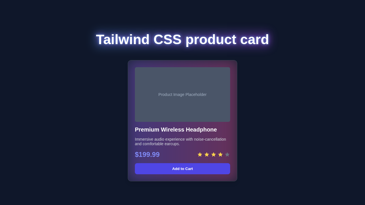
<div class="max-w-sm mx-auto bg-white rounded-xl shadow-lg overflow-hidden md:max-w-lg">
<!--
Responsive Layout for Image and Content:
- `md:flex`: On medium screens and up, the children (image and content) will display in a row.
-->
<div class="md:flex">
<!--
Product Image Section:
- `md:shrink-0`: Prevents the image section from shrinking on medium screens.
-->
<div class="md:shrink-0">
<!--
Product Image Placeholder:
- `h-48` & `w-full`: Sets fixed height and full width on small screens.
- `object-cover`: Ensures the image covers the area, cropping if necessary.
- `md:h-full` & `md:w-48`: On medium screens, the height becomes full (relative to parent flex item)
and width is fixed to 48 Tailwind units (192px).
- `bg-gradient-to-r from-blue-500 to-purple-600`: A gradient background for the placeholder.
- `flex items-center justify-center text-white text-lg font-bold`: Centers text in the placeholder.
-->
<div class="h-48 w-full object-cover md:h-full md:w-48 bg-gradient-to-r from-blue-500 to-purple-600 flex items-center justify-center text-white text-lg font-bold">
PRODUCT IMAGE
</div>
</div>
<!--
Product Details Section:
- `p-8`: Adds consistent padding around the content.
-->
<div class="p-8">
<!-- Product Category/Label -->
<div class="uppercase tracking-wide text-sm text-indigo-500 font-semibold">
New Arrival
</div>
<!-- Product Title -->
<a href="#" class="block mt-1 text-lg leading-tight font-medium text-black hover:underline">
Ergonomic Office Chair
</a>
<!-- Product Description -->
<p class="mt-2 text-gray-500">
Experience ultimate comfort and support with our latest ergonomic office chair, designed for productivity.
</p>
<!-- Price and Rating Section -->
<div class="mt-4 flex items-center justify-between">
<!-- Product Price -->
<span class="text-2xl font-bold text-gray-900">
$299.00
</span>
<!-- Product Rating (Star Icons) -->
<div class="flex items-center">
<!-- Full Star -->
<svg class="w-5 h-5 text-yellow-400" fill="currentColor" viewBox="0 0 20 20">
<path d="M9.049 2.927c.3-.921 1.603-.921 1.902 0l1.07 3.292a1 1 0 00.95.69h3.462c.969 0 1.371 1.24.588 1.81l-2.8 2.034a1 1 0 00-.364 1.118l1.07 3.292c.3.921-.755 1.688-1.538 1.118l-2.8-2.034a1 1 0 00-1.176 0l-2.8 2.034c-.783.57-1.838-.197-1.538-1.118l1.07-3.292a1 1 0 00-.364-1.118L2.98 8.72c-.783-.57-.381-1.81.588-1.81h3.462a1 1 0 00.95-.69l1.07-3.292z"></path>
</svg>
<!-- Empty Star -->
<svg class="w-5 h-5 text-gray-300" fill="currentColor" viewBox="0 0 20 20">
<path d="M9.049 2.927c.3-.921 1.603-.921 1.902 0l1.07 3.292a1 1 0 00.95.69h3.462c.969 0 1.371 1.24.588 1.81l-2.8 2.034a1 1 0 00-.364 1.118l1.07 3.292c.3.921-.755 1.688-1.538 1.118l-2.8-2.034a1 1 0 00-1.176 0l-2.8 2.034c-.783.57-1.838-.197-1.538-1.118l1.07-3.292a1 1 0 00-.364-1.118L2.98 8.72c-.783-.57-.381-1.81.588-1.81h3.462a1 1 0 00.95-.69l1.07-3.292z"></path>
</svg>
</div>
</div>
<!-- Add to Cart Button -->
<button class="mt-6 w-full bg-indigo-600 hover:bg-indigo-700 text-white font-bold py-2 px-4 rounded-lg transition duration-300 ease-in-out transform hover:scale-105">
Add to Cart
</button>
</div>
</div>
</div>
</body>
</html>
CSS Styling: Bringing Your Product Card to Life with Tailwind CSS
Now for the exciting part: styling! We’ll use powerful Tailwind CSS utility classes. These help us quickly apply styles without writing a single line of custom CSS. Tailwind CSS makes responsive design an absolute breeze. It’s super efficient. It also keeps our stylesheet incredibly lean. Here’s the cool part: these classes are very intuitive.
styles.css
/*
   This file is intentionally left empty as all styling for the product card
   is handled directly using Tailwind CSS utility classes in `index.html`.

   If you needed to add custom CSS that cannot be achieved with Tailwind utilities
   (e.g., highly specific animations or complex custom components), you would add it here.
*/
JavaScript: Adding Interactivity and Dark Mode
Finally, we’ll add a tiny bit of JavaScript. This handles the elegant dark mode toggle functionality. It switches between light and dark themes with just a simple click. Don’t worry about this part; it’s just a few concise lines of code. Let me explain exactly what’s happening here. It’s easier than you think.
How It All Works Together: Unpacking Your Responsive Product Card
Let’s break down exactly how these fantastic pieces combine. Understanding the workflow helps you build even more complex components in the future. We start with HTML for content. Then, we layer on Tailwind for styling. JavaScript adds the final touch of interactivity. It’s a logical and powerful progression.
The HTML Foundation
Our HTML provides the essential skeleton. It carefully defines containers for the image, text, and action buttons. Each element has a clear and distinct purpose. We thoughtfully use `div` elements to group related content together. For example, the product image sits within its own dedicated `div`. This helps us control its layout and proportions effectively. The product title and its description also reside within their own structured areas. This clear and organized structure makes styling much easier. Indeed, a well-organized HTML document is absolutely key. It ensures our content is accessible. It also makes it manageable for future changes.
Tailwind CSS Magic: Styling Your Product Card
This is truly where the Product Card Tailwind really shines brightly! Tailwind CSS applies styles directly within your HTML. You will see classes like `bg-white`, `dark:bg-gray-800`, `shadow-lg`, and `rounded-xl`. `bg-white` sets the background to a crisp, clean white color. `dark:bg-gray-800` is specifically for dark mode. This clever class automatically changes the background when dark mode is active. It’s truly brilliant and effortless. For a deeper dive into making your sites adapt to user preferences, be sure to check out our Tailwind Dark Mode Tutorial: HTML & Tailwind CSS Utility Classes. `shadow-lg` adds a prominent and attractive box shadow. `rounded-xl` gives a nice, smooth rounded border to the card. These utility classes make styling incredibly fast. They also ensure remarkable consistency across your entire design. They are very powerful indeed. They simplify complex styling tasks significantly.
Pro Tip: Tailwind CSS uses a mobile-first approach. This means you style for small screens first. Then, you add classes like
md:w-1/2for medium screens. This ensures your design is responsive by default. It makes building a Responsive Landing Page with HTML and Tailwind CSS Utility Classes much easier! This methodology saves you valuable time. It also guarantees a better user experience across all devices. Always think small first!
Crafting Seamless Responsiveness
We actively employ Tailwind’s responsive prefixes. These include `sm:`, `md:`, and `lg:`. These prefixes meticulously control how elements behave at different screen sizes. For instance, `flex flex-col md:flex-row` means stacking items vertically on small screens. Then, they gracefully become horizontal on medium screens and larger. This is precisely how our product card adapts beautifully and fluidly. It ensures a fantastic user experience everywhere, no matter the device. This flexible approach is a key part of modern web design. It allows for dynamic layouts. Therefore, your content always looks its absolute best. It’s quite efficient and smart. Want to know more about the efficiency of utility classes versus traditional CSS methods? Read our insightful article on Tailwind CSS vs Plain CSS: A Visual Comparison. You’ll definitely see the clear advantages.
Dark Mode with Simple JavaScript
Our JavaScript snippet is quite simple, yet incredibly effective. It listens attentively for clicks on our dedicated dark mode toggle button. When clicked, it efficiently adds or removes a `dark` class from the main `` element. Tailwind CSS then takes over seamlessly and magically. Classes like `dark:bg-gray-800` automatically apply their specific styles. This instantly transforms the card’s entire appearance. It switches smoothly between light and dark themes. It’s a smooth, seamless transition for your users. This makes for a delightful and highly accessible user experience. We are definitely using modern web standards here. This approach is highly performant. It keeps your code clean.
“The journey of a thousand lines of code begins with a single
div. Keep learning and keep building. Every project, big or small, makes you a better developer!”
Tips to Customise Your Product Card Tailwind
You’ve built an amazing card! But don’t stop here. Here are some fantastic ideas to make it uniquely yours:
- Change the Colors and Fonts: Experiment freely with different Tailwind color palettes. You can also easily add custom fonts from popular services like Google Fonts. This will perfectly match your brand or personal style. It’s a simple yet impactful way to personalize your design.
- Add More Interactive Details: Consider including a “Add to Cart” quantity selector for e-commerce. Or, display a dynamic star rating component to show reviews. These truly enhance the product information greatly. They make the card more functional and engaging.
- Implement an Image Carousel: If you have multiple product images, integrate a simple image carousel. This could cycle through different views of the product. It’s a great way to showcase items in detail. It adds a professional touch.
- Integrate with a Real API: Fetch actual product data from a public API, like Fake Store API. This makes your card dynamic and powerful, showcasing real-time information. It’s a truly great next step for building data-driven UIs. This skill is very valuable.
- Subtle Hover Effects: Add subtle hover animations to buttons or even the entire card itself. This creates a more engaging user interface. For example, a slight scale up or a graceful shadow change. For more on how to create beautiful CSS transitions, explore the MDN Web Docs.
- Accessibility Improvements: Ensure all interactive elements, such as buttons and links, have proper
ariaattributes. This greatly helps users with assistive technologies like screen readers. For instance, usearia-labeloraria-describedby. Learn more about general accessibility best practices on CSS-Tricks. This is crucial for inclusive design.
Conclusion: You Just Built a Fantastic Product Card!
Amazing job, seriously! You just built a fully responsive Product Card Tailwind with dark mode support. You used modern web development techniques like a pro. You’ve truly mastered a fundamental UI component that is highly sought after. This skill is incredibly valuable in today’s web landscape. Now you have a solid foundation. You can apply these concepts to countless other projects. So, share your creation with the world! Show off your awesome new card. Keep coding, keep building, and keep learning! The possibilities are endless.