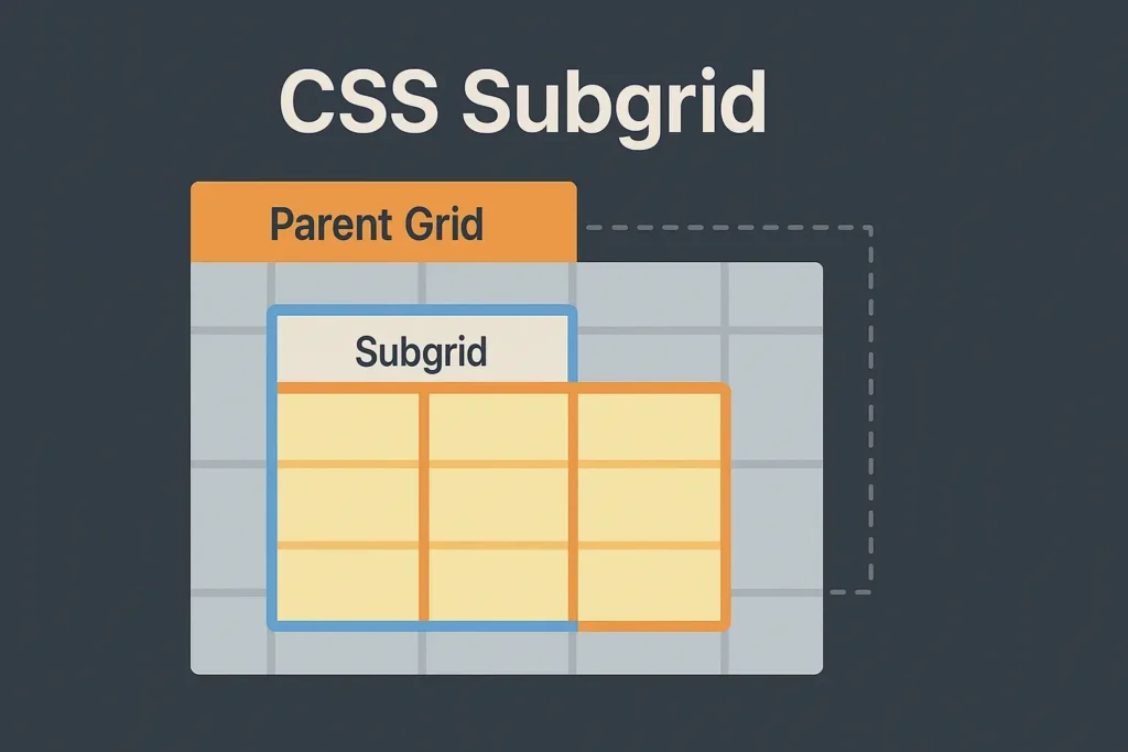
Learn how CSS Subgrid brings perfect nested alignment to your projects while reducing CSS complexity.
Introduction
Modern websites often combine cards, sidebars, and media blocks inside large responsive grids. However, nested elements rarely align neatly with the main grid. Fortunately, CSS Subgrid solves this issue by letting child grids inherit the column or row sizes from their parent grid. As a result, you get consistent spacing, fewer “magic numbers,” and much cleaner CSS code. Moreover, it simplifies design systems and ensures visual balance across the entire layout.

What Is CSS Subgrid (and Why It Matters)
CSS Subgrid expands on the CSS Grid layout system. It allows a child grid to reuse the track definitions (columns and/or rows) of a parent grid. Instead of repeating values like grid-template-columns or gaps, the child grid simply declares subgrid, and the browser aligns everything automatically. In this way, Subgrid makes alignment both smarter and more efficient.
Key Benefits of Using CSS Subgrid
- Perfect alignment: Inner items follow the same columns and rows as the parent.
- Less duplication: You no longer need to repeat grid definitions.
- Simpler design systems: Track logic stays in one place.
- Easier maintenance: When you update the parent grid, every child automatically adjusts.
- Better scalability: Components stay in sync, even as your layout grows.
Browser Support and Fallbacks
The good news is that CSS Subgrid now works in Firefox, Safari, and the newest Chromium browsers. Still, older browsers might not support it. Therefore, it’s wise to add a lightweight fallback to keep layouts usable everywhere. Fortunately, progressive enhancement makes this easy to achieve.
Progressive Enhancement Example
/* Base grid fallback */
.card-list {
  display: grid;
  grid-template-columns: repeat(12, 1fr);
  gap: 1rem;
}

/* Nested card without subgrid */
.card {
  display: grid;
  grid-template-columns: repeat(12, 1fr);
  gap: .75rem;
}

/* Modern browsers: enable subgrid */
@supports (grid-template-columns: subgrid) {
  .card {
    grid-template-columns: subgrid;
    grid-template-rows: subgrid;
  }
}
Tip: Keep fallbacks short and reusable. You can store track values in CSS variables under :root so that spacing tokens remain consistent. Additionally, always test fallbacks in an older browser or responsive emulator.
Subgrid Syntax: The Essentials
You can apply subgrid on columns, rows, or both. The child grid must sit inside a defined grid area of the parent. Therefore, ensure that each child properly spans the parent’s grid columns or rows before expecting inherited sizing.
/* Parent grid defines layout */
.layout {
  display: grid;
  grid-template-columns: 1fr minmax(16rem, 22rem) 2fr;
  gap: 1rem;
}

/* Child grid inherits sizes */
.layout__article {
  display: grid;
  grid-template-columns: subgrid;
  grid-template-rows: auto subgrid;
  grid-column: 1 / -1;
}
In simple terms:
- Use
subgridwhen the child grid should share tracks with the parent. - The child must span a grid area defined by the parent.
- Gaps are inherited automatically, ensuring spacing consistency.
Consequently, your nested sections will align without manually copying track sizes.
When Should You Use CSS Subgrid
Use Subgrid when child elements must line up exactly with the outer layout. For instance:
- Article layouts where images, headings, and text follow one column rhythm.
- Card collections that need unified alignment.
- Dashboards with widgets using the same column widths.
- Marketing pages where multiple sections share the same column grid.
On the other hand, if a component is independent and doesn’t need alignment with the main layout, skip Subgrid. In short, use it where synchronization matters.
Common Patterns for CSS Subgrid
Pattern 1 – Card Deck With Aligned Headlines
Cards often differ in height. However, Subgrid keeps headings, descriptions, and buttons aligned across every row. Consequently, your entire grid feels more polished and consistent.
<section class="deck layout">
  <article class="card">
    <h3 class="card__title">Fast Onboarding</h3>
    <p class="card__copy">Quick start for new users.</p>
    <a class="card__cta" href="#">Read more</a>
  </article>
</section>
.deck.layout {
  display: grid;
  grid-template-columns: repeat(12, 1fr);
  gap: 1rem;
}

.card {
  display: grid;
  grid-column: span 4;
  padding: 1rem;
  border: 1px solid #e4e6eb;
  border-radius: .75rem;
}

@supports (grid-template-columns: subgrid) {
  .card {
    grid-template-columns: subgrid;
    grid-template-rows: subgrid;
  }
  .card__title { grid-column: 1 / 9; }
  .card__copy  { grid-column: 1 / 12; }
  .card__cta   { grid-column: 1 / 5; }
}
Result: All cards line up perfectly, creating a balanced rhythm across your design. Moreover, it saves time when maintaining content cards later.
Pattern 2 – Article Layout With Shared Typography Grid
Long-form pages need steady line lengths and even spacing. Therefore, a parent grid can manage both text measure and media alignment effectively.
<main class="article-shell">
  <article class="prose">
    <figure class="hero"><img src="hero.webp" alt=""></figure>
    <h1>Design for Focus</h1>
    <p>Intro paragraph...</p>
    <h2>Section Title</h2>
    <p>Body content...</p>
  </article>
</main>
.article-shell {
  display: grid;
  grid-template-columns: [full-start] 1fr [content-start]
    repeat(8, minmax(0, 7ch))
    [content-end] 1fr [full-end];
  gap: clamp(1rem, 2vw, 2rem);
}

.prose {
  display: grid;
  grid-column: content-start / content-end;
}

@supports (grid-template-columns: subgrid) {
  .prose {
    grid-template-columns: subgrid;
    grid-template-rows: subgrid;
  }
  .hero {
    grid-column: full-start / full-end;
  }
}
Takeaway: Text and images remain perfectly aligned even as content scales. Additionally, typography rhythm stays consistent, improving readability.
Pattern 3 – Sidebar With Nested Widgets
Sidebars often contain small widgets. Meanwhile, Subgrid ensures that titles, stats, and values align neatly.
<aside class="sidebar">
  <section class="widget">
    <h4>Stats</h4>
    <ul class="stats">
      <li>↑ 12%</li>
      <li>34 k</li>
    </ul>
  </section>
</aside>
.sidebar {
  display: grid;
  row-gap: .75rem;
}

.widget {
  display: grid;
  padding: .75rem;
  border: 1px solid #e9ebef;
  border-radius: .5rem;
}

@supports (grid-template-columns: subgrid) {
  .widget {
    grid-template-columns: subgrid;
  }
}
As a result, every widget aligns with the parent column structure, making dashboards cleaner and more cohesive.
Subgrid for Columns and Rows
You can apply Subgrid to only columns, only rows, or both. For example, you might want a parent grid to define columns while allowing each child to decide its own row heights.
.module {
  display: grid;
  grid-template-columns: subgrid;
  grid-template-rows: auto auto;
}
This approach keeps vertical rhythm flexible while maintaining horizontal consistency. Consequently, layouts look unified even when content differs.
Handling Gaps and Named Lines
Gaps and named lines make CSS Subgrid even more powerful. The child grid inherits both automatically. Therefore, it’s easy to maintain consistent margins and spacing between sections.
.layout {
  display: grid;
  grid-template-columns: [edge] 1fr
    [content-start] repeat(8, 7ch)
    [content-end] 1fr [edge];
  column-gap: clamp(.75rem, 2vw, 1.25rem);
}

.section {
  display: grid;
  grid-template-columns: subgrid;
}
.section h2 {
  grid-column: content-start / content-end;
}
In other words, you can set alignment rules once at the parent level and reuse them throughout your project. Moreover, this prevents style drift between teams and pages.
Typography and Baseline Rhythm
Good typography depends on even spacing. With CSS Subgrid, it becomes easier to control text measure and rhythm.
- Use character-based tracks like
7ch. - Keep pull quotes aligned to named lines.
- Align code blocks or figures consistently.
.reading {
  display: grid;
  grid-template-columns: [content-start]
    repeat(8, 7ch)
    [content-end];
}
.note {
  grid-column: content-start / span 2;
}
As a result, long articles feel balanced, visually comfortable, and easy to read. Additionally, readers can scan large pages without distraction.
Accessibility and Source Order
CSS Subgrid changes visual layout but not document order. Therefore, you should:
- Keep HTML semantic (
<header>,<main>,<section>,<aside>,<footer>). - Ensure keyboard focus follows the reading order.
- Use ARIA labels when visually reordering items.
In addition, test your design with a screen reader to confirm accessibility. After all, great layouts should be inclusive as well as elegant.
Debugging CSS Subgrid Layouts
If your layout looks off, start by checking the parent grid first. Usually, small oversights cause alignment errors.
Checklist
- Confirm that the child spans the parent’s grid area.
- Ensure
subgridis declared properly. - Verify that gaps exist on the parent.
- Check your named line references.
- Test one axis at a time for easier debugging.
Nowadays, browsers like Firefox and Chrome offer grid overlays in DevTools, helping you see inherited tracks clearly.
Performance Tips
Modern rendering engines handle Subgrid efficiently. Still, there are ways to keep it smooth:
- Avoid deeply nested grids.
- Use flexible units like
minmax(0, 1fr)carefully. - Prevent unnecessary reflows by reducing heavy DOM updates.
In short, Subgrid simplifies your CSS and can even boost performance by reducing duplicate definitions.
Frequently Asked Questions
Q1. Is CSS Subgrid the same as nested grid?
No. You can nest grids without Subgrid, but only Subgrid shares track definitions with the parent.
Q2. Can I use Subgrid in production?
Yes. It’s supported in most modern browsers. However, add a fallback for older ones.
Q3. Do gaps inherit with Subgrid?
Yes. The child grid automatically uses the parent’s gap values.
Q4. Can I Subgrid only rows or only columns?
Absolutely. Use grid-template-columns: subgrid; or grid-template-rows: subgrid; depending on your layout.
Q5. How do I fix misalignment?
Make sure the child grid sits inside the correct parent area and that subgrid is declared properly. If needed, test in DevTools for visual confirmation.
Conclusion – Try Subgrid in Your Next Project
CSS Subgrid helps you build cleaner, more consistent layouts. Therefore, start using it for dashboards, article pages, or card sections to keep everything in perfect sync.
Refactor one complex layout using Subgrid — you’ll likely remove dozens of CSS lines and gain better visual control.


