Hey! If you have wanted to build a dynamic theme switcher but had no idea where to start, you are in the right place. Tailwind Custom Themes make it easy to create stunning light, dark, and custom themes.
What We Are Building
We are building a dynamic theme switcher with Tailwind CSS.
It will have light, dark, and custom colors.
This will be useful for users who like switching between themes.
Here’s the cool part: we can do it with just HTML and Tailwind CSS.
HTML Structure
The HTML will be simple.
We need a button to switch themes.
Don’t worry about this part, it’s easy.
Let me explain what’s happening here: we use HTML to define our structure.
index.html
<!DOCTYPE html>
<html lang="en">
<head>
<meta charset="UTF-8">
<meta name="viewport" content="width=device-width, initial-scale=1.0">
<title>Tailwind Custom Theme Example</title>
<!-- Link to your compiled Tailwind CSS file -->
<!-- This file is typically generated by running `npx tailwindcss -i ./src/styles.css -o ./dist/styles.css --watch` -->
<link href="./dist/styles.css" rel="stylesheet">
<style>
/* Ensure safe fonts if not explicitly defined in Tailwind config for body/base */
body {
font-family: Helvetica, Arial, sans-serif;
margin: 0;
box-sizing: border-box;
overflow-x: hidden; /* Prevent horizontal scroll */
}
</style>
</head>
<body class="bg-slate-900 text-custom-light-gray min-h-screen flex flex-col items-center justify-center p-8">
<h1 class="text-4xl sm:text-5xl font-extrabold text-white mb-10 text-center leading-tight tracking-wider">
<span class="block text-primary font-heading">Tailwind CSS Custom Themes</span>
<span class="block text-accent text-2xl sm:text-3xl font-body mt-2">Elevate Your Design System</span>
</h1>
<div class="grid grid-cols-1 md:grid-cols-2 gap-8 w-full max-w-5xl">
<!-- Card 1: Using Custom Theme Colors & Fonts -->
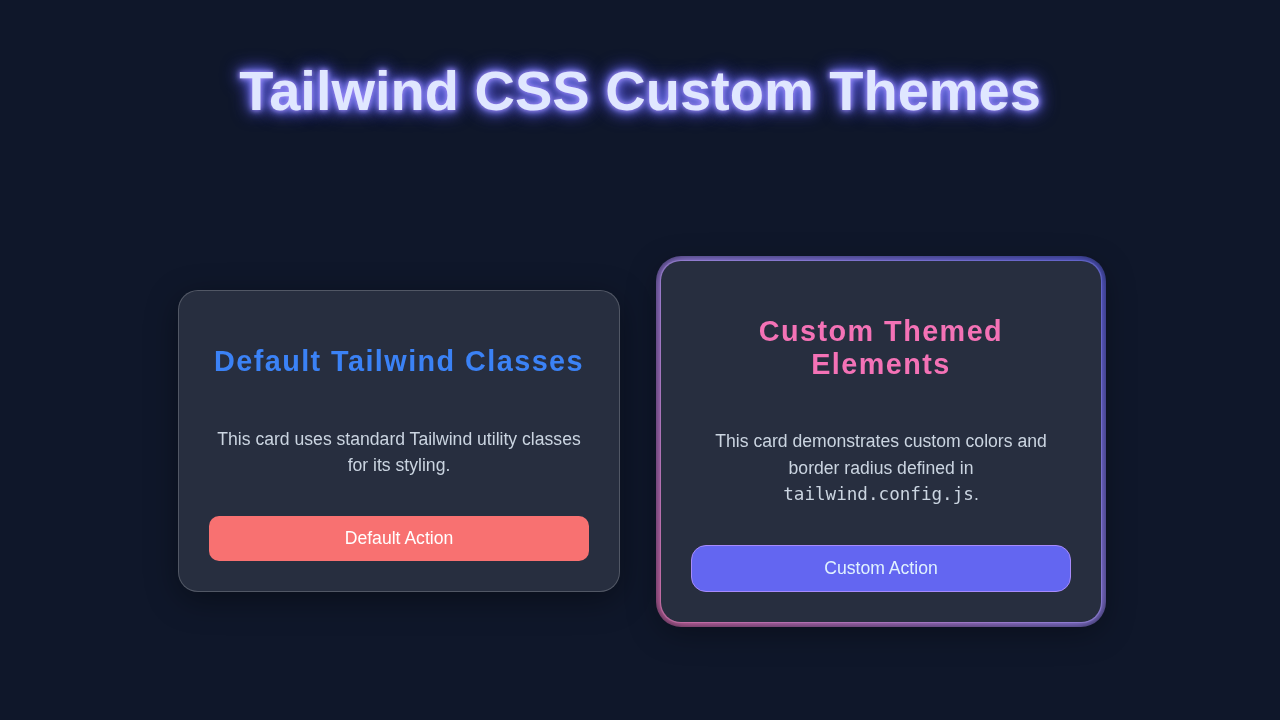
<div class="bg-custom-dark p-8 rounded-xl3 shadow-xl border border-primary/50">
<h2 class="text-3xl font-heading text-accent mb-4">Custom Card Title</h2>
<p class="text-secondary font-body mb-6 text-lg">
This card leverages our custom theme definitions. Notice the unique <code class="bg-slate-700 px-1 py-0.5 rounded text-white">primary</code> background color, <code class="bg-slate-700 px-1 py-0.5 rounded text-white">accent</code> text, and <code class="bg-slate-700 px-1 py-0.5 rounded text-white">rounded-xl3</code> border radius.
</p>
<button class="bg-primary text-secondary py-3 px-6 rounded-xl3 shadow-lg hover:bg-primary/80 transition-all duration-300 text-lg font-bold border-2 border-primary-light">
Explore Custom Button
</button>
<p class="mt-6 text-sm text-custom-light-gray/80">
Using <code class="bg-slate-700 px-1 py-0.5 rounded text-white">font-heading</code> and <code class="bg-slate-700 px-1 py-0.5 rounded text-white">font-body</code>.
</p>
</div>
<!-- Card 2: Using Default Tailwind Classes for comparison -->
<div class="bg-white p-8 rounded-xl shadow-lg border border-gray-300">
<h2 class="text-3xl font-sans text-gray-900 mb-4">Default Tailwind Card</h2>
<p class="text-gray-700 font-sans mb-6 text-lg">
This card uses standard Tailwind utility classes. It provides a good contrast to see the impact of our custom theme settings.
</p>
<button class="bg-blue-600 text-white py-3 px-6 rounded-lg shadow-md hover:bg-blue-700 transition-all duration-300 text-lg font-semibold">
Standard Button
</button>
<p class="mt-6 text-sm text-gray-500">
Using default <code class="bg-gray-200 px-1 py-0.5 rounded text-gray-800">font-sans</code>.
</p>
</div>
</div>
<footer class="mt-12 text-center text-slate-500 text-sm">
© 2023 Tailwind Theme Tutorial. All rights reserved.
</footer>
</body>
</html>CSS Styling
The CSS will be where the magic happens.
We will use Tailwind Custom Themes to create our themes.
We will define our light, dark, and custom colors.
For more on CSS, check out CSS-Tricks.
styles.css
/* src/styles.css */

/* Include Tailwind's base styles, component styles, and utility classes */
/* These directives will be processed by Tailwind CLI or PostCSS */
@tailwind base;
@tailwind components;
@tailwind utilities;

/*
   Optional: You can add custom CSS here if needed,
   but the goal of Tailwind is to minimize this.
   Example for box-sizing reset:
*/
* {
  box-sizing: border-box;
}

/*
   Note: For the custom font families defined in tailwind.config.js (e.g., 'Arial Black'),
   you typically don't need to @import them here if they are system fonts.
   If you were using Google Fonts, you would typically import them here,
   but per tutorial rules, we are using safe system fonts only.
*/
JavaScript
We will use JavaScript to switch between themes.
We will add an event listener to our button.
When the button is clicked, we will switch themes.
Don’t worry if you’re new to JavaScript.
tailwind.config.js
/** @type {import('tailwindcss').Config} */
module.exports = {
  // Configure files to scan for Tailwind classes
  content: [
    "./index.html",
    "./src/**/*.{js,ts,jsx,tsx}",
  ],
  theme: {
    // Extend Tailwind's default theme with custom values
    extend: {
      // Define custom color palette
      colors: {
        'primary': '#6366f1',  // A vibrant indigo for primary actions/backgrounds
        'secondary': '#e0f2fe', // A light blue for text or subtle accents
        'accent': '#f472b6',   // A playful pink for highlights or warnings
        'custom-dark': '#1e293b', // A darker custom background for elements
        'custom-light-gray': '#e5e7eb' // A light gray for text within dark elements
      },
      // Define custom font families
      fontFamily: {
        // 'sans' and 'serif' are default Tailwind, 'heading' and 'body' are custom.
        // Ensure these fonts are available on the user's system or provided via CSS.
        'heading': ['Arial Black', 'Arial', 'sans-serif'], // Example custom heading font
        'body': ['Helvetica', 'sans-serif'] // Example custom body font
      },
      // Define custom spacing (e.g., padding, margin, gap)
      spacing: {
        '128': '32rem', // 512px
        '144': '36rem', // 576px
      },
      // Define custom border radius values
      borderRadius: {
        'xl3': '1.75rem', // A larger custom border radius
      }
    },
  },
  // Add any plugins here
  plugins: [],
}
README.md
# Tailwind CSS Custom Themes Tutorial

This tutorial demonstrates how to create and apply custom themes in Tailwind CSS using HTML and Tailwind utility classes.

## Setup Instructions

To run this project, you'll need Node.js and npm (or yarn) installed to use the Tailwind CSS CLI.

1.  **Create your project folder and navigate into it:**
    ```bash
    mkdir tailwind-custom-themes
    cd tailwind-custom-themes
    ```

2.  **Initialize Node.js project and install Tailwind CSS:**
    ```bash
    npm init -y
    npm install -D tailwindcss postcss autoprefixer
    npx tailwindcss init -p
    ```
    This will create `package.json`, `tailwind.config.js`, and `postcss.config.js`.

3.  **Copy the provided files:**
    *   Place `index.html` in the root of your project folder.
    *   Replace the content of the generated `tailwind.config.js` with the provided `tailwind.config.js` code.
    *   Create a folder named `src` and inside it, create `styles.css` with the provided `styles.css` code.

4.  **Configure `tailwind.config.js`:**
    Ensure your `tailwind.config.js` has the `content` property correctly pointing to your HTML file to scan for classes:
    ```javascript
    // tailwind.config.js
    module.exports = {
      content: [
        "./index.html", // Point to your HTML file
        // Add other files if you have them, e.g., "./src/**/*.{js,ts,jsx,tsx}"
      ],
      // ... rest of your custom theme configuration
    }
    ```

5.  **Compile your CSS:**
    Tailwind CSS needs to be compiled. Add a script to your `package.json` for convenience.

    Open `package.json` and add the following to the `scripts` section:
    ```json
    "scripts": {
      "build:css": "npx tailwindcss -i ./src/styles.css -o ./dist/styles.css",
      "watch:css": "npx tailwindcss -i ./src/styles.css -o ./dist/styles.css --watch"
    },
    ```

    *   **To generate the initial CSS:**
        ```bash
        npm run build:css
        ```
        This will create a `dist` folder with `styles.css` inside it.

    *   **To watch for changes during development:**
        ```bash
        npm run watch:css
        ```
        Keep this command running in your terminal while you are developing.

6.  **Open `index.html`:**
    Simply open `index.html` in your web browser to see the custom theme in action!

## Understanding the Code

*   **`tailwind.config.js`**: This is the heart of your custom theme. We've extended Tailwind's `theme` object to define custom colors (`primary`, `secondary`, `accent`, `custom-dark`, `custom-light-gray`), custom `fontFamily` (`heading`, `body`), custom `spacing` units, and custom `borderRadius` values. These custom values are now available as utility classes (e.g., `bg-primary`, `text-accent`, `font-heading`, `rounded-xl3`).

*   **`index.html`**: This file demonstrates how to use the newly defined custom utility classes alongside standard Tailwind classes. You'll see elements styled with `bg-custom-dark`, `text-accent`, `font-heading`, and `rounded-xl3` to showcase the custom theme.

*   **`styles.css`**: This file is minimal, containing only the `@tailwind` directives. Tailwind CLI processes these directives and replaces them with all the generated CSS based on your `tailwind.config.js` and the classes found in your HTML files.

This setup provides a robust foundation for building consistent and customizable UI designs with Tailwind CSS.
How It All Works Together
Step 1: Create HTML Structure
First, we create our HTML structure.
This will be the base of our project.
Then we move on to the CSS.
Step 2: Add CSS Styling
Next, we add our CSS styling.
This will make our project look nice.
We use Tailwind Custom Themes to create our themes.
Step 3: Add JavaScript
Finally, we add our JavaScript.
This will make our project functional.
We use JavaScript to switch between themes.
Remember, practice makes perfect. Don’t be afraid to try new things.
Tips to Customise It
Here are a few tips to customise your project:
add more themes,
change the colors,
add animations.
For more inspiration, check out our Tailwind Admin Dashboard and Tailwind Product Card tutorials.
You got this! You’re doing great. Keep going and you’ll have a stunning dynamic theme switcher in no time.
Conclusion
We did it!
We built a dynamic theme switcher with Tailwind Custom Themes.
Go ahead and share your project with the world.
Check out our Tailwind Dark Mode Tutorial for more on dynamic themes.