Hey there, fellow developers! Have you ever wished you could create truly reusable, encapsulated components for your web projects, components that work anywhere regardless of framework? Well, get ready, because Web Component technology is here to make that dream a reality. This incredible set of browser APIs lets you build custom, reusable, and framework-agnostic HTML tags. Imagine crafting your own <my-button> or <user-card> that carries its own functionality and styling. It’s truly powerful stuff, opening up a world of possibilities for modular and maintainable codebases.
What We Are Building
Let’s dive right into what we’ll be crafting today: a super versatile, fully custom user profile card. Think of a sleek UI element, perhaps like a mini-LinkedIn profile or a contact card in an app. This card will display an avatar, a name, a short bio, and a customizable button, all wrapped up in our very own custom HTML tag. We’ll design it with modern aesthetics, ensuring it looks sharp and professional.
The concept of custom elements is absolutely trending right now. Developers crave encapsulated, portable UI pieces. They want to avoid ‘div soup’ and create semantic, self-contained units. Where can you use these? Everywhere! From design systems and component libraries to complex single-page applications. They provide excellent isolation, preventing style conflicts and JavaScript pollution. This makes your codebase cleaner and easier to manage in the long run.
We will explore how to craft this component using plain HTML, CSS, and JavaScript. No external libraries, no frameworks – just the raw power of the web platform. You’ll gain a fundamental understanding of Custom Elements, Shadow DOM, and HTML templates, which are the core pillars of this technology. Ready to build something amazing?
HTML Structure
Our HTML structure forms the backbone of our custom element. We will define a <template> tag, which is crucial for custom elements as it holds the actual content that will be cloned and inserted into our Shadow DOM. This ensures our component’s internal structure is clearly defined and decoupled from the main document.
<template id="user-profile-card-template">
  <div class="profile-card">
    <img id="avatar" class="profile-avatar" src="https://via.placeholder.com/100" alt="Profile Avatar">
    <h3 id="name" class="profile-name">John Doe</h3>
    <p id="bio" class="profile-bio">Passionate developer, always learning and building exciting web experiences.</p>
    <a id="button" class="profile-button" href="#">Learn More</a>
  </div>
</template>

<!-- Example usage in your main HTML file -->
<!--
<user-profile-card
  name="Jane Smith"
  bio="Frontend architect building accessible and performant web applications."
  avatar="https://via.placeholder.com/100/FF5733/FFFFFF?text=JS"
  button-text="Connect"
  button-link="https://example.com/jane-smith"
  accent-color="#FF5733"
  button-bg="#FF5733"
  button-hover-bg="#CC472A"
></user-profile-card>

<user-profile-card
  name="Alice Wonderland"
  bio="Fullstack developer specializing in scalable cloud solutions and modern APIs."
  avatar="https://via.placeholder.com/100/33FF57/FFFFFF?text=AW"
  button-text="Hire Me"
  button-link="https://example.com/alice-w"
  accent-color="#33FF57"
  button-bg="#33FF57"
  button-hover-bg="#29CC47"
></user-profile-card>
-->
CSS Styling
Next, we’ll bring our component to life with some elegant CSS. We are going to embed these styles directly within our template’s <style> tag, leveraging the power of Shadow DOM to scope them perfectly. This means our styles won’t leak out and affect other parts of your page. Likewise, external styles won’t inadvertently alter our component’s appearance, providing true encapsulation. This ensures predictable styling across all implementations.
/* Styling for the Web Component itself, scoped by Shadow DOM */
:host {
  display: block; /* Important for custom elements to behave like block elements */
  width: 100%;
  max-width: 300px;
  margin: 20px auto;
  font-family: 'Segoe UI', Tahoma, Geneva, Verdana, sans-serif;
  box-shadow: 0 4px 8px rgba(0, 0, 0, 0.1);
  border-radius: 12px;
  overflow: hidden;
  background-color: #ffffff;
  transition: transform 0.2s ease-in-out;
}

:host(:hover) {
  transform: translateY(-5px);
}

.profile-card {
  padding: 20px;
  text-align: center;
  background-color: var(--card-bg, #f4f7f6);
  color: var(--text-color, #333);
}

.profile-avatar {
  width: 100px;
  height: 100px;
  border-radius: 50%;
  object-fit: cover;
  margin-bottom: 15px;
  border: 3px solid var(--accent-color, #007bff);
  box-shadow: 0 0 0 4px rgba(0, 123, 255, 0.2);
}

.profile-name {
  margin: 0;
  font-size: 1.8em;
  color: var(--name-color, #1a202c);
}

.profile-bio {
  font-size: 0.9em;
  color: var(--bio-color, #6b7280);
  margin: 10px 0 20px;
  line-height: 1.5;
}

.profile-button {
  background-color: var(--button-bg, #007bff);
  color: var(--button-text, white);
  border: none;
  padding: 10px 20px;
  border-radius: 8px;
  cursor: pointer;
  font-size: 1em;
  transition: background-color 0.3s ease;
  text-decoration: none;
  display: inline-block;
}

.profile-button:hover {
  background-color: var(--button-hover-bg, #0056b3);
}

@media (max-width: 480px) {
  .profile-card {
    padding: 15px;
  }
  .profile-name {
    font-size: 1.5em;
  }
  .profile-bio {
    font-size: 0.8em;
  }
  .profile-avatar {
    width: 80px;
    height: 80px;
  }
}
Step-by-Step Breakdown
Now, let’s peel back the layers and understand exactly how our custom component comes together. We’ll look at the JavaScript, which is the brain behind our UI. This section breaks down the code, showing you the magic in action. The combination of these techniques gives us truly isolated and powerful custom elements.
Defining Our Custom Element
First and foremost, we define our custom element using JavaScript classes. We extend HTMLElement, which is the base class for all HTML elements. This gives our custom element all the standard properties and methods of a regular DOM element. You specify the tag name here – in our case, user-profile-card. Remember, custom element names must contain a hyphen; this standard prevents conflicts with future HTML elements. This convention makes your custom elements easy to identify and ensures compatibility with the web platform.
Leveraging the Shadow DOM
The this.attachShadow({ mode: 'open' }) line is incredibly important. It creates a Shadow DOM root for our element. This isolated DOM tree ensures that our component’s internal structure, styles, and behavior are completely self-contained. mode: 'open' means JavaScript from the main document can access the Shadow DOM if needed, while mode: 'closed' would prevent this. This encapsulation is a cornerstone of robust Web Component design. It truly shields our component from the outside world, preventing global style leaks or script interference. Want to explore more about Shadow DOM? Check out this helpful resource on MDN Web Docs.
Importing and Cloning the Template
Inside our constructor, after creating the Shadow DOM, we grab our <template> element. We then cloneNode(true) to create a deep copy of its content. This copy includes all the nested HTML and styles. Appending this cloned content to our Shadow Root effectively renders our component’s UI within its isolated environment. This approach is highly performant and keeps our markup clean and declarative. It removes the need for complex string concatenation or manual DOM creation, simplifying the component’s internal rendering logic.
This method truly separates concerns, enabling better maintainability. It also makes your components easier to reason about because the structure is declared right in your HTML. Think of how much simpler managing components becomes! This is particularly useful in projects with many distinct UI pieces, much like an AI Generator UI where many specialized elements come together. We can quickly see how our component is constructed by just looking at the template.
Handling Attributes and Properties
Custom elements really shine when you can customize them. We achieve this by observing attributes. The static get observedAttributes() method returns an array of attribute names we want to monitor for changes. When these attributes change, our attributeChangedCallback(name, oldValue, newValue) method is invoked. This is where we update the component’s internal state or DOM based on the new attribute values. We also implement a mechanism to update CSS variables based on attributes, allowing users to theme the card. This provides a clean API for component interaction.
We can also define properties that reflect attributes for easier JavaScript interaction. For instance, setting this.name = 'Jane Doe' in JS could automatically update the name attribute on the element. This bidirectional communication makes our component flexible and easy to integrate into any application. For a deeper dive into attribute observation, CSS-Tricks offers some fantastic insights. It helps us control our component’s appearance and behavior.
Event Handling
Just like any other DOM element, our custom element can handle events. Inside connectedCallback(), which fires when the element is inserted into the DOM, we can attach event listeners. For our profile card, we might add a click listener to the button. When clicked, it could emit a custom event using this.dispatchEvent(new CustomEvent('cardButtonClick')). This allows the parent component to react to interactions within our custom element, passing along relevant data in the detail property. This pattern is very powerful.
“Web Components offer a powerful way to encapsulate functionality, making your code more modular and maintainable across diverse projects.”
This event-driven approach ensures loose coupling between components. It means our profile card doesn’t need to know anything about its parent; it just tells the outside world that something happened. This significantly improves reusability and allows for flexible integration into various application architectures. You can listen for these custom events just like native DOM events.
The Connected Callback Lifecycle
The connectedCallback() method is a vital part of the custom element lifecycle. It runs every time your custom element is attached to the document DOM. This is the perfect place to perform setup tasks, like fetching initial data, attaching event listeners, or rendering dynamic content. Conversely, disconnectedCallback() fires when the element is removed from the DOM, allowing us to clean up resources and prevent memory leaks. Managing the lifecycle is crucial for robust components; it ensures proper initialization and teardown, maintaining performance and stability. This lifecycle management makes our components behave predictably.
class UserProfileCard extends HTMLElement {
    static get observedAttributes() {
        return ['name', 'bio', 'avatar', 'button-text', 'button-link',
                'card-bg', 'text-color', 'name-color', 'bio-color',
                'button-bg', 'button-hover-bg', 'button-text-color', 'accent-color'];
    }

    constructor() {
        super();
        this.attachShadow({ mode: 'open' });
        const template = document.getElementById('user-profile-card-template');
        this.shadowRoot.appendChild(template.content.cloneNode(true));

        this._elements = {
            avatar: this.shadowRoot.getElementById('avatar'),
            name: this.shadowRoot.getElementById('name'),
            bio: this.shadowRoot.getElementById('bio'),
            button: this.shadowRoot.getElementById('button'),
        };

        this._elements.button.addEventListener('click', this._handleButtonClick.bind(this));
    }

    connectedCallback() {
        this._updateContent();
        this._updateCssVariables();
    }

    attributeChangedCallback(name, oldValue, newValue) {
        if (oldValue !== newValue) {
            this._updateContent();
            this._updateCssVariables();
        }
    }

    _updateContent() {
        this._elements.avatar.src = this.getAttribute('avatar') || 'https://via.placeholder.com/100';
        this._elements.name.textContent = this.getAttribute('name') || 'John Doe';
        this._elements.bio.textContent = this.getAttribute('bio') || 'Passionate developer, always learning and building exciting web experiences.';
        this._elements.button.textContent = this.getAttribute('button-text') || 'Learn More';
        this._elements.button.href = this.getAttribute('button-link') || '#';
    }

    _updateCssVariables() {
        const customProps = {
            'card-bg': this.getAttribute('card-bg'),
            'text-color': this.getAttribute('text-color'),
            'name-color': this.getAttribute('name-color'),
            'bio-color': this.getAttribute('bio-color'),
            'button-bg': this.getAttribute('button-bg'),
            'button-hover-bg': this.getAttribute('button-hover-bg'),
            'button-text': this.getAttribute('button-text-color'), // This refers to the CSS variable for button text color
            'accent-color': this.getAttribute('accent-color'),
        };

        for (const [prop, value] of Object.entries(customProps)) {
            if (value) {
                this.shadowRoot.host.style.setProperty(`--${prop}`, value);
            } else {
                this.shadowRoot.host.style.removeProperty(`--${prop}`);
            }
        }
    }

    _handleButtonClick(event) {
        if (this.getAttribute('button-link') === '#' || !this.getAttribute('button-link')) {
            event.preventDefault();
        }
        this.dispatchEvent(new CustomEvent('cardButtonClick', {
            bubbles: true, // Event will bubble up through the shadow root boundary
            composed: true, // Event can pass through shadow DOM boundary
            detail: {
                name: this.getAttribute('name'),
                link: this.getAttribute('button-link')
            }
        }));
    }
}

customElements.define('user-profile-card', UserProfileCard);
Making It Responsive
Creating truly reusable components means ensuring they look great everywhere, on any device. Responsiveness is not an afterthought; it’s an integral part of modern web development. For our user profile card, we’ll use standard CSS media queries right inside our component’s Shadow DOM. This ensures that its layout and presentation adapt seamlessly to different screen sizes. Our component will adjust its styling gracefully, providing a consistent user experience.
We adopt a mobile-first approach. This involves designing the component for smaller screens first, then progressively enhancing it for larger viewports. We define our base styles for mobile, then use min-width media queries to apply adjustments for tablets and desktops. For example, the card might stack elements vertically on mobile but switch to a horizontal layout on wider screens. This method simplifies our CSS and optimizes performance for all users. You can see similar responsive techniques applied when building an AI Image Generator: Interface with HTML, CSS & JS, where the layout needs to adapt for various image sizes and controls. This ensures your component is ready for any screen size.
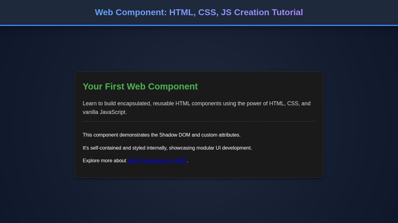
Final Output
After meticulously crafting our HTML structure, applying our encapsulated CSS, and wiring up the functionality with JavaScript, our user profile card component really comes to life. The key visual elements include a perfectly circular avatar, a clear hierarchy for the user’s name and bio, and an interactive call-to-action button. All these elements render beautifully, inheriting no styles from the parent page. You will see a polished, self-contained UI element.
The button, for instance, exhibits a subtle hover effect. Text within the card is readable and well-spaced. Most importantly, the entire card behaves as a single, cohesive unit. You can drop <user-profile-card> anywhere in your HTML, and it will just work, looking and feeling exactly as designed, completely independent of its surroundings. This is the true power of creating a self-contained Web Component. Its isolation ensures consistent display and behavior.
“Custom Elements, Shadow DOM, and HTML Templates empower developers to build robust, reusable, and framework-agnostic UI components.”
Conclusion
Wow, what a journey! We’ve successfully explored the exciting world of Web Component creation using nothing but HTML, CSS, and JavaScript. You now understand how to define a custom element, encapsulate its styles and structure with Shadow DOM, and manage its behavior and lifecycle. This fundamental knowledge is invaluable for any modern web developer. This skillset will undoubtedly empower you.
The power of custom elements lies in their reusability and encapsulation. They allow you to build complex interfaces from small, independent pieces, making your codebase more modular and easier to maintain. Consider using them for design systems, shared UI libraries, or even just to organize your own larger applications. You can even combine them with your favorite frameworks like React or Vue, creating truly universal components. If you’re tackling complex interfaces like those found in a Chatbot UI Design: HTML, CSS & JS Interface Guide, these modular building blocks are indispensable. Keep experimenting, keep building, and unleash the full potential of custom elements!