Have you ever marveled at how Google or your favorite IDE magically finishes your thoughts? That’s the power of intelligent suggestion at play. Today, we’re diving deep into building our very own AI Autocomplete input using fundamental web technologies: HTML, CSS, and JavaScript. This isn’t just a UI trick; it’s about creating a smarter, more intuitive user experience that anticipates user needs and saves precious keystrokes. We’ll craft a component that feels truly responsive and intelligent, paving the way for more engaging web applications.
What We Are Building
Imagine a search bar that, as you type, offers incredibly relevant suggestions even before you finish your word. That’s the essence of what we’re creating – a dynamic input field designed to anticipate your queries or entries. Our inspiration comes from modern search engines and interactive forms where speed and accuracy are paramount.
This type of feature is trending for excellent reasons. It significantly enhances user experience by reducing typing effort and minimizing errors. In an age where every second counts, an intelligent autocomplete system translates directly into improved productivity and user satisfaction. Think about e-commerce sites where quick product searches boost sales, or internal dashboards where precise data entry is critical. From bustling online stores to sophisticated code editors, the applications are virtually limitless. We are not just building a feature; we are building an intelligent assistant right into our web pages.
HTML Structure
Firstly, we lay the foundation with simple yet semantic HTML. We’ll need a container for our input and another for the dynamically generated suggestion list. Keep it clean; simplicity is key for both styling and JavaScript manipulation. This structure provides a clear separation of concerns, making our code easier to read and maintain.
<div class="autocomplete-container">
  <input type="text" id="aiAutocompleteInput" placeholder="Start typing..." autocomplete="off" aria-label="AI Autocomplete search input">
  <div id="autocompleteSuggestions" class="autocomplete-suggestions"></div>
</div>
CSS Styling
Next, we bring our component to life with CSS. Our goal is to create a visually appealing and highly usable interface. We’ll style the input field, the suggestion container, and individual suggestion items, ensuring they look great and provide clear feedback to the user. From subtle shadows to hover effects, every detail contributes to a polished feel.
.autocomplete-container {
  position: relative;
  width: 100%;
  max-width: 500px;
  margin: 50px auto;
}

#aiAutocompleteInput {
  width: 100%;
  padding: 12px 15px;
  font-size: 1rem;
  border: 1px solid #ccc;
  border-radius: 8px;
  box-shadow: 0 2px 5px rgba(0,0,0,0.1);
  outline: none;
  transition: border-color 0.3s ease, box-shadow 0.3s ease;
}

#aiAutocompleteInput:focus {
  border-color: #007bff;
  box-shadow: 0 0 0 3px rgba(0, 123, 255, 0.25);
}

.autocomplete-suggestions {
  position: absolute;
  top: 100%;
  left: 0;
  right: 0;
  background-color: #fff;
  border: 1px solid #eee;
  border-top: none;
  border-radius: 0 0 8px 8px;
  box-shadow: 0 5px 15px rgba(0,0,0,0.1);
  max-height: 200px;
  overflow-y: auto;
  z-index: 1000;
  display: none; /* Hidden by default */
}

.autocomplete-suggestion-item {
  padding: 10px 15px;
  cursor: pointer;
  font-size: 0.95rem;
  color: #333;
  transition: background-color 0.2s ease;
}

.autocomplete-suggestion-item:hover,
.autocomplete-suggestion-item.active {
  background-color: #f0f0f0;
  color: #007bff;
}

.autocomplete-suggestions.visible {
  display: block;
}
Step-by-Step Breakdown: Crafting Our AI Autocomplete Logic
This is where the magic happens! Our JavaScript will power the intelligence behind the autocomplete. We’ll handle user input, fetch suggestions (simulating an AI service), and dynamically update the UI. It’s a journey through event handling, DOM manipulation, and a touch of asynchronous programming.
1. Setting Up the Core Elements and Data
First things first, we need to grab references to our HTML elements. Then, we’ll define a simple array of potential suggestions. In a real-world scenario, this data would come from an API, possibly powered by machine learning models, but for our demonstration, a local array serves perfectly to illustrate the logic.
"The core of any interactive web component lies in its ability to respond to user actions. Event listeners are our ears, and DOM manipulation is our voice."
const aiAutocompleteInput = document.getElementById('aiAutocompleteInput');
const autocompleteSuggestions = document.getElementById('autocompleteSuggestions');

// Simulate AI-powered suggestions (in a real app, this would be an API call)
const suggestionsData = [
  "Artificial Intelligence", "Machine Learning", "Deep Learning",
  "Natural Language Processing", "Computer Vision", "Reinforcement Learning",
  "Data Science", "Big Data", "Cloud Computing",
  "Web Development", "Frontend Development", "Backend Development",
  "Full Stack Development", "DevOps", "Cybersecurity",
  "User Interface", "User Experience", "Agile Methodology",
  "Software Engineering", "Mobile Development", "Blockchain Technology"
];
It’s crucial to select meaningful identifiers for your elements. Clear IDs like aiAutocompleteInput and autocompleteSuggestions make our JavaScript much more readable and maintainable.
2. Listening for User Input and Debouncing
Performance is key. We don’t want to fetch suggestions on every single keystroke. Instead, we’ll implement a debouncing technique. This ensures our suggestion fetching function only runs after the user has paused typing for a short duration, preventing excessive calls and improving responsiveness. For handling asynchronous operations, understanding Promise Rejection: Best Practices in JavaScript becomes incredibly valuable, especially when dealing with real API calls that might fail.
let debounceTimer;

aiAutocompleteInput.addEventListener('input', () => {
  clearTimeout(debounceTimer);
  debounceTimer = setTimeout(() => {
    const inputValue = aiAutocompleteInput.value.toLowerCase();
    fetchSuggestions(inputValue);
  }, 300); // 300ms debounce time
});

aiAutocompleteInput.addEventListener('focus', () => {
  const inputValue = aiAutocompleteInput.value.toLowerCase();
  if (inputValue.length > 0) {
    fetchSuggestions(inputValue);
  }
});

document.addEventListener('click', (event) => {
  if (!autocompleteSuggestions.contains(event.target) && event.target !== aiAutocompleteInput) {
    hideSuggestions();
  }
});
We’ve added a focus listener to display suggestions if there’s already text in the input when the user clicks on it, and a global click listener to hide suggestions when clicking outside the component. This creates a much more natural user interaction flow.
3. Fetching and Displaying “AI” Suggestions
Our fetchSuggestions function will simulate an AI backend by filtering our suggestionsData array. It checks if the input value matches any part of the suggestions. Then, it dynamically creates div elements for each matching suggestion and appends them to our suggestions container. Proper ARIA attributes (external link to W3C documentation) are crucial for accessibility, especially in interactive forms like this. Making sure that interactive elements are navigable and understandable by everyone is paramount, as discussed in detail in Building Accessible Web Forms with HTML5 and JavaScript.
function fetchSuggestions(query) {
  autocompleteSuggestions.innerHTML = ''; // Clear previous suggestions

  if (query.length === 0) {
    hideSuggestions();
    return;
  }

  // Simulate async AI processing with a slight delay
  setTimeout(() => {
    const filteredSuggestions = suggestionsData.filter(suggestion =>
      suggestion.toLowerCase().includes(query)
    );

    if (filteredSuggestions.length > 0) {
      filteredSuggestions.forEach(suggestion => {
        const item = document.createElement('div');
        item.classList.add('autocomplete-suggestion-item');
        item.textContent = suggestion;
        item.addEventListener('click', () => {
          aiAutocompleteInput.value = suggestion;
          hideSuggestions();
        });
        autocompleteSuggestions.appendChild(item);
      });
      showSuggestions();
    } else {
      hideSuggestions();
    }
  }, 100); // Simulate network delay
}

function showSuggestions() {
  autocompleteSuggestions.classList.add('visible');
}

function hideSuggestions() {
  autocompleteSuggestions.classList.remove('visible');
  autocompleteSuggestions.innerHTML = '';
}
Notice the setTimeout in fetchSuggestions. While it’s a simple `setTimeout` here, it mimics the real-world latency you’d experience with a genuine API call to an AI service. This thoughtful approach to user feedback is vital.
4. Enhancing User Experience with Keyboard Navigation
A truly great autocomplete component allows users to navigate suggestions using the keyboard. We’ll add event listeners for arrow keys and Enter, making the experience seamless. Modern JavaScript features, like those previewed in JavaScript ES2025 — 5 Features You Should Know, often provide cleaner ways to handle such interactions, though standard event listeners remain powerful.
let activeSuggestionIndex = -1;

aiAutocompleteInput.addEventListener('keydown', (e) => {
  const items = autocompleteSuggestions.querySelectorAll('.autocomplete-suggestion-item');

  if (items.length === 0) return;

  if (e.key === 'ArrowDown') {
    e.preventDefault(); // Prevent cursor movement in input
    activeSuggestionIndex = (activeSuggestionIndex + 1) % items.length;
    updateActiveSuggestion(items);
  } else if (e.key === 'ArrowUp') {
    e.preventDefault(); // Prevent cursor movement in input
    activeSuggestionIndex = (activeSuggestionIndex - 1 + items.length) % items.length;
    updateActiveSuggestion(items);
  } else if (e.key === 'Enter') {
    e.preventDefault();
    if (activeSuggestionIndex > -1) {
      items[activeSuggestionIndex].click(); // Simulate click on active item
    } else {
      // Optionally, submit the current input value if no suggestion is active
      console.log('Submitted:', aiAutocompleteInput.value);
      hideSuggestions();
    }
  } else if (e.key === 'Escape') {
    hideSuggestions();
  }
});

function updateActiveSuggestion(items) {
  items.forEach((item, index) => {
    item.classList.remove('active');
    if (index === activeSuggestionIndex) {
      item.classList.add('active');
      // Scroll into view if necessary
      item.scrollIntoView({ block: 'nearest', inline: 'nearest' });
    }
  });
  // Update input value with active suggestion for visual feedback
  if (activeSuggestionIndex > -1) {
    aiAutocompleteInput.value = items[activeSuggestionIndex].textContent;
  }
}
With keyboard navigation, users can quickly cycle through suggestions, select the desired one, or dismiss the list. This small addition makes a monumental difference in usability, especially for power users.
Making It Responsive
In today’s multi-device world, responsiveness isn’t optional – it’s fundamental. Our AI Autocomplete input needs to look and function flawlessly across desktops, tablets, and smartphones. We achieve this primarily through fluid units and strategic media queries, adopting a mobile-first approach. This means designing for smaller screens first, then progressively enhancing for larger viewports.
We’ve already used max-width: 500px and width: 100% on our container, which helps it shrink gracefully. For font sizes and padding, relative units like rem or em are excellent choices. Consider adjusting font-size and possibly padding within media queries for an even more refined look on smaller screens.
/* Basic mobile-first adjustments */
@media (max-width: 600px) {
  .autocomplete-container {
    margin: 20px auto;
    padding: 0 15px; /* Add some padding on smaller screens */
  }

  #aiAutocompleteInput {
    font-size: 0.9rem;
    padding: 10px 12px;
  }

  .autocomplete-suggestion-item {
    font-size: 0.85rem;
    padding: 8px 12px;
  }
}
By starting with sensible defaults and then introducing specific rules for different breakpoints, we ensure our component remains elegant and functional, regardless of the device. This technique guarantees a consistent and pleasant experience for all your users. If you want to dive deeper into responsive design techniques, CSS-Tricks has fantastic resources (external link to CSS-Tricks) on media queries.
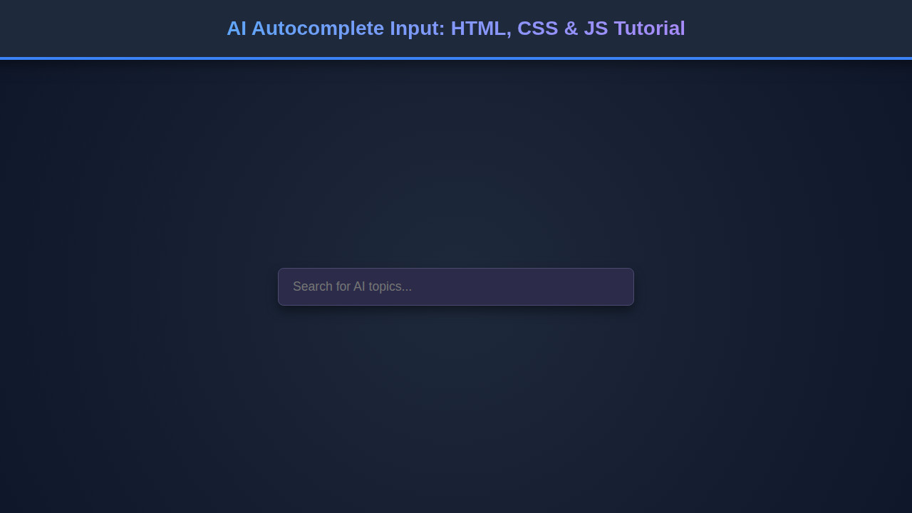
Final Output
Upon completing all these steps, you’ll have a fully functional and visually appealing AI-powered autocomplete input. The key visual elements will include a sleek, modern input field with clear focus states and a suggestion dropdown that appears dynamically. Each suggestion item will highlight on hover or keyboard navigation, providing excellent visual feedback. The overall aesthetic will be clean, professional, and intuitive, ready to be integrated into any web project. It truly feels like a smart component.
"Building something truly interactive means thinking about every micro-interaction. From the subtle delay of a simulated API call to precise keyboard navigation, these details define excellence."
Conclusion
You’ve just built an intelligent AI Autocomplete input using foundational web technologies! We started with a robust HTML structure, polished it with responsive CSS, and brought it to life with sophisticated JavaScript. This journey covered essential concepts like event handling, DOM manipulation, debouncing, and enhancing accessibility with keyboard navigation.
This component isn’t just a fancy UI element; it’s a powerful tool for improving user experience across countless applications. Think about integrating this into your next e-commerce search bar, a dynamic form for data entry, or even an internal knowledge base. The principles learned here are universally applicable. Keep experimenting, keep building, and remember that even seemingly complex features can be broken down into manageable, exciting steps. Happy coding!