Ever wanted to add a sleek, interactive notification or chat widget to your website? Look no further! Pop-out Messaging extensions are becoming incredibly popular. They offer a dynamic way to engage users without interrupting their flow. In this tutorial, we’re going to build a fantastic pop-out messaging widget from scratch. We’ll use the power of HTML, CSS, and JavaScript.
This project is perfect for enhancing user experience. It provides immediate feedback or communication options. Get ready to dive into some fun front-end development!
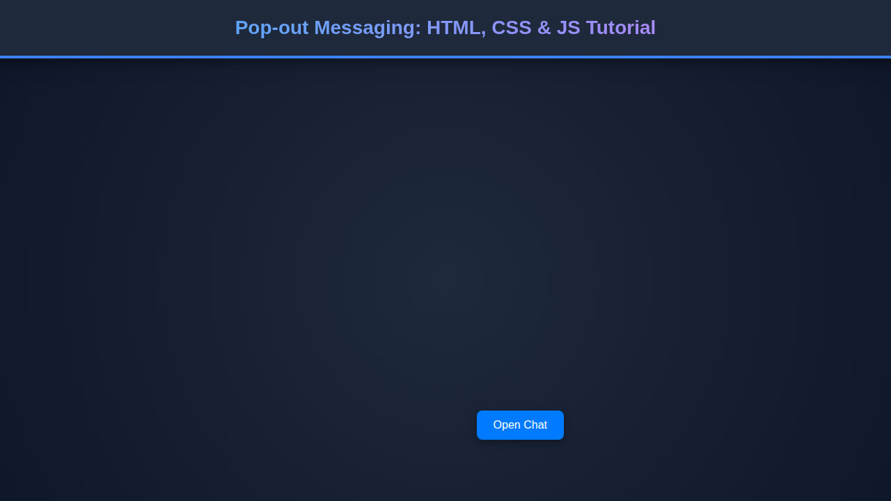
What We Are Building
Imagine a small, discreet icon on your webpage. When clicked, it smoothly expands into a feature-rich messaging panel. This is exactly what we are creating today. Our design draws inspiration from modern chat applications and notification systems. Think about the chat bubbles you see on e-commerce sites or the notification panels on social media platforms. These elements are user-friendly and highly intuitive.
Why are these “pop-out” features trending? They offer a non-intrusive way to deliver information or enable interaction. Users appreciate the control over when and how they engage. Furthermore, they keep the main interface clean and uncluttered. You can use these widgets for customer support, quick announcements, or even a mini-chat application. The possibilities are vast and incredibly exciting.
These components are extremely versatile. They fit perfectly into any web application that requires dynamic user interaction. They can be found on blogs, portfolios, or business sites. Ready to build something truly useful? Let’s get started on this exciting project!
“Great UI isn’t just about looking good; it’s about making complex interactions feel simple and intuitive for the user.”
Crafting the Pop-out Messaging HTML Structure
First, we’ll lay down the foundational HTML. This creates the basic elements for our pop-out widget. Our structure will be semantic and easy to understand. It ensures accessibility and maintainability. We will define a container for the entire widget, a button to toggle its visibility, and the messaging panel itself. The messaging panel will house a header, message area, and input field.
index.html
<!DOCTYPE html>
<html lang="en">
<head>
    <meta charset="UTF-8">
    <meta name="viewport" content="width=device-width, initial-scale=1.0">
    <title>Pop-out Messaging Extension</title>
    <link rel="stylesheet" href="styles.css">
</head>
<body>
    <!-- The button to toggle the message box -->
    <button id="messageToggleBtn" class="message-toggle-btn">Open Chat</button>

    <!-- The pop-out message box -->
    <div id="messageBox" class="message-box">
        <div class="message-header">
            <h3>Live Support Chat</h3>
            <button id="closeMessageBtn" class="close-btn">×</button>
        </div>
        <div class="message-content">
            <p>Hi there! Welcome to our live support.</p>
            <p>We're happy to help you with any questions about our products or services.</p>
            <p>Type your message below and a representative will get back to you shortly.</p>
            <p>Our team is available from 9 AM to 5 PM EST, Monday to Friday.</p>
            <p>If you're reaching out outside of these hours, we'll respond as soon as we're back online.</p>
        </div>
        <div class="message-input-area">
            <input type="text" placeholder="Type your message...">
            <button>Send</button>
        </div>
    </div>

    <script src="script.js"></script>
</body>
</html>
script.js
document.addEventListener('DOMContentLoaded', () => {
    const messageToggleBtn = document.getElementById('messageToggleBtn');
    const messageBox = document.getElementById('messageBox');
    const closeMessageBtn = document.getElementById('closeMessageBtn');

    // Ensure all elements exist before attaching listeners
    if (messageToggleBtn && messageBox && closeMessageBtn) {
        // Toggle the 'is-open' class on the message box when the main button is clicked
        messageToggleBtn.addEventListener('click', () => {
            messageBox.classList.toggle('is-open');
        });

        // Remove the 'is-open' class when the close button is clicked
        closeMessageBtn.addEventListener('click', () => {
            messageBox.classList.remove('is-open');
        });

        // Optional: Close message box if a click occurs outside the message box or toggle button
        document.addEventListener('click', (event) => {
            if (
                messageBox.classList.contains('is-open') &&
                !messageBox.contains(event.target) &&
                !messageToggleBtn.contains(event.target)
            ) {
                messageBox.classList.remove('is-open');
            }
        });
    }
});
Styling Your Pop-out Messaging with CSS
Next, we will bring our HTML to life with some elegant CSS. We’ll focus on making the widget visually appealing and highly functional. This includes smooth transitions for the pop-out effect, thoughtful positioning, and responsive design. Our goal is a clean, modern aesthetic that integrates seamlessly into any website. We’ll ensure it looks great on all devices.
styles.css
/* Basic reset and font settings */
* {
    box-sizing: border-box;
}

body {
    font-family: Arial, Helvetica, sans-serif;
    background-color: #f4f7f6; /* Light background for general site content */
    color: #333;
    margin: 0;
    overflow-x: hidden; /* Prevent horizontal scrollbars */
}

/* Styling for the message toggle button */
.message-toggle-btn {
    position: fixed;
    bottom: 40px;
    right: 40px;
    background-color: #007bff;
    color: white;
    border: none;
    padding: 12px 24px;
    border-radius: 8px;
    cursor: pointer;
    font-size: 1em;
    box-shadow: 0 4px 12px rgba(0, 0, 0, 0.3);
    transition: background-color 0.3s ease, transform 0.2s ease;
    z-index: 1000;
}

.message-toggle-btn:hover {
    background-color: #0056b3;
    transform: translateY(-2px);
}

/* Styling for the pop-out message box */
.message-box {
    position: fixed;
    bottom: 40px; /* Aligned with the button */
    right: 40px; /* Aligned with the button */
    width: 320px;
    max-width: calc(100vw - 80px); /* Responsive max width */
    height: 400px;
    max-height: calc(100vh - 80px); /* Responsive max height */
    background-color: #fff; /* White background for light theme */
    border: 1px solid #ddd;
    border-radius: 12px;
    box-shadow: 0 8px 32px rgba(0, 0, 0, 0.2);
    display: flex;
    flex-direction: column;
    transform: scale(0.7); /* Initial state: scaled down */
    transform-origin: bottom right; /* Scale from bottom right */
    opacity: 0;
    pointer-events: none; /* Make it unclickable when hidden */
    transition: transform 0.4s cubic-bezier(0.175, 0.885, 0.32, 1.275), opacity 0.3s ease; /* Pop-out effect with bounce */
    z-index: 1001;
}

.message-box.is-open {
    transform: scale(1); /* Open state: full size */
    opacity: 1;
    pointer-events: auto; /* Make it clickable when open */
}

/* Header of the message box */
.message-header {
    display: flex;
    justify-content: space-between;
    align-items: center;
    padding: 15px 20px;
    border-bottom: 1px solid #eee;
    background-color: #f7f7f7; /* Lighter background for header */
    border-top-left-radius: 11px;
    border-top-right-radius: 11px;
}

.message-header h3 {
    margin: 0;
    font-size: 1.1em;
    color: #333;
}

/* Close button in the header */
.close-btn {
    background: none;
    border: none;
    color: #888;
    font-size: 1.5em;
    cursor: pointer;
    padding: 5px;
    line-height: 1;
    transition: color 0.2s ease;
}

.close-btn:hover {
    color: #333;
}

/* Content area of the message box */
.message-content {
    flex-grow: 1;
    padding: 20px;
    overflow-y: auto;
    color: #555;
    line-height: 1.6;
}

/* Custom scrollbar for light theme */
.message-content::-webkit-scrollbar {
    width: 8px;
}

.message-content::-webkit-scrollbar-track {
    background: #f1f1f1;
    border-radius: 10px;
}

.message-content::-webkit-scrollbar-thumb {
    background: #ccc;
    border-radius: 10px;
}

.message-content::-webkit-scrollbar-thumb:hover {
    background: #bbb;
}

/* Input area at the bottom of the message box */
.message-input-area {
    padding: 15px 20px;
    border-top: 1px solid #eee;
    display: flex;
    background-color: #f7f7f7;
    border-bottom-left-radius: 11px;
    border-bottom-right-radius: 11px;
}

.message-input-area input {
    flex-grow: 1;
    padding: 10px 15px;
    border: 1px solid #ccc;
    border-radius: 6px;
    background-color: #fefefe;
    color: #333;
    font-size: 0.9em;
    margin-right: 10px;
    outline: none;
}

.message-input-area input::placeholder {
    color: #aaa;
}

.message-input-area input:focus {
    border-color: #007bff;
}

.message-input-area button {
    background-color: #007bff;
    color: white;
    border: none;
    padding: 10px 18px;
    border-radius: 6px;
    cursor: pointer;
    font-size: 0.9em;
    transition: background-color 0.3s ease;
}

.message-input-area button:hover {
    background-color: #0056b3;
}

/* Responsive adjustments for smaller screens */
@media (max-width: 600px) {
    .message-toggle-btn {
        bottom: 20px;
        right: 20px;
        padding: 10px 20px;
        font-size: 0.9em;
    }

    .message-box {
        bottom: 20px;
        right: 20px;
        width: calc(100vw - 40px);
        height: calc(100vh - 100px); /* Give more vertical space */
        max-height: calc(100vh - 100px);
    }
}
Step-by-Step Breakdown
Now, let’s pull back the curtain and understand how our code works its magic. We’ll dissect the HTML, CSS, and JavaScript. This will clarify each part’s role in creating our interactive pop-out widget. Each component plays a crucial role. We will explore event listeners, class toggling, and dynamic content injection.
The Core HTML: A Semantic Foundation
Our HTML serves as the backbone. It defines the structure of our pop-out messaging extension. We start with a main `div` container, perhaps with a class like `message-widget-container`. Inside this, we have a trigger button, usually a `button` or `div` with an icon. This button will open and close the messaging panel. The panel itself is another `div`. It contains a header, a body for messages, and a footer for input. Every element has a purpose.
Think about the `message-body` area. This is where all the conversations will appear. It’s important to give it an `overflow-y: auto;` property in CSS. This ensures that long message threads scroll properly. The input field, often a `textarea` or `input` element, allows users to type new messages. A send button, commonly an `` tag with an icon, completes the input section. This design promotes clear communication flow.
Dynamic Styling with CSS Transforms and Transitions
CSS is where the “pop-out” magic truly happens. We use properties like `position: fixed` or `absolute` to place our widget. It stays in a consistent spot on the screen. The initial state of our messaging panel is usually hidden, often with `transform: translateY(100%)` or `scale(0)` and `opacity: 0`. This makes it invisible off-screen or very small. We achieve the smooth animation by applying `transition` properties. These typically target `transform` and `opacity` over a short duration, like `0.3s ease-out`. This creates a polished feel.
When the user clicks the toggle button, JavaScript adds a class, for example, `is-active`. This class overrides the hidden styles. It changes the `transform` to `translateY(0)` or `scale(1)` and `opacity: 1`. Immediately, the panel slides smoothly into view. Remember to set a `z-index` to ensure your widget always appears above other page content. Using `box-shadow` also adds depth, making the widget stand out nicely. For more advanced styling techniques, check out MDN’s CSS reference. It is a fantastic resource for any web developer. You can also explore CSS-Tricks for creative layout ideas. They offer excellent guides on responsive design.
“Interactive components bridge the gap between static content and dynamic user engagement, turning visitors into participants.”
JavaScript: The Brains Behind the Behavior
JavaScript orchestrates the entire interactive experience. Our primary script handles the click event on the toggle button. When clicked, it checks if the messaging panel has the `is-active` class. If not, it adds the class, revealing the panel. If it does, it removes the class, hiding the panel. This simple toggle mechanism is very powerful. This also allows us to implement other features easily.
Beyond toggling, JavaScript also handles sending messages. When the user types something into the input field and clicks send, JavaScript captures that input. It then dynamically creates new HTML elements—a `div` or `li` for each message—and appends them to the `message-body` container. Each message should include the sender and content. A timestamp can also be added for better context. Remember to clear the input field after sending a message for a clean user experience. This also creates a dynamic chat flow. For other interactive UI ideas, consider building an AI Content Creator UI, which uses similar JavaScript principles for dynamic content display.
For a robust solution, you might also want to implement features like scrolling to the bottom of the `message-body` after a new message is added. The `scrollIntoView()` method is perfect for this. It ensures the latest message is always visible. Event delegation can also optimize handling clicks on multiple buttons inside the panel. This makes your code more efficient. We are creating a truly interactive experience.
Making It Responsive
A modern web component must look great on all screen sizes. Our pop-out messaging widget is no exception. We achieve responsiveness primarily through CSS media queries. For smaller screens, such as mobile phones, we might want the widget to occupy a larger portion of the screen. Instead of a small pop-out, it could become a full-width, bottom-fixed panel. This ensures readability and usability.
For example, a media query like `@media (max-width: 768px)` allows us to adjust the `width`, `height`, and `position` properties. On desktops, it might be a small floating widget in the corner. On mobile, it could expand to `width: 100%; height: 50vh;` and be fixed to the bottom. Flexbox or CSS Grid can also assist in arranging elements within the panel beautifully across different devices. Always prioritize mobile-first design. This ensures a great experience for all users.
Final Output
Upon completion, you will have a fully functional Pop-out Messaging extension. It features a sleek, animated toggle button and a dynamic message panel. The widget will seamlessly pop into view with a smooth transition. It allows users to send and view messages in real-time. It’s aesthetically pleasing and highly interactive. This enhances any web project by providing a direct communication channel or notification system. The visual effect will be quite satisfying. You’ve created a polished and professional component.
You can see how similar design principles are applied in building an AI Image Generator Interface. The user interaction and dynamic display elements are quite analogous. These skills are highly transferable.
Conclusion
We’ve embarked on an exciting journey. We built a powerful Pop-out Messaging extension using HTML, CSS, and JavaScript. This project showcases fundamental front-end development skills. It also demonstrates how to create interactive and engaging user interfaces. Such widgets are invaluable for improving user engagement and providing essential communication pathways on any website. You now have a solid foundation.
You can extend this project in many ways. Consider integrating with a backend for real-time chat, adding user avatars, or implementing message notifications. The core principles you’ve learned here apply to a vast array of interactive web components. Perhaps you’ll even integrate this into a Chatbot UI Design project! Keep experimenting and building. The web is your canvas!