Ever landed on a long article or documentation page and wished for a quick way to jump around? An Interactive TOC (Table of Contents) is your answer! This essential component dramatically improves user experience by providing a navigable outline of your content. Today, we’re going to dive deep into building a fully functional and stylish interactive table of contents using only HTML, CSS, and JavaScript. Get ready to empower your users with seamless navigation!
What We Are Building: Enhancing Navigation with an Interactive TOC
We’re embarking on a journey to construct a dynamic table of contents that isn’t just a static list of links. Instead, our creation will highlight the current section as the user scrolls, offering visual feedback and a sense of place within the document. Think of the polished documentation sites you admire; they often feature this exact element, making complex information digestible and easy to explore. It’s a game-changer for lengthy blog posts, project readmes, and extensive online guides.
Why is this trending? Because modern web design prioritizes user flow and accessibility. An intuitive navigation system, especially one that adapts to the user’s current view, significantly reduces cognitive load. It makes a site feel responsive and thoughtfully designed, guiding visitors effortlessly through your content. Furthermore, implementing an interactive element like this showcases a higher level of frontend development skill.
You can use this component virtually anywhere a page has multiple distinct sections. Imagine your portfolio site’s ‘About Me’ page, broken into sections like ‘Skills,’ ‘Experience,’ and ‘Projects.’ Or a detailed tutorial where users might want to jump directly to ‘Installation’ or ‘Troubleshooting.’ The possibilities are endless, and the value it adds to user experience is immeasurable. Let’s make your content shine!
HTML Structure: The Foundation of Our Component
Our HTML serves as the backbone, defining the content and the container for our table of contents. We’ll set up a main article area with several headings (h2, h3) that will eventually populate our TOC. The table of contents itself will live in a dedicated sidebar. This semantic approach makes our document accessible and easy to parse.
index.html
<!DOCTYPE html>
<html lang="en">
<head>
<meta charset="UTF-8">
<meta name="viewport" content="width=device-width, initial-scale=1.0">
<title>Interactive Table of Contents Component</title>
<link rel="stylesheet" href="styles.css">
</head>
<body>
<div class="container">
<nav id="toc" class="toc-component">
<h2>Contents</h2>
<ul>
<!-- TOC items will be dynamically generated by script.js -->
</ul>
</nav>
<main class="content-area">
<section id="introduction-to-component">
<h2>1. Introduction to the Component</h2>
<p>An interactive Table of Contents (TOC) significantly enhances user navigation on web pages, especially for lengthy articles or documentation. This component dynamically generates navigation links from your page's headings and highlights the current section as the user scrolls. It's built with standard web technologies: HTML for structure, CSS for styling, and JavaScript for dynamic behavior and interactivity.</p>
<p>The goal is to provide a seamless and intuitive browsing experience, allowing users to quickly jump to relevant sections while always knowing their position within the document. This tutorial will guide you through creating such a component from scratch, ensuring it's both functional and aesthetically pleasing in a dark mode theme.</p>
</section>
<section id="setting-up-html-structure">
<h2>2. Setting Up the HTML Structure</h2>
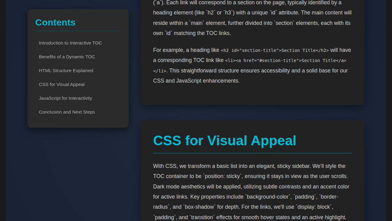
<p>The HTML foundation for our TOC involves two main parts: the navigation sidebar itself and the main content area. We'll use semantic HTML tags to ensure good accessibility and structure. The main content will consist of several <code><section></code> elements, each containing a heading (e.g., <code><h2></code>) and some paragraph text. Each <code><section></code> and its corresponding heading should have a unique <code>id</code> attribute. These IDs are crucial for linking from the TOC.</p>
<p>The TOC will be a <code><nav></code> element, containing an unordered list (<code><ul></code>). The list items (<code><li></code>) within this `ul` will hold anchor tags (<code><a></code>) that link to the `id`s of our content sections. JavaScript will populate this `ul` dynamically, making the component flexible and easy to use across different pages without manual updates.</p>
</section>
<section id="styling-with-css">
<h2>3. Styling with CSS</h2>
<p>Our CSS will transform the plain HTML into a visually appealing and functional component, adhering to a dark mode aesthetic. Key styling elements include setting a dark background for the entire page and sections, using a vibrant accent color for headings and active TOC links, and ensuring good contrast for readability. The TOC will be positioned as a sticky sidebar, meaning it remains visible as the user scrolls down the page.</p>
<p>We'll apply styles for:
<ul>
<li><strong>Body:</strong> Dark background, safe font-family, basic text color.</li>
<li><strong>Container:</strong> Flexbox for layout, centering, and spacing between TOC and content.</li>
<li><strong>TOC Component:</strong> Sticky positioning, dark background, padding, rounded corners, subtle shadow, and distinct styling for links, including hover and active states.</li>
<li><strong>Content Sections:</strong> Darker background than body, padding, rounded corners, and shadows, along with clear heading styles.</li>
</ul>
</p>
<p>The use of `box-sizing: border-box;` will ensure consistent sizing, and `overflow-x: hidden;` will prevent unwanted horizontal scrollbars. Transitions will be added for smooth visual feedback on hover and active states.</p>
</section>
<section id="javascript-for-interactivity">
<h2>4. JavaScript for Interactivity</h2>
<p>JavaScript brings the interactive aspects to life. It handles three primary functions:</p>
<ol>
<li><strong>Dynamic TOC Generation:</strong> It scans the document for specific heading elements (e.g., <code><h2></code>), assigns unique IDs if they don't exist, and creates corresponding list items and anchor links in the TOC.</li>
<li><strong>Smooth Scrolling:</strong> When a user clicks on a TOC link, JavaScript intercepts the default anchor jump and performs a smooth scroll to the target section using <code>scrollIntoView({ behavior: 'smooth' })</code>.</li>
<li><strong>Active Section Highlighting:</strong> This is achieved using the powerful <code>Intersection Observer API</code>. An observer monitors when each content section enters or leaves a specific "active zone" in the viewport. When a section becomes active, its corresponding TOC link is highlighted with a special CSS class (<code>.active</code>), providing real-time visual feedback to the user.</li>
</ol>
<p>The `Intersection Observer` is configured with a `rootMargin` to define the active zone (e.g., the top 30% of the viewport), ensuring that the highlight correctly switches as the user scrolls past sections. This robust approach ensures efficient and performant interactivity without continuously monitoring scroll events.</p>
</section>
<section id="customization-and-best-practices">
<h2>5. Customization and Best Practices</h2>
<p>This component is designed to be highly customizable. You can easily adjust the colors, fonts, spacing, and transition timings in <code>styles.css</code> to match your website's branding. For the JavaScript, consider:</p>
<ul>
<li><strong>Targeting Different Headings:</strong> Modify <code>document.querySelectorAll('.content-area h2')</code> to target <code>h3</code> or other heading levels if your content structure requires it.</li>
<li><strong>Intersection Observer Threshold:</strong> Experiment with the `rootMargin` and `threshold` values in the `observerOptions` to fine-tune when a section is considered "active."</li>
<li><strong>Accessibility:</strong> Ensure sufficient color contrast, provide keyboard navigation (which is largely handled by standard anchor tags but can be enhanced), and consider ARIA attributes if the component becomes more complex.</li>
<li><strong>Performance:</strong> The `Intersection Observer` is inherently performant, but always test on various devices to ensure a smooth experience.</li>
</ul>
<p>By following these guidelines, you can integrate a powerful and elegant interactive Table of Contents into your web projects, significantly enhancing content navigation and overall user experience.</p>
</section>
</main>
</div>
<script src="script.js"></script>
</body>
</html>script.js
document.addEventListener('DOMContentLoaded', () => {
    const tocList = document.querySelector('#toc ul');
    const contentHeadings = document.querySelectorAll('.content-area section h2');
    const contentSections = document.querySelectorAll('.content-area section');

    if (!tocList || contentHeadings.length === 0) {
        console.warn('TOC list or content headings not found. Skipping TOC generation.');
        return;
    }

    // 1. Dynamic TOC Generation
    contentHeadings.forEach((heading, index) => {
        // Ensure each heading has a unique ID
        const id = heading.id || `section-${index + 1}`;
        heading.id = id;

        // Create TOC list item and link
        const listItem = document.createElement('li');
        const link = document.createElement('a');
        link.href = `#${id}`;
        link.textContent = heading.textContent;
        link.dataset.targetId = id; // Custom data attribute to easily find the link

        // 2. Smooth Scrolling on Click
        link.addEventListener('click', (e) => {
            e.preventDefault(); // Prevent default jump behavior
            const targetElement = document.getElementById(id);
            if (targetElement) {
                targetElement.scrollIntoView({
                    behavior: 'smooth'
                });

                // Manually update active class when clicking a link
                document.querySelectorAll('.toc-component li a').forEach(a => a.classList.remove('active'));
                link.classList.add('active');
            }
        });

        listItem.appendChild(link);
        tocList.appendChild(listItem);
    });

    // 3. Active Section Highlighting using Intersection Observer
    const observerOptions = {
        root: null, // The viewport is the root
        rootMargin: '0px 0px -70% 0px', // A section is considered "active" when its top enters the top 30% of the viewport.
        threshold: 0 // As soon as any part of the target enters the root.
    };

    const observer = new IntersectionObserver((entries) => {
        let activeSectionId = null;

        // Find the topmost intersecting section in the 'active zone'.
        // Filter for currently intersecting entries.
        const intersectingEntries = entries.filter(entry => entry.isIntersecting);

        // Sort them by their position from the top of the viewport to get the topmost one.
        intersectingEntries.sort((a, b) => a.boundingClientRect.top - b.boundingClientRect.top);

        if (intersectingEntries.length > 0) {
            // The first one after sorting is the topmost intersecting entry
            activeSectionId = intersectingEntries[0].target.id;
        } else {
            // If no section is intersecting the 'active zone' (e.g., at very top of page or between sections),
            // default to the first section if available.
            if (contentHeadings.length > 0) {
                activeSectionId = contentHeadings[0].id;
            }
        }

        // Update active class on TOC links
        document.querySelectorAll('.toc-component li a').forEach(a => {
            if (a.dataset.targetId === activeSectionId) {
                a.classList.add('active');
            } else {
                a.classList.remove('active');
            }
        });
    }, observerOptions);

    // Observe each content section
    contentSections.forEach(section => {
        observer.observe(section);
    });
});
CSS Styling: Bringing Our Table of Contents to Life
With our HTML in place, CSS steps in to transform raw elements into a visually appealing and functional navigation panel. We’ll style the main content area, the sidebar, and most importantly, the individual links within the TOC. Our goal is to create a clean, readable, and visually distinct table of contents that complements the main content without being intrusive. We’ll also consider hover states and an ‘active’ class to highlight the current section.
styles.css
/* General Body and Base Styles */
body {
    font-family: Arial, Helvetica, sans-serif;
    margin: 0;
    background-color: #121212; /* Darkest background */
    color: #e0e0e0; /* Light text color */
    line-height: 1.6;
    padding: 20px;
    box-sizing: border-box; /* Include padding/border in element's total width/height */
    overflow-x: hidden; /* Prevent horizontal scroll */
}

/* Main Container Layout */
.container {
    display: flex;
    justify-content: center; /* Center content horizontally */
    align-items: flex-start; /* Align items to the top */
    max-width: 1200px; /* Max width for the whole component */
    margin: 0 auto; /* Center the container itself */
    gap: 40px; /* Space between TOC and content */
}

/* Table of Contents (TOC) Component */
.toc-component {
    flex: 0 0 280px; /* Fixed width, non-growing/shrinking */
    position: sticky; /* Keeps TOC in view while scrolling */
    top: 20px; /* Distance from top of viewport when sticky */
    padding: 25px;
    background-color: #1a1a1a; /* Slightly lighter dark for TOC background */
    border-radius: 10px;
    box-shadow: 0 5px 15px rgba(0,0,0,0.4); /* Subtle depth */
    transition: transform 0.3s ease; /* Smooth lift on hover */
}

.toc-component:hover {
    transform: translateY(-2px); /* Slight lift */
}

.toc-component h2 {
    font-size: 1.8em;
    color: #00bcd4; /* Accent color for TOC title */
    margin-top: 0;
    margin-bottom: 20px;
    border-bottom: 1px solid rgba(0,188,212,0.3); /* Subtle separator */
    padding-bottom: 10px;
}

.toc-component ul {
    list-style: none; /* Remove bullet points */
    padding: 0;
    margin: 0;
}

.toc-component li {
    margin-bottom: 8px; /* Space between TOC items */
}

.toc-component li a {
    display: block; /* Make the whole area clickable */
    padding: 10px 12px;
    color: #a0a0a0; /* Default link color */
    text-decoration: none; /* Remove underline */
    border-radius: 8px;
    transition: background-color 0.2s, color 0.2s, transform 0.2s; /* Smooth transitions */
    font-size: 0.95em;
}

.toc-component li a:hover {
    background-color: #2a2a2a; /* Darker background on hover */
    color: #ffffff; /* White text on hover */
    transform: translateX(5px); /* Slide effect on hover */
}

.toc-component li a.active {
    background-color: #00bcd4; /* Accent color for active item */
    color: #ffffff;
    font-weight: bold;
    box-shadow: 0 2px 8px rgba(0,188,212,0.4); /* Glow effect */
    transform: translateX(0); /* Reset slide for active item */
}

/* Content Area Styling */
.content-area {
    flex: 1; /* Takes remaining space */
    max-width: 800px; /* Max width for content sections */
}

section {
    background-color: #1a1a1a; /* Dark background for sections */
    padding: 30px;
    margin-bottom: 60px; /* Space between sections */
    border-radius: 10px;
    box-shadow: 0 5px 15px rgba(0,0,0,0.3); /* Depth for sections */
    transition: transform 0.3s ease; /* Smooth lift on hover */
    overflow: hidden; /* Ensure content stays within bounds */
    max-width: 100%; /* Important for responsive images/tables inside sections */
}

section:hover {
    transform: translateY(-3px); /* Slight lift on hover */
}

section h2 {
    font-size: 2.5em; /* Larger headings */
    color: #00bcd4; /* Accent color for section headings */
    margin-top: 0;
    margin-bottom: 25px;
    border-bottom: 2px solid rgba(0,188,212,0.3); /* Separator under heading */
    padding-bottom: 15px;
}

section p {
    font-size: 1.1em;
    line-height: 1.8; /* More readable line height */
    margin-bottom: 1em;
}

section ul {
    list-style: disc;
    padding-left: 20px;
    margin-bottom: 1em;
}

section li {
    margin-bottom: 0.5em;
}

/* Responsive Adjustments */
@media (max-width: 900px) {
    .container {
        flex-direction: column; /* Stack TOC and content vertically */
        align-items: center; /* Center items in column */
        gap: 30px;
    }
    .toc-component {
        position: static; /* No sticky positioning on smaller screens */
        width: 100%; /* Full width */
        max-width: 500px; /* Limit max width for TOC on small screens */
        margin-bottom: 20px; /* Space below TOC */
        top: auto; /* Reset top for static position */
    }
    .content-area {
        width: 100%;
        max-width: 600px; /* Limit content width on small screens */
    }
    body {
        padding: 15px;
    }
    section {
        margin-bottom: 40px;
        padding: 25px;
    }
    section h2 {
        font-size: 2em;
    }
    .toc-component h2 {
        font-size: 1.6em;
    }
}
Step-by-Step Breakdown: The JavaScript Magic
Here’s where the real fun begins! JavaScript is the brain behind our Interactive TOC, handling the dynamic generation, scroll tracking, and active link highlighting. We’ll break down the core logic into digestible sections, demonstrating how to make our component truly interactive.
Dynamically Generating the TOC
First, we need to populate our table of contents from the existing headings on the page. This prevents us from manually updating the TOC every time we add or remove a section. We’ll query all relevant heading elements (like h2 and h3) and create corresponding list items and anchor links for each. For instance, an h2 might become a top-level item, while h3s could be nested, creating a clear hierarchy.
We’ll extract the text content of each heading and use it as the link text. Importantly, each heading needs a unique ID if it doesn’t already have one, as these IDs will be the targets for our anchor links. We can generate these IDs programmatically by sanitizing the heading text, ensuring smooth navigation. Consequently, clicking a TOC link will smoothly scroll the user to the associated content section. Developing robust JavaScript applications often involves careful element manipulation, much like handling complex scenarios in end-to-end testing with Playwright, where selecting and interacting with page elements is key.
“Effective web development isn’t just about building features; it’s about crafting experiences that empower users and make complex interactions feel effortless.”
Tracking Scroll Position with Intersection Observer
The magic of highlighting the current section as you scroll typically involves the Intersection Observer API. This powerful API provides a way to asynchronously observe changes in the intersection of a target element with an ancestor scroll container or with the document’s viewport. It’s far more performant than listening to the scroll event, as it avoids continuous, expensive calculations.
We’ll create an observer instance and tell it to watch each of our content sections. When a section enters or leaves the viewport, the observer’s callback function fires. Inside this callback, we determine which section is currently in view and then apply an ‘active’ class to its corresponding link in the TOC. Conversely, we remove the ‘active’ class from previously highlighted links. This creates a smooth, visual indication of where the user is within the document, enhancing their navigational awareness.
Smooth Scrolling and Link Interaction
When a user clicks on a link in our Interactive TOC, we want the page to scroll smoothly to the target section, rather than abruptly jumping. We can achieve this using the scroll-behavior: smooth; CSS property on the html element. Alternatively, for more fine-grained control or browser compatibility, JavaScript’s element.scrollIntoView({ behavior: 'smooth' }) method is an excellent choice. This provides a polished user experience, preventing jarring transitions.
Furthermore, we need to ensure that when a TOC link is clicked, the ‘active’ class is immediately applied to that link. This gives instant visual feedback to the user that their action was registered. While the Intersection Observer will eventually catch up as the page scrolls, directly activating the link on click makes the component feel highly responsive. Maintaining consistent state and responsiveness is vital for any interactive component, similar to the precision needed when debugging complex JavaScript issues, where understanding execution flow is paramount for tools like JavaScript Debugging techniques.
Making It Responsive: Adapting to All Screens
In today’s multi-device world, a responsive design isn’t just a nice-to-have; it’s a must. Our interactive table of contents needs to look great and function flawlessly on desktops, tablets, and mobile phones. We’ll achieve this primarily through CSS media queries. This allows us to adjust the layout and styling based on screen size.
For smaller screens, the fixed sidebar might become too intrusive. Consequently, we could transform it into a collapsible menu or move it to the top of the content area. We might hide it by default and only reveal it when a ‘hamburger’ icon is tapped. Also, adjusting font sizes and padding within the TOC ensures readability without overwhelming the viewport. Ensuring your web components gracefully handle various screen sizes is critical for a broad user base. This kind of attention to detail is as important for user experience as robust testing is for application stability, such as E2E testing with JavaScript for robust applications.
Our Interactive TOC: Achieving the Final Polish
The beauty of our interactive table of contents lies in its seamless integration and thoughtful design. We’ve created a component that dynamically adapts to content changes, provides immediate visual feedback during scrolling, and offers smooth navigation. The ‘active’ link styling ensures users always know their current position, a critical feature for long-form content. This attention to detail elevates a standard page into a highly interactive and user-friendly experience.
Visually, the key elements we aimed for include a clear distinction between the main content and the sidebar TOC, distinct hover states for links, and a prominent ‘active’ state that is easily discernible. We also focused on subtle transitions and animations to make the interactions feel fluid rather than abrupt. Moreover, consistent typography and spacing contribute to an overall professional aesthetic. You can find excellent resources on advanced CSS animations and transitions on CSS-Tricks to further enhance such details.
Conclusion: Empowering Your Users with Better Navigation
You’ve just built a powerful Interactive TOC component, a testament to the versatility of HTML, CSS, and JavaScript. This journey has demonstrated not just how to code, but how to think about user experience and performance. By dynamically generating the TOC, using the Intersection Observer for efficient scroll tracking, and ensuring responsiveness, you’ve equipped your web projects with an invaluable navigation tool.
Applying this component can transform any content-heavy page into an accessible and engaging read. Think about documentation sites, comprehensive blog posts, or even e-learning platforms. The ability for users to quickly scan, understand the structure, and jump to relevant sections significantly reduces frustration and improves content retention. Furthermore, this adds a professional touch, signaling to your users that you care about their journey through your information.
“The best user interfaces often fade into the background, allowing the content and the user’s goals to take center stage.”
So go forth, integrate this interactive gem into your next project, and watch as your users effortlessly navigate through your brilliantly structured content. Happy coding!