GeoCities Card Design is making a fun comeback in web development, bringing a wave of nostalgia with its quirky, vibrant aesthetic. Do you remember the wild west days of the internet, where every personal page had its own unique, often chaotic, charm? Today, we’re not just reminiscing; we’re reclaiming that spirit! This tutorial will guide you through crafting beautiful, retro-inspired card designs using only HTML and CSS, proving that sometimes, old school truly is the new cool. Get ready to sprinkle some pixelated magic onto your modern projects.
What We Are Building
We’re embarking on a delightful journey to recreate the distinctive look of GeoCities-era web pages, specifically focusing on card-like elements. Imagine those personal "home page" sections, often featuring bold borders, pixel art, shimmering backgrounds, and a dash of animated GIFs. This isn’t just about mimicry; it’s about capturing a unique *vibe*. This style is trending because it stands out dramatically from the sleek, minimalist designs prevalent today. It offers a playful, human touch that modern users often find refreshing and engaging.
You can deploy these unique GeoCities Card Design elements in various contemporary contexts. For instance, imagine a "meet the team" section where each member receives a personalized, quirky card. Or, consider an event listing with each event highlighted in its own retro container. Furthermore, these designs are perfect for portfolio showcases, blog post summaries, or even as eye-catching call-to-action button sets. The opportunities are truly endless for injecting personality and a sense of fun, making your web projects memorable.
HTML Structure
First, we’ll lay down the foundational HTML. This creates the basic container for our card and its content, establishing a clear semantic structure before we even think about styling. We’ll use a div for the main card, with internal elements for an image, title, and descriptive text. Here’s how our basic structure will look:
<div class="geocities-card-container">
    <div class="geocities-card">
        <img src="https://via.placeholder.com/150x150/FF00FF/000000?text=My+Pic" alt="Profile picture" class="card-image">
        <h3 class="card-title">Welcome to My Page! <span class="blinking-text">NEW!</span></h3>
        <p class="card-text">
            Hey there, internet traveler! This is my super cool GeoCities inspired card.
            Here you'll find all sorts of awesome stuff. Under construction!
        </p>
        <div class="card-footer">
            <button class="card-button">Enter Here</button>
            <span class="visitor-count">Visitors: <span id="visitor-counter">9001</span></span>
        </div>
        <div class="decorative-element top-left">✨</div>
        <div class="decorative-element bottom-right">🌈</div>
    </div>

    <div class="geocities-card special-card">
        <img src="https://via.placeholder.com/150x150/00FFFF/000000?text=Another+Pic" alt="Another random picture" class="card-image">
        <h3 class="card-title">Cool Stuff Inside</h3>
        <p class="card-text">
            Check out this totally radical section! We've got links, facts, and more!
            Don't forget to sign my guestbook!
        </p>
        <div class="card-footer">
            <button class="card-button">Click Me!</button>
            <span class="animated-icon">🚀</span>
        </div>
        <div class="decorative-element top-right">🚧</div>
        <div class="decorative-element bottom-left">💻</div>
    </div>
</div>
CSS Styling
Next, we’ll dive into the heart of our project: the CSS. This is undoubtedly where the true GeoCities magic happens! We’ll apply styles that transform our plain HTML into a vibrant, border-heavy, and visually engaging card, complete with those iconic retro flourishes. Prepare to make it pop!
body {
    font-family: "Comic Sans MS", "Comic Sans", cursive, sans-serif; /* The quintessential GeoCities font */
    background-color: #333;
    color: #eee;
    margin: 0;
    display: flex;
    justify-content: center;
    align-items: center;
    min-height: 100vh;
    padding: 20px;
    box-sizing: border-box;
    background-image: url('data:image/svg+xml;base64,PHN2ZyB3aWR0aD0iMjAiIGhlaWdodD0iMjAiIHZpZXdCb3g9IjAgMCAyMCAyMCIgZmlsbD0ibm9uZSIgeG1sbnM9Imh0dHA6Ly93d3cudzMub3JnLzIwMDAvc3ZnIj4KPHJlY3Qgd2lkdGg9IjIwIiBoZWlnaHQ9IjIwIiBmaWxsPSIjMzMzMzMzIi8+CjxwYXRoIGQ9Ik0wIDBINjBWMjBIMFYwWiIgZmlsbD0idXJsKCNwYXR0ZXJuMCkiLz4KPHBhdGggZD0iTTggMEgyMFYxMkg4VjBaIiBmaWxsPSJ1cmwoI3BhdHRlcm4xKSIvPgo8ZGVmcz4KPHBhdHRlcm4gaWQ9InBhdHRlcm4wIiBwYXR0ZXJuQ29udGVudFVuaXRzPSJvYmplY3RCb3VuZGluZ0JveCIgd2lkdGg9IjEiIGhlaWdodD0iMSI+Cjx1c2Ugc3Ryb2tlPSJibGFjayIgc3Ryb2tlLXdpZHRoPSIuMjUiIGhyZWY9IiNzdGFyIi8+CjwvcGF0dGVybj4KPHBhdHRlcm4gaWQ9InBhdHRlcm4xIiBwYXR0ZXJuQ29udGVudFVuaXRzPSJvYmplY3RCb3VuZGluZ0JveCIgd2lkdGg9IjEiIGhlaWdodD0iMSI+Cjx1c2Ugc3Ryb2tlPSJibGFjayIgc3Ryb2tlLXdpZHRoPSIuMjUiIGhyZWY9IiNzdGFyIi8+CjwvcGF0dGVybj4KPG1hc2sgYWN0aXZlPSJub25lIiBpZD0ibWFzazAiIHN0eWxlPSJtYXNjLXR5cGU6YWxwaGEiIG1hc2tVbml0cz0idXNlckNwYWNlT25Vc2UiIHg9IjAiIHk9IjAiIHdpZHRoPSIyMCIgaGVpZ2h0PSIyMCI+CjxyZWN0IHdpZHRoPSIyMCIgaGVpZ2h0PSIyMCIgZmlsbD0iI2ZmZmZmZiIvPgo8L21hc2s+CjxkZWZzPgogIDxzeW1ib2wgaWQ9InN0YXIiIHZpZXdCb3g9IjAgMCA1IDUiPgogICAgPHBvbHlnb24gcG9pbnRzPSIyLjUsMC4xIDMsMS42IDQuOSwxLjYgMy40LDIuNyAzLjksNC44IDIuNSwzLjcgMS4xLDQuOCAxLjYsMi43IDAuMSwxLjYgMiwxLjYgMi41LDAuMSIgZmlsbD0id2hpdGUiIHN0cm9rZT0iYmxhY2siIHN0cm9rZS13aWR0aD0iLjIiLz4KICA8L3N5bWJvbT4KPC9kZWZzPgo8L3N2Zz4='); /* Subtle star tile pattern */
    background-size: 20px 20px;
}

.geocities-card-container {
    display: flex;
    flex-wrap: wrap;
    gap: 40px; /* Space between cards */
    justify-content: center;
    align-items: flex-start;
    max-width: 1200px;
}

.geocities-card {
    background-color: #000080; /* Dark blue background */
    color: #FFD700; /* Gold text */
    padding: 20px;
    border: 5px solid #FF00FF; /* Magenta border */
    border-style: double;
    box-shadow: 8px 8px 0px 0px #00FFFF, 16px 16px 0px 0px #FFFF00; /* Cyan and yellow layered shadow */
    max-width: 300px;
    min-width: 280px;
    text-align: center;
    position: relative;
    overflow: hidden;
    margin-bottom: 30px; /* Added margin for stacking on smaller screens */
    transition: all 0.3s ease-in-out;
}

.geocities-card:hover {
    transform: scale(1.05) rotate(2deg);
    box-shadow: 10px 10px 0px 0px #00FFFF, 20px 20px 0px 0px #FFFF00, 30px 30px 0px 0px #FF00FF;
    z-index: 10;
}

.card-image {
    width: 150px;
    height: 150px;
    object-fit: cover;
    border: 3px solid #00FFFF; /* Cyan border around image */
    margin-bottom: 15px;
    filter: grayscale(80%);
    transition: filter 0.3s ease;
}

.geocities-card:hover .card-image {
    filter: grayscale(0%);
    border-color: #FF00FF; /* Magenta border on hover */
}

.card-title {
    font-size: 1.8em;
    color: #FFFF00; /* Bright yellow title */
    text-shadow: 3px 3px #FF00FF; /* Magenta shadow */
    margin-bottom: 10px;
    text-transform: uppercase;
    animation: text-glow 2s infinite alternate;
}

.card-text {
    font-size: 1.1em;
    line-height: 1.4;
    color: #FFD700; /* Gold text */
    margin-bottom: 20px;
}

.card-footer {
    display: flex;
    justify-content: space-between;
    align-items: center;
    margin-top: 20px;
    border-top: 2px dashed #00FFFF;
    padding-top: 15px;
}

.card-button {
    background-color: #FF00FF; /* Magenta button */
    color: #00FFFF; /* Cyan text */
    border: 3px outset #00FFFF; /* Outset border */
    padding: 10px 15px;
    cursor: grab;
    font-weight: bold;
    text-transform: uppercase;
    font-family: inherit;
    transition: all 0.2s ease;
}

.card-button:hover {
    background-color: #00FFFF; /* Cyan on hover */
    color: #FF00FF; /* Magenta text on hover */
    border-style: inset;
    transform: translateY(-2px);
    cursor: url('data:image/svg+xml;utf8,<svg xmlns="http://www.w3.org/2000/svg" width="20" height="20" viewBox="0 0 20 20"><path fill="%23FFFF00" stroke="%23000" stroke-width="1" d="M10 0 L12 8 L20 8 L14 12 L16 20 L10 16 L4 20 L6 12 L0 8 L8 8 Z"/></svg>') 10 10, auto; /* Star cursor */
}

.visitor-count {
    font-size: 0.9em;
    color: #00FFFF; /* Cyan count */
    background-color: #000080;
    padding: 5px 10px;
    border: 1px solid #FF00FF;
    display: inline-block;
    animation: pulse-border 1.5s infinite alternate;
}

.blinking-text {
    animation: blink 0.8s infinite alternate;
}

.decorative-element {
    position: absolute;
    font-size: 2.5em;
    line-height: 1;
    text-shadow: 2px 2px #000;
    z-index: 5;
    pointer-events: none;
}

.top-left {
    top: -15px;
    left: -15px;
    animation: rotate-shake 3s infinite ease-in-out;
}

.top-right {
    top: -15px;
    right: -15px;
    animation: pulse-color 4s infinite alternate;
    color: #FF00FF;
}

.bottom-left {
    bottom: -15px;
    left: -15px;
    animation: float 5s infinite ease-in-out;
}

.bottom-right {
    bottom: -15px;
    right: -15px;
    animation: wobble 2s infinite ease-in-out;
}

.special-card {
    background-color: #800080; /* Purple background */
    border-color: #00FF00; /* Green border */
    box-shadow: 8px 8px 0px 0px #FF00FF, 16px 16px 0px 0px #00FFFF; /* Magenta and cyan layered shadow */
    animation: card-hover-animation 5s infinite alternate; /* Continuous subtle animation */
}

.special-card .card-title {
    color: #00FF00; /* Green title */
    text-shadow: 3px 3px #FF00FF;
}

.special-card .card-button {
    background-color: #00FF00; /* Green button */
    color: #800080; /* Purple text */
    border-color: #FF00FF;
}

.special-card .card-button:hover {
    background-color: #FF00FF;
    color: #00FF00;
    border-color: #00FF00;
}

.animated-icon {
    font-size: 2em;
    animation: bounce 1.5s infinite;
    display: inline-block;
}

/* Keyframe Animations */
@keyframes blink {
    0%, 100% { opacity: 1; }
    50% { opacity: 0; }
}

@keyframes text-glow {
    0%, 100% { text-shadow: 3px 3px #FF00FF; }
    50% { text-shadow: 3px 3px 5px #FFFF00, 0 0 20px #FF00FF; }
}

@keyframes pulse-border {
    0%, 100% { border-color: #FF00FF; }
    50% { border-color: #00FFFF; }
}

@keyframes rotate-shake {
    0% { transform: rotate(0deg); }
    25% { transform: rotate(5deg) translateX(2px); }
    50% { transform: rotate(-5deg) translateX(-2px); }
    75% { transform: rotate(3deg) translateX(1px); }
    100% { transform: rotate(0deg); }
}

@keyframes pulse-color {
    0%, 100% { color: #FF00FF; }
    50% { color: #00FFFF; }
}

@keyframes float {
    0%, 100% { transform: translateY(0); }
    50% { transform: translateY(-10px); }
}

@keyframes wobble {
    0%, 100% { transform: translateX(0) translateY(0); }
    15% { transform: translateX(-5px) translateY(-5px); }
    30% { transform: translateX(5px) translateY(5px); }
    45% { transform: translateX(-5px) translateY(-5px); }
    60% { transform: translateX(5px) translateY(5px); }
    75% { transform: translateX(-5px) translateY(-5px); }
    90% { transform: translateX(5px) translateY(5px); }
}

@keyframes bounce {
    0%, 20%, 50%, 80%, 100% {
        transform: translateY(0);
    }
    40% {
        transform: translateY(-15px);
    }
    60% {
        transform: translateY(-7px);
    }
}

@keyframes card-hover-animation {
    0%, 100% {
        transform: rotate(0deg);
        box-shadow: 8px 8px 0px 0px #FF00FF, 16px 16px 0px 0px #00FFFF;
    }
    50% {
        transform: rotate(-1deg);
        box-shadow: 10px 10px 0px 0px #FF00FF, 20px 20px 0px 0px #00FFFF;
    }
}

/* Responsive adjustments */
@media (max-width: 768px) {
    .geocities-card-container {
        gap: 20px;
    }

    .geocities-card {
        max-width: 90%;
        min-width: unset;
        width: 100%;
        margin-left: auto;
        margin-right: auto;
        box-shadow: 5px 5px 0px 0px #00FFFF, 10px 10px 0px 0px #FFFF00; /* Smaller shadows */
    }

    .geocities-card:hover {
        transform: scale(1.02); /* Less dramatic hover effect on mobile */
        box-shadow: 7px 7px 0px 0px #00FFFF, 14px 14px 0px 0px #FFFF00, 21px 21px 0px 0px #FF00FF;
    }

    .card-title {
        font-size: 1.5em;
    }

    .card-text {
        font-size: 1em;
    }

    .card-footer {
        flex-direction: column;
        gap: 10px;
    }

    .card-button {
        width: 100%;
    }

    .visitor-count {
        width: 100%;
    }

    .decorative-element {
        font-size: 1.8em; /* Smaller decorative elements */
    }
}
Step-by-Step Breakdown
Let’s dissect the code and understand how each piece contributes to our GeoCities Card Design. We’ll cover everything from the basic layout to the intricate details that scream 90s internet.
Base Styles and Layout
First, we begin by setting up a simple page structure. Consequently, a body with display: flex, justify-content: center, and align-items: center helps center our cards nicely. The font-family immediately brings us back to those classic web fonts; for example, ‘Comic Sans MS’ or ‘Impact’ are prime candidates for this nostalgic feel. Remember, the goal here is to embrace the maximalism and sometimes "imperfect" beauty of early web design.
We define a .geocities-card class for our main container. This digital canvas will house all our card’s elements. We give it a width, min-height, and padding. Critical to the GeoCities aesthetic are the border properties. Instead of a single, sleek line, we often see multiple borders, perhaps a double border or even ridge/groove effects. This creates that chunky, layered look. Don’t forget a box-shadow for depth; perhaps even a slightly exaggerated one to mimic early graphical interfaces.
Imagery and Text Elements
Inside our card, we typically find an image. The .card-image class ensures our image fits well within the card’s boundaries. Utilizing width: 100% and height: auto makes it responsive, while object-fit: cover prevents distortion. Sometimes, a subtle border around the image itself, or even a filter: grayscale() with a hover effect to bring back color, can add a nice touch. For more advanced effects like a pulsating border, you might explore techniques used in a skeleton loader animation to simulate a loading state or add a dynamic flair.
The .card-title and .card-text are where our typography truly comes alive. GeoCities sites loved large, bold titles, often with text-shadow or even a text-decoration: underline that wasn’t just for links. Color choices are paramount here – think bright, contrasting hues! Yellows, magentas, and electric blues were commonplace. Furthermore, line height and letter spacing were frequently adjusted to fill space or create a more "designed" look, even if it wasn’t always perfectly legible by modern standards.
The charm of GeoCities wasn’t just in its aesthetics; it was in the unfiltered self-expression it empowered. Every blinking GIF and tiled background told a story.
Decorative Elements and Animations
This is where we truly let our creativity go wild! GeoCities pages were notorious for their decorative elements. We can simulate these using pseudo-elements (::before and ::after). Imagine adding a small, pixelated star icon or a tiny "under construction" sign in a corner of your card. You can easily achieve this with content: '✨' and absolute positioning.
Animated backgrounds were also a hallmark. While we won’t use actual GIFs, we can create CSS animations that mimic that early web feel. A subtle animation: pulse 2s infinite alternate; on a border or a background-position shift can instantly bring life to your card. For example, if you wanted to build a notification system, you could explore how toast notification designs incorporate small animated elements to draw attention. It’s truly about movement, vibrancy, and a bit of organized chaos.
We might even include a simple button. The .card-button would feature bold text, a bright background, and perhaps a border-width that shifts on hover, or a transform: scale(1.05) for a gentle pop. Buttons back then were often more about making a statement than sleek usability. Learning about the different types of CSS border styles on MDN can give you even more ideas for creating truly unique button aesthetics.
Hover Effects and Interactivity
GeoCities sites absolutely loved a good hover effect! Think about transform: rotate(2deg); or a sudden background-color change when you mouse over a card. These interactions, while simple, truly add to the playfulness. We can use transition: all 0.3s ease-in-out; to smooth these effects, making them feel intentional rather than jarring. A classic technique involves changing the box-shadow or border on hover, making the card appear to "pop out" or glow.
Web design in the 90s was a wild frontier. Developers were explorers, experimenting with every tag and property, creating a vibrant, unregulated digital landscape.
Consider a different cursor on hover, such as cursor: help; or cursor: grabbing; to further enhance the retro feel. You can even experiment with filter properties, for instance, filter: invert(100%) on hover for a truly shocking, vintage effect. For more comprehensive UI components, like creating an accessible interactive element, you might reference guides on building an accessible tooltip to ensure your retro designs are still user-friendly.
Making It Responsive
While GeoCities wasn’t built for mobile, our modern recreation certainly should be! Making your GeoCities Card Design responsive is crucial. We’ll employ media queries to adjust the card’s layout and size for smaller screens. Specifically, the flex-wrap: wrap property on the parent container ensures cards stack neatly.
For mobile-first development, start by styling your card for the smallest screen, then use min-width media queries to progressively enhance the design for larger viewports. For instance, you might reduce padding, simplify border styles, or decrease font sizes within a @media (max-width: 768px) block. On larger screens, you can increase the width of the cards or allow them to sit side-by-side using flex-basis or grid-template-columns. Ensuring readability and usability on all devices is key, even when aiming for a nostalgic aesthetic. This sometimes means toning down some of the more elaborate decorations for smaller screens. You can learn more about responsive design techniques on sites like CSS-Tricks, which offers excellent guides on Flexbox.
Final Output
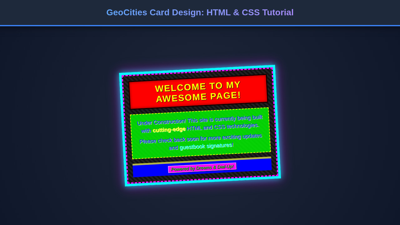
With all our HTML and CSS in place, the result is a beautifully chaotic and utterly charming GeoCities Card Design. We’ve achieved that iconic chunky border, the vibrant, often clashing color palette, and the distinct retro typography. The cards stand out boldly, each one a mini-masterpiece of early internet aesthetics. Imagine a gallery of these cards, each one a window into a bygone digital era, yet perfectly functional and engaging in a modern browser. Ultimately, the key visual elements – the distinct border treatments, the impactful fonts, and the playful use of color and shadow – all come together to create a truly unique user experience that evokes a sense of nostalgia and fun.
Conclusion
You’ve just learned how to craft a fantastic GeoCities Card Design using straightforward HTML and CSS. We’ve explored everything from structuring your content to applying those wonderfully over-the-top styles that define the early internet. This isn’t just a design exercise; it’s a celebration of web history and a powerful way to inject personality into your projects.
So, where can you apply this? Beyond the "meet the team" and "event listing" ideas, think about personal blogs, creative portfolio sections, or even themed e-commerce sites. Any place you want to break away from the mundane and offer a truly unique, memorable user experience is fair game. Go forth, experiment, and let your creativity run wild – just like the early web developers did! The digital world is your playground; now you have another exciting tool in your design toolkit.