Want to Make Your Layouts Effortlessly Responsive? CSS Grid Can Make It Happen
Introduction
In the world of modern frontend development, CSS Grid has become one of the most revolutionary layout systems available. It allows developers and designers to create flexible, fully responsive page structures without the messy tangle of floats, clearfix hacks, or endless media queries. Whether you’re designing a product dashboard, a photography portfolio, a marketing landing page, or a complex blog layout, CSS Grid puts the power of precise alignment and proportional control right at your fingertips.
In this comprehensive guide, you’ll explore powerful CSS Grid techniques—sometimes called “Grid tricks”—that make layout creation faster, cleaner, and more predictable. We’ll also look at how CSS Grid pairs beautifully with Flexbox to give you total control at both the macro (page) and micro (component) levels. By the end, you’ll be ready to build designs that gracefully adapt to any screen size.

1. Use auto-fit and minmax() for Truly Flexible Grids
One of the most popular and effective CSS Grid patterns is combining auto-fit with the minmax() function. This dynamic duo allows your layout to automatically adapt to different viewport sizes without you writing a single media query.
.grid {
  display: grid;
  grid-template-columns: repeat(auto-fit, minmax(250px, 1fr));
  gap: 1rem;
}
What happens here is magical: as the browser resizes, the grid will automatically fill the row with as many 250 px-wide columns as possible. When there’s no room left, items simply wrap to the next line. The 1fr ensures that each column flexes to fill available space, creating a perfectly balanced and responsive grid.
Why it matters: this setup eliminates rigid breakpoints. It’s ideal for product listings, image galleries, service cards, or blog post previews. Designers often spend hours writing media queries for layouts that this one-liner can handle elegantly.
Bonus Tip: You can pair it with place-items: center; to ensure all items align nicely both horizontally and vertically.
2. Master Implicit vs. Explicit Grid Tracks
CSS Grid gives you two types of tracks—explicit and implicit. Understanding how both behave makes your layouts predictable and easier to maintain.
Explicit tracks are those you define directly in your CSS:
.grid {
  display: grid;
  grid-template-columns: repeat(3, 1fr);
}
Implicit tracks, on the other hand, are automatically created by the browser whenever grid items overflow beyond the defined template. For example, if you have more than three items, the browser will generate additional rows for them.
To control the size of these automatically generated tracks, use:
.grid {
  grid-auto-rows: 200px;
  grid-auto-columns: 100px;
}
This trick ensures your implicit tracks behave consistently, preventing unpredictable spacing when content varies. It’s particularly useful for content feeds or dynamic lists where the number of items isn’t fixed.
Pro insight: when mixing explicit and implicit tracks, remember that Grid calculates available space first for explicit ones, then distributes the remainder for implicit ones. Adjusting grid-auto-flow (for example, row dense) can help fill gaps efficiently.
3. Create Responsive Layouts with grid-template-areas
Named grid areas are one of CSS Grid’s most readable and intuitive features. Instead of juggling row and column numbers, you can describe your layout in plain text.
.grid {
  display: grid;
  grid-template-areas:
    "header header"
    "sidebar content"
    "footer footer";
  grid-template-columns: 250px 1fr;
  gap: 1rem;
}
Then assign each element to a named area:
header { grid-area: header; }
aside  { grid-area: sidebar; }
main   { grid-area: content; }
footer { grid-area: footer; }
When adapting this for mobile, you can redefine the grid areas with a quick media query:
@media (max-width: 600px) {
  .grid {
    grid-template-areas:
      "header"
      "content"
      "footer";
    grid-template-columns: 1fr;
  }
}
The result? A responsive layout that collapses gracefully without having to rewrite your entire structure. It’s semantic, self-documenting, and easy to read—making it perfect for collaborative projects.
4. Combine Flexbox and Grid for Hybrid Power
CSS Grid and Flexbox are often seen as competitors, but in reality, they complement each other beautifully. Grid handles large-scale structure—rows, columns, and spacing—while Flexbox excels at aligning content within those grid items.
.card {
  display: flex;
  flex-direction: column;
  justify-content: space-between;
  padding: 1rem;
  border-radius: .5rem;
  background: #fff;
}
Place these cards inside a grid container defined like this:
.cards {
  display: grid;
  grid-template-columns: repeat(auto-fit, minmax(280px, 1fr));
  gap: 1.5rem;
}
This hybrid approach creates a responsive, adaptive design system. Each card uses Flexbox for internal alignment (for instance, keeping buttons anchored at the bottom), while Grid ensures the overall structure stays balanced.
Use case: dashboards, e-commerce product listings, or feature grids where individual components have internal hierarchy.
5. Use fr Units for Proportional Sizing
The fraction unit (fr) is one of CSS Grid’s most powerful tools. It represents a fraction of the available space and lets you define proportional layouts effortlessly.
.grid {
  display: grid;
  grid-template-columns: 2fr 1fr;
  gap: 1rem;
}
Here, the first column always takes twice as much space as the second, regardless of the viewport width. This makes it ideal for layouts with a sidebar and main content area, pricing tables, or split-screen hero sections.
You can also mix fr units with fixed and auto sizes:
.grid {
  grid-template-columns: 300px 1fr 2fr;
}
This creates a static sidebar, a flexible middle column, and a main content area that expands more aggressively. It’s one of the simplest ways to maintain proportional balance in your designs.
6. Create Equal Height Rows with auto and Alignment
Vertical consistency is crucial in responsive layouts. CSS Grid makes it easy to align items and ensure equal heights without complex CSS tricks.
.grid {
  display: grid;
  grid-auto-rows: minmax(100px, auto);
  align-items: stretch;
}
Each grid cell grows or shrinks to match its content while keeping an even baseline. Combined with align-items, it guarantees that taller content doesn’t break the visual rhythm of your layout.
Tip: use this for testimonial cards, article previews, or photo grids where varying content lengths could otherwise cause awkward gaps.
7. Simplify Alignment with justify-items and align-content
CSS Grid provides complete control over both horizontal and vertical alignment—something that used to be tedious to achieve with older techniques.
.grid {
  display: grid;
  justify-items: center;
  align-content: space-between;
}
justify-items aligns items within their cells horizontally, while align-content controls the distribution of rows inside the grid container.
If you want to center everything in both directions, you can use the shorthand:
.grid {
  place-items: center;
}
This single declaration replaces two lines and instantly centers all content inside the grid cells. It’s particularly helpful for landing page sections, empty states, and hero banners.
8. Build a “Holy Grail” Layout Without Media Queries
The legendary “Holy Grail” layout—header, footer, main content, and sidebar—has been a benchmark in CSS layout challenges for decades. CSS Grid makes it trivial, responsive, and media-query-free.
.container {
  display: grid;
  grid-template-areas:
    "header header"
    "nav main"
    "footer footer";
  grid-template-columns: 220px 1fr;
  grid-template-rows: auto 1fr auto;
  min-height: 100vh;
  gap: 1rem;
}
Assign each region to a named area:
header { grid-area: header; }
nav    { grid-area: nav; }
main   { grid-area: main; }
footer { grid-area: footer; }
This layout automatically adapts to any viewport. For small screens, you can enhance responsiveness by combining it with auto-fit or redefining grid areas within a simple media query.
Accessibility tip: maintain a logical HTML source order matching the visual layout. Screen readers depend on DOM order, not visual arrangement.
9. Bonus: Debug CSS Grid in Your Browser
Modern browsers such as Chrome, Edge, and Firefox come with excellent Grid debugging tools. You can activate the Grid overlay directly from DevTools to visualize rows, columns, and named areas instantly. This makes troubleshooting alignment issues far easier than in the Flexbox or float days.
Pro workflow:
- Open DevTools and select your grid container.
- Click the Grid badge or layout tab to toggle the overlay.
- Use different color codes for multiple grids (e.g., nested grids).
- Inspect grid area names, gaps, and track sizes visually in real time.
This visualization feature saves hours of guesswork, especially when working with nested or auto-generated grids.
10. Combining Grid with Responsive Units and Modern CSS
Grid becomes even more powerful when paired with modern CSS features such as clamp(), min(), and max(). These functions let you create fluid layouts that respond smoothly without sudden jumps.
.grid {
  display: grid;
  grid-template-columns: repeat(auto-fit, minmax(clamp(200px, 30%, 400px), 1fr));
  gap: 1.5rem;
  padding: 1rem;
}
With this, columns never get smaller than 200 px or larger than 400 px, scaling smoothly between those limits. It’s a smart way to design for everything from small phones to ultra-wide monitors without breakpoints.
Try it on components like: portfolios, feature lists, or pricing plans. You’ll notice the grid automatically balances itself, preserving aesthetics at every screen width.
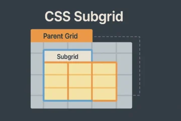
11. Using Subgrid for Consistent Internal Alignment
CSS Grid Level 2 introduces the subgrid feature, allowing child grids to inherit column and row definitions from their parent. Although support is still expanding, it’s already available in most modern browsers.
.parent {
  display: grid;
  grid-template-columns: 200px 1fr 1fr;
  gap: 1rem;
}

.child {
  display: grid;
  grid-template-columns: subgrid;
}
This ensures consistent column alignment across nested components—for example, aligning image captions or buttons beneath cards in a gallery. With subgrid, your design system maintains coherence without repetitive code.
📺 Watch It in Action
You can watch a detailed walkthrough of these techniques here:
CSS Grid Tricks — Full Video Tutorial on YouTube
This video visually explains auto-fit, grid-template-areas, and hybrid layouts so you can follow along step by step.
12. Real-World Use Cases for CSS Grid
- Portfolios: Arrange project thumbnails responsively with
auto-fit. - Dashboards: Mix fixed navigation panels with flexible widgets.
- Blogs and magazines: Create editorial layouts with named areas for featured posts and sidebars.
- E-commerce: Display product cards that rearrange automatically as the viewport changes.
- Landing pages: Align hero images, call-to-actions, and testimonials neatly without media queries.
In every case, CSS Grid reduces boilerplate code, enhances maintainability, and improves visual harmony across devices.
13. Accessibility and Performance Considerations
- Keep a logical document flow; Grid doesn’t affect reading order.
- Use semantic HTML tags (
<main>,<aside>,<header>) for better accessibility. - Combine Grid’s
gapwith rem or em units for scalable spacing. - Avoid nesting too many grids unnecessarily—it can affect rendering performance on lower-end devices.
Remember: clean, semantic HTML combined with Grid ensures your layouts are not only responsive but also inclusive and accessible to assistive technologies.
Conclusion — Take Your Layouts to the Next Level
Mastering these CSS Grid tricks will transform the way you approach web layout. From the simplicity of auto-fit to the precision of grid-template-areas and the flexibility of fr units, Grid empowers you to create designs that scale effortlessly and look pixel-perfect across devices. Once you integrate Grid into your workflow, you’ll find yourself writing fewer media queries, producing cleaner markup, and maintaining a more predictable design system.
Next steps: experiment by recreating your current layouts using Grid. Compare the difference in readability and responsiveness. Combine it with Flexbox for component-level alignment, and don’t forget to use browser DevTools to visualize and debug grid lines.
Ready to keep improving? Subscribe to our newsletter for weekly front-end tips or watch our CSS Grid YouTube Series for hands-on demos, patterns, and real-world projects.