Ever wanted to craft a front-end for an AI Image Generator? You’re in the right place! The digital landscape is dynamic. Tools leveraging artificial intelligence are captivating. Building their interfaces is incredibly rewarding. We’re diving deep into creating a sleek, functional user interface. We’ll use HTML, CSS, and JavaScript. Get ready to transform your ideas into stunning visuals!
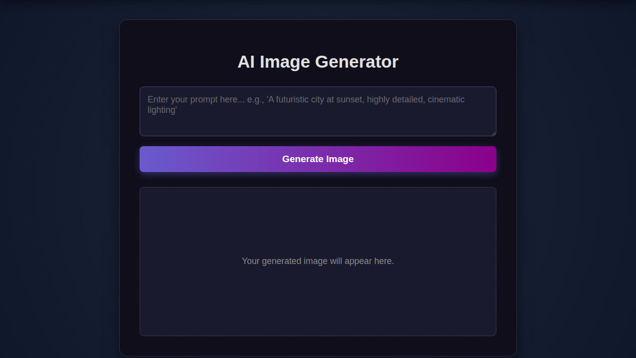
What We Are Building: An AI Image Generator Interface
Imagine a canvas where users input a prompt, click a button, and behold a unique image. That’s precisely what we’ll construct! Our design draws inspiration from popular generative art platforms. We focus on an intuitive layout. Our aim is a clean, modern aesthetic that prioritizes the user experience.
This kind of AI Image Generator interface is more than just a cool project. It’s trending thanks to the explosion of AI tools like DALL-E, Midjourney, and Stable Diffusion. Learning to build such an interface equips you with valuable skills. You can deploy this in creative studios, marketing agencies, or even personal portfolios. It will showcase your front-end prowess effectively.
Moreover, it’s an excellent opportunity to solidify your understanding. Modern web applications interact with backend services. (We’ll simulate the AI part for this front-end focused tutorial). We’re making it beautiful and functional.
HTML Structure
Our HTML provides the semantic backbone for the entire application. It defines the main sections, input fields, buttons, and the area where our generated images will appear. We keep it clean, focusing on accessibility and proper element usage.
<div class="container">
    <h1>AI Image Generator</h1>
    <div class="input-section">
        <textarea id="prompt-input" placeholder="Enter your prompt..."></textarea>
        <button id="generate-btn">Generate Image</button>
    </div>
    <div class="loader" id="loader"></div>
    <div class="image-gallery" id="image-gallery">
        <!-- Generated images will appear here -->
    </div>
    <button id="copy-prompt-btn" class="copy-button">Copy Prompt</button>
</div>
CSS Styling
With our HTML in place, CSS brings our interface to life. We’ll utilize modern CSS properties like Flexbox and Grid for layout. This ensures our components are well-aligned and visually appealing. Expect vibrant colors, subtle shadows, and smooth transitions.
body {
    font-family: 'Arial', sans-serif;
    background-color: #f4f7fa;
    color: #333;
    display: flex;
    justify-content: center;
    align-items: flex-start; /* Align at the top, allowing scroll */
    min-height: 100vh;
    margin: 0;
    padding: 20px;
    box-sizing: border-box;
}

.container {
    background-color: #fff;
    border-radius: 12px;
    box-shadow: 0 8px 20px rgba(0, 0, 0, 0.1);
    padding: 30px;
    max-width: 800px;
    width: 100%;
    text-align: center;
}

h1 {
    color: #007bff;
    margin-bottom: 25px;
}

.input-section {
    display: flex;
    gap: 15px;
    margin-bottom: 25px;
    flex-wrap: wrap; /* Allow wrapping on smaller screens */
    justify-content: center;
}

textarea {
    flex-grow: 1;
    padding: 12px 15px;
    border: 1px solid #ddd;
    border-radius: 8px;
    font-size: 1rem;
    min-height: 80px;
    resize: vertical;
    box-shadow: inset 0 1px 3px rgba(0,0,0,0.05);
}

button {
    background-color: #007bff;
    color: white;
    border: none;
    padding: 12px 25px;
    border-radius: 8px;
    cursor: pointer;
    font-size: 1rem;
    transition: background-color 0.3s ease, transform 0.2s ease;
    box-shadow: 0 4px 10px rgba(0, 123, 255, 0.2);
}

button:hover {
    background-color: #0056b3;
    transform: translateY(-2px);
}

button:disabled {
    background-color: #a0cffc;
    cursor: not-allowed;
    box-shadow: none;
    transform: none;
}

.loader {
    border: 4px solid #f3f3f3;
    border-top: 4px solid #007bff;
    border-radius: 50%;
    width: 30px;
    height: 30px;
    animation: spin 1s linear infinite;
    margin: 20px auto;
    display: none; /* Hidden by default */
}

.loader.show {
    display: block;
}

@keyframes spin {
    0% { transform: rotate(0deg); }
    100% { transform: rotate(360deg); }
}

.image-gallery {
    display: flex;
    flex-wrap: wrap;
    justify-content: center;
    gap: 20px;
    margin-top: 30px;
    min-height: 200px; /* To prevent layout shift */
    background-color: #e9ecef;
    padding: 20px;
    border-radius: 8px;
    box-shadow: inset 0 1px 5px rgba(0,0,0,0.08);
}

.image-gallery img {
    max-width: 100%;
    height: auto;
    border-radius: 8px;
    box-shadow: 0 4px 15px rgba(0, 0, 0, 0.1);
    transition: transform 0.3s ease;
    object-fit: contain;
    max-height: 300px;
}

.image-gallery img:hover {
    transform: scale(1.02);
}

.copy-button {
    background-color: #28a745;
    margin-top: 20px;
    display: none; /* Hidden until an image is generated */
}

.copy-button:hover {
    background-color: #218838;
}

.copy-button.show {
    display: inline-block;
}

/* Responsive adjustments */
@media (max-width: 600px) {
    .input-section {
        flex-direction: column;
        gap: 10px;
    }

    textarea {
        min-height: 100px;
    }

    button {
        width: 100%;
    }

    .container {
        padding: 20px 15px;
    }
}
Step-by-Step Breakdown
Now, let’s unpack the magic behind the scenes with JavaScript. We’ll walk through how user interactions trigger actions. Then, we’ll manage the display of generated images. Finally, we’ll create a smooth user flow. This part truly connects our static HTML and CSS to dynamic behavior.
Setting Up Our Elements and Event Listeners
First things first, we need to grab references to our HTML elements. Using document.querySelector is ideal for this. We’ll target the prompt input, the “Generate” button, the image container, and the loading indicator. Attaching an event listener to our “Generate” button is crucial. It will listen for a ‘click’ event. This then kicks off our image generation process. This fundamental setup ensures our application is interactive right from the start. You’ll find that this pattern is common in many dynamic web applications.
Good interfaces don’t just look great; they anticipate user needs and respond intuitively. Our JavaScript is the bridge between user intent and digital creation.
Handling User Input and Displaying Loading States
When a user types a prompt and clicks “Generate,” we capture that input. It’s vital to provide immediate feedback. Thus, we display a loading spinner. This spinner signals that an operation is underway. It prevents the user from wondering if the button click registered. We achieve this by toggling CSS classes that show or hide our loading element. This small detail significantly improves user experience, especially for tasks that might take a few seconds.
Simulating Image Generation
For this front-end focused tutorial, we’re going to simulate the actual AI image generation. In a real-world scenario, you’d make an API call to a backend service. Examples include OpenAI’s DALL-E API or Stability AI’s API. For now, we’ll use a setTimeout function to mimic that delay. After a brief pause, we’ll generate a placeholder image URL or pick one from a predefined array. This approach allows us to focus purely on the interface aspect. We don’t need a live AI backend for this tutorial.
Displaying Generated Images
Once our “image” is ready (after the simulated delay), we dynamically create an <img> element. We set its src attribute to our generated image URL. We also add appropriate alt text. Crucially, we append this new image element to our designated image container in the HTML. Before displaying the new image, we clear any previous images. This keeps the interface clean. It ensures that only the latest generation is prominently featured. You might even consider building a system with accessible tabs if you wanted to manage multiple image results!
Managing Errors and User Feedback
Robust applications handle errors gracefully. For instance, if the user tries to generate an image without providing a prompt, we should display an error message. Similarly, if our simulated API call failed, we’d provide feedback. This often involves showing a temporary message on the screen. Perhaps it appears in a different color, to alert the user. After the generation process (success or failure), we hide the loading spinner. Then, we re-enable the “Generate” button. This makes it ready for the next action. Consider checking out MDN Web Docs on Web Workers if you’re curious about handling more intensive tasks without freezing the UI.
The best front-end code anticipates edge cases, making sure the user always feels in control and informed, even when things don’t go as planned.
Enhancing User Experience: Copy-to-Clipboard
A nice touch for any generative tool is the ability to easily reuse the output. We can add a “Copy Prompt” button next to our generated image. When clicked, it copies the original prompt text to the user’s clipboard. This uses the navigator.clipboard.writeText() API. It’s a modern and secure way to interact with the clipboard. It streamlines the workflow. Users can tweak prompts for new generations or share them easily. You could apply similar principles to a chatbot UI design where users might want to copy conversation snippets.
Making It Responsive
A truly modern interface must look great on any device. We’ll use CSS media queries to adapt our layout for smaller screens. A mobile-first approach is often best. Design for the smallest screen first. Then, add styles for larger viewports. This ensures a solid base. Our primary goal is to adjust element sizes, font sizes, and perhaps stack elements vertically instead of horizontally on mobile. This creates a seamless experience across desktops, tablets, and smartphones. For more advanced responsive techniques, CSS-Tricks Flexbox Guide is an excellent resource.
Final Output
When you put all these pieces together, you get a beautiful and highly interactive UI like a custom notification bell. Our AI Image Generator interface will feature a prominent input field for the prompt. It will have a clear call-to-action button. A dedicated section will display the generated image. A subtle loading spinner will provide feedback. And a “Copy Prompt” button adds a delightful utility. The overall aesthetic is clean, intuitive, and visually engaging. It is ready to impress any user.
Conclusion: Building an AI Image Generator UI
Congratulations! You’ve successfully outlined the creation of a dynamic AI Image Generator interface. We used HTML, CSS, and JavaScript. We’ve covered everything from structuring your content and styling it beautifully. We added interactive JavaScript logic. We also ensured responsiveness across devices. This project serves as an outstanding foundation for integrating with real AI APIs down the line.
The skills you’ve honed here are invaluable across the entire spectrum of web development. Whether you’re building sophisticated web applications, engaging portfolio pieces, or innovative tools, understanding how to craft intuitive UIs is paramount. Keep experimenting, keep building, and let your creativity flow!