Excited to craft something truly modern and impactful today? Building an AI Code Assistant UI isn’t just about functionality; it’s about creating an intuitive, seamless experience for developers. In this comprehensive guide, we’ll dive deep into using HTML, CSS, and JavaScript to design a stunning and highly functional user interface. We’ll explore the core principles of front-end development, ensuring your AI companion feels as intelligent as the code it generates. Get ready to bring your vision to life!
What We Are Building: Your AI Code Assistant UI
Imagine a workspace where code flows effortlessly, suggestions appear intelligently, and errors are proactively highlighted. This is the dream of every developer, and it’s precisely what a well-designed AI Code Assistant UI aims to achieve. We’re not just creating a visual shell; we’re building the front-end for a tool that could revolutionize coding workflows. Our design will prioritize clarity, efficiency, and a touch of modern aesthetics.
“A great UI makes powerful tools feel effortless.”
Think about popular IDEs or even generative AI chat interfaces. They often feature distinct areas for input, output, history, and actions. We’ll draw inspiration from these proven patterns, adapting them for the unique demands of code generation. The goal is a clean layout that minimizes clutter, making the AI’s power accessible without overwhelming the user. Furthermore, the interface must guide the user, clearly separating their prompts from the AI’s responses.
This kind of UI isn’t just for a standalone application; it’s incredibly versatile. You could integrate it into a web-based IDE, a learning platform, or even an internal tool to streamline development processes. The possibilities are truly endless, therefore making this a valuable skill to master.
Designing the AI Code Assistant Layout: HTML Structure
Our journey begins with HTML, the backbone of our AI Code Assistant UI. We’ll lay down a semantic and accessible foundation, creating distinct sections for input, output, and actions. This careful structuring helps both browsers and assistive technologies understand the page’s flow.
“`html
AI Code Assistant
Your generated code will appear here…
“`
Bringing Your AI Code Assistant to Life with CSS
Now that our structure is in place, it’s time to bring our AI Code Assistant UI to life with CSS. We’ll focus on creating a sleek, modern look that enhances usability and provides visual hierarchy. From subtle shadows to vibrant accents, every style choice will contribute to a professional aesthetic.
“`css
/* Basic Reset & Body Styling */
:root {
–bg-primary: #1a1a2e;
–bg-secondary: #16213e;
–text-primary: #e0e0e0;
–text-secondary: #a0a0a0;
–accent-color: #e94560;
–border-color: #0f3460;
–shadow-color: rgba(0, 0, 0, 0.4);
–font-family: ‘Inter’, sans-serif;
–border-radius: 8px;
–spacing-sm: 10px;
–spacing-md: 20px;
–spacing-lg: 30px;
}
*, *::before, *::after {
box-sizing: border-box;
margin: 0;
padding: 0;
}
body {
font-family: var(–font-family);
background-color: var(–bg-primary);
color: var(–text-primary);
line-height: 1.6;
display: flex;
justify-content: center;
align-items: flex-start; /* Align to top */
min-height: 100vh;
padding: var(–spacing-md);
}
/* Container for overall layout */
.container {
display: flex;
flex-direction: column;
width: 100%;
max-width: 1400px;
background-color: var(–bg-secondary);
border-radius: var(–border-radius);
box-shadow: 0 10px 30px var(–shadow-color);
overflow: hidden; /* For rounded corners */
}
/* Header Styling */
.header {
background-color: var(–bg-primary);
padding: var(–spacing-md) var(–spacing-lg);
display: flex;
justify-content: space-between;
align-items: center;
border-bottom: 1px solid var(–border-color);
}
.header h1 {
font-size: 1.8rem;
color: var(–accent-color);
}
.nav {
display: flex;
gap: var(–spacing-md);
}
.nav-item {
color: var(–text-secondary);
text-decoration: none;
font-weight: 500;
padding: 5px 10px;
border-radius: 5px;
transition: background-color 0.2s ease, color 0.2s ease;
}
.nav-item:hover, .nav-item.active {
background-color: var(–accent-color);
color: var(–text-primary);
}
/* Main Content Area */
.main-content {
display: flex;
flex-grow: 1;
min-height: calc(100vh – 100px); /* Adjust based on header height, for example */
}
/* Chat Interface (Input + Output) */
.chat-interface {
flex: 3; /* Takes more space */
display: flex;
flex-direction: column;
padding: var(–spacing-lg);
border-right: 1px solid var(–border-color);
}
.output-area {
background-color: var(–bg-primary);
border: 1px solid var(–border-color);
border-radius: var(–border-radius);
padding: var(–spacing-md);
margin-bottom: var(–spacing-md);
flex-grow: 1;
overflow-y: auto;
max-height: 70vh; /* Limit height and allow scroll */
}
.output-area p.placeholder {
color: var(–text-secondary);
font-style: italic;
text-align: center;
padding: var(–spacing-md);
}
/* Code block styling within output (example) */
.output-area pre {
background-color: #0f1225; /* Darker background for code */
padding: var(–spacing-sm);
border-radius: 4px;
overflow-x: auto;
font-size: 0.9em;
margin-top: var(–spacing-sm);
}
.output-area code {
font-family: ‘Fira Code’, ‘Cascadia Code’, monospace;
color: #50fa7b; /* Example syntax highlighting color */
}
.input-area {
display: flex;
gap: var(–spacing-sm);
align-items: center;
}
#promptInput {
flex-grow: 1;
background-color: var(–bg-primary);
border: 1px solid var(–border-color);
border-radius: var(–border-radius);
padding: var(–spacing-sm) var(–spacing-md);
color: var(–text-primary);
font-family: var(–font-family);
font-size: 1rem;
resize: vertical; /* Allow vertical resize */
min-height: 60px;
}
#promptInput::placeholder {
color: var(–text-secondary);
}
#promptInput:focus {
outline: none;
border-color: var(–accent-color);
box-shadow: 0 0 0 2px rgba(233, 69, 96, 0.3);
}
.generate-button {
background-color: var(–accent-color);
color: var(–text-primary);
border: none;
border-radius: var(–border-radius);
padding: var(–spacing-sm) var(–spacing-md);
font-size: 1rem;
font-weight: 600;
cursor: pointer;
transition: background-color 0.2s ease, transform 0.1s ease;
white-space: nowrap; /* Prevent button text from wrapping */
}
.generate-button:hover {
background-color: #d13a52; /* Slightly darker */
transform: translateY(-1px);
}
.generate-button:active {
transform: translateY(0);
}
/* Sidebar Styling */
.sidebar {
flex: 1; /* Takes less space */
background-color: var(–bg-primary);
padding: var(–spacing-lg);
border-left: 1px solid var(–border-color); /* Added border to match chat-interface right border */
overflow-y: auto; /* Allow scrolling if content overflows */
}
.sidebar h2 {
font-size: 1.4rem;
color: var(–accent-color);
margin-bottom: var(–spacing-md);
padding-bottom: var(–spacing-sm);
border-bottom: 1px solid var(–border-color);
}
.sidebar ul {
list-style: none;
margin-bottom: var(–spacing-lg);
}
.sidebar ul li {
margin-bottom: var(–spacing-sm);
}
.sidebar ul li a {
color: var(–text-secondary);
text-decoration: none;
transition: color 0.2s ease;
display: block; /* Make the whole area clickable */
padding: 5px 0;
}
.sidebar ul li a:hover {
color: var(–accent-color);
}
.feedback {
margin-top: var(–spacing-lg);
padding-top: var(–spacing-md);
border-top: 1px solid var(–border-color);
font-size: 0.9em;
color: var(–text-secondary);
}
.feedback a {
color: var(–accent-color);
text-decoration: none;
}
.feedback a:hover {
text-decoration: underline;
}
“`
Step-by-Step Breakdown
Understanding how these pieces fit together is key to mastering front-end development. We’ll walk through the HTML structure, the CSS styling rules, and a glimpse into the JavaScript interaction, demystifying each component of our AI Code Assistant UI. This modular approach ensures clarity and maintainability.
Crafting the Core HTML Elements
At its heart, our UI utilizes simple yet powerful HTML elements to establish a clear hierarchy. The div.container acts as our outermost wrapper, setting the stage for the entire application. Inside, we have a header for branding and navigation, and a main-content area that cleverly uses CSS Flexbox (or Grid, as we’ll see) to organize the primary interactive zones.
The chat-interface section holds the output-area where the AI’s wisdom will reside, typically displaying code snippets, and the input-area for user prompts. A textarea allows for multi-line input, crucial for detailed coding requests, while a button triggers the AI’s processing. Meanwhile, the aside.sidebar element provides secondary information, like recent queries, enhancing the user’s workflow. Remember, well-structured HTML isn’t just for browsers; it forms the semantic foundation that makes your application understandable and accessible. For interactive elements that truly stand out, you can always check out a Code Playground: Interactive Design with HTML, CSS, JS.
Styling the Layout: A Visual Foundation
CSS is where our AI Code Assistant truly gains its personality. We kick things off with a :root pseudo-class for defining custom properties, essentially creating a design system for our colors, fonts, and spacing. This approach makes updates incredibly simple! Furthermore, our body element ensures a full-height, centered layout, establishing a comfortable canvas for our application.
The .container employs flex-direction: column to stack the header and main content vertically. Then, main-content itself uses display: flex to arrange the .chat-interface and .sidebar side-by-side. The flex property helps these sections intelligently share available space. For instance, the chat-interface takes flex: 3 (three times the space), while the sidebar takes flex: 1, creating a balanced and visually appealing distribution. This strategic use of Flexbox ensures our layout is both fluid and predictable. In addition, you can delve deeper into organized styling by considering Design System Components: HTML, CSS & JS Development.
Beautifying Inputs and Outputs
The interactive elements, particularly the input and output areas, demand careful attention. The .output-area receives a dark background, a subtle border, and overflow-y: auto to manage generated code that might exceed its visible height. Inside, placeholder text helps guide the user before any code is generated. When code does appear, we style pre and code tags with a distinct, monospace font like ‘Fira Code’ and specific syntax highlighting colors, making the generated output highly readable and professional.
“Visual feedback is paramount for an intuitive user experience.”
The .input-area combines the textarea and button using display: flex to keep them aligned. Our textarea#promptInput gets a dark, minimalistic style, along with resize: vertical for user comfort. Crucially, its ::placeholder styling ensures helpful guidance. On the other hand, the .generate-button stands out with a vibrant accent color, clear padding, and smooth hover/active transitions. This visual feedback tells the user their action is recognized, contributing significantly to a positive user experience. Moreover, consistent styling across these elements maintains a cohesive look and feel.
Adding Basic Interaction with JavaScript
While the core of an AI Code Assistant involves complex backend logic, our UI needs frontend JavaScript to feel alive. We’ll set up listeners for user actions and dynamically update the DOM. First, we’ll select our promptInput, generateBtn, and codeOutput elements using document.getElementById().
When the generateBtn is clicked, we’ll prevent the default form submission (if it were in a form) and grab the text from promptInput. For demonstration, let’s simulate AI output: we can wrap the user’s prompt in a pre and code block, then append it to codeOutput. This creates an interactive experience. A more advanced setup would involve fetch() requests to a real AI API. However, for a frontend UI, simply demonstrating the flow helps users visualize the interaction. You can build even more complex interactions and Browser Automation Script Design with JavaScript.
Making It Responsive
A truly modern AI Code Assistant UI must look great on any device, from large desktops to small mobile phones. Therefore, responsiveness is non-negotiable. We achieve this primarily using CSS media queries. For smaller screens, our flexible layout needs to adapt significantly.
We start with a mobile-first approach, designing the layout for smaller viewports initially, then progressively enhancing it for larger screens. For example, at a certain breakpoint (e.g., max-width: 768px), we’ll switch the main-content to flex-direction: column. This stacks the chat interface and sidebar vertically instead of side-by-side, making better use of limited horizontal space. Additionally, we might reduce padding, font sizes, and adjust flex values to ensure elements don’t get squished. Relative units like rem and percentages are crucial here, providing inherent adaptability. Ultimately, our goal is a seamless user experience, regardless of screen size.
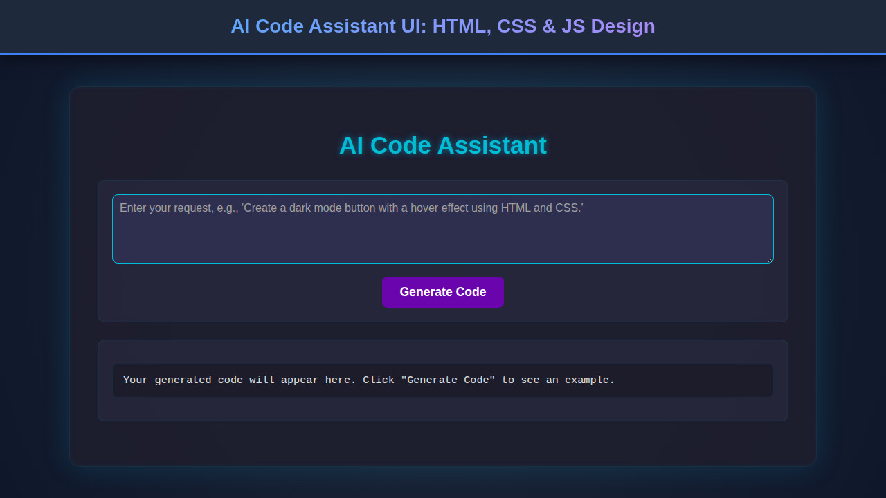
Final Output
After meticulously crafting our HTML and applying our thoughtful CSS, the final AI Code Assistant UI emerges as a sleek, dark-themed, and highly functional interface. Users will encounter a clear header, an expansive code output area, and an intuitive input field with a prominent ‘Generate Code’ button. The sidebar provides quick access to history, enhancing navigation. Every element is designed to provide visual comfort and efficient interaction, truly embodying a modern developer tool.
Conclusion
Congratulations! You’ve just walked through the process of designing a sophisticated AI Code Assistant UI using fundamental web technologies. We’ve covered semantic HTML, elegant CSS styling with Flexbox, and the crucial aspects of responsiveness and basic JavaScript interaction. The skills honed here extend far beyond this specific project; they are the bedrock of any compelling web application.
This UI serves as an excellent foundation for various applications. Perhaps you’ll integrate it with a real AI model, adapt it for a code review tool, or even use the principles to design other complex dashboards. The key is to always prioritize user experience, ensuring your interfaces are not only beautiful but also intuitive and efficient. Keep experimenting, keep building, and continue to push the boundaries of what’s possible in web development!