Building inclusive web experiences is not just a best practice; it’s a necessity. Today, we’re diving into creating an accessible tooltip component. This seemingly simple UI element often poses significant accessibility challenges. Many developers implement tooltips without considering users who rely on keyboard navigation or screen readers. Our goal? To craft a robust, user-friendly, and accessible tooltip solution using plain HTML, CSS, and JavaScript.
This tutorial will guide you step-by-step. We’ll ensure our tooltip is not only visually appealing but also fully navigable and understandable by everyone. You’ll learn the essential ARIA attributes, proper styling techniques, and the JavaScript logic needed to bring it all together. Get ready to enhance your web development skills!
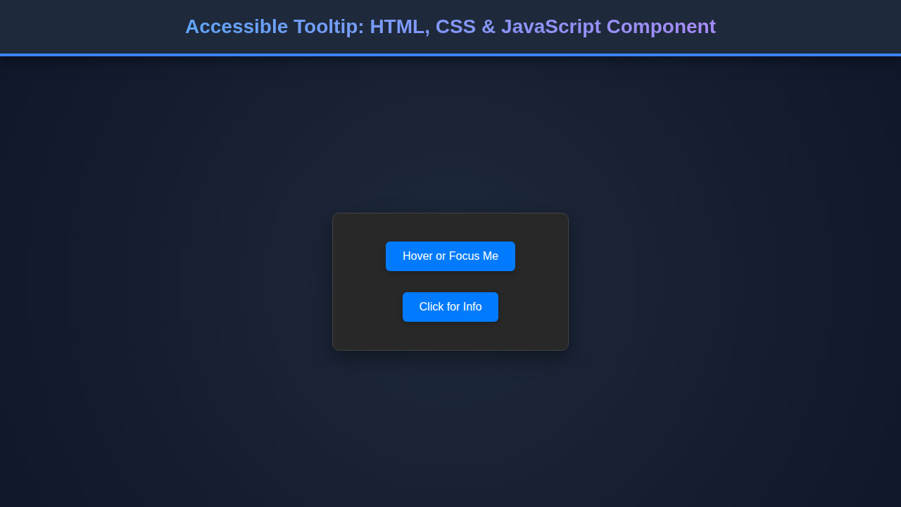
What We Are Building
Imagine a sleek, unobtrusive little box appearing when you hover over an icon or focus on a text snippet. This is our tooltip! We’re drawing inspiration from modern UI libraries, focusing on clean design and smooth transitions. Tooltips are trending because they offer contextual help without cluttering the main interface. They’re perfect for explaining icons, clarifying form fields, or providing quick definitions.
You can use an accessible tooltip in countless scenarios. Think about a settings panel where each toggle needs a brief explanation. Consider an e-commerce site where product features require a quick pop-up description. Or perhaps a dashboard with complex data visualizations where each chart element benefits from extra context. Our component will be versatile enough to fit these needs and more.
By building this component ourselves, we gain full control. This ensures it adheres strictly to accessibility standards. Furthermore, it gives us a deeper understanding of how these interactive elements truly work behind the scenes. Ready to make your web apps more informative and inclusive?
HTML Structure
Our HTML is the foundation. We’ll use semantic elements and crucial ARIA attributes to connect the tooltip trigger with its content. The key is to associate the tooltip content using aria-describedby, ensuring screen readers can announce the tooltip’s purpose.
Here’s the HTML:
<div class="tooltip-container">
    <button type="button" class="tooltip-trigger" aria-describedby="tooltip-info-1">
        Hover or Focus Me!
        <span id="tooltip-info-1" role="tooltip" class="tooltip-content">
            This is an <a href="https://developer.mozilla.org/en-US/docs/Web/Accessibility/ARIA/Roles/tooltip_role" target="_blank" rel="noopener noreferrer">accessible tooltip</a> example.
        </span>
    </button>

    <p class="paragraph-with-tooltip">
        You can also place a tooltip on
        <span class="tooltip-trigger" tabindex="0" aria-describedby="tooltip-info-2">
            plain text elements.
            <span id="tooltip-info-2" role="tooltip" class="tooltip-content">
                Ensure it's focusable for keyboard users!
            </span>
        </span>
        Making web experiences inclusive is crucial.
    </p>

    <button type="button" class="tooltip-trigger top" aria-describedby="tooltip-info-3">
        Tooltip Top
        <span id="tooltip-info-3" role="tooltip" class="tooltip-content">
            Positioned above the element.
        </span>
    </button>
</div>
CSS Styling
Our CSS will make the tooltip look great and position it correctly. We’ll hide it by default and use transitions for a smooth reveal. Plus, we’ll add a little arrow for a professional touch. This ensures our component feels polished and integrated into the design.
/* Basic Reset & Body Styling */
body {
    font-family: 'Segoe UI', Tahoma, Geneva, Verdana, sans-serif;
    line-height: 1.6;
    background-color: #f4f7f6;
    color: #333;
    padding: 20px;
    display: flex;
    flex-direction: column;
    align-items: center;
    min-height: 100vh;
    box-sizing: border-box;
}

.tooltip-container {
    display: flex;
    flex-direction: column;
    gap: 40px; /* Space between examples */
    margin-top: 50px;
    width: 100%;
    max-width: 600px;
    padding: 20px;
    background-color: #fff;
    border-radius: 8px;
    box-shadow: 0 4px 15px rgba(0, 0, 0, 0.1);
}

/* Tooltip Trigger Styling */
.tooltip-trigger {
    position: relative; /* Crucial for positioning the tooltip content */
    display: inline-block;
    padding: 8px 15px;
    background-color: #007bff;
    color: white;
    border: none;
    border-radius: 5px;
    cursor: pointer;
    font-size: 1rem;
    transition: background-color 0.2s ease, box-shadow 0.2s ease;
    text-decoration: none; /* For span/a tags */
}

.tooltip-trigger:hover,
.tooltip-trigger:focus {
    background-color: #0056b3;
    box-shadow: 0 0 0 3px rgba(0, 123, 255, 0.5);
    outline: none; /* Remove default focus outline if box-shadow is used */
}

.paragraph-with-tooltip .tooltip-trigger {
    background: none;
    color: #007bff;
    padding: 0;
    text-decoration: underline dashed;
    cursor: help;
}

.paragraph-with-tooltip .tooltip-trigger:hover,
.paragraph-with-tooltip .tooltip-trigger:focus {
    color: #0056b3;
    background: none;
    box-shadow: none;
    outline: none;
}

/* Tooltip Content Styling */
.tooltip-content {
    visibility: hidden;
    opacity: 0;
    background-color: #333;
    color: #fff;
    text-align: center;
    border-radius: 6px;
    padding: 10px 15px;
    position: absolute;
    z-index: 1000;
    bottom: 125%; /* Position above the trigger by default */
    left: 50%;
    transform: translateX(-50%) translateY(10px); /* Adjust for arrow and initial hidden position */
    transition: opacity 0.3s ease, visibility 0.3s ease, transform 0.3s ease;
    min-width: 150px;
    box-shadow: 0 2px 10px rgba(0, 0, 0, 0.2);
    font-size: 0.9rem;
    white-space: nowrap; /* Prevent text wrapping unless necessary */
    pointer-events: none; /* Important: Allows interaction with element underneath if not shown by JS */
}

/* Arrow Styling */
.tooltip-content::after {
    content: "";
    position: absolute;
    top: 100%; /* Arrow at the bottom of the tooltip */
    left: 50%;
    margin-left: -8px;
    border-width: 8px;
    border-style: solid;
    border-color: #333 transparent transparent transparent;
}

/* Tooltip Visible State */
.tooltip-content.is-visible {
    visibility: visible;
    opacity: 1;
    transform: translateX(-50%) translateY(0); /* Final visible position */
}

/* Positioning for Top Tooltips */
.tooltip-trigger.top .tooltip-content {
    bottom: auto;
    top: 125%; /* Position below the trigger */
    transform: translateX(-50%) translateY(-10px); /* Initial position */
}

.tooltip-trigger.top .tooltip-content.is-visible {
    transform: translateX(-50%) translateY(0);
}

.tooltip-trigger.top .tooltip-content::after {
    top: -8px; /* Arrow at the top pointing up */
    border-color: transparent transparent #333 transparent;
}

/* Link styling inside tooltip */
.tooltip-content a {
    color: #add8e6; /* Light blue for contrast */
    text-decoration: underline;
}

.tooltip-content a:hover,
.tooltip-content a:focus {
    color: #87ceeb;
}

/* Responsive adjustments */
@media (max-width: 768px) {
    .tooltip-content {
        font-size: 0.85rem;
        padding: 8px 12px;
        min-width: 120px;
        white-space: normal; /* Allow text to wrap on smaller screens */
        max-width: calc(100vw - 40px); /* Max width relative to viewport minus padding */
        left: 50%;
        transform: translateX(-50%) translateY(10px);
    }
    .tooltip-content.is-visible {
        transform: translateX(-50%) translateY(0);
    }
    .tooltip-content::after {
        margin-left: -5px; /* Adjust arrow position */
        border-width: 6px;
    }
    .tooltip-trigger.top .tooltip-content {
        transform: translateX(-50%) translateY(-10px);
    }
    .tooltip-trigger.top .tooltip-content.is-visible {
        transform: translateX(-50%) translateY(0);
    }
}
Building Your Accessible Tooltip: JavaScript & Accessibility
JavaScript brings our tooltip to life. It handles showing and hiding the tooltip based on user interaction, including keyboard navigation. Our script ensures the tooltip appears on hover or focus and disappears correctly. This responsiveness is crucial for an excellent user experience across all input methods.
document.addEventListener('DOMContentLoaded', () => {
    const tooltipTriggers = document.querySelectorAll('.tooltip-trigger');

    tooltipTriggers.forEach(trigger => {
        const tooltipId = trigger.getAttribute('aria-describedby');
        if (!tooltipId) {
            console.warn('Tooltip trigger is missing aria-describedby attribute:', trigger);
            return;
        }
        const tooltip = document.getElementById(tooltipId);

        if (!tooltip) {
            console.warn('No tooltip found for ID:', tooltipId);
            return;
        }

        let showTimeout;
        let hideTimeout;

        const showTooltip = () => {
            clearTimeout(hideTimeout);
            showTimeout = setTimeout(() => {
                tooltip.classList.add('is-visible');
            }, 300); // Small delay for hover to prevent flicker
        };

        const hideTooltip = () => {
            clearTimeout(showTimeout);
            hideTimeout = setTimeout(() => {
                tooltip.classList.remove('is-visible');
            }, 100); // Small delay for smooth transition
        };

        // Event Listeners for mouse and keyboard
        trigger.addEventListener('mouseenter', showTooltip);
        trigger.addEventListener('mouseleave', hideTooltip);
        trigger.addEventListener('focus', showTooltip);
        trigger.addEventListener('blur', hideTooltip);

        // Keyboard accessibility: Escape key to hide for active element
        trigger.addEventListener('keydown', (e) => {
            if (e.key === 'Escape' && tooltip.classList.contains('is-visible')) {
                hideTooltip();
                // Optional: remove focus from the trigger if you want to fully dismiss interaction
                // trigger.blur();
            }
        });
    });
});
Connecting Triggers and Tooltips
First, we select all elements with the .tooltip-trigger class. For each trigger, we grab its aria-describedby attribute. This attribute’s value is the ID of the actual tooltip content. It establishes a programmatic link, telling assistive technologies like screen readers that the trigger is described by the content of that specific element. Without this, a screen reader user might never know the tooltip exists. It’s a fundamental aspect of creating an inclusive component.
Handling Visibility with JavaScript
Our showTooltip and hideTooltip functions are straightforward. They add or remove an .is-visible class to the tooltip content. We use setTimeout to introduce slight delays. This prevents the tooltip from flickering if the user’s mouse briefly passes over the trigger. It also allows for smoother transitions defined in our CSS. This simple class-toggling approach is clean and efficient.
Consider best practices when writing JavaScript, especially with asynchronous operations. For instance, managing multiple promises effectively can be complex. You might find resources on best practices for promise rejection helpful in other JavaScript projects, ensuring robust error handling.
Ensuring Keyboard Accessibility
Accessibility isn’t just for mouse users. We attach mouseenter and mouseleave events for traditional hover interactions. Crucially, we also attach focus and blur events. This ensures that keyboard users (who navigate with Tab and Shift+Tab) can activate and dismiss the tooltip. Furthermore, we add a keydown listener for the ‘Escape’ key. If the tooltip is visible, pressing ‘Escape’ will hide it, providing a familiar interaction pattern for users. This simple addition significantly improves usability.
“The power of the web is in its universality. Access by everyone regardless of disability is an essential aspect.” – Tim Berners-Lee
Making It Responsive
A truly modern web component must look and feel great on any device. Our tooltip is no exception! We adopt a mobile-first approach, ensuring the basic layout works well on small screens. Then, we use media queries to enhance the experience for larger viewports. This ensures consistent usability.
Our CSS already includes a responsive section:
@media (max-width: 768px) { ... }
Inside this query, we adjust the font size, padding, and even allow the tooltip text to wrap. On smaller screens, a long line of text inside a white-space: nowrap; tooltip would create horizontal scrolling. Allowing text to wrap makes the tooltip much more readable on mobile devices. We also ensure the tooltip remains centered and adjusts its vertical positioning appropriately. For complex interfaces, building components like an accessible modal also requires careful responsive considerations.
“Accessibility is not a feature, it’s a prerequisite.” – Unknown
Final Output
With HTML, CSS, and JavaScript working in harmony, our accessible tooltip component is ready! You’ll observe triggers that light up on hover or focus. The tooltip content will smoothly appear and disappear, positioned elegantly above or below the trigger. Keyboard users will navigate seamlessly, and screen reader users will receive full context.
The visual feedback is immediate and clear. The subtle transitions create a pleasant user experience. More importantly, the underlying accessibility ensures that this helpful UI element doesn’t become a barrier for any user. It’s a testament to how thoughtful design and development can create powerful, inclusive tools.
Conclusion
Congratulations! You’ve successfully built an accessible tooltip component. We’ve covered the essential HTML structure with ARIA attributes, styled it beautifully with CSS, and added interactive logic with JavaScript. You now understand how to create a tooltip that is not only visually appealing but also fully inclusive for all users.
This component is a fantastic addition to any web project. You can apply these principles to other interactive elements, fostering a more accessible web. Keep exploring and building. Learning to integrate dynamic, interactive elements like this perfectly complements skills in areas such as AI autocomplete inputs, further enhancing user interfaces. Your users will truly appreciate the extra effort put into accessibility. Happy coding!