Introduction
Creating interactive components is a cornerstone of modern web development, and Accessible Tabs are among the most frequently used. They help organize content efficiently, providing a cleaner interface for users. However, designing them correctly isn’t just about aesthetics; it’s crucially about ensuring everyone, regardless of their abilities or assistive technology, can use them seamlessly. Today, we’ll dive deep into crafting a robust, keyboard-friendly, and screen-reader-compatible tab interface using HTML, CSS, and vanilla JavaScript.
Building Truly Accessible Tabs: What We Are Creating
Imagine a typical product page or a settings panel. You often see distinct sections of content, only one of which is visible at a time. This is a perfect use case for tabs! They prevent information overload, keeping your UI clean and intuitive. Modern web applications heavily rely on such organizational patterns, making them a trending and indispensable UI element.
Our goal is to build a tab interface that not only looks great but also adheres to Web Content Accessibility Guidelines (WCAG) and WAI-ARIA best practices. This means ensuring that users can navigate tabs with a keyboard (using arrow keys, home, end, enter, and space), that screen readers announce the correct states, and that visual focus indicators are clear. We draw inspiration from patterns found in professional dashboards and highly accessible websites, focusing on a balance of functionality and user experience.
By the end of this tutorial, you will have a fully functional and highly accessible tab component that you can integrate into any of your projects. Furthermore, the principles learned here extend to other complex UI elements, empowering you to build more inclusive web experiences.
Structuring Accessible Tabs with HTML
The foundation of any accessible component starts with semantic HTML. We’ll use specific ARIA roles to inform assistive technologies about the structure and purpose of our tab interface. This setup ensures that screen readers understand it’s a tablist with individual tabs and associated panels.
index.html
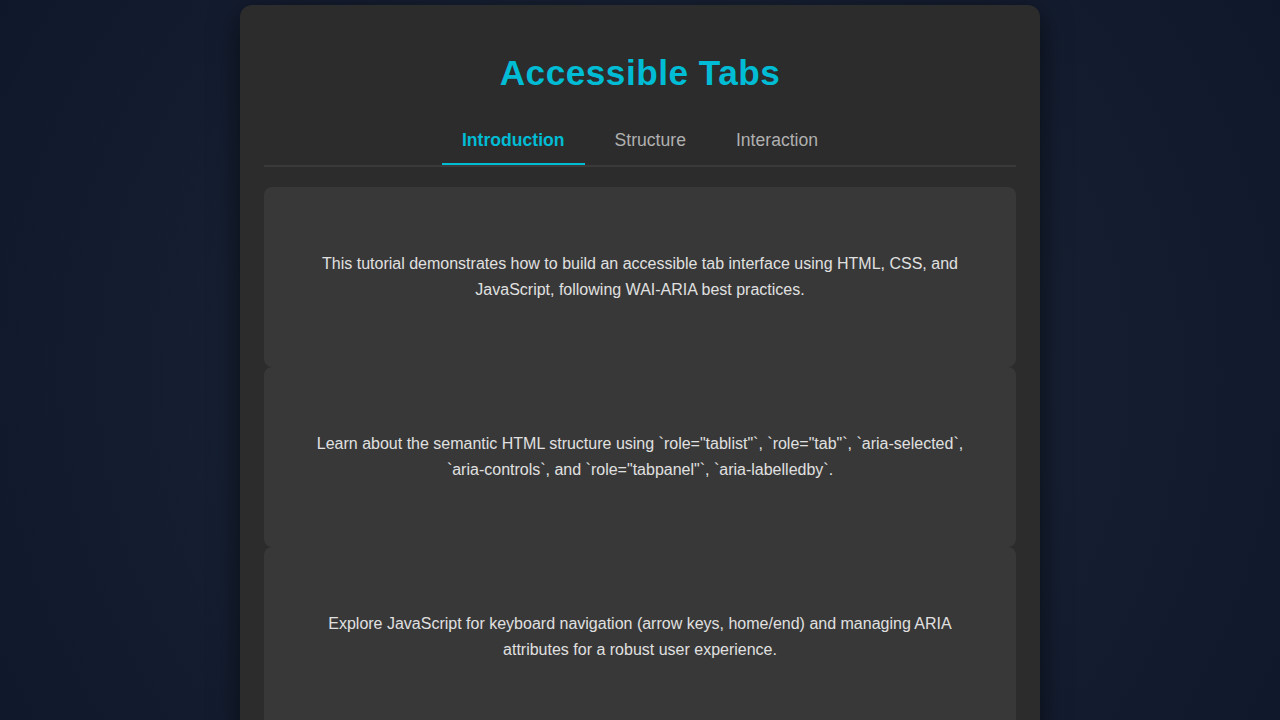
<!DOCTYPE html> <html lang="en"> <head> <meta charset="UTF-8"> <meta name="viewport" content="width=device-width, initial-scale=1.0"> <title>Accessible Tabs</title> <link rel="stylesheet" href="styles.css"> </head> <body> <div class="tab-component"> <h1>Accessible Tabs</h1> <div class="tab-list" role="tablist"> <button id="tab-1" class="tab-button" role="tab" aria-selected="true" aria-controls="panel-1" tabindex="0"> Introduction </button> <button id="tab-2" class="tab-button" role="tab" aria-selected="false" aria-controls="panel-2" tabindex="-1"> Structure </button> <button id="tab-3" class="tab-button" role="tab" aria-selected="false" aria-controls="panel-3" tabindex="-1"> Interaction </button> </div> <div id="panel-1" class="tab-panel" role="tabpanel" aria-labelledby="tab-1"> <p>This tutorial demonstrates how to build an accessible tab interface using HTML, CSS, and JavaScript, following WAI-ARIA best practices.</p> </div> <div id="panel-2" class="tab-panel" role="tabpanel" aria-labelledby="tab-2" hidden> <p>Learn about the semantic HTML structure using `role="tablist"`, `role="tab"`, `aria-selected`, `aria-controls`, and `role="tabpanel"`, `aria-labelledby`.</p> </div> <div id="panel-3" class="tab-panel" role="tabpanel" aria-labelledby="tab-3" hidden> <p>Explore JavaScript for keyboard navigation (arrow keys, home/end) and managing ARIA attributes for a robust user experience.</p> </div> </div> <script src="script.js"></script> </body> </html>script.js
document.addEventListener('DOMContentLoaded', () => { const tablist = document.querySelector('.tab-list'); const tabs = tablist.querySelectorAll('.tab-button'); const panels = document.querySelectorAll('.tab-panel'); tabs.forEach(tab => { tab.addEventListener('click', (e) => { activateTab(e.target); }); tab.addEventListener('keydown', (e) => { let index = Array.from(tabs).indexOf(e.target); switch (e.key) { case 'ArrowLeft': case 'ArrowUp': e.preventDefault(); index = index === 0 ? tabs.length - 1 : index - 1; tabs[index].focus(); activateTab(tabs[index]); break; case 'ArrowRight': case 'ArrowDown': e.preventDefault(); index = index === tabs.length - 1 ? 0 : index + 1; tabs[index].focus(); activateTab(tabs[index]); break; case 'Home': e.preventDefault(); tabs[0].focus(); activateTab(tabs[0]); break; case 'End': e.preventDefault(); tabs[tabs.length - 1].focus(); activateTab(tabs[tabs.length - 1]); break; } }); }); function activateTab(activeTab) { // Deactivate all tabs and hide all panels tabs.forEach(tab => { tab.setAttribute('aria-selected', 'false'); tab.setAttribute('tabindex', '-1'); }); panels.forEach(panel => { panel.setAttribute('hidden', 'true'); }); // Activate the clicked/focused tab activeTab.setAttribute('aria-selected', 'true'); activeTab.setAttribute('tabindex', '0'); activeTab.focus(); // Ensure focus for programmatic activation // Show the corresponding panel const targetPanelId = activeTab.getAttribute('aria-controls'); document.getElementById(targetPanelId).removeAttribute('hidden'); } });Styling Your Tabs with CSS
Once our HTML is semantically rich, we’ll apply CSS to make our tabs visually appealing and clearly indicate their active states. We’ll style the tab buttons, the tab panel, and ensure proper spacing and visual feedback for user interactions, including hover and focus states.
styles.css
body { margin: 0; padding: 0; font-family: Arial, Helvetica, sans-serif; background-color: #1a1a1a; /* Dark background */ color: #e0e0e0; /* Light text */ display: flex; justify-content: center; align-items: center; min-height: 100vh; overflow: hidden; /* Ensure no scrollbars for the main viewport */ box-sizing: border-box; } .tab-component { max-width: 800px; width: 90%; background-color: #2c2c2c; border-radius: 12px; box-shadow: 0 8px 30px rgba(0, 0, 0, 0.6); padding: 24px; box-sizing: border-box; } .tab-component h1 { color: #00bcd4; /* Accent color for title */ text-align: center; margin-bottom: 25px; font-size: 2.2em; letter-spacing: 0.5px; } .tab-list { display: flex; justify-content: center; border-bottom: 2px solid #3a3a3a; list-style: none; padding: 0; margin: 0 0 20px 0; } .tab-button { background: none; border: none; padding: 12px 20px; font-size: 1.1em; color: #b0b0b0; cursor: pointer; transition: color 0.3s ease, border-bottom 0.3s ease; outline: none; border-bottom: 2px solid transparent; margin: 0 5px; } .tab-button:hover { color: #00bcd4; } .tab-button[aria-selected="true"] { color: #00bcd4; border-bottom: 2px solid #00bcd4; font-weight: bold; } .tab-button:focus-visible { outline: 2px solid #00bcd4; outline-offset: 2px; border-radius: 4px; } .tab-panel { padding: 15px; background-color: #383838; border-radius: 8px; line-height: 1.6; min-height: 150px; display: flex; flex-direction: column; justify-content: center; align-items: center; text-align: center; } .tab-panel p { margin: 0; max-width: 90%; }Bringing Interactivity with JavaScript
JavaScript is where our tabs truly come to life, handling the dynamic switching of content and crucial keyboard navigation. We’ll write a script to manage tab selection, show/hide content panels, and implement robust keyboard accessibility.
[INJECT_JS_CODE]Step-by-Step Breakdown
Understanding the HTML Semantics and ARIA Roles
Our HTML provides the essential structure. Notice the `role=”tablist”` on the `ul` element; this tells assistive technologies that it’s a list of tab elements. Each `li` inside it holds a button with `role=”tab”`. The `aria-controls` attribute on each button links it directly to its corresponding content panel via the panel’s ID. Conversely, each `div` with `role=”tabpanel”` has an `aria-labelledby` attribute pointing back to its associated tab button.
Crucially, `aria-selected=”true”` denotes the currently active tab, while `tabindex=”0″` makes the active tab focusable by default. Inactive tabs receive `tabindex=”-1″` to remove them from the default tab order, making keyboard navigation more efficient. For instance, when dealing with complex data structures on other parts of your site, remember that proper data management, much like our tab structure, is key. You can explore how to handle such situations by checking out articles on GraphQL fetching with JavaScript’s
fetchAPI.Essential CSS for Visual Clarity
The CSS primarily focuses on making the tabs look like distinct, clickable buttons and panels. We use `display: flex` on the tablist to arrange tabs horizontally. The active tab (`.tab-button.active`) receives a different background or border to clearly show its selected state. Furthermore, we provide a distinct `outline` for focus states, which is vital for keyboard users. This ensures that when a user navigates with the tab key, they can clearly see which element is currently focused. Building visually clear and accessible components is a consistent theme across all UI elements.
“Accessibility isn’t a feature; it’s a fundamental aspect of user experience. Neglecting it is akin to building a house without a door for everyone.”
We hide inactive tab panels using `display: none` and reveal the active one. This visual hiding is paired with ARIA attributes to ensure screen readers correctly announce the visibility status. Therefore, the combination of `display: none` and `aria-hidden=”true”` for inactive panels is robust. If you’re looking for similar component design principles, perhaps you’d be interested in learning about an accessible tooltip component for another perspective.
Implementing Keyboard Navigation
This is where JavaScript shines for accessibility. When a tab has focus, pressing the left or right arrow keys moves focus to the previous or next tab in the `tablist`, respectively. The Home key moves focus to the first tab, and the End key moves it to the last. When a user presses Enter or Space on a tab, our script activates that tab, showing its corresponding panel and updating ARIA attributes.
This behavior is crucial for users who rely solely on keyboards or assistive devices. We achieve this by listening for `keydown` events on the `tablist` element. This event listener checks `event.key` to determine which arrow key was pressed and then programmatically sets focus (`.focus()`) to the correct tab button. For more details on ARIA roles and keyboard interactions, I highly recommend consulting the MDN Web Docs on the Tab Role.
Dynamic Content Switching
The `activateTab` function is the core of our interactivity. It takes a `tabElement` as an argument. First, it deactivates all other tabs and their panels by removing the `active` class, setting `aria-selected=”false”`, and `tabindex=”-1″`. For content panels, `aria-hidden=”true”` is applied along with `display: none` in CSS. Then, the `activateTab` function marks the selected `tabElement` as active, sets `aria-selected=”true”`, and `tabindex=”0″`. Its corresponding panel has `aria-hidden=”false”` and becomes visible. This dynamic update ensures both visual and semantic correctness. When building complex JavaScript applications, maintaining type safety and predictability in such functions can be challenging. Many developers find that learning TypeScript fundamentals can make such endeavors much smoother, providing robust error checking and better code organization at scale.
Making It Responsive
A great tab interface isn’t just accessible; it’s also responsive, adapting gracefully to different screen sizes. Our current design is fairly responsive by default due to its `flexbox` layout. However, we might want to adjust font sizes, padding, or even stack the tabs vertically on smaller screens for better readability and touch interaction.
Consider a mobile-first approach. Start by designing the tabs to look good on small screens, perhaps stacking them, then use media queries to progressively enhance the layout for larger viewports. For instance, a media query could switch the `flex-direction` to `column` for the tablist below a certain breakpoint, making each tab button take up full width. Remember, designing for mobile users first ensures a solid base before scaling up. You can find excellent resources on responsive design techniques over at CSS-Tricks.
“Responsive design isn’t just about shrinking elements; it’s about re-imagining the user experience for every device.”
Final Output
By combining well-structured HTML, thoughtful CSS, and dynamic JavaScript, we’ve successfully crafted an interactive and truly accessible tab interface. The visual elements clearly indicate the active tab and its content. More importantly, it supports seamless keyboard navigation and provides accurate information to screen readers, ensuring a delightful experience for all users.
You now have a robust component that effectively organizes content without compromising on inclusivity. Users can navigate using arrow keys, activate tabs with Enter or Space, and understand the context of the displayed information.
Conclusion
Building Accessible Tabs isn’t just a technical exercise; it’s a commitment to inclusive design. By leveraging semantic HTML, strategic ARIA attributes, and JavaScript for interactive controls and keyboard management, we empower every user to engage with our content effectively. This approach not only improves user experience for individuals with disabilities but also enhances usability for all, including power users who prefer keyboard navigation.
The principles explored today apply to a wide array of UI components. Whether you’re developing complex dashboards, content-rich websites, or single-page applications, integrating accessibility from the ground up makes your work robust and future-proof. Always remember that the web is for everyone, and as developers, we hold the power to ensure it remains so. Happy coding, and keep building for a better, more inclusive web!