Tired of the browser’s default, often clunky, and visually inconsistent select dropdowns? Want to infuse some modern flair into your forms? You’re in the right place! Creating a truly custom select component is a common challenge for web developers, but it’s incredibly rewarding. This tutorial will guide you through building a stunning and accessible Custom Select dropdown using HTML, CSS, and plain old JavaScript.
It’s not just about aesthetics; it’s about control, user experience, and making your web applications shine. Let’s dive in and build something awesome together!
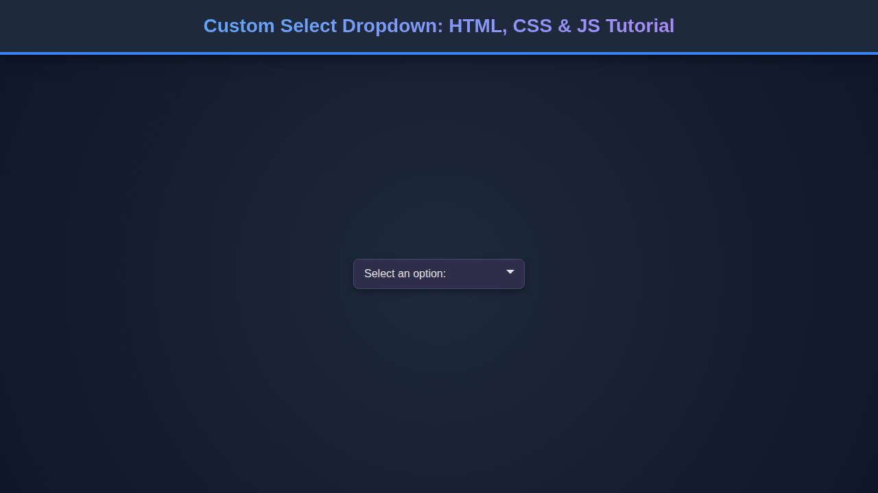
What We Are Building
We’re going to construct a dropdown that looks and feels like a native select element but gives us complete control over its styling and behavior. Imagine a sleek, modern UI, perhaps inspired by popular design systems, where every element perfectly matches your brand’s aesthetic. That’s the power of a custom component!
These custom elements are trending because they solve a real pain point: the limitations of browser defaults. Standard dropdowns are notoriously difficult to style consistently across different browsers and operating systems. Moreover, they often lack the flexibility needed for complex interactions or visually rich interfaces. Think about e-commerce sites, data dashboards, or even simple registration forms where a polished look makes all the difference.
Ultimately, a robust custom select component enhances usability, providing better visual feedback and a more intuitive interaction for your users. It allows for a cohesive design language throughout your application, improving the overall user experience.
HTML Structure
Our HTML serves as the skeleton of our custom select. We’ll use semantic elements as much as possible, wrapped in a main container. Here’s what our basic markup will look like:
<!-- For demonstration, wrap in a div. In a real app, it would be part of a form -->
<div class="custom-select-wrapper">
    <!-- The main custom select component -->
    <div class="custom-select" role="combobox" aria-haspopup="listbox" aria-expanded="false" tabindex="0">
        <!-- This div acts as the clickable trigger for the dropdown -->
        <div class="custom-select-trigger">
            <span>Choose an option</span>
            <div class="arrow"></div>
        </div>
        <!-- This div contains all the options for the dropdown -->
        <div class="custom-options" role="listbox">
            <span class="custom-option selected" data-value="default" role="option" id="custom-option-0">Choose an option</span>
            <span class="custom-option" data-value="option1" role="option" id="custom-option-1">Option 1</span>
            <span class="custom-option" data-value="option2" role="option" id="custom-option-2">Option 2</span>
            <span class="custom-option" data-value="option3" role="option" id="custom-option-3">Option 3</span>
            <span class="custom-option" data-value="option4" role="option" id="custom-option-4">Another Option</span>
        </div>
    </div>
</div>
CSS Styling
Now, let’s bring our structure to life with some beautiful CSS! We’ll style the trigger, the dropdown options, and add states for active and hover elements. This is where the magic happens, transforming plain divs and spans into a sleek interactive component.
/* Custom Select Styling */
.custom-select-wrapper {
    position: relative;
    display: inline-block;
    width: 250px; /* Adjust as needed */
    font-family: 'Segoe UI', Tahoma, Geneva, Verdana, sans-serif;
    font-size: 16px;
    margin: 20px 0;
}

.custom-select {
    position: relative;
    background-color: #ffffff;
    border: 1px solid #dcdcdc;
    border-radius: 6px;
    cursor: pointer;
    user-select: none; /* Prevent text selection */
    box-shadow: 0 2px 5px rgba(0,0,0,0.08);
    transition: all 0.2s ease-in-out;
}

.custom-select.open {
    border-color: #88c0d0; /* Highlight when open */
    box-shadow: 0 0 0 2px rgba(136, 192, 208, 0.4);
}

.custom-select-trigger {
    display: flex;
    justify-content: space-between;
    align-items: center;
    padding: 12px 18px;
    color: #333;
    transition: background-color 0.2s ease;
}

.custom-select-trigger:hover {
    background-color: #f7f7f7;
}

.custom-select-trigger span {
    white-space: nowrap;
    overflow: hidden;
    text-overflow: ellipsis;
    flex-grow: 1;
}

.custom-select-trigger .arrow {
    display: inline-block;
    width: 0;
    height: 0;
    border-left: 6px solid transparent;
    border-right: 6px solid transparent;
    border-top: 6px solid #666;
    margin-left: 12px;
    transition: transform 0.2s ease;
}

.custom-select.open .custom-select-trigger .arrow {
    transform: rotate(-180deg);
}

.custom-options {
    position: absolute;
    top: calc(100% - 1px); /* Position right below the trigger, overlap border */
    left: 0;
    right: 0;
    background-color: #fff;
    border: 1px solid #dcdcdc;
    border-radius: 0 0 6px 6px;
    box-shadow: 0 4px 8px rgba(0,0,0,0.1);
    max-height: 220px; /* Scrollable height for many options */
    overflow-y: auto;
    z-index: 100;
    display: none; /* Hidden by default */
    border-top: none;
}

.custom-select.open .custom-options {
    display: block; /* Show when open */
}

.custom-option {
    padding: 12px 18px;
    cursor: pointer;
    color: #333;
    transition: background-color 0.2s ease, color 0.2s ease;
}

.custom-option:not(:last-child) {
    border-bottom: 1px solid #eee;
}

.custom-option:hover {
    background-color: #eef7fc;
    color: #007bff;
}

.custom-option.selected {
    background-color: #e0f2f7;
    font-weight: 600;
    color: #0056b3;
}

/* Ensure focus outline for accessibility */
.custom-select:focus-visible {
    outline: 2px solid #88c0d0;
    outline-offset: 2px;
    border-color: #88c0d0;
}

.custom-option:focus-visible {
    outline: 2px solid #88c0d0;
    background-color: #eef7fc;
}
Step-by-Step Breakdown
With our HTML and CSS in place, it’s time to add the interactive magic with JavaScript. We’ll handle opening/closing the dropdown, selecting options, and ensuring accessibility. This part glues everything together, bringing our static structure to life.
1. Initializing the Custom Select
First things first, we need to select our custom dropdowns and prepare them. We’ll iterate through each one, attaching event listeners. This makes our component reusable, allowing multiple custom selects on a single page.
document.addEventListener('DOMContentLoaded', () => {
    document.querySelectorAll('.custom-select').forEach(setupCustomSelect);

    function setupCustomSelect(selectElement) {
        // Get references to key elements within this custom select
        const trigger = selectElement.querySelector('.custom-select-trigger');
        const optionsContainer = selectElement.querySelector('.custom-options');
        const options = optionsContainer.querySelectorAll('.custom-option');
        const selectedSpan = trigger.querySelector('span');

        // Create a hidden input to hold the actual selected value for form submission
        // This mimics a native select's behavior for forms.
        const hiddenInput = document.createElement('input');
        hiddenInput.type = 'hidden';
        hiddenInput.name = selectElement.dataset.name || 'custom-select-value'; // Use data-name attribute if available
        selectElement.appendChild(hiddenInput);

        // Set initial selected value and update hidden input
        const initialSelectedOption = optionsContainer.querySelector('.custom-option.selected');
        if (initialSelectedOption) {
            selectedSpan.textContent = initialSelectedOption.textContent;
            hiddenInput.value = initialSelectedOption.dataset.value; // Store actual value
            selectElement.setAttribute('aria-activedescendant', initialSelectedOption.id);
        }

        // ... (rest of the JS code will go here)
    }
});
Notice the hidden input; this is a crucial step for form submission. When the form submits, this hidden input carries the selected value, just like a native <select> element would. This approach ensures your server-side code receives the expected data without needing special handling. If you’re interested in how data is fetched or submitted, consider exploring more on GraphQL Fetching: JavaScript Data with `fetch` API, which often involves handling form data.
2. Toggling the Dropdown (Click & Keyboard)
We need to show and hide the options when the trigger is clicked. We’ll toggle an ‘open’ class on the main .custom-select element, which our CSS will then use to display or hide the .custom-options. Moreover, we must handle clicks outside the component to close it, and importantly, keyboard navigation for accessibility.
        // ... (inside setupCustomSelect function)

        // Function to open/close the dropdown
        function toggleDropdown(isOpen) {
            selectElement.classList.toggle('open', isOpen);
            selectElement.setAttribute('aria-expanded', isOpen);
        }

        // Handle click on the trigger to open/close
        trigger.addEventListener('click', () => {
            toggleDropdown(!selectElement.classList.contains('open'));
        });

        // Close when clicking anywhere outside the custom select
        document.addEventListener('click', (e) => {
            if (!selectElement.contains(e.target) && selectElement.classList.contains('open')) {
                toggleDropdown(false);
            }
        });

        // Keyboard navigation for accessibility (crucial!)
        selectElement.addEventListener('keydown', (e) => {
            const isOptionsOpen = selectElement.classList.contains('open');
            const visibleOptions = Array.from(options);
            let focusedIndex = visibleOptions.indexOf(document.activeElement);

            if (e.key === 'ArrowDown' || e.key === 'ArrowUp') {
                e.preventDefault(); // Prevent page scroll

                if (!isOptionsOpen) {
                    toggleDropdown(true);
                    focusedIndex = visibleOptions.findIndex(opt => opt.classList.contains('selected'));
                    if (focusedIndex === -1 && visibleOptions.length > 0) focusedIndex = 0;
                } else {
                    if (e.key === 'ArrowDown') {
                        focusedIndex = (focusedIndex + 1) % visibleOptions.length;
                    } else {
                        focusedIndex = (focusedIndex - 1 + visibleOptions.length) % visibleOptions.length;
                    }
                }
                if (visibleOptions[focusedIndex]) {
                    visibleOptions[focusedIndex].focus();
                }
            } else if (e.key === 'Enter' || e.key === ' ') {
                e.preventDefault(); // Prevent default space/enter behavior
                if (isOptionsOpen) {
                    const currentFocused = document.activeElement;
                    if (currentFocused && visibleOptions.includes(currentFocused)) {
                        currentFocused.click(); // Simulate click on focused option
                    }
                } else {
                    toggleDropdown(true); // Open dropdown on Enter/Space
                }
            } else if (e.key === 'Escape') {
                if (isOptionsOpen) {
                    toggleDropdown(false);
                    trigger.focus(); // Return focus to trigger
                }
            }
        });

        // ... (rest of the JS code)
Accessibility isn’t a feature; it’s a fundamental requirement. Building custom components provides an opportunity to exceed basic accessibility standards, offering a richer experience for all users.
3. Selecting an Option
When a user clicks an option, we need to update the displayed text, mark the option as ‘selected’, and then close the dropdown. We also dispatch a custom event for other parts of your application to react to the change, making our component highly modular. For more on building accessible components, check out this guide on an Accessible Tooltip: HTML, CSS & JavaScript Component.
        // ... (inside setupCustomSelect function)

        options.forEach(option => {
            option.addEventListener('click', () => {
                if (!option.classList.contains('selected')) {
                    // Remove 'selected' from previous option
                    const prevSelected = optionsContainer.querySelector('.custom-option.selected');
                    if (prevSelected) {
                        prevSelected.classList.remove('selected');
                    }

                    // Add 'selected' to current option
                    option.classList.add('selected');
                    selectedSpan.textContent = option.textContent;
                    hiddenInput.value = option.dataset.value; // Update hidden input value

                    // Update ARIA attributes
                    selectElement.setAttribute('aria-activedescendant', option.id);

                    // Close the dropdown
                    toggleDropdown(false);

                    // Dispatch a custom event for developers to listen to
                    selectElement.dispatchEvent(new CustomEvent('custom-select:change', {
                        detail: {
                            value: option.dataset.value,
                            text: option.textContent
                        },
                        bubbles: true // Allow event to bubble up
                    }));
                }
            });
        });
By dispatching a custom event, we ensure that other parts of your JavaScript application can easily subscribe to changes in the custom select. This decoupling makes your code cleaner and more maintainable. It’s a pattern you might see when working with modern JavaScript features or even learning TypeScript Basics: Learn TS Fundamentals using JS for more robust development.
JavaScript isn’t just for interactivity; it’s the bridge that connects user actions to meaningful changes in the DOM, transforming static pages into dynamic experiences.
4. Accessibility Enhancements (ARIA Roles)
We’ve already added some ARIA attributes in our HTML, but JavaScript needs to dynamically update them. For example, aria-expanded on the .custom-select element should reflect whether the dropdown is open or closed. The aria-activedescendant attribute on the combobox should point to the ID of the currently selected (or focused) option. These attributes are vital for screen readers to correctly interpret and navigate our custom component. For an excellent resource on ARIA, check out MDN Web Docs on ARIA.
The keyboard navigation implemented earlier also contributes significantly to accessibility, allowing users who cannot use a mouse to fully interact with the component.
Making It Responsive
Our custom select needs to look great on all devices, from large desktops to small mobile screens. Responsiveness is key for a good user experience. We typically achieve this with CSS media queries.
For our custom select, the primary responsive consideration is its width. On smaller screens, a fixed width might cause overflow or look cramped. It’s better to allow it to expand to fill the available space.
/* Responsive adjustments */
@media (max-width: 768px) {
    .custom-select-wrapper {
        width: 100%; /* Full width on smaller screens */
    }
    .custom-select-trigger, .custom-option {
        padding: 10px 15px; /* Slightly less padding */
        font-size: 15px;
    }
}

@media (max-width: 480px) {
    .custom-select-trigger, .custom-option {
        padding: 8px 12px; /* Even smaller padding */
        font-size: 14px;
    }
    .custom-select-trigger .arrow {
        margin-left: 8px;
        border-left: 5px solid transparent;
        border-right: 5px solid transparent;
        border-top: 5px solid #666;
    }
}
By setting width: 100% within a media query for smaller viewports, the custom select will naturally adapt to the screen size. We might also adjust padding or font sizes to ensure readability and comfortable touch targets on mobile devices. Remember, a mobile-first approach often yields the best responsive results, designing for the smallest screen first and then progressively enhancing for larger ones. Learn more about responsive design patterns on CSS-Tricks.
Final Output
Once you’ve implemented all the HTML, CSS, and JavaScript, you’ll have a fully functional and visually appealing custom select dropdown. This component will feature a smooth toggle animation, clear hover and active states for options, and consistent styling across your application. You will have full control over the visual presentation, from fonts and colors to padding and border-radius, something nearly impossible with native select boxes. Users will enjoy a more cohesive and professional interface, enhancing their overall interaction with your forms and application.
Conclusion
Congratulations! You’ve successfully built a beautiful and accessible Custom Select dropdown using HTML, CSS, and JavaScript. We tackled the limitations of native select elements, implemented custom styling, and ensured robust accessibility with ARIA attributes and keyboard navigation. This foundational component is incredibly versatile.
You can apply this knowledge to countless projects: e-commerce product options, filtering systems in data tables, language selectors, or any place where a standard dropdown just won’t cut it. Custom components elevate user experience and brand consistency, making your web applications stand out. Keep experimenting, keep building, and never stop learning!