Have you ever clicked a button and a sleek, focused window popped up, dimming the background? That’s our target! We’re not just building a pretty box; we’re crafting an interactive, inclusive experience. Think about user settings panels, confirmation prompts, or image galleries – these are prime candidates for modals. A well-implemented modal keeps users engaged and provides critical information without navigating away from the main content.
In today’s fast-paced digital world, user experience is paramount. Users expect seamless interactions, and modals, when done right, deliver just that. They help declutter complex interfaces and guide users through specific flows, making web applications feel more intuitive and professional. Our design inspiration comes from modern, clean interfaces, prioritizing clarity and ease of use.
So, why is this trending? Beyond aesthetics, accessibility is a massive driver. Regrettably, many modals out there fail accessibility audits, leaving users who rely on screen readers or keyboard navigation frustrated. We’re here to change that by building an Accessible Modal from the ground up, ensuring everyone has an equal and positive interaction.
HTML Structure: The Foundation for an Accessible Modal
First things first, let’s lay down the semantic HTML. This provides the backbone for our modal, ensuring screen readers understand its purpose and content. We’ll use the <dialog> element, a fantastic native HTML component, alongside some carefully chosen ARIA attributes for enhanced accessibility.
<button id="openModalBtn">Open Awesome Modal</button>
<dialog id="myAccessibleModal" aria-labelledby="modalTitle" aria-describedby="modalDescription">
<div class="modal-content">
<h2 id="modalTitle">Welcome to Our Accessible Dialog!</h2>
<p id="modalDescription">This is a dynamic and accessible modal. You can close it using the 'Escape' key or by clicking outside of it. Navigate with Tab.</p>
<p>
Need to learn more about JavaScript features? Check out these <a href="https://procoder09.com/javascript-es2025-features/" rel="noopener noreferrer">upcoming JavaScript features</a> that might surprise you!
</p>
<button id="closeModalBtn" aria-label="Close dialog">×</button>
<form>
<label for="name">Your Name:</label>
<input type="text" id="name" placeholder="John Doe" required>
<label for="email">Your Email:</label>
<input type="email" id="email" placeholder="john@example.com">
<button type="submit">Submit</button>
</form>
<a href="https://developer.mozilla.org/en-US/docs/Web/Accessibility/ARIA/Roles/dialog_role" target="_blank" rel="noopener noreferrer">Learn more about the dialog role on MDN</a>.
</div>
</dialog>CSS Styling
With our HTML in place, let’s make it look fantastic! Our CSS will handle the modal’s visual presentation, including the overlay, positioning, and animations. We aim for a clean, modern aesthetic that feels intuitive to interact with.
body {
  font-family: 'Segoe UI', Tahoma, Geneva, Verdana, sans-serif;
  display: flex;
  justify-content: center;
  align-items: center;
  min-height: 100vh;
  margin: 0;
  background-color: #f4f7f6;
  color: #333;
}

button#openModalBtn {
  padding: 12px 25px;
  font-size: 1.1rem;
  background-color: #007bff;
  color: white;
  border: none;
  border-radius: 8px;
  cursor: pointer;
  transition: background-color 0.3s ease, transform 0.2s ease;
  box-shadow: 0 4px 10px rgba(0, 123, 255, 0.2);
}

button#openModalBtn:hover {
  background-color: #0056b3;
  transform: translateY(-2px);
}

dialog {
  border: none;
  padding: 0;
  border-radius: 12px;
  box-shadow: 0 10px 30px rgba(0, 0, 0, 0.2);
  max-width: 90%;
  width: 500px;
  opacity: 0;
  transform: scale(0.9);
  transition: opacity 0.3s ease, transform 0.3s ease;
  position: fixed; /* Ensures it stays centered */
  top: 50%;
  left: 50%;
  transform: translate(-50%, -50%) scale(0.9);
  z-index: 1000; /* Ensure it's above other content */
}

dialog[open] {
  opacity: 1;
  transform: translate(-50%, -50%) scale(1);
}

dialog::backdrop {
  background-color: rgba(0, 0, 0, 0.6);
  backdrop-filter: blur(5px);
  opacity: 0;
  transition: opacity 0.3s ease;
}

dialog[open]::backdrop {
  opacity: 1;
}

.modal-content {
  background-color: #ffffff;
  padding: 30px;
  border-radius: 12px;
  position: relative;
}

.modal-content h2 {
  color: #007bff;
  margin-top: 0;
  margin-bottom: 20px;
  font-size: 1.8rem;
}

.modal-content p {
  line-height: 1.6;
  margin-bottom: 15px;
}

.modal-content a {
  color: #007bff;
  text-decoration: none;
  font-weight: bold;
}

.modal-content a:hover {
  text-decoration: underline;
}

button#closeModalBtn {
  position: absolute;
  top: 15px;
  right: 15px;
  background: none;
  border: none;
  font-size: 1.5rem;
  cursor: pointer;
  color: #666;
  transition: color 0.3s ease, transform 0.2s ease;
}

button#closeModalBtn:hover {
  color: #000;
  transform: rotate(90deg);
}

form {
  margin-top: 20px;
  display: flex;
  flex-direction: column;
}

form label {
  margin-bottom: 5px;
  font-weight: bold;
  color: #555;
}

form input[type="text"],
form input[type="email"] {
  padding: 10px;
  margin-bottom: 15px;
  border: 1px solid #ddd;
  border-radius: 6px;
  font-size: 1rem;
}

form input[type="text"]:focus,
form input[type="email"]:focus {
  outline: none;
  border-color: #007bff;
  box-shadow: 0 0 0 3px rgba(0, 123, 255, 0.25);
}

form button[type="submit"] {
  background-color: #28a745;
  color: white;
  padding: 12px 20px;
  border: none;
  border-radius: 8px;
  cursor: pointer;
  font-size: 1.1rem;
  transition: background-color 0.3s ease, transform 0.2s ease;
  box-shadow: 0 4px 10px rgba(40, 167, 69, 0.2);
}

form button[type="submit"]:hover {
  background-color: #218838;
  transform: translateY(-2px);
}
Step-by-Step Breakdown: JavaScript Magic
Now for the real brainpower – JavaScript! This is where we bring our modal to life, making it interactive and, most importantly, accessible. We’ll manage its opening, closing, focus, and keyboard navigation to provide a top-notch user experience for everyone.
Initial Setup and Event Listeners
First, we need to grab references to our HTML elements. Attaching event listeners to our ‘open’ and ‘close’ buttons is the logical next step. When the ‘open’ button is clicked, we call modal.showModal(). This native method is fantastic because it handles focus management and the ::backdrop element automatically! For closing, we’ll use modal.close(). This provides a baseline functionality. We also want to close the modal if the user clicks the overlay, a common pattern. This requires a little trick since dialog elements don’t inherently close on backdrop click.
const openModalBtn = document.getElementById('openModalBtn');
const closeModalBtn = document.getElementById('closeModalBtn');
const myAccessibleModal = document.getElementById('myAccessibleModal');

// Open modal
openModalBtn.addEventListener('click', () => {
  myAccessibleModal.showModal();
  // Set focus to the first focusable element inside the modal for accessibility
  // In this case, the close button is likely the first interactive element.
  closeModalBtn.focus();
});

// Close modal
closeModalBtn.addEventListener('click', () => {
  myAccessibleModal.close();
});

// Close modal when clicking on the backdrop
myAccessibleModal.addEventListener('click', (event) => {
  if (event.target === myAccessibleModal) {
    myAccessibleModal.close();
  }
});
Keyboard Navigation: Esc Key and Tab Trap
Keyboard navigation is crucial for accessibility. Users relying on keyboards expect to close a modal with the ‘Escape’ key and to navigate within it using ‘Tab’. The <dialog> element thankfully handles the ‘Escape’ key out-of-the-box, which is brilliant! However, keeping focus within the modal when it’s open (a ‘focus trap’) is something we often need to implement manually for robustness, especially if the dialog element isn’t perfectly supported across all contexts or if custom elements are involved. Our native <dialog> handles this well, but let’s understand the concept.
An accessible modal ensures users can interact with all content and controls inside it, regardless of their input method. This includes keyboard-only navigation and screen reader support.
A proper focus trap prevents users from tabbing outside the modal and interacting with background content. We essentially listen for the Tab key and, if it tries to leave the modal’s boundaries, we redirect it back to the first or last focusable element inside. This provides a truly confined experience. We don’t need extensive JS for this specific native dialog, but knowing how to implement a focus trap is vital for custom modals. You might even want to ensure you’re handling potential promise rejections gracefully in more complex JavaScript applications interacting with modals or asynchronous tasks.
Managing Focus After Closing
When the modal closes, where should the user’s focus return? Ideally, it should go back to the element that triggered the modal’s opening. This prevents users from getting lost in the document. We achieve this by storing a reference to the openModalBtn before opening and then programmatically setting focus back to it once the modal closes. This small detail significantly enhances the user experience. You might think this is a minor thing, but it’s a huge win for usability!
let lastFocusedElement; // Variable to store the element that opened the modal

openModalBtn.addEventListener('click', () => {
  lastFocusedElement = document.activeElement; // Store the element that was focused before opening
  myAccessibleModal.showModal();
  closeModalBtn.focus(); // Focus on the close button or first interactive element
});

myAccessibleModal.addEventListener('close', () => {
  if (lastFocusedElement) {
    lastFocusedElement.focus(); // Return focus to the element that opened the modal
  }
});
ARIA Attributes and Semantics
We’ve already started strong by using the native <dialog> element. It inherently comes with many accessibility benefits. Crucially, we added aria-labelledby="modalTitle" and aria-describedby="modalDescription" to our <dialog> element. These attributes link the modal to its heading and descriptive content, respectively. Screen readers then announce these relationships, providing much-needed context to users. Furthermore, the aria-label="Close dialog" on our close button makes its purpose explicit. This semantic clarity is foundational for truly accessible interfaces.
Accessibility isn’t a feature; it’s a fundamental aspect of inclusive design. Ignoring it means excluding a significant portion of your potential audience.
Remember, while <dialog> handles much, understanding ARIA ensures you can apply these principles to custom components as well. If you’re passionate about making every part of your site accessible, then diving deeper into building accessible web forms could be your next adventure. Such practices make your applications usable by everyone, everywhere.
Making It Responsive
Our modal needs to look great and function flawlessly on devices of all sizes, from large desktop monitors to small mobile screens. Responsiveness is key for modern web development. For our specific <dialog> element, we’ve already set max-width: 90%; and width: 500px; which helps it scale down gracefully. However, for smaller screens, we might want to adjust padding or font sizes.
Consider a mobile-first approach. Start styling for the smallest screen, then use min-width media queries to add styles for larger viewports. For instance, you could reduce the modal’s internal padding on tiny screens to maximize content area. For more advanced responsive modal patterns, check out full-page modal techniques on CSS-Tricks. Here’s a quick example:
@media (max-width: 600px) {
  dialog {
    width: 95%; /* Make it slightly wider on very small screens */
    padding: 15px; /* Adjust internal padding */
  }

  .modal-content h2 {
    font-size: 1.5rem;
  }

  .modal-content p {
    font-size: 0.95rem;
  }

  form input, form button[type="submit"] {
    padding: 10px;
    font-size: 0.9rem;
  }
}
These adjustments ensure the modal remains legible and easy to interact with, even on a smartphone. Always test your modals on various devices to catch any unexpected layout shifts.
Final Output
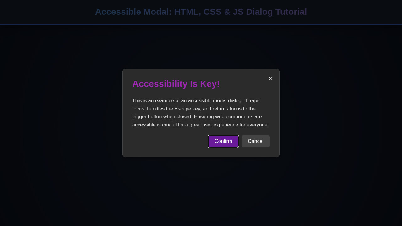
So, what have we achieved? Our accessible modal now boasts a sleek, modern design with a subtle backdrop blur. It opens and closes with smooth transitions, providing visual feedback to the user. All interactive elements within, like the form fields and buttons, are clearly styled and functional. Crucially, it responds beautifully to keyboard commands – ‘Escape’ closes it, ‘Tab’ navigates within, and focus returns to the triggering element. The semantic HTML and ARIA attributes ensure screen readers convey its purpose and content accurately. This isn’t just a modal; it’s a testament to thoughtful, inclusive UI design.
Conclusion: Mastering the Accessible Modal
Phew! We’ve covered a lot of ground today, haven’t we? Crafting an Accessible Modal is more than just throwing a div on the screen; it’s about empathetic design. We learned how to leverage HTML’s native <dialog> element, style it elegantly with CSS, and add crucial JavaScript logic for interaction and focus management. We also tackled essential accessibility considerations, ensuring our modal is usable by everyone, regardless of ability.
Implementing these best practices will not only improve your user experience but also boost your website’s overall accessibility score. This approach creates a more robust and inclusive web. Take these techniques and apply them to your own projects. Remember, every little bit of accessibility makes a big difference. Keep building, keep learning, and keep making the web a better place for all!