Building a captivating and functional Weather App UI is a fantastic way to sharpen your frontend development skills. Today, we’re diving deep into creating a stunning weather application interface using the powerful trio of HTML, CSS, and JavaScript. You’ll learn how to craft a visually appealing design that provides real-time weather information at a glance. Get ready to transform static designs into interactive web experiences!
What We Are Building
Imagine an application that not only tells you the weather but looks great doing it. We are going to construct a modern weather application interface. This design takes inspiration from popular weather services, focusing on clarity, elegance, and user experience. Our goal is to present essential data like temperature, humidity, wind speed, and weather conditions in an intuitive layout.
Weather apps are incredibly popular and useful tools. They trend because everyone needs to know what to wear, whether to carry an umbrella, or if their outdoor plans are viable. Moreover, they offer a perfect playground for learning fundamental web development concepts. You’ll employ dynamic data fetching, responsive design principles, and engaging visual effects. This project is ideal for showcasing your skills in a portfolio.
You can integrate such a UI into various projects. Think personal dashboards, smart home interfaces, or even a component within a larger travel application. The skills you gain here are highly transferable. They will empower you to create compelling user interfaces for countless other web applications.
Crafting the Weather App UI with HTML
Our HTML structure forms the backbone of the entire weather application interface. It’s crucial to lay out the elements logically. We will create a main container to hold all our components. Inside, you’ll find sections for the search bar, the main weather display, and detailed weather information. We also account for an error message display. This systematic approach ensures maintainability and readability for our Weather App UI.
index.html
<!DOCTYPE html> <html lang="en"> <head> <meta charset="UTF-8"> <meta name="viewport" content="width=device-width, initial-scale=1.0"> <title>Weather App UI</title> <link rel="stylesheet" href="styles.css"> </head> <body> <div class="weather-card"> <div class="weather-icon" id="weatherIcon">☁️</div> <div class="temperature" id="temperature">24°C</div> <div class="city" id="city">London</div> <div class="description" id="description">Partly Cloudy</div> <div class="details"> <div class="detail-item"> 💧 <span id="humidity">65%</span> </div> <div class="detail-item"> 💨 <span id="windSpeed">12 km/h</span> </div> <div class="detail-item"> ⬆️ <span id="tempMax">28°C</span> </div> <div class="detail-item"> ⬇️ <span id="tempMin">18°C</span> </div> </div> <button id="refreshWeather" class="refresh-button">Refresh Weather</button> </div> <script src="script.js"></script> </body> </html>script.js
document.addEventListener('DOMContentLoaded', () => { const weatherIcon = document.getElementById('weatherIcon'); const temperature = document.getElementById('temperature'); const city = document.getElementById('city'); const description = document.getElementById('description'); const humidity = document.getElementById('humidity'); const windSpeed = document.getElementById('windSpeed'); const tempMax = document.getElementById('tempMax'); const tempMin = document.getElementById('tempMin'); const refreshButton = document.getElementById('refreshWeather'); const weatherData = [ { icon: '☀️', temp: '28°C', city: 'Los Angeles', desc: 'Sunny', humidity: '45%', wind: '10 km/h', max: '32°C', min: '20°C' }, { icon: '☁️', temp: '24°C', city: 'London', desc: 'Partly Cloudy', humidity: '65%', wind: '12 km/h', max: '28°C', min: '18°C' }, { icon: '🌧️', temp: '15°C', city: 'Paris', desc: 'Rainy', humidity: '88%', wind: '18 km/h', max: '17°C', min: '10°C' }, { icon: '❄️', temp: '-2°C', city: 'Moscow', desc: 'Snowy', humidity: '92%', wind: '25 km/h', max: '0°C', min: '-5°C' }, { icon: '⚡', temp: '20°C', city: 'New York', desc: 'Thunderstorms', humidity: '75%', wind: '30 km/h', max: '23°C', min: '16°C' } ]; let currentIndex = 0; function updateWeatherUI(data) { weatherIcon.textContent = data.icon; temperature.textContent = data.temp; city.textContent = data.city; description.textContent = data.desc; humidity.textContent = data.humidity; windSpeed.textContent = data.wind; tempMax.textContent = data.max; tempMin.textContent = data.min; } function refreshWeather() { currentIndex = (currentIndex + 1) % weatherData.length; updateWeatherUI(weatherData[currentIndex]); } // Initial load updateWeatherUI(weatherData[currentIndex]); // Event listener for the refresh button refreshButton.addEventListener('click', refreshWeather); });Styling Your Weather App UI with CSS
CSS brings our weather app to life, transforming raw HTML into a beautiful and interactive experience. We’ll use modern CSS techniques to achieve a sleek design, vibrant backgrounds, and smooth transitions. Every element, from the input field to the weather icons, will receive careful attention. This styling process ensures a polished and professional look for your Weather App UI.
styles.css
/* General Reset and Base Styles */ body { margin: 0; padding: 0; font-family: Arial, Helvetica, sans-serif; background-color: #1a1a1a; /* Dark background */ color: #e0e0e0; /* Light text */ display: flex; justify-content: center; align-items: center; min-height: 100vh; overflow: hidden; /* Ensure no scrollbars */ box-sizing: border-box; /* Include padding and border in the element's total width and height */ } /* Weather Card Styling */ .weather-card { background: linear-gradient(135deg, #2a2a2a, #3a3a3a); border-radius: 20px; padding: 40px; box-shadow: 0 10px 30px rgba(0, 0, 0, 0.4); text-align: center; max-width: 400px; width: 90%; /* Responsive width */ position: relative; overflow: hidden; /* Prevent child elements from breaking layout */ animation: fadeIn 1s ease-out; /* Simple entry animation */ } /* Keyframe for fade-in animation */ @keyframes fadeIn { from { opacity: 0; transform: translateY(20px); } to { opacity: 1; transform: translateY(0); } } /* Weather Icon */ .weather-icon { font-size: 80px; margin-bottom: 15px; color: #87ceeb; /* Sky blue for icons */ } /* Temperature Display */ .temperature { font-size: 72px; font-weight: bold; margin-bottom: 10px; } /* City Name */ .city { font-size: 32px; margin-bottom: 20px; color: #c0c0c0; } /* Weather Description */ .description { font-size: 20px; color: #a0a0a0; margin-bottom: 30px; } /* Details Section (Humidity, Wind, etc.) */ .details { display: flex; justify-content: space-around; font-size: 18px; color: #c0c0c0; margin-bottom: 30px; } .detail-item { display: flex; flex-direction: column; align-items: center; min-width: 60px; /* Ensure some spacing for small screens */ } .detail-item span { margin-top: 5px; font-size: 16px; } /* Refresh Button */ .refresh-button { background-color: #007bff; /* Blue button */ color: white; border: none; border-radius: 8px; padding: 12px 25px; font-size: 18px; cursor: pointer; transition: background-color 0.3s ease, transform 0.2s ease; outline: none; /* Remove focus outline */ } .refresh-button:hover { background-color: #0056b3; /* Darker blue on hover */ transform: translateY(-2px); } .refresh-button:active { background-color: #004085; /* Even darker on active */ transform: translateY(0); } /* Responsive adjustments */ @media (max-width: 600px) { .weather-card { padding: 30px 20px; } .temperature { font-size: 60px; } .city { font-size: 28px; } .description { font-size: 18px; } .details { flex-wrap: wrap; justify-content: center; } .detail-item { margin: 10px; } }Basic Layout & Typography
First, we’ll establish a comfortable base for our application. This involves setting global styles, defining a responsive font-size, and ensuring proper line heights. We use
display: flexfor centering our main container, making it easy to position elements. Furthermore, a clean, modern font ensures readability and enhances the overall aesthetic. We’ll also define primary and secondary colors to create a cohesive visual theme.Our main container uses a subtle box-shadow and a border-radius. This gives it a soft, floating appearance on the page. Meanwhile, the search box receives a distinct background and padding. This makes it stand out as an interactive element. Remember, good typography isn’t just about choosing a font; it’s about how that font is presented and used throughout your design.
“Design is not just what it looks like and feels like. Design is how it works.” – Steve Jobs
Card Design & Details
The core weather display is crafted as an elegant card. It features a prominent temperature reading and a clear weather description. We’ll use flexible box layouts (flexbox) within this card to align items perfectly. This ensures a clean and organized presentation of dynamic data. Explore more about flexbox on MDN Web Docs for advanced techniques.
Below the main display, a detailed section showcases humidity and wind speed. Icons will accompany these values, providing quick visual cues. The design emphasizes whitespace and a hierarchical structure. This allows users to easily scan and understand the information. Each detail is given its own small container, styled for consistency.
Dynamic Backgrounds
A truly engaging weather app changes its appearance based on current conditions. We’ll implement CSS classes that dynamically alter the background image or color. For instance, a sunny day might display a bright, clear sky, while a cloudy day could show soft, diffused light. This enhances the user experience significantly. Smooth transitions add to the magic. These transitions make the changes feel natural and immersive. It’s all about making the app feel alive.
Bringing the Weather App UI to Life with JavaScript
JavaScript is the brain behind our beautiful interface. It handles fetching real-time weather data from an API, updating the HTML dynamically, and responding to user interactions. We’ll write clean, modular JavaScript code to manage these functionalities. This ensures our app is both responsive and efficient.
Fetching Weather Data
Our journey begins with data retrieval. We utilize the Fetch API to make asynchronous requests to a public weather API (like OpenWeatherMap). When a user enters a city, JavaScript sends a request to this API. It then waits for the data to return. This process is handled asynchronously to prevent the UI from freezing. Error handling is also crucial here. We must inform the user if the city is not found or if there’s a network issue. To build more complex data integrations, consider understanding Web Scraping JavaScript: Data Extraction Tutorial. This helps in extracting data beyond simple APIs.
Updating the UI
Once we receive the weather data, JavaScript takes over to parse it. It then updates various elements in our HTML. The temperature, city name, weather description, humidity, and wind speed are all populated dynamically. Moreover, based on the weather condition code, we change the weather icon and the dynamic background discussed earlier. We achieve this by adding or removing specific CSS classes to our elements. This creates a highly interactive and visually responsive experience for the user. It’s about making the numbers tell a story.
Handling User Input
Interaction is key for any app. We’ll attach an event listener to our search button and the input field (for ‘Enter’ key presses). When triggered, these events initiate the data fetching process. The input value, which is the city name, is extracted and passed to our API call. Furthermore, we implement simple input validation to ensure a city name is provided. This prevents unnecessary API requests and enhances user experience. Understanding how to manage events effectively is a fundamental part of JavaScript Code Review: Best Practices for Developers, ensuring your code remains robust.
Making Your Weather App Responsive
In today’s multi-device world, responsiveness is non-negotiable. Our weather app UI will look fantastic on any screen size, from large desktop monitors to small mobile phones. We achieve this by adopting a mobile-first approach. We start styling for smaller screens and progressively enhance the design for larger viewports. This ensures a consistent and enjoyable user experience across all devices.
Media queries are our best friend in this endeavor. We’ll use them to adjust font sizes, spacing, and element arrangements based on screen width. For example, on a smaller screen, elements might stack vertically. On a larger screen, they might arrange side-by-side. The key is to optimize readability and interactivity for each breakpoint. Check out CSS-Tricks’ guide on responsive design for more advanced techniques.
Furthermore, flexible units like percentages and
remunits play a vital role. They allow elements to scale proportionally with the viewport. Testing on various devices or using browser developer tools is essential during this phase. This confirms that our design holds up across the spectrum. A truly responsive design anticipates user needs, no matter how they access your application.Final Look of Our Weather App
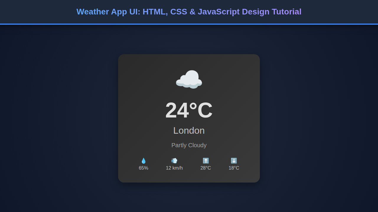
Upon completion, our weather application will boast a clean, modern aesthetic. Key visual elements include a centralized, aesthetically pleasing weather card. This card prominently displays temperature and an animated weather icon. Below it, a well-organized section details humidity and wind speed. The search bar is intuitively placed at the top, inviting user interaction. Moreover, dynamic backgrounds will visually represent current weather conditions. This makes the app both informative and engaging.
Users will find the interface incredibly intuitive. It offers a quick and easy way to check weather in any city. The transitions are smooth, and the layout is uncluttered. This focus on user experience ensures that the app is not just functional but a pleasure to use. It’s a complete package of form and function.
“Good design is as little design as possible.” – Dieter Rams
Conclusion
Congratulations! You’ve successfully embarked on building a fantastic Weather App UI using HTML, CSS, and JavaScript. This project reinforces core frontend development principles: structuring content, styling for appeal, and adding dynamic functionality. You now possess a solid foundation for creating interactive web applications. You’ve also learned valuable lessons in responsive design and API integration.
The skills honed in this tutorial are highly versatile. You can apply them to countless other projects. Consider building a task manager, an e-commerce product display, or even a Markdown Editor Design with HTML, CSS & JavaScript. The possibilities are endless! Keep experimenting, keep learning, and keep building amazing web experiences. Your journey as a developer is just beginning, and this app is a brilliant step forward.