Design better interfaces faster. Here are 5 UI Design Principles that web developers can apply today to make interfaces clearer, faster, and more pleasant.
Introduction
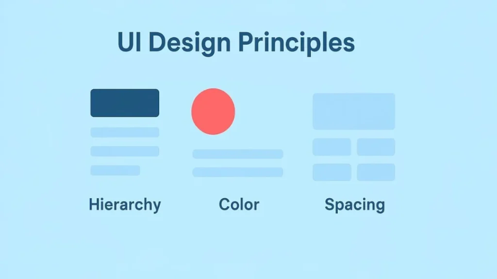
UI Design Principles are practical rules that help developers build interfaces that are easy to use and delightful. In this article we cover five fundamentals — visual hierarchy, consistency, color theory, spacing & layout, and feedback/affordance — and we include examples, a tiny CSS snippet, accessibility notes, and a critique checklist for your next review session. Importantly, these are developer-first guidelines: pragmatic, testable, and easy to add to sprints.
1 — Visual Hierarchy: Guide the eye
Visual hierarchy determines the order in which people scan content. First, identify the most important action or information on the page. Then, emphasize it with size, weight, color, or placement. For example, make primary CTAs larger, use bolder font weights for headings, and increase contrast for top-level content.
Practical tips
- Use a typographic scale for consistent heading sizes.
- Make primary CTAs visually dominant using color and size.
- Group related items with whitespace so the eye moves naturally.
Moreover, prioritize content for devices. On mobile, the top of the page is gold — place your primary goal above the fold. Consequently, the user flow becomes obvious, and you improve conversions. Also, when screens are narrow, simplify the hierarchy so the top-level task remains clear. For instance, show fewer actions and collapse secondary options behind a menu. Finally, measure impact: A/B test headline sizes and CTA prominence, and then iterate on results.
2 — Consistency: Reduce cognitive load
Consistency reduces the need to relearn controls and layouts. In code terms, this means design tokens, a small component library, and CSS variables. In practice, it speeds user interactions and lowers errors.
Implementation checklist
- Centralize tokens: spacing, colors, font sizes.
- Reuse components: buttons, inputs, and cards should behave the same across pages.
- Standardize interaction patterns (e.g., hover, active, focus states).
Additionally, consistent focus and hover styling help keyboard users and sighted users alike. As a result, your UI feels predictable and professional. Likewise, when you document edge cases in your style guide, new team members onboard faster. Furthermore, automate enforcement where possible: add lint rules and visual snapshot tests so regressions are caught before production.
3 — Color Theory: Communicate intentionally
Color communicates mood, status, and interactive surfaces. Yet poor color choices break usability. Always test for contrast and accessibility. For example, use softer neutrals for backgrounds and reserve saturated colors for primary actions.
Color rules
- Build a neutral palette for backgrounds and text.
- Reserve saturates for primary actions and accents.
- Use semantic colors for status (success, warning, error).
Also, supplement color changes with icons or text so color-blind users aren’t dependent on hue alone. Finally, check contrast ratios against WCAG to ensure legibility. Moreover, consider cultural context when choosing hues: in some locales colors carry strong connotations. In addition, provide an accessible theme switch (light/dark) and ensure your palette adapts accordingly.
4 — Spacing & Layout: Let things breathe
Spacing is an often-overlooked design multiplier. Good spacing improves legibility and makes content scannable. Use a simple spacing system and apply it consistently.
Grid & spacing practices
- Use a base spacing unit (for example 4px, 8px, 16px) as tokens.
- Employ CSS Grid for page scaffolding and Flexbox for inline components.
- Use
rem(orclamp()) to make spacing responsive.
For instance, on mobile reduce gutters and padding, while on larger screens increase whitespace to create an airy layout. By varying spacing deliberately, you signal grouping without extra visual noise. Similarly, use vertical rhythm to guide reading: consistent line heights and paragraph spacing reduce cognitive effort. Meanwhile, when content density is high, increase spacing between interactive elements to avoid tapping errors on touch devices.
5 — Feedback & Affordance: Make interactions obvious
Feedback tells users that actions worked and helps them recover when they do not. Affordance indicates what can be clicked or edited. Therefore, design both proactively and conservatively to minimize surprise.
Feedback checklist
- Provide immediate visual or textual confirmation for actions.
- Use skeleton loaders or spinners for async operations.
- Disable or style buttons when actions are unavailable.
Moreover, design affordances (like raised buttons, input borders, or pointer cursors) to make interactivity discoverable. When combined with ARIA attributes and concise microcopy, your UI becomes understandable and resilient. Also, include undo paths for destructive actions so users can recover mistakes. For example, show a toast with “Undo” after deleting an item; this is forgiving and increases trust.
Tiny Pattern: tokens + responsive grid
Below is a compact CSS pattern that puts many of these principles into practice. It is intentionally small and pragmatic.
:root{
  --space-1: 4px;
  --space-2: 8px;
  --space-3: 16px;
  --space-4: 24px;
  --brand: #0ea5e9;
  --muted: #6b7280;
  --radius: 8px;
}

.container{
  padding: var(--space-3);
  max-width: 1100px;
  margin: 0 auto;
}

.grid{
  display:grid;
  gap:var(--space-3);
  grid-template-columns: 1fr;
}

@media (min-width:900px){
  .grid{ grid-template-columns: 1fr 320px; }
}

.button-primary{
  background:var(--brand);
  color:#fff;
  padding: .6rem 1rem;
  border-radius: var(--radius);
  border: none;
}
This snippet uses design tokens, a simple responsive grid, and a clear primary button style — all aligned with the principles above. Consequently, it is easy to extend and maintain.
Accessibility Notes
Design for everyone. Use semantic HTML, ensure keyboard focus is visible, and provide ARIA attributes for custom widgets. Check color contrast, offer text alternatives for icons, and test using screen readers and keyboard navigation. In addition, test zooming and text scaling because many users increase font size. Also, ensure form labels are explicit and error messages are clear; this reduces form abandonment and improves completion rates.
Quick UI Critique Checklist (for your Saturday review)
- Is the most important element visually prominent?
- Are buttons and links consistent in appearance and behavior?
- Does the color palette meet contrast standards?
- Is spacing consistent and purposeful?
- Do interactions provide immediate feedback?
- Can a keyboard user complete the main task?
Use these questions when you review UI with your team or mentor. Furthermore, document outcomes and assign a follow-up ticket so small wins accumulate over time.
Bonus: Small UX microcopy tips
- Use action-first labels: “Save draft” rather than “Submit” if saving occurs.
- Provide confirmations for destructive actions: “Delete comment — this can’t be undone”.
- Keep error messages helpful: suggest next steps instead of generic failures.
- Show progress for long operations and estimated time when possible.
These small phrases improve clarity and reduce support load.
Conclusion & CTA
In short, UI Design Principles are practical, implementable rules that help developers ship cleaner interfaces: prioritize hierarchy, favor consistency, apply color thoughtfully, respect spacing, and provide feedback. Try converting one page in your app using these rules this weekend. If you’d like feedback, share a screenshot in the comments, or subscribe for weekly frontend + design tips. Also, consider running a quick critique with a teammate — often a fresh pair of eyes surfaces the best improvements.