Introduction
Ever found yourself needing a neat way to handle multiple user inputs, like categories or keywords? The Tag Input component is your perfect solution! It’s an elegant, space-efficient way to let users add, view, and remove items dynamically. This guide will walk you through building a sleek and functional tag input from scratch, using only HTML, CSS, and JavaScript. Get ready to elevate your form designs!
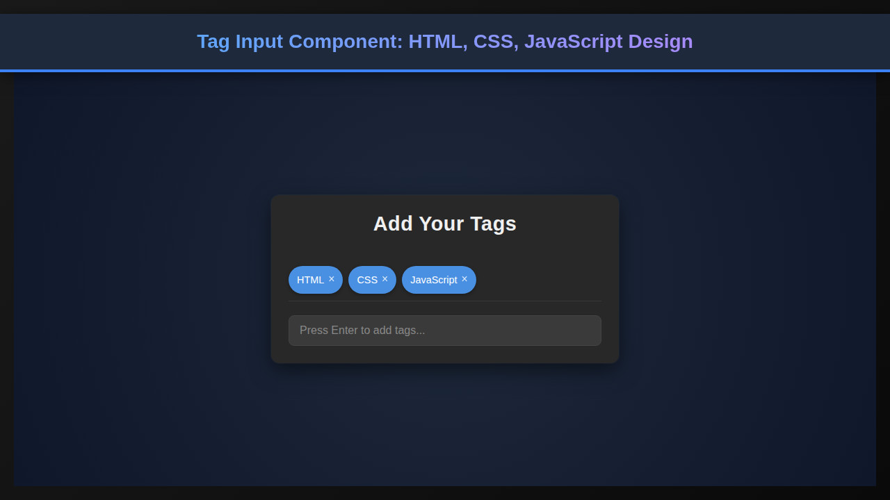
What We Are Building: Our Tag Input Component
We’re crafting a versatile Tag Input component that looks great and works flawlessly. Imagine the tags you see on GitHub issues, Stack Overflow questions, or even in many modern content management systems. That’s our inspiration! These components are trending because they offer a superior user experience compared to traditional multi-select dropdowns or comma-separated text fields. They make data entry intuitive and visually appealing.
You can deploy this component in a multitude of scenarios. For instance, think about a blog post editor where you need to assign multiple categories or tags. It’s also ideal for e-commerce product listings, allowing sellers to define product features quickly. Furthermore, consider a user profile where individuals list their skills or interests. A tag input simplifies this process considerably.
Building this component yourself provides invaluable insights into core front-end development principles. We’ll cover event handling, DOM manipulation, and fundamental styling techniques. This project is not just about making a fancy input; it’s about understanding how to create robust, interactive UI elements that enhance user engagement significantly.
HTML Structure
Our HTML provides the semantic backbone for the component. We’ll use a main container, an unordered list for displaying individual tags, and an input field for new tag entry. It’s clean, simple, and sets us up perfectly for styling and interactivity.
index.html
<!DOCTYPE html>
<html lang="en">
<head>
    <meta charset="UTF-8">
    <meta name="viewport" content="width=device-width, initial-scale=1.0">
    <title>Tag Input Component</title>
    <link rel="stylesheet" href="styles.css">
</head>
<body>
    <div class="tag-input-wrapper">
        <h2>Add Your Tags</h2>
        <div class="tag-list" id="tagList">
            <!-- Tags will be rendered here by JS -->
        </div>
        <input type="text" class="tag-input" id="tagInput" placeholder="Press Enter to add tags...">
    </div>

    <script src="script.js"></script>
</body>
</html>
script.js
// script.js
document.addEventListener('DOMContentLoaded', () => {
    const tagInput = document.getElementById('tagInput');
    const tagList = document.getElementById('tagList');
    let tags = ['HTML', 'CSS', 'JavaScript']; // Initial tags

    function renderTags() {
        tagList.innerHTML = ''; // Clear existing tags
        tags.forEach((tag, index) => {
            const tagElement = document.createElement('div');
            tagElement.classList.add('tag');
            tagElement.innerHTML = `
                <span>${tag}</span>
                <button type="button" class="tag-close" data-index="${index}">×</button>
            `;
            tagList.appendChild(tagElement);
        });
    }

    function addTag(e) {
        if (e.key === 'Enter') {
            const value = tagInput.value.trim();
            if (value && !tags.includes(value)) {
                tags.push(value);
                tagInput.value = '';
                renderTags();
            }
            e.preventDefault(); // Prevent default form submission behavior
        }
    }

    function removeTag(e) {
        if (e.target.classList.contains('tag-close')) {
            const indexToRemove = parseInt(e.target.dataset.index);
            tags.splice(indexToRemove, 1);
            renderTags();
        }
    }

    // Event Listeners
    tagInput.addEventListener('keydown', addTag);
    tagList.addEventListener('click', removeTag);

    // Initial render of tags when the page loads
    renderTags();
});
CSS Styling
With our HTML in place, CSS brings our component to life, transforming raw elements into an elegant and intuitive UI. We’ll focus on creating a visually appealing container, styling individual tags, and ensuring the input field blends seamlessly. This ensures a polished user experience from the get-go.
styles.css
body {
    font-family: Arial, Helvetica, sans-serif;
    margin: 0;
    padding: 0;
    box-sizing: border-box;
    background-color: #1a1a1a; /* Default dark background for component example */
    color: #e0e0e0;
    overflow: hidden;
}

.tag-input-wrapper {
    max-width: 100%;
    width: 500px; /* Can be adjusted */
    background-color: #282828;
    border-radius: 12px;
    padding: 25px;
    box-shadow: 0 10px 30px rgba(0, 0, 0, 0.5), 0 0 0 1px rgba(255, 255, 255, 0.05);
    display: flex;
    flex-direction: column;
    gap: 20px;
    margin: 50px auto; /* Centering the component horizontally */
    box-sizing: border-box;
}

h2 {
    color: #f0f0f0;
    text-align: center;
    margin-top: 0;
    font-size: 1.8em;
    letter-spacing: 0.5px;
}

.tag-list {
    display: flex;
    flex-wrap: wrap;
    gap: 8px;
    min-height: 40px;
    padding-bottom: 10px;
    border-bottom: 1px solid rgba(255, 255, 255, 0.08);
}

.tag {
    background-color: #4a90e2;
    color: #ffffff;
    padding: 7px 12px;
    border-radius: 20px;
    display: flex;
    align-items: center;
    gap: 6px;
    font-size: 0.9em;
    box-shadow: 0 2px 5px rgba(0, 0, 0, 0.3);
    cursor: default;
    transition: background-color 0.2s ease;
    box-sizing: border-box;
}

.tag:hover {
    background-color: #357bd8;
}

.tag-close {
    background: none;
    border: none;
    color: #ffffff;
    font-size: 1.1em;
    cursor: pointer;
    padding: 0 0 2px 0;
    line-height: 1;
    opacity: 0.8;
    transition: opacity 0.2s ease;
    box-sizing: border-box;
}

.tag-close:hover {
    opacity: 1;
}

.tag-input {
    width: 100%;
    padding: 12px 15px;
    border: 1px solid #444;
    border-radius: 8px;
    background-color: #3a3a3a;
    color: #e0e0e0;
    font-size: 1em;
    box-sizing: border-box;
    outline: none;
    transition: border-color 0.2s ease, box-shadow 0.2s ease;
}

.tag-input::placeholder {
    color: #888;
}

.tag-input:focus {
    border-color: #4a90e2;
    box-shadow: 0 0 0 3px rgba(74, 144, 226, 0.3);
}
Step-by-Step Breakdown
Now for the exciting part: making it all interactive with JavaScript! This section will meticulously explain each piece of our JavaScript logic, from adding new tags to removing existing ones, and even handling dynamic sizing. We’ll ensure our component is not just static but truly responsive to user actions.
Initializing the Component
First, we need to grab references to our key DOM elements. This includes the main container, the <ul> where tags will live, and the <input> element. We also maintain an array in JavaScript to hold our tags. This array will be the single source of truth for our component’s state. Whenever the array changes, we’ll update the UI to reflect these changes. This separation of concerns helps keep our code clean and manageable. You can learn more about managing UI states by exploring how to build a Web Component: HTML, CSS, JS Creation Tutorial, which offers deeper insights into component architecture.
Adding New Tags
When a user types a tag and presses ‘Enter’, our JavaScript springs into action. We listen for the ‘keydown’ event on our input field. If the key pressed is ‘Enter’ and the input isn’t empty, we then process the tag. We’ll trim any whitespace and ensure the tag isn’t already present in our tags array to avoid duplicates. Moreover, we’ll set a maximum limit for tags, preventing the component from becoming cluttered. After validation, the new tag is added to our array, and the input field is cleared. This prepares it for the next entry.
Displaying and Removing Tags
For each tag in our tags array, we dynamically create an <li> element. Inside this <li>, we place the tag’s text and a ‘remove’ icon – typically a simple ‘x’ button. We attach an event listener to this remove icon. When clicked, it should delete the corresponding tag from our tags array. Subsequently, we need to re-render the entire list of tags to reflect this change. This ensures our UI always stays synchronized with our data.
This rendering logic is encapsulated in a separate function. Calling this function after adding or removing a tag means our display is always up-to-date. This approach is efficient and prevents stale UI elements. Consider the user experience; they expect immediate feedback. So, fast updates are crucial.
Clean code starts with clear responsibilities. Keep your data logic separate from your rendering logic for maintainable components.
Handling the removal of tags also involves updating the input field’s width. This ensures it resizes correctly as tags are added or removed, maintaining a clean layout. It’s a small detail, but it significantly contributes to the overall polish of the Tag Input component. For further UI interaction ideas, check out this guide on Pop-out Messaging: HTML, CSS & JS Tutorial for dynamic element creation.
Dynamic Input Sizing
A common frustration with tag inputs is when the text input doesn’t resize correctly. Our solution involves dynamically adjusting the input field’s width based on its content. We achieve this by creating a temporary, hidden <span> element. We then copy the input field’s current value into this <span>.
The browser calculates the width of the <span> based on its content and inherited styles. We can then use this calculated width to set the actual input field’s width. This technique ensures the input field is always just wide enough to accommodate the text, plus a small buffer. It provides a smooth, professional feel as users type. Without this, the input might overflow or leave too much empty space, impacting the overall design.
Making It Responsive
Creating a flexible Tag Input component means ensuring it looks good on any device. We tackle responsiveness primarily through CSS media queries. Our base styles are mobile-first, establishing a solid foundation for smaller screens.
As the screen size increases, we introduce specific breakpoints. For instance, we might adjust padding, font sizes, or even the maximum width of the component itself. We use flexbox for internal layout, which naturally adapts to different screen dimensions. This approach prevents tags from breaking awkwardly and maintains visual integrity. Furthermore, scaling elements proportionally ensures a consistent user experience whether on a phone or a desktop monitor.
Responsive design isn’t just about shrinking; it’s about optimizing the user experience for every viewport.
Final Output
After meticulously applying our HTML structure, CSS styling, and JavaScript logic, the result is a fully functional and aesthetically pleasing Tag Input component. You’ll see smooth tag addition and removal, an intelligently resizing input field, and a design that adapts gracefully to various screen sizes. This robust component is ready for integration into your next project, offering an improved user interaction for tagging or listing elements dynamically. For example, consider how such an interactive element could enhance a content creation interface like an AI Generator UI: HTML, CSS & JS Content Creator, making input management seamless.
Conclusion: Mastering the Tag Input Component
We’ve embarked on an exciting journey, building a powerful and intuitive Tag Input component from the ground up using core web technologies. We covered everything from crafting the semantic HTML, applying elegant CSS styles, to implementing the dynamic JavaScript logic that brings it all to life. This component isn’t just a UI element; it’s a testament to the power of thoughtful design and meticulous implementation. Moreover, mastering such components enhances your skills as a developer considerably.
The applications for a dynamic tag input are vast. Think about simplifying forms, enriching content creation interfaces, or even building a better search experience. Your users will appreciate the streamlined interaction and clear visual feedback. This project demonstrates how combining HTML, CSS, and JavaScript creates compelling user experiences. Dive deeper into UI design concepts on CSS-Tricks, a fantastic resource for front-end developers. For more advanced JavaScript interactions, the MDN Web Docs JavaScript guide is an indispensable resource. Remember to keep experimenting and building!