Hey there, fellow web artisans! Today, we’re diving deep into an absolute cornerstone of modern web design: the **Responsive Navbar**. This isn’t just about making links appear; it’s about crafting a seamless, intuitive, and universally accessible navigation experience. Whether your users are on a colossal desktop monitor or a tiny smartphone screen, your website’s navigation should always feel right at home.
As developers, we often build intricate features, but if users can’t navigate them easily, what’s the point? Therefore, mastering responsive and accessible navigation is paramount. Together, we’ll build a robust, beautiful, and highly functional navigation bar using the power of HTML, CSS, and JavaScript. You’ll gain practical skills to make your projects shine!
What We Are Building
Imagine a navigation bar that effortlessly transforms from a sleek, horizontal menu on large screens to a compact, toggle-able overlay on smaller devices. That’s precisely what we’re going to create! We’ll incorporate essential accessibility features, ensuring keyboard navigation and screen reader compatibility. This design isn’t just a trend; it’s a fundamental requirement for a truly inclusive web.
Our inspiration comes from clean, user-centric designs found across popular websites and web applications. Modern users expect fluid interactions and flawless adaptability. Navbars are always trending because they are the gateway to your site’s content. A well-designed navigation can dramatically improve user retention and satisfaction. We’ll ensure our design is clean, fast, and delightful to use.
You can apply this responsive navigation pattern to almost any website or web app. Think about your portfolio, an e-commerce platform, or a corporate site. A robust navigation system is crucial. It guides users through content, just like a well-structured interface helps users understand complex processes, such as designing a weather app UI with dynamic data displays. Understanding this foundational component truly unlocks your frontend potential.
HTML Structure: Crafting the Foundation for Your Responsive Navbar
Our HTML forms the semantic backbone of the navigation. We’ll use meaningful tags and ARIA attributes to ensure accessibility, providing context for assistive technologies. This foundation is crucial for both functionality and semantic meaning.
index.html
<!DOCTYPE html>
<html lang="en">
<head>
    <meta charset="UTF-8">
    <meta name="viewport" content="width=device-width, initial-scale=1.0">
    <title>Accessible Responsive Navbar</title>
    <link rel="stylesheet" href="styles.css">
</head>
<body>
    <header>
        <nav class="navbar" aria-label="Main navigation">
            <a href="#" class="navbar-brand">BrandName</a>
            <button class="navbar-toggler" aria-label="Toggle navigation" aria-controls="navbar-menu" aria-expanded="false">
                <span class="toggler-icon"></span>
                <span class="toggler-icon"></span>
                <span class="toggler-icon"></span>
            </button>
            <ul class="navbar-menu" id="navbar-menu" role="menubar">
                <li role="none"><a href="#home" role="menuitem">Home</a></li>
                <li role="none"><a href="#about" role="menuitem">About</a></li>
                <li role="none"><a href="#services" role="menuitem">Services</a></li>
                <li role="none"><a href="#contact" role="menuitem">Contact</a></li>
            </ul>
        </nav>
    </header>

    <main class="page-content">
        <h1>Welcome to Our Accessible Website!</h1>
        <p>This is a demonstration of an accessible and responsive navigation bar built with HTML, CSS, and JavaScript.</p>
        <section id="home">
            <h2>Home Section</h2>
            <p>Here you'll find our latest updates and featured content.</p>
        </section>
        <section id="about">
            <h2>About Us</h2>
            <p>Learn more about our mission, vision, and team.</p>
        </section>
        <section id="services">
            <h2>Our Services</h2>
            <p>Discover the range of services we offer to help you succeed.</p>
        </section>
        <section id="contact">
            <h2>Contact Us</h2>
            <p>Get in touch with us through various channels.</p>
        </section>
    </main>

    <script src="script.js"></script>
</body>
</html>
script.js
document.addEventListener('DOMContentLoaded', () => {
    const toggler = document.querySelector('.navbar-toggler');
    const menu = document.querySelector('.navbar-menu');
    const navbar = document.querySelector('.navbar'); // Get navbar for outside click detection

    if (toggler && menu && navbar) {
        toggler.addEventListener('click', () => {
            const isExpanded = toggler.getAttribute('aria-expanded') === 'true';
            toggler.setAttribute('aria-expanded', !isExpanded);
            menu.classList.toggle('active');
            toggler.classList.toggle('active'); // For burger icon animation
        });

        // Close menu when clicking outside of the navbar
        document.addEventListener('click', (event) => {
            if (!navbar.contains(event.target) && menu.classList.contains('active')) {
                toggler.setAttribute('aria-expanded', 'false');
                menu.classList.remove('active');
                toggler.classList.remove('active');
            }
        });

        // Close menu on ESC key press for accessibility
        document.addEventListener('keydown', (event) => {
            if (event.key === 'Escape' && menu.classList.contains('active')) {
                toggler.setAttribute('aria-expanded', 'false');
                menu.classList.remove('active');
                toggler.classList.remove('active');
                toggler.focus(); // Return focus to the toggler button
            }
        });
    }
});
CSS Styling: Bringing Your Navbar to Life
With our HTML in place, CSS will transform it into a visually appealing and responsive component. We’ll leverage modern CSS properties like Flexbox for layout and media queries for adaptability. This makes our navbar not only look great but also perform across devices.
styles.css
/* Global Reset & Box Sizing */
*, *::before, *::after {
    box-sizing: border-box;
    margin: 0;
    padding: 0;
}

/* Body and Base Typography */
body {
    font-family: Arial, Helvetica, sans-serif;
    line-height: 1.6;
    color: #333;
    background-color: #f8f8f8;
    overflow-x: hidden; /* Prevent horizontal scroll on small screens */
}

.page-content {
    max-width: 960px;
    margin: 20px auto;
    padding: 0 20px;
}

.page-content h1 {
    margin-bottom: 20px;
    color: #333;
}

.page-content section {
    background-color: #ffffff;
    border-radius: 8px;
    padding: 30px;
    margin-bottom: 20px;
    box-shadow: 0 2px 8px rgba(0,0,0,0.08);
    min-height: 300px; /* For demonstration scroll */
}

.page-content section h2 {
    color: #007bff;
    margin-bottom: 15px;
}

/* Navbar Styles */
.navbar {
    display: flex;
    justify-content: space-between;
    align-items: center;
    background-color: #ffffff;
    padding: 10px 20px;
    border-bottom: 1px solid #e0e0e0;
    box-shadow: 0 2px 5px rgba(0,0,0,0.05);
    position: relative;
    z-index: 10;
    max-width: 100%;
}

.navbar-brand {
    font-size: 1.5em;
    font-weight: bold;
    color: #007bff;
    text-decoration: none;
    transition: color 0.3s ease;
}

.navbar-brand:hover, .navbar-brand:focus {
    color: #0056b3;
}

.navbar-toggler {
    display: none; /* Hidden on desktop */
    background: #f0f0f0;
    border: 1px solid #ccc;
    border-radius: 4px;
    cursor: pointer;
    padding: 8px 10px;
    z-index: 20;
    position: relative;
}

.toggler-icon {
    display: block;
    width: 25px;
    height: 3px;
    background-color: #333;
    margin: 5px 0;
    transition: all 0.3s ease;
}

/* Hamburger Animation */
.navbar-toggler.active .toggler-icon:nth-child(1) {
    transform: translateY(8px) rotate(45deg);
}
.navbar-toggler.active .toggler-icon:nth-child(2) {
    opacity: 0;
    transform: translateX(-20px);
}
.navbar-toggler.active .toggler-icon:nth-child(3) {
    transform: translateY(-8px) rotate(-45deg);
}

.navbar-menu {
    display: flex;
    list-style: none;
    margin: 0;
    padding: 0;
}

.navbar-menu li {
    margin-left: 15px;
}

.navbar-menu li a {
    color: #333;
    text-decoration: none;
    padding: 8px 12px;
    display: block;
    transition: background-color 0.3s ease, color 0.3s ease, border-radius 0.3s ease;
    border-radius: 4px;
    font-weight: 500;
}

.navbar-menu li a:hover, .navbar-menu li a:focus {
    background-color: #e9e9e9;
    color: #007bff;
    outline: none;
}

/* Responsive Design */
@media (max-width: 768px) {
    .navbar {
        flex-wrap: wrap;
        padding: 10px 15px;
    }

    .navbar-toggler {
        display: block;
    }

    .navbar-menu {
        flex-direction: column;
        width: 100%;
        position: absolute;
        top: 100%;
        left: 0;
        background-color: #ffffff;
        box-shadow: 0 4px 10px rgba(0, 0, 0, 0.1);
        border-radius: 0 0 8px 8px;
        padding: 10px 0;
        overflow: hidden;
        max-height: 0; /* Initially hidden */
        transition: max-height 0.4s ease-in-out;
        z-index: 9;
        border-top: 1px solid #e0e0e0; /* Visual separation */
    }

    .navbar-menu.active {
        max-height: 250px; /* Adjust as needed for menu content */
    }

    .navbar-menu li {
        margin: 0;
        width: 100%;
        border-bottom: 1px solid #f0f0f0;
    }

    .navbar-menu li:last-child {
        border-bottom: none;
    }

    .navbar-menu li a {
        padding: 12px 15px;
        text-align: center;
        border-radius: 0;
    }

    .navbar-menu li a:hover, .navbar-menu li a:focus {
        background-color: #f5f5f5;
    }

    .page-content {
        margin-top: 15px;
    }
}
Step-by-Step Breakdown
Let’s dissect the code and understand each piece’s role in bringing our accessible responsive navbar to life. Each component works in harmony to deliver a smooth user experience.
The Semantic HTML Foundation
Our journey begins with HTML. We start with a <nav> element, which semantically represents a navigation section. Inside, a <button> serves as our mobile toggle. Crucially, it has an aria-controls attribute pointing to our navigation links. This helps screen readers understand its purpose. The aria-expanded attribute dynamically changes with JavaScript, informing users if the menu is open or closed. Furthermore, the button includes an `aria-label` for clarity.
Our actual navigation links reside within an unordered list, <ul>. Each list item contains an anchor tag, <a>, for navigation. We’ll add a class to distinguish the navigation links easily. Remember, semantic HTML is not just good practice; it’s a commitment to accessibility. It makes your site navigable for everyone.
Styling with Modern CSS
The CSS brings our navbar to life. We start by styling the main <nav> container. Using Flexbox for the initial layout simplifies alignment. We distribute space effectively and center items vertically. The logo, if present, remains prominent. On larger screens, the navigation links are displayed horizontally, creating a classic menu feel.
For the mobile toggle button, we initially hide it on desktop. This ensures a clean, streamlined look. The links themselves receive styling for text color, hover effects, and padding. This provides visual feedback and enhances interactivity. Furthermore, we apply basic reset styles to list items to remove default bullet points and padding. This offers a clean canvas for our custom design.
“A truly accessible design is not just a feature; it’s a fundamental right. It ensures everyone can participate in the digital world, regardless of ability.”
JavaScript for Interactivity and Accessibility
JavaScript injects the dynamic behavior needed for our responsive menu. We target the mobile toggle button and the navigation links container. An event listener on the button toggles an ‘active’ class on the navigation links. This class then controls their visibility and styling.
More importantly, JavaScript updates the aria-expanded attribute on the toggle button. When the menu opens, aria-expanded becomes true. When it closes, it reverts to false. This explicit communication is vital for screen reader users. We also manage focus. When the menu opens, we ensure the first navigable item receives focus. This allows keyboard users to immediately interact with the menu without extra effort.
Consider how this level of interactivity mirrors other dynamic components, like those in a markdown editor design, where JavaScript handles real-time updates and user interaction seamlessly. JavaScript makes our navbar smart and user-friendly.
Enhancing Accessibility Features
Accessibility isn’t an afterthought; it’s integrated from the start. We’ve used semantic HTML elements like <nav> and <button>. We added ARIA attributes (aria-controls, aria-expanded, aria-label) to provide richer context. These attributes are read by assistive technologies. They translate visual cues into audible descriptions.
Keyboard navigation is also a priority. Users can tab through the navigation links when the menu is open. The toggle button is focusable and actionable with the Enter or Space key. This comprehensive approach ensures that individuals using screen readers or navigating with a keyboard have an equally robust experience. Learn more about ARIA attributes on MDN Web Docs to deepen your understanding.
Making It Responsive: Adapting Your Responsive Navbar for All Screens
The magic of responsiveness primarily lies within our CSS media queries. Our approach is mobile-first. This means we design for the smallest screen sizes first, then progressively enhance the experience for larger viewports. It’s a powerful and efficient strategy.
For mobile, the navigation links are hidden by default. The hamburger icon (our toggle button) becomes visible. When activated, JavaScript applies a class that displays the links, often as a full-width overlay or a sidebar. As the screen size increases beyond a certain breakpoint (e.g., 768px), our media query kicks in. It hides the mobile toggle button and reverts the navigation links to their horizontal, desktop-friendly layout.
We’re not just resizing elements; we’re fundamentally rethinking the layout and interaction patterns based on available screen real estate. This fluid adaptation guarantees an optimal user experience across desktops, tablets, and smartphones. Therefore, testing on various devices during development is absolutely essential for a truly responsive outcome.
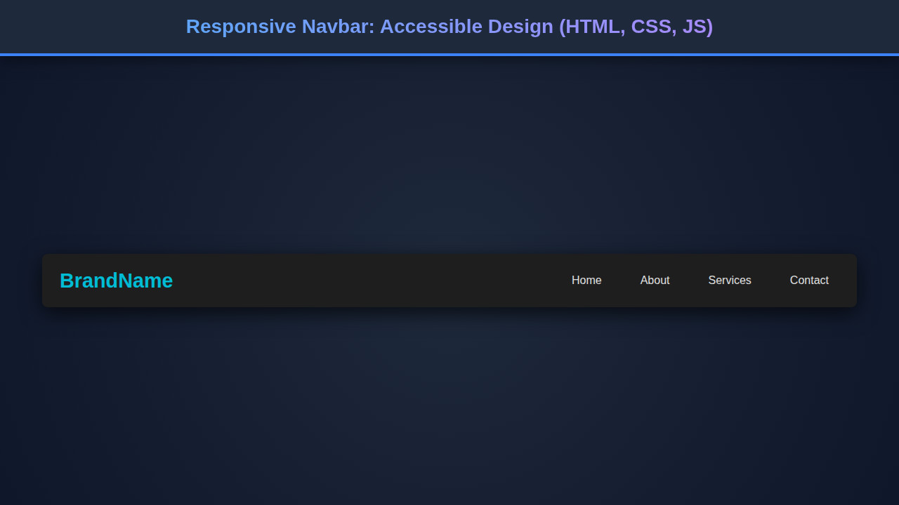
Final Output
What have we achieved? We’ve built a sleek, functional, and highly accessible responsive navbar. On desktops, it’s a clean, inline navigation menu. The links are clear, and interaction is smooth. On mobile, it transforms gracefully. A clear toggle button appears, and clicking it reveals the navigation links in an easy-to-use format.
Visually, it looks modern and professional. More importantly, it works for everyone. This component is ready to integrate into any project, providing a solid navigation foundation. We have also ensured proper focus management and ARIA attribute updates.
“Responsive design isn’t just about flexible layouts; it’s about flexible thinking and prioritizing the user experience above all else.”
Conclusion
Crafting an accessible responsive navbar is more than just a coding exercise; it’s about user empathy and technical excellence. You’ve learned how to combine HTML’s semantic power, CSS’s visual elegance, and JavaScript’s interactive prowess. The result is a navigation system that looks great and works flawlessly for every single user, on any device.
Remember, a well-designed navigation significantly impacts user engagement and satisfaction. Keep experimenting with different styles and interactions. Furthermore, consider extending these principles to other interactive components. For example, mastering these techniques will certainly help you with designing pagination for large datasets, ensuring smooth content navigation.
The web is for everyone. By prioritizing accessibility and responsiveness in your development, you contribute to a more inclusive digital world. Continue to explore advanced CSS layouts and JavaScript interactions. You can discover more layout methods on CSS-Tricks to further enhance your skills. Happy coding!