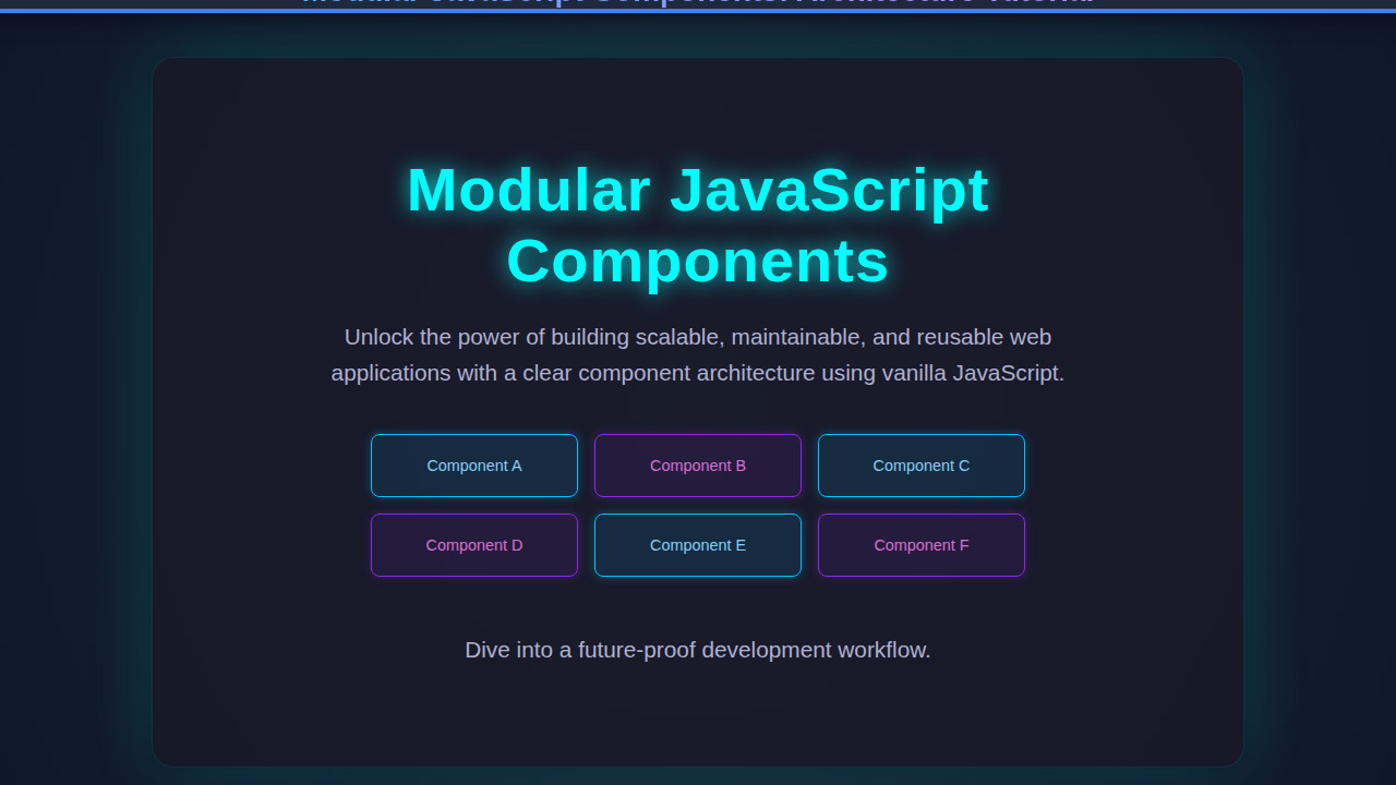
Modular JavaScript Components are not just a buzzword; they are the bedrock of modern, scalable web development. As developers, we constantly strive for cleaner, more maintainable codebases, and component architecture offers a powerful solution. This tutorial dives deep into building truly modular, reusable UI elements using plain JavaScript, empowering you to create robust and flexible applications. We’ll explore the principles behind this approach and walk through a practical example you can implement today.
What We Are Building: Modular JavaScript Components in Action
Imagine building a complex dashboard application, filled with various widgets: user cards, data charts, notification feeds. Without a modular approach, your codebase quickly becomes a tangled mess, a nightmare to maintain or scale. Conversely, when each of these widgets is a self-contained, independent unit, your development process transforms. This is the inspiration behind modular components.
Why is this trend so prevalent? Simply put, modularity fosters reusability, simplifies debugging, and enhances team collaboration. Each component encapsulates its own logic, structure, and styling, making it a “black box” that can be dropped into any part of your application. This dramatically reduces duplication and promotes consistency across your UI. You’re no longer writing sprawling, monolithic JavaScript files; instead, you’re orchestrating a symphony of small, focused modules.
You’ll find modular JavaScript components everywhere, from enterprise-grade applications to personal portfolios. Consider a social media feed: each post, comment section, or user profile picture can be its own component. Or perhaps an e-commerce site where product cards, shopping cart items, and review sections are all independent units. This architecture is especially powerful when integrating new features or maintaining large projects.
HTML Structure
For our demonstration, we’ll build a simple “User Profile Card” component. This card will display a user’s avatar, name, and a short bio. The HTML provides the basic semantic scaffold that our JavaScript will then bring to life. We always start with a clear, minimal structure.
<!DOCTYPE html>
<html lang="en">
<head>
    <meta charset="UTF-8">
    <meta name="viewport" content="width=device-width, initial-scale=1.0">
    <title>Modular JavaScript Components: Architecture Tutorial</title>
    <link rel="stylesheet" href="style.css">
</head>
<body>
    <div id="app">
        <!-- Our modular components will be injected here by JavaScript -->
    </div>

    <script type="module" src="main.js"></script>
</body>
</html>
CSS Styling
Good component architecture means styling that’s scoped and manageable. While we could use fancy CSS-in-JS solutions, for our plain JavaScript example, we’ll keep it simple with a dedicated CSS file. This ensures our components look great and are visually consistent. Remember to aim for styles that are specific to the component itself.
/* Basic styling for the body */
body {
    font-family: 'Segoe UI', Tahoma, Geneva, Verdana, sans-serif;
    background-color: #f4f7f6;
    display: flex;
    justify-content: center;
    align-items: flex-start;
    min-height: 100vh;
    margin: 20px;
    box-sizing: border-box;
}

/* Container for our components */
#app {
    display: grid;
    grid-template-columns: repeat(auto-fill, minmax(280px, 1fr));
    gap: 20px;
    max-width: 1200px;
    width: 100%;
}

/* User Profile Card styles */
.user-profile-card {
    background-color: #ffffff;
    border-radius: 12px;
    box-shadow: 0 4px 15px rgba(0, 0, 0, 0.1);
    padding: 25px;
    text-align: center;
    transition: transform 0.2s ease-in-out, box-shadow 0.2s ease-in-out;
    border: 1px solid #e0e0e0;
}

.user-profile-card:hover {
    transform: translateY(-5px);
    box-shadow: 0 6px 20px rgba(0, 0, 0, 0.15);
}

.user-profile-card__avatar {
    width: 100px;
    height: 100px;
    border-radius: 50%;
    object-fit: cover;
    margin-bottom: 15px;
    border: 3px solid #667eea; /* A vibrant border color */
    box-shadow: 0 2px 8px rgba(0, 0, 0, 0.1);
}

.user-profile-card__name {
    font-size: 1.6em;
    color: #333;
    margin: 0 0 8px 0;
    font-weight: 600;
}

.user-profile-card__bio {
    font-size: 0.95em;
    color: #555;
    line-height: 1.6;
    margin-bottom: 15px;
}

.user-profile-card__button {
    background-color: #667eea;
    color: white;
    border: none;
    padding: 10px 20px;
    border-radius: 6px;
    cursor: pointer;
    font-size: 0.9em;
    font-weight: 500;
    transition: background-color 0.2s ease-in-out, transform 0.1s ease-in-out;
}

.user-profile-card__button:hover {
    background-color: #5a67d8;
    transform: translateY(-1px);
}

.user-profile-card__button:active {
    transform: translateY(0);
}

/* Simple utility class for text alignment */
.text-center {
    text-align: center;
}

/* Responsive adjustments */
@media (max-width: 768px) {
    #app {
        grid-template-columns: repeat(auto-fill, minmax(250px, 1fr));
        gap: 15px;
    }

    .user-profile-card {
        padding: 20px;
    }

    .user-profile-card__name {
        font-size: 1.4em;
    }

    .user-profile-card__bio {
        font-size: 0.9em;
    }
}

@media (max-width: 480px) {
    #app {
        grid-template-columns: 1fr; /* Stack cards vertically on very small screens */
        gap: 15px;
        margin: 10px;
    }

    body {
        margin: 10px;
    }

    .user-profile-card__avatar {
        width: 80px;
        height: 80px;
    }
}
Step-by-Step Breakdown: Building Modular JavaScript Components
Now, let’s dive into the exciting part: crafting our JavaScript component. Our goal is to create a reusable UserProfileCard that can be instantiated multiple times with different data. We will use ES Modules for true modularity.
Defining the Component Structure (The Class)
First, we’ll create a UserProfileCard class. This class will encapsulate all the necessary properties and methods for our component. Think of it as a blueprint. Consequently, each instance will be an independent, self-managing entity.
// components/UserProfileCard.js
export class UserProfileCard {
    constructor(parentSelector, userData) {
        this.parentSelector = parentSelector;
        this.userData = userData;
        this.element = null; // Will hold the DOM element
        console.log(`UserProfileCard created for: ${userData.name}`);
    }

    // This method will generate the HTML for the card
    createCardHTML() {
        const { id, name, avatar, bio } = this.userData;
        return `
            <div class="user-profile-card" data-user-id="${id}">
                <img src="${avatar}" alt="${name}'s Avatar" class="user-profile-card__avatar">
                <h3 class="user-profile-card__name">${name}</h3>
                <p class="user-profile-card__bio">${bio}</p>
                <button class="user-profile-card__button" data-action="view-profile">View Profile</button>
            </div>
        `;
    }

    // This method renders the component into the DOM
    render() {
        const parentElement = document.querySelector(this.parentSelector);
        if (!parentElement) {
            console.error(`Parent element with selector "${this.parentSelector}" not found.`);
            return;
        }

        const cardHTML = this.createCardHTML();
        const tempDiv = document.createElement('div');
        tempDiv.innerHTML = cardHTML.trim();
        this.element = tempDiv.firstChild; // Store the actual card element

        parentElement.appendChild(this.element);
        this.addEventListeners(); // Add events after rendering
        console.log(`UserProfileCard for ${this.userData.name} rendered.`);
    }

    // This method updates the component's data and re-renders part of it
    update(newUserData) {
        this.userData = { ...this.userData, ...newUserData };
        if (this.element) {
            // Update specific parts without re-rendering the whole card
            const nameElement = this.element.querySelector('.user-profile-card__name');
            const bioElement = this.element.querySelector('.user-profile-card__bio');
            const avatarElement = this.element.querySelector('.user-profile-card__avatar');

            if (nameElement) nameElement.textContent = this.userData.name;
            if (bioElement) bioElement.textContent = this.userData.bio;
            if (avatarElement) {
                avatarElement.src = this.userData.avatar;
                avatarElement.alt = `${this.userData.name}'s Avatar`;
            }
            console.log(`UserProfileCard for ${this.userData.name} updated.`);
        }
    }

    // Handle component-specific events
    addEventListeners() {
        if (this.element) {
            const viewProfileButton = this.element.querySelector('[data-action="view-profile"]');
            if (viewProfileButton) {
                viewProfileButton.addEventListener('click', () => {
                    alert(`Viewing profile for ${this.userData.name}! (ID: ${this.userData.id})`);
                    // Here you might emit an event or navigate
                });
            }
        }
    }

    // Clean up component (optional, but good practice)
    destroy() {
        if (this.element && this.element.parentNode) {
            this.element.parentNode.removeChild(this.element);
            this.element = null;
            console.log(`UserProfileCard for ${this.userData.name} destroyed.`);
        }
    }
}
Orchestrating Components (The Main Application Logic)
Now that our UserProfileCard component is defined, we need to instantiate and manage it in our main application. We’ll use main.js to import our component and render multiple instances. This modular approach is excellent for managing various parts of an application, much like how one might coordinate different JS agents in a larger system, perhaps even integrating with something like AI Orchestration: JS Agent Coordination for more complex scenarios.
// main.js
import { UserProfileCard } from './components/UserProfileCard.js';

document.addEventListener('DOMContentLoaded', () => {
    const appContainer = '#app'; // Our target DOM element

    const usersData = [
        { id: 1, name: 'Alice Johnson', avatar: 'https://i.pravatar.cc/100?img=1', bio: 'Passionate front-end developer and UI/UX enthusiast.' },
        { id: 2, name: 'Bob Smith', avatar: 'https://i.pravatar.cc/100?img=2', bio: 'Backend wizard crafting robust APIs and scalable systems.' },
        { id: 3, name: 'Charlie Brown', avatar: 'https://i.pravatar.cc/100?img=3', bio: 'Full-stack developer with a love for open-source projects.' },
        { id: 4, name: 'Diana Prince', avatar: 'https://i.pravatar.cc/100?img=4', bio: 'Design-minded developer focused on accessibility and performance.' }
    ];

    const userCards = [];

    // Create and render each user card
    usersData.forEach(userData => {
        const card = new UserProfileCard(appContainer, userData);
        card.render();
        userCards.push(card);
    });

    // Example of updating a card after some time
    setTimeout(() => {
        const aliceCard = userCards.find(card => card.userData.id === 1);
        if (aliceCard) {
            aliceCard.update({
                bio: 'Updated: Alice is now a Senior Front-end Architect specializing in design systems!'
            });
        }
    }, 3000); // Update Alice's bio after 3 seconds
});
Why ES Modules Matter for Component Architecture
ES Modules (import/export) are foundational to modern modular JavaScript. They provide a standard way to organize your code into separate files, preventing global scope pollution and making dependencies explicit. This explicit dependency management is vital for large applications. Furthermore, it helps avoid naming conflicts and improves maintainability significantly. Understanding modularity also helps when dealing with complex data integrations, like AI Agent API Integration with JavaScript, where managing different data streams is crucial.
“Modularity allows us to break down complex systems into smaller, manageable, and independently deployable units, significantly reducing cognitive load and improving maintainability.”
This structured approach, where each file or class has a single responsibility, mirrors the principles of good software design. It means you can confidently modify one component without fear of unintended side effects on another. Moreover, modern build tools leverage ES Modules for efficient tree-shaking and bundling.
The Power of Encapsulation
Notice how our UserProfileCard class manages its own DOM element, its data, and its event listeners. This is encapsulation in action. The internal workings of the component are hidden from the outside world; you interact with it through its public methods like render() and update(). This dramatically reduces coupling between different parts of your application, making it more resilient to change. It also makes your components easier to test in isolation.
Making It Responsive
A truly robust component architecture also accounts for varying screen sizes. Our UserProfileCard components will naturally adapt thanks to a combination of flexible CSS and media queries. The grid-template-columns: repeat(auto-fill, minmax(280px, 1fr)) property on our #app container is already doing heavy lifting, allowing cards to flow and wrap automatically.
However, sometimes you need more fine-grained control. For instance, we might want to adjust padding or font sizes on smaller devices for optimal readability. By adopting a mobile-first approach, you ensure your designs are performant and accessible on the smallest screens first, then progressively enhance for larger viewports. This makes our modular components versatile across devices, enhancing the user experience considerably. Check out more responsive design patterns on CSS-Tricks’ guide to Flexbox for deeper insights into creating flexible layouts.
Final Output
With all our pieces in place – the clean HTML, the component-specific CSS, and the modular JavaScript – our application will beautifully render a dynamic grid of user profile cards. Each card will be a distinct, interactive entity. You’ll observe how clicking the “View Profile” button on any card triggers an alert specific to that user, showcasing the component’s encapsulated behavior. The grid layout will fluidly adjust as you resize your browser window, demonstrating robust responsiveness. This visually confirms the power of our modular approach.
“A well-designed modular component is like a perfect building block: self-contained, versatile, and ready to snap into any part of your architecture.”
This setup delivers a visually appealing and highly functional user interface, all while maintaining a clear separation of concerns in your codebase.
Conclusion
We’ve journeyed through the core principles and a practical implementation of Modular JavaScript Components. You’ve seen how creating self-contained, reusable units dramatically improves code organization, scalability, and maintainability. By leveraging ES Modules, classes, and thoughtful encapsulation, we can build robust front-end architectures that stand the test of time. This pattern is not just for user profile cards; it’s applicable to virtually any UI element, from intricate data tables to simple buttons.
Embrace this modular thinking in your projects. It will streamline development, reduce bugs, and make your codebase a joy to work with. Furthermore, these architectural principles can even extend to how you manage interactive elements, such as those found in a LLM Token Counter UI: HTML, CSS & JS Tutorial, ensuring consistency and reusability across different interactive features. Start small, build intentionally, and watch your applications become more powerful and easier to manage. For further reading on JavaScript best practices and modularity, consider exploring resources like MDN’s guide to JavaScript Modules.