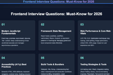
Introduction
CSS Flexbox is a modern layout module that makes one-dimensional alignment and distribution of space simple across different screen sizes. In this beginner’s guide to CSS Flexbox, you’ll learn the core ideas, the most useful properties, and repeatable patterns you can drop into any project today.
What Is Flexbox and When to Use It
Flexbox is a one-dimensional layout system. It arranges items in a row or a column, then gives you precise control over alignment, spacing, and ordering. Use Flexbox when you’re laying out navigation bars, card rows, media objects, or form controls. For full-page grids or dashboards, CSS Grid often fits better; still, Flexbox shines inside components where items flow naturally in one direction.
Key Terms
- Flex container – The parent element with
display: flex; - Flex items – Direct children of the container
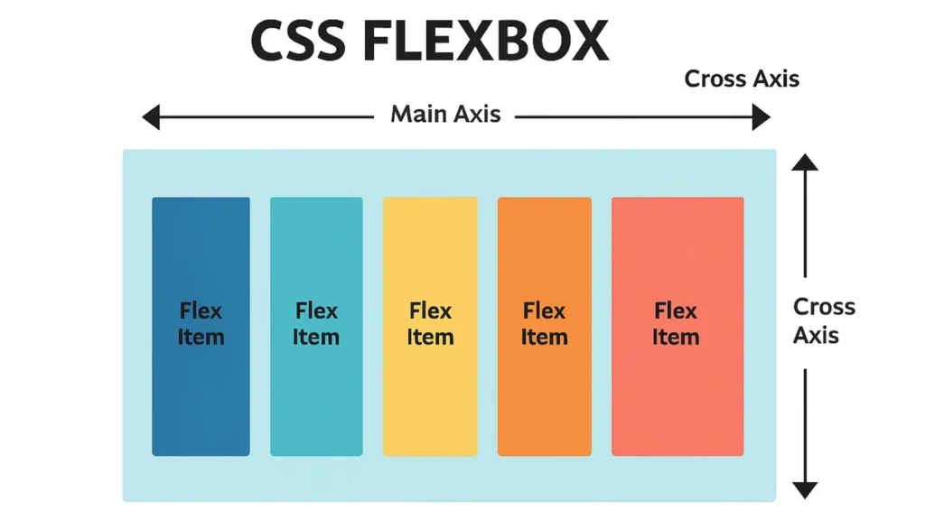
- Main axis – Direction items flow (row by default)
- Cross axis – Perpendicular to the main axis
(Diagram: CSS Flexbox main and cross axes)
The Essential Flex Container Properties
These are the switches you’ll flip most often on the container.
1) display
.container {
  display: flex;  /* or inline-flex */
}
Tip: Use semantic HTML containers such as <nav>, <ul>, or <section> instead of generic <div> elements. This improves accessibility and SEO.
2) flex-direction
Controls the main axis:
.container {
  flex‐direction: row;  /* row | row‐reverse | column | column‐reverse */
}
Common pattern: row for horizontal menus; column for stacked mobile lists.
3) flex-wrap
Allows items to wrap to new lines when space runs out:
.container {
  flex‐wrap: wrap;  /* nowrap | wrap | wrap‐reverse */
}
Without wrapping, items may overflow on small screens.
4) justify-content (main-axis alignment)
.container {
  justify‐content: center;  /* flex‐start | center | space‐between | space‐around | space‐evenly */
}
Use it to distribute items horizontally when flex‐direction: row;.
5) align-items (cross-axis alignment)
.container {
  align‐items: center;  /* stretch | flex‐start | center | baseline | flex‐end */
}
It vertically aligns items when the main axis is horizontal.
6) gap (modern spacing)
.container {
  gap: 1rem;  /* row‐gap col‐gap shorthand */
}
Why gap? It creates consistent spacing without margin hacks and keeps alignment predictable—especially when items wrap.
The Must-Know Flex Item Properties
These control individual items without affecting siblings.
1) flex (grow, shrink, basis)
.item {
  flex: 1 1 200px;  /* grow | shrink | basis */
}
flex‐grow: 1 lets an item take leftover space. flex‐shrink: 1 allows it to shrink when needed. flex‐basis: 200px sets the starting size.
Together, they form the flexible sizing formula that makes layouts responsive.
2) align-self (override cross axis)
.item‐‐special {
  align‐self: flex‐end;  /* overrides container’s align‐items */
}
Use it to align one item differently—handy for CTAs or buttons at the bottom of a card.
3) order (visual ordering)
.item‐‐cta { order: -1; } /* bring the important card first */
Use order sparingly; changing visual order can confuse keyboard navigation and screen readers.
Common Flexbox Patterns You’ll Reuse
These practical layouts cover most everyday UI needs.
Center Anything (Classic)
<section class="center" aria‐label="Centered content example">
  <div class="box">Perfectly centered</div>
</section>

.center {
  display: flex;
  justify‐content: center;
  align‐items: center;
  min‐height: 40vh;
}
.box {
  padding: 1rem 1.5rem;
  background: #f2f4f7;
  border‐radius: .5rem;
}
Why it works: justify-content centers along the main axis; align-items along the cross axis. Together they create true centering both ways.
Responsive Card Row with Wrap
<ul class="cards" aria‐label="Product cards">
  <li class="card">Card A</li>
  <li class="card">Card B</li>
  <li class="card">Card C</li>
  <li class="card">Card D</li>
</ul>

.cards {
  display: flex;
  flex‐wrap: wrap;
  gap: 1rem;
  list‐style: none;
  padding: 0;
  margin: 0;
}
.card {
  flex: 1 1 240px;
  background: #fff;
  border: 1px solid #e5e7eb;
  border‐radius: .5rem;
  padding: 1rem;
}
Accessibility tip: Provide an aria-label for context and maintain logical DOM order even if you visually reorder items.
Space Between for Nav Bars
<nav class="navbar" aria‐label="Primary">
  <a class="brand" href="/">Brand</a>
  <ul class="nav">
    <li><a href="/features">Features</a></li>
    <li><a href="/pricing">Pricing</a></li>
    <li><a href="/docs">Docs</a></li>
  </ul>
</nav>

.navbar {
  display: flex;
  justify‐content: space‐between;
  align‐items: center;
  padding: .75rem 1rem;
  border-bottom: 1px solid #e5e7eb;
}
.nav {
  display: flex;
  gap: 1rem;
  list‐style: none;
  margin: 0;
  padding: 0;
}
Media Object (Image + Text)
<article class="media">
  <img src="avatar.jpg" alt="Author headshot" width="64" height="64">
  <div class="content">
    <h3>Title</h3>
    <p>Short summary goes here.</p>
  </div>
</article>

.media {
  display: flex;
  align‐items: flex‐start;
  gap: .75rem;
}
.media img { flex: 0 0 64px; border‐radius: 9999px; }
.media .content { flex: 1 1 auto; }
This pattern is perfect for comments, testimonials, or blog lists.
Debugging and Mastering Alignment
Flexbox offers powerful alignment but can feel tricky until you visualize axes.
Quick Debug Technique
.container { outline: 1px dashed #cbd5e1; }
.item { background: rgba(59,130,246,.08); }
Add temporary outlines to see available space and diagnose mis-alignment quickly.
Why Items Overflow (and Fixes)
- No wrapping: Add
flex‐wrap: wrap;. - Rigid basis: Lower
flex‐basisor enable shrinking. - Huge content: Use
min‐width: 0;on flex children containing long text.
.child { min‐width: 0; } /* allows text to wrap */Axis Memory Trick
Say it aloud: “Main axis follows flex-direction; cross axis is perpendicular.” If flex-direction: column;, then justify-content controls vertical alignment, not horizontal.
Flexbox vs. Grid — Choose the Right Tool
Use CSS Flexbox for linear flows: navbars, toolbars, media objects, or rows of cards. Use CSS Grid for two-dimensional layouts such as full pages or image galleries. Often you’ll combine them—Grid for page structure, Flexbox inside components for finer control.
Performance, Semantics & Accessibility
- Prefer semantic containers (
<nav>,<ul>,<section>,<form>). - Maintain logical DOM order; avoid over-using
order. - Add
aria-labelor visible labels for interactive controls. - Avoid empty wrappers—Flexbox works directly on meaningful elements.
- Use
gapfor spacing; it’s more predictable than margins, especially with wrapping.
Practical Walkthrough (Video + Steps)
If you like to learn visually, here’s a quick Flexbox primer: https://www.youtube.com/embed/JJSoEo8JSnc
Step-by-step recap:
- Turn on Flexbox →
display: flex; - Decide direction →
flex-direction - Allow wrapping if needed →
flex-wrap - Set main-axis spacing →
justify-content - Align cross axis →
align-items - Add consistent whitespace →
gap - Control items →
flex,align-self,order
Cheatsheet — Properties at a Glance
Container: display, flex-direction, flex-wrap, justify-content, align-items, align-content, gap
Items: flex, flex-grow, flex-shrink, flex-basis, align-self, order, min-width: 0
Mnemonic: D-D-W-J-A-G (Display, Direction, Wrap, Justify, Align, Gap)
Real-World Flexbox Use Cases
Flexbox powers countless real interfaces:
- Navigation bars: Align brand left, menu right, with
justify-content: space-between;. - Pricing tables: Each plan box grows equally with
flex: 1;. - Chat UIs: Messages and avatars align cleanly using
align-items: flex-end;. - Forms: Labels and inputs align neatly with
flex-direction: column;for mobile androw;for desktop. - Feature grids: Combine Flexbox wrapping with gap to make adaptive product cards.
When used thoughtfully, Flexbox eliminates the need for float hacks or complex media queries, creating lightweight, responsive UIs that perform smoothly across devices.
Conclusion — What to Do Next
You now know the essential CSS Flexbox controls, the most common patterns, and how to debug alignment issues. Practice replacing margin-based layouts in your next project with Flexbox and note how cleaner your CSS becomes.
Subscribe for more layout recipes or drop a comment sharing which Flexbox component you’d like built next!