Image Lazy Loading is an essential technique for modern web performance. Have you ever visited a webpage packed with high-resolution images, only to find it loading at a snail’s pace? It’s frustrating, isn’t it? As developers, we constantly strive to deliver blazing-fast user experiences. This optimization significantly improves initial page load times by deferring the loading of non-critical resources until they are actually needed. Today, we’re diving deep into implementing this powerful strategy using plain JavaScript. We’ll build a practical example together, ensuring your sites load faster and delight your users.
What We Are Building: Optimizing with Image Lazy Loading
Imagine a beautifully designed product showcase or a captivating photography portfolio. These sites often feature numerous high-quality images. Loading all of them upfront, even those far down the page, can consume significant bandwidth and delay the rendering of critical content. This leads to a poor user experience and can even hurt your search engine rankings.
Our goal today is to build a robust system for Image Lazy Loading. We’ll craft a solution where images only load when they enter the user’s viewport. This approach is trending because it directly addresses core performance issues, leading to quicker Time to Interactive metrics and reduced server load. For instance, consider an e-commerce site; customers want to see products quickly, not wait for every single image on a long category page to load.
This technique is incredibly useful for any content-heavy website. Think about blogs with many inline images, news portals with extensive galleries, or social media feeds. By selectively loading content, we ensure users get immediate access to the visible parts of your page. Furthermore, it saves mobile users precious data.
HTML Structure
We need a simple HTML setup to demonstrate the concept. We’ll use a div container to hold our images, marking them with a special attribute to indicate they should be lazy-loaded.
<div class="image-gallery">
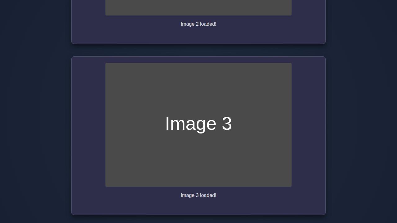
<img class="lazy-image" data-src="https://via.placeholder.com/600x400/FF5733/FFFFFF?text=Image+1" alt="Placeholder Image 1">
<img class="lazy-image" data-src="https://via.placeholder.com/600x400/33FF57/FFFFFF?text=Image+2" alt="Placeholder Image 2">
<img class="lazy-image" data-src="https://via.placeholder.com/600x400/3357FF/FFFFFF?text=Image+3" alt="Placeholder Image 3">
<img class="lazy-image" data-src="https://via.placeholder.com/600x400/FF33A1/FFFFFF?text=Image+4" alt="Placeholder Image 4">
<img class="lazy-image" data-src="https://via.placeholder.com/600x400/A1FF33/FFFFFF?text=Image+5" alt="Placeholder Image 5">
<img class="lazy-image" data-src="https://via.placeholder.com/600x400/33A1FF/FFFFFF?text=Image+6" alt="Placeholder Image 6">
<img class="lazy-image" data-src="https://via.placeholder.com/600x400/FF3333/FFFFFF?text=Image+7" alt="Placeholder Image 7">
<img class="lazy-image" data-src="https://via.placeholder.com/600x400/33FF33/FFFFFF?text=Image+8" alt="Placeholder Image 8">
<img class="lazy-image" data-src="https://via.placeholder.com/600x400/3333FF/FFFFFF?text=Image+9" alt="Placeholder Image 9">
<img class="lazy-image" data-src="https://via.placeholder.com/600x400/FF3366/FFFFFF?text=Image+10" alt="Placeholder Image 10">
</div>CSS Styling
Basic CSS will help us visualize the lazy loading effect. We’ll add some dimensions and a placeholder background for images that haven’t loaded yet. This ensures our layout doesn’t jump around.
.image-gallery {
    display: grid;
    grid-template-columns: repeat(auto-fit, minmax(280px, 1fr));
    gap: 20px;
    padding: 20px;
    max-width: 1200px;
    margin: 0 auto;
}

.image-gallery img {
    width: 100%;
    height: 200px; /* Fixed height for placeholders */
    object-fit: cover;
    background-color: #f0f0f0; /* Placeholder background */
    display: block;
    transition: background-color 0.3s ease;
    border-radius: 8px;
    box-shadow: 0 4px 8px rgba(0, 0, 0, 0.1);
}

/* Optional: Add a subtle loading indicator or different background for lazy images */
.lazy-image {
    background-color: #e0e0e0;
    border: 1px dashed #ccc;
    animation: pulse 1.5s infinite ease-in-out;
}

@keyframes pulse {
    0% { opacity: 0.8; }
    50% { opacity: 1; }
    100% { opacity: 0.8; }
}

@media (max-width: 768px) {
    .image-gallery {
        grid-template-columns: 1fr;
        padding: 15px;
    }
    .image-gallery img {
        height: 180px;
    }
}

@media (max-width: 480px) {
    .image-gallery {
        gap: 15px;
        padding: 10px;
    }
    .image-gallery img {
        height: 150px;
    }
}
Step-by-Step Breakdown: The JavaScript Logic
This is where the magic truly happens. We’ll use JavaScript to identify our lazy-loadable images and then implement an observer to detect when they enter the viewport. This pattern, utilizing the Intersection Observer API, is remarkably efficient.
Selecting Our Images
First, we need to gather all the images that are candidates for lazy loading. We’ll assign a specific class, let’s say lazy-image, to these img tags.
const lazyImages = document.querySelectorAll('.lazy-image');This simple line gives us a NodeList of all elements we intend to lazy load. It’s the foundational step, ensuring our JavaScript targets the correct elements.
Understanding the Intersection Observer API
The Intersection Observer API is a game-changer for performance optimizations. It efficiently observes when an element intersects with the viewport. This API is much more performant than constantly polling for element positions using scroll event listeners. It simply tells us when an element becomes visible. For more details, explore the MDN Web Docs. It’s a fundamental modern front-end tool.
Creating the Observer Instance
Now, let’s set up our IntersectionObserver. This involves defining a callback function that will execute whenever an observed element’s visibility changes.
const observerOptions = {
    root: null, // viewport
    rootMargin: '0px',
    threshold: 0.1 // Trigger when 10% of the image is visible
};

const imageObserver = new IntersectionObserver((entries, observer) => {
    entries.forEach(entry => {
        if (entry.isIntersecting) {
            const image = entry.target;
            const imageUrl = image.dataset.src; // Get the actual source from data-src

            // Only load if imageUrl exists
            if (imageUrl) {
                image.src = imageUrl;
            }

            image.classList.remove('lazy-image'); // Remove class to indicate it's loaded
            observer.unobserve(image); // Stop observing once loaded
        }
    });
}, observerOptions);
root: null observes against the viewport. rootMargin: '0px' adds no extra margin. threshold: 0.1 triggers when 10% of the image is visible. When entry.isIntersecting is true, we grab the data-src, assign it to src, and unobserve the image. This process is highly efficient and gracefully handles images already in view.
Attaching the Observer to Images
Finally, we iterate through our lazyImages NodeList and tell our imageObserver to start watching each one.
lazyImages.forEach(image => {
    imageObserver.observe(image);
});
This loop ensures that every image we marked for lazy loading is now under the watchful eye of our IntersectionObserver. Once an image appears in the viewport according to our threshold, the callback function fires, and the image loads. This modular approach to handling assets makes scaling much simpler. If you’ve ever worked on projects with a complex asset pipeline, you’ll appreciate how declarative this method is. For insights into managing complex JavaScript applications, you might want to review an article on modular JavaScript components. It emphasizes building maintainable and scalable codebases, much like what we’re doing here.
Fallback for Older Browsers (Optional but Recommended)
While Intersection Observer has excellent support, providing a fallback for older browsers is good practice. We can check for the API’s presence. If it’s not available, we can load all images immediately or implement a less performant scroll listener.
if ('IntersectionObserver' in window) {
    // Our Intersection Observer logic goes here
    lazyImages.forEach(image => {
        imageObserver.observe(image);
    });
} else {
    // Fallback: load all images immediately
    lazyImages.forEach(image => {
        const imageUrl = image.dataset.src;
        if (imageUrl) {
            image.src = imageUrl;
        }
        image.classList.remove('lazy-image');
    });
}
This ensures graceful degradation for users on older browsers. They receive content, even without the full performance benefits. It’s a pragmatic approach to diverse browser landscapes.
Making It Responsive
Responsiveness is crucial for any modern web project. Our lazy-loaded images need to look great and scale properly across all devices, from small smartphones to large desktop monitors. Fortunately, the JavaScript lazy loading mechanism itself doesn’t interfere with responsive image techniques.
We can achieve responsiveness primarily through CSS. Using max-width: 100%; and height: auto; on our image elements ensures they don’t overflow their containers and maintain their aspect ratio. For more advanced control, consider using the <picture> element with srcset and sizes attributes, which allows the browser to choose the most appropriate image source based on screen size and resolution. This works seamlessly with our JavaScript approach, as the data-src attribute can still point to a low-res fallback, while srcset takes over for resolution switching once the image loads. For practical examples and deeper insights into responsive images, CSS-Tricks offers excellent resources.
“Responsive design isn’t just about adapting layouts; it’s about optimizing content delivery for every user, regardless of their device. Lazy loading complements this by making sure even large images contribute to a smooth experience, not a slow one.”
Moreover, CSS media queries are your best friend here. You can adjust image widths, margins, or even display different image placeholders based on breakpoint. For example, you might have larger thumbnails on desktop and smaller, more compact ones on mobile.
Final Output
Upon successful implementation, you’ll notice a significant improvement in initial page load times. The page will render quickly, and images will seamlessly pop into view as you scroll. This provides a much smoother and more engaging user experience. You’ll see placeholders briefly, then crisp images appear, without any janky scrolling or long waits. This visual feedback confirms the optimization is working perfectly. Furthermore, you’ve implemented a robust solution that is both efficient and maintainable. This kind of thoughtful design consideration can also be found in complex user interfaces, such as those that might feature an interactive password strength indicator, where real-time feedback is paramount.
Conclusion: Embracing Image Lazy Loading for Speed
You’ve successfully implemented Image Lazy Loading using JavaScript and the powerful Intersection Observer API! This isn’t just a fancy trick; it’s a fundamental performance optimization that directly impacts user satisfaction, bounce rates, and even SEO. By deferring the loading of off-screen images, you reduce initial page weight, conserve bandwidth, and ensure your users see content faster.
“In the fast-paced world of web development, every millisecond counts. Image lazy loading offers one of the most significant performance gains for media-rich sites, making it an indispensable technique.”
This technique is applicable across a vast array of web applications, from large-scale content platforms to personal blogs. The principles we’ve discussed today extend beyond images; you can apply similar Intersection Observer logic to lazy load videos, components, or even entire sections of your page. Understanding these core optimization patterns is key to building modern, high-performance web applications. Speaking of modern web development, exploring concepts like Hot Module Replacement can further enhance your development workflow, allowing for even faster iterations. Keep experimenting, keep building, and keep optimizing!