Glitch Text effects are a fantastic way to add a dynamic, futuristic, and slightly chaotic touch to your web designs. Have you ever wanted to make your titles or important messages jump out with that cool, digital distortion vibe? Well, today, we’re diving deep into creating just that! We’ll explore how to craft a captivating glitch text effect using nothing but pure HTML and CSS, transforming static text into a vibrant, animated spectacle. Get ready to impress your users with this engaging visual trick.
What We Are Building
Modern web design constantly seeks unique ways to grab attention, and a digital distortion effect does precisely that. We’re going to build a striking animated text effect that simulates a temporary digital disruption. Imagine text flickering, shifting colors, and slightly displacing itself – this is the essence of what we’ll achieve. This effect is incredibly popular in gaming interfaces, sci-fi themed websites, and even some edgy brand landing pages.
Why is this trending? Because it adds a layer of depth and intrigue. It suggests something is happening, something dynamic, making the user pause and look. It’s not just static text; it’s an experience. Consequently, you can effectively use this on hero sections, call-to-action buttons, or even loading screens to create a strong visual impact.
This effect isn’t merely about aesthetics; it’s about user engagement. For instance, much like a well-placed skeleton loader smoothly guides user attention during content loading, a glitch effect can highlight critical elements in a visually stimulating way. It communicates a certain mood, often one of modernity or a “breaking the norm” attitude.
HTML Structure
Setting up our HTML is remarkably straightforward. We’ll need a container for our text and the text itself, which will live inside an <h1> tag. The key here is the data-text attribute. This attribute will be crucial for our CSS pseudo-elements to duplicate the text and create the layers necessary for the glitching effect.
<div class="glitch-container">
    <h1 class="glitch" data-text="HELLO WORLD">HELLO WORLD</h1>
</div>
CSS Styling
Now for the fun part – the CSS! This is where we truly bring our static text to life, transforming it into a dynamic, pulsating visual experience. We’ll employ a series of clever tricks involving positioning to layer our text, text-shadow for that vibrant chromatic aberration, clip-path to selectively reveal and hide portions of the text, and, of course, powerful @keyframes animations. By manipulating these properties, we’ll layer multiple versions of our text using pseudo-elements and then animate their positions and clip paths independently. This careful orchestration is what creates that signature broken digital look, making your text appear as if it’s flickering in and out of existence.
body {
    display: flex;
    justify-content: center;
    align-items: center;
    min-height: 100vh;
    background-color: #1a1a1a;
    font-family: 'Space Mono', monospace; /* Or any futuristic font */
    overflow: hidden;
    margin: 0;
}

.glitch-container {
    position: relative;
    text-align: center;
    width: fit-content;
    margin: auto;
}

.glitch {
    font-size: 8rem;
    font-weight: 700;
    color: #fff;
    position: relative;
    animation: glitch-skew 1s infinite linear alternate-reverse;
}

.glitch::before,
.glitch::after {
    content: attr(data-text);
    position: absolute;
    top: 0;
    left: 0;
    width: 100%;
    height: 100%;
    background: #1a1a1a;
    color: #fff;
    overflow: hidden;
}

.glitch::before {
    left: 2px;
    text-shadow: -2px 0 #ff00c1; /* Magenta */
    animation: glitch-anim-1 1.5s infinite linear alternate-reverse;
}

.glitch::after {
    left: -2px;
    text-shadow: 2px 0 #00ffff; /* Cyan */
    animation: glitch-anim-2 2s infinite linear alternate-reverse;
}

/* Keyframes for the glitch effect */
@keyframes glitch-skew {
    0% { transform: skewX(0deg); }
    20% { transform: skewX(-5deg); }
    40% { transform: skewX(5deg); }
    60% { transform: skewX(-3deg); }
    80% { transform: skewX(3deg); }
    100% { transform: skewX(0deg); }
}

@keyframes glitch-anim-1 {
    0% { clip-path: inset(20% 0 80% 0); transform: translate(-5px, 0); }
    10% { clip-path: inset(80% 0 0% 0); transform: translate(5px, 0); }
    20% { clip-path: inset(10% 0 90% 0); transform: translate(-5px, 0); }
    30% { clip-path: inset(70% 0 10% 0); transform: translate(5px, 0); }
    40% { clip-path: inset(20% 0 80% 0); transform: translate(-5px, 0); }
    50% { clip-path: inset(80% 0 0% 0); transform: translate(5px, 0); }
    60% { clip-path: inset(10% 0 90% 0); transform: translate(-5px, 0); }
    70% { clip-path: inset(70% 0 10% 0); transform: translate(5px, 0); }
    80% { clip-path: inset(20% 0 80% 0); transform: translate(-5px, 0); }
    90% { clip-path: inset(80% 0 0% 0); transform: translate(5px, 0); }
    100% { clip-path: inset(20% 0 80% 0); transform: translate(-5px, 0); }
}

@keyframes glitch-anim-2 {
    0% { clip-path: inset(25% 0 75% 0); transform: translate(5px, 0); }
    15% { clip-path: inset(0% 0 100% 0); transform: translate(-5px, 0); }
    30% { clip-path: inset(75% 0 25% 0); transform: translate(5px, 0); }
    45% { clip-path: inset(0% 0 100% 0); transform: translate(-5px, 0); }
    60% { clip-path: inset(25% 0 75% 0); transform: translate(5px, 0); }
    75% { clip-path: inset(0% 0 100% 0); transform: translate(-5px, 0); }
    90% { clip-path: inset(75% 0 25% 0); transform: translate(5px, 0); }
    100% { clip-path: inset(25% 0 75% 0); transform: translate(5px, 0); }
}
Step-by-Step Breakdown
Let’s dissect this code to truly understand how our Glitch Text effect comes together. Every line plays a vital role in crafting this dynamic animation. Understanding these principles will empower you to customize and create your own unique effects.
The Foundation: Body and Container
First, we establish a basic page layout. The body element uses display: flex to center our content perfectly on the screen. A dark background-color provides a stark contrast, making our bright text pop. We also apply a futuristic font-family like ‘Space Mono’ for extra thematic flair. Furthermore, overflow: hidden on the body ensures that any glitching text fragments don’t cause scrollbars to appear, keeping the design clean.
The Core: .glitch Class
The .glitch class is applied directly to our <h1> element. Here, we set the font-size and font-weight for visual prominence. Crucially, position: relative is applied. This makes the <h1> an anchor for its pseudo-elements, allowing them to be positioned absolutely within its boundaries. The initial animation: glitch-skew starts a subtle skewing effect on the main text itself, adding to the overall instability.
Duplicating the Text with Pseudo-elements (::before and ::after)
This is where the magic truly begins. The ::before and ::after pseudo-elements are like invisible layers of text that sit directly on top of our original “HELLO WORLD”. We use content: attr(data-text) to dynamically pull the text from the data-text attribute of our <h1>. This means if you change the text in HTML, these layers automatically update!
Both pseudo-elements are absolutely positioned, covering the parent <h1> entirely. They share the same background color as the body, effectively masking parts of the original text. However, they each have distinct text-shadow values: one magenta (#ff00c1) and one cyan (#00ffff). These color offsets are critical for the classic RGB split look of a digital glitch. Each pseudo-element also receives its own unique animation, glitch-anim-1 and glitch-anim-2, running at different durations and offsets. This deliberate desynchronization is what creates the chaotic, broken feel.
“The true artistry of a glitch effect lies in its controlled chaos. By carefully orchestrating subtle shifts and disruptions, we can create something visually engaging rather than merely disorienting.”
Animating the Glitch: @keyframes Explained
We utilize three distinct @keyframes animations to create the complete glitch effect.
glitch-skew
This animation applies a transform: skewX() property to the main .glitch text. It causes the entire word to briefly tilt left and right, adding a layer of subtle horizontal distortion. This primary animation runs for 1 second, repeatedly, in an alternate-reverse direction, ensuring a continuous, natural wobble.
glitch-anim-1 and glitch-anim-2
These two animations are the absolute core of the visual corruption, running concurrently but out of sync on our ::before and ::after elements respectively. They both skillfully manipulate the clip-path and transform: translate() properties.
clip-path: inset(top right bottom left): This incredibly powerful CSS property allows us to define a visible region of an element, effectively cropping it. By rapidly changing theinsetvalues across various keyframes, we continuously reveal and hide different horizontal slices of the pseudo-elements. For example,inset(20% 0 80% 0)means only the middle 60% of the text’s height is visible, creating those distinctive horizontal “scan lines” or data corruptions. Then, at other keyframes, the clip path shifts, creating a sudden, jarring cut. This rapid change in visibility is key to the flickering effect.transform: translate(): In perfect sync with theclip-pathchanges, we horizontally shift (translate) these clipped layers. For instance,translate(-5px, 0)moves the layer 5 pixels to the left. This horizontal displacement, combined with the vertical slicing, creates the impression that the text is not only tearing apart but also misaligning, enhancing the broken digital feel.
The magic truly happens because glitch-anim-1 and glitch-anim-2 have intentionally different durations (1.5s vs. 2s) and slightly varied clip-path and translate values at their keyframes. This deliberate desynchronization ensures that the two colored layers (magenta and cyan) never perfectly overlap. If they did, the effect would be lost. Instead, this asymmetry maintains their distinct, flickering, and distorted appearance, crucial for a convincing glitch. You can learn more about clip-path and its myriad capabilities on the MDN Web Docs, an indispensable resource for web developers.
Making Our Glitch Text Responsive
In today’s multi-device world, ensuring your designs look great everywhere is non-negotiable. Our Glitch Text effect needs to scale gracefully from large desktop monitors down to mobile phones. The primary adjustment we’ll need to make is for the font-size of our .glitch text. A massive 8rem font looks impressive on a desktop but will likely overflow on a small screen.
We achieve responsiveness using media queries. This powerful CSS feature allows us to apply different styles based on device characteristics, such as screen width. For instance, we can reduce the font-size for screens smaller than a certain breakpoint.
@media (max-width: 768px) {
    .glitch {
        font-size: 4rem; /* Smaller font for tablets */
    }
}

@media (max-width: 480px) {
    .glitch {
        font-size: 2.5rem; /* Even smaller for mobile phones */
    }
}
This approach ensures that while the core glitch animation remains consistent, the text itself resizes appropriately, maintaining readability and visual appeal. When you consider responsive design, think about other UI elements too. Just like ensuring your toast notifications don’t block content on mobile, adapting font sizes is crucial for usability.
Final Output
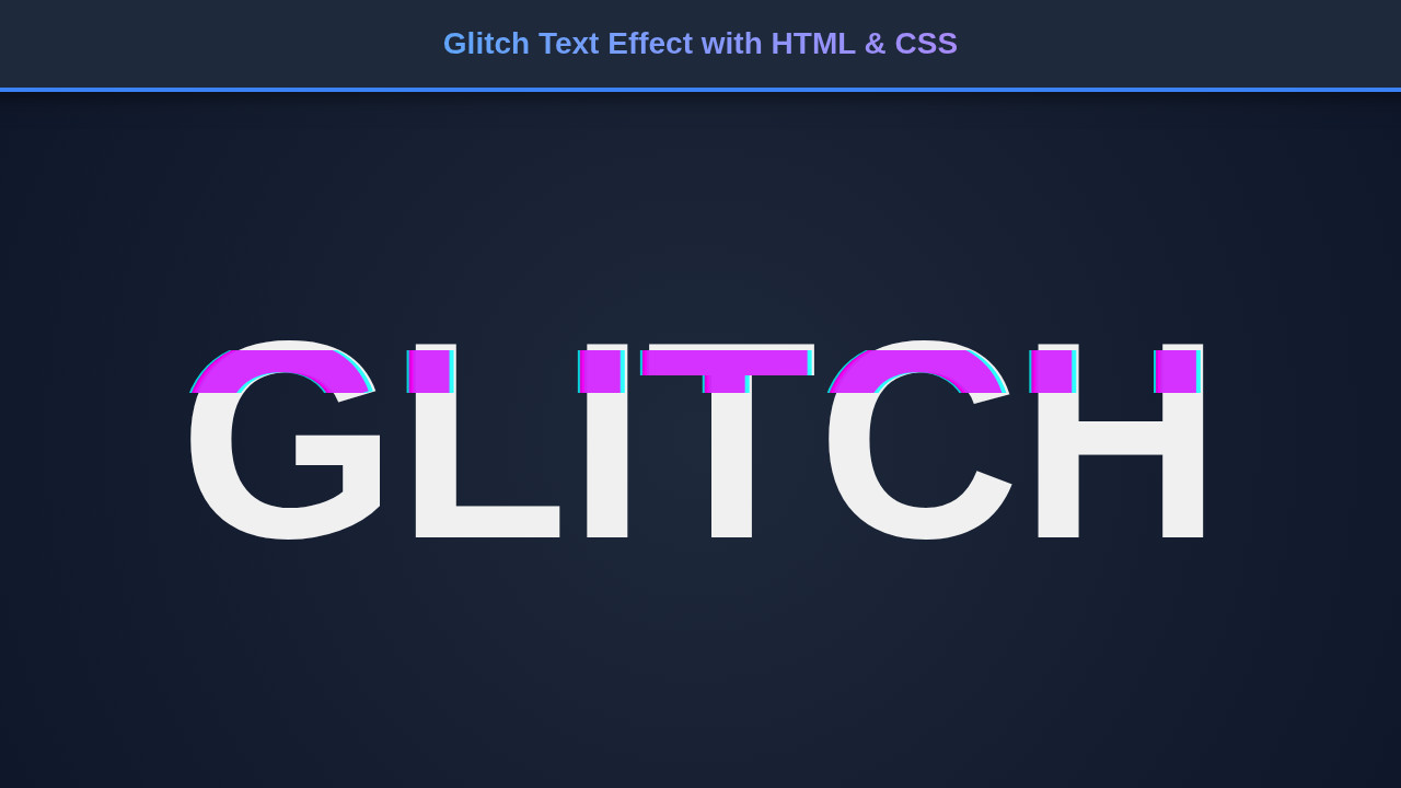
With all the HTML in place and CSS animations running smoothly, the final output is a mesmerizing Glitch Text effect. You’ll observe “HELLO WORLD” (or whatever text you chose) shimmering and distorting with a vibrant, energetic glow. The independent animation of the cyan and magenta layers creates a deep, almost 3D illusion of digital interference.
The continuous, slightly randomized nature of the clip-path and transform properties, combined with the subtle skewX on the main text, results in an unpredictable yet captivating visual. It truly looks like your text is momentarily breaking apart before reassembling itself, only to glitch again. This effect is a testament to how much can be achieved with pure CSS, pushing the boundaries of what browsers can render dynamically. You’ve successfully brought a piece of the digital age’s aesthetic directly into your browser!
Conclusion: Unleash Your Glitch Text
You’ve just learned how to craft a fantastic Glitch Text effect using fundamental HTML and CSS, transforming ordinary text into an extraordinary visual statement. This powerful technique isn’t just a gimmick; it’s a tool for enhancing user experience and conveying a distinct brand personality.
From gaming websites to futuristic portfolios, the applications are endless. Imagine using this for a “Loading…” message, an error indicator, or even a bold main heading on your next project. Feel free to experiment with the text-shadow colors, animation durations, and clip-path values to create your unique variations. Perhaps you want to make it less aggressive, or even more chaotic!
“Mastering CSS animations opens up a universe of creative possibilities, allowing you to breathe life into static designs and engage users on a deeper visual level.”
Remember, while flashy effects are great, accessibility is always key. Ensure that your text is still readable for all users, even if they have motion sensitivities. You might consider providing a toggle for animations if this is used on primary content. For more insights on building robust and accessible components, check out this guide on creating an accessible tooltip. Dive into the world of CSS animations and keep building awesome things! Another great resource for advanced CSS techniques is CSS-Tricks, a fantastic place to deepen your knowledge.