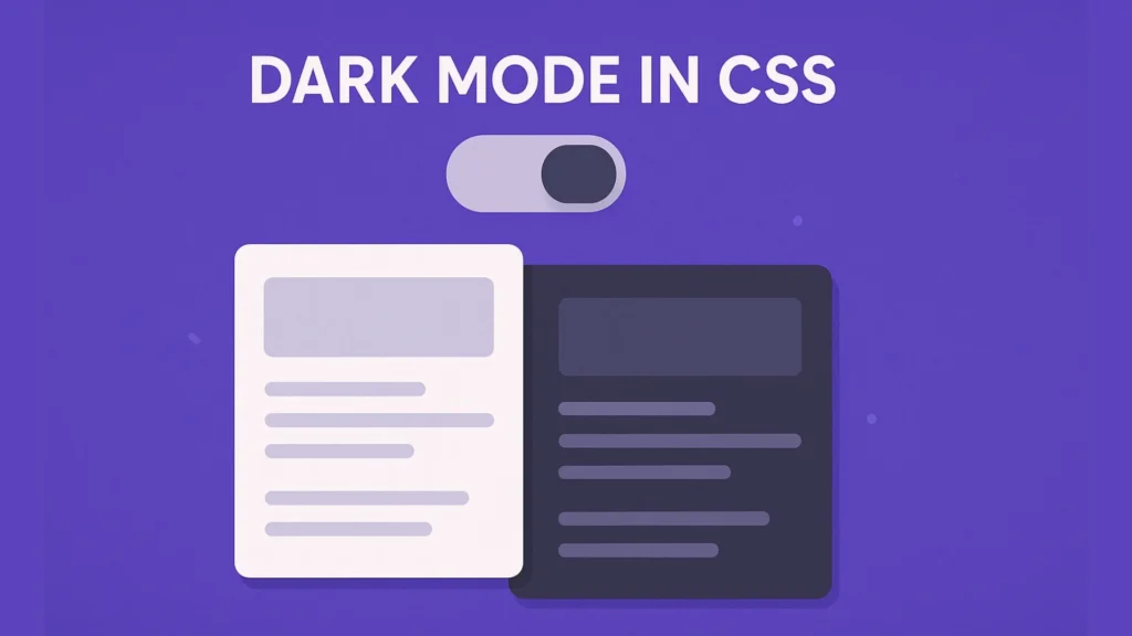
Make your site easier on the eyes and smarter about user preferences — implement Dark Mode in CSS with automatic theme switching.
Introduction
Dark interfaces are no longer a trend; they are an expectation. With Dark Mode in CSS, you can respect the user’s system preference, reduce eye strain at night, and still keep your brand on point. In this guide, you’ll build automatic theme switching with prefers-color-scheme, CSS variables, and a small JavaScript toggle that remembers the user’s choice.

What Is Dark Mode in CSS?
Dark Mode in CSS is the practice of designing a dark color scheme and applying it automatically when the user or system prefers it. Instead of forcing visitors to use a bright layout, you offer both light and dark themes that respond to settings on their device.
Why users love dark mode
Dark mode is popular for several reasons:
- It can feel more comfortable in low-light environments.
- It often reduces glare, which many users appreciate.
- On OLED screens, darker pixels may save some battery power.
Most importantly, giving users a dark option shows that you value comfort and control.
Detecting System Preference with prefers-color-scheme
The easiest way to enable Dark Mode in CSS is to rely on the browser’s built-in media query: prefers-color-scheme. This query tells you whether the user prefers a light, dark, or no-preference theme at the system level.
Basic CSS-only dark mode
Here is a minimal example:
:root {
  /* Light theme defaults */
  --bg: #ffffff;
  --text: #111827;
  --accent: #2563eb;
}

body {
  background-color: var(--bg);
  color: var(--text);
}

/* Dark mode when system prefers dark */
@media (prefers-color-scheme: dark) {
  :root {
    --bg: #020617;
    --text: #e5e7eb;
    --accent: #38bdf8;
  }
}
In this snippet, you define light theme colors on :root, then override them inside the dark-mode media query. The rest of your CSS pulls from the same variables, so both themes stay in sync.
Setting Up the HTML Structure
Before adding more advanced behaviors, let’s create a simple page layout that you can style. You will add a theme toggle later.
<body>
  <header class="site-header">
    <h1>Dark Mode in CSS Demo</h1>
    <button id="theme-toggle" aria-label="Toggle dark mode">
      🌓
    </button>
  </header>

  <main class="content">
    <p>Welcome! This page switches themes automatically.</p>
    <a href="#" class="btn-primary">Primary action</a>
  </main>
</body>
This structure keeps things semantic: <header>, <main>, and a clear button for the theme toggle. The ARIA label helps screen readers understand the button’s purpose.
Implementing Automatic Theme Switching (CSS + JS)
Using Dark Mode in CSS with only prefers-color-scheme is a great start. However, many users also want a manual switch. You can combine both approaches: detect system preference first, then let JavaScript override it when the user clicks the toggle.
Step 1 – Add CSS classes for light and dark
Keep your design token-based so you can reuse the same variables:
:root {
  color-scheme: light dark; /* hint to the browser */
  --bg: #ffffff;
  --text: #111827;
  --accent: #2563eb;
}

body {
  background: var(--bg);
  color: var(--text);
  font-family: system-ui, -apple-system, BlinkMacSystemFont, sans-serif;
}

/* Dark mode token set */
body.theme-dark {
  --bg: #020617;
  --text: #e5e7eb;
  --accent: #38bdf8;
}

/* Light mode token set (explicit) */
body.theme-light {
  --bg: #ffffff;
  --text: #111827;
  --accent: #2563eb;
}

a.btn-primary {
  background: var(--accent);
  color: #f9fafb;
  padding: 0.6rem 1.2rem;
  border-radius: 999px;
  text-decoration: none;
}
The tokens stay on :root, while Dark Mode in CSS is controlled by the theme-dark and theme-light classes applied to the <body> element.
Step 2 – Decide the initial theme
Now you can use JavaScript to decide which theme class to add on first load. The logic is:
- If the user previously chose a theme, use it.
- Otherwise, check
prefers-color-scheme. - If none is set, default to light.
const themeToggle = document.getElementById('theme-toggle');
const storedTheme = localStorage.getItem('theme');

function getPreferredTheme() {
  if (storedTheme === 'light' || storedTheme === 'dark') {
    return storedTheme;
  }

  if (window.matchMedia('(prefers-color-scheme: dark)').matches) {
    return 'dark';
  }

  return 'light';
}

function applyTheme(theme) {
  document.body.classList.remove('theme-light', 'theme-dark');
  document.body.classList.add(`theme-${theme}`);
  localStorage.setItem('theme', theme);
}

const initialTheme = getPreferredTheme();
applyTheme(initialTheme);
This script reads the previous choice from localStorage, then falls back to the system preference. Finally, it sets a class that drives Dark Mode in CSS via tokens.
Step 3 – Add the toggle behavior
Next, wire up the button to swap themes. You can also change its label for accessibility.
themeToggle.addEventListener('click', () => {
  const isDark = document.body.classList.contains('theme-dark');
  const newTheme = isDark ? 'light' : 'dark';
  applyTheme(newTheme);

  themeToggle.setAttribute(
    'aria-label',
    newTheme === 'dark' ? 'Switch to light mode' : 'Switch to dark mode'
  );
});
Now users can follow their system preference or override it with a click. The theme persists across page loads, which feels smooth and respectful.
Designing Color Tokens for Light and Dark
To make Dark Mode in CSS maintainable, treat colors as tokens, not hard-coded values. This approach reduces mistakes and keeps your theme consistent.
Recommended color groups
At minimum, define these variables:
- Background tokens: surface, elevated, subtle.
- Text tokens: primary, secondary, muted.
- Accent tokens: brand, accent-hover, accent-soft.
- Borders and separators: strong, subtle.
For example:
:root {
  --bg-surface: #ffffff;
  --bg-elevated: #f9fafb;
  --text-primary: #111827;
  --text-muted: #6b7280;
  --accent: #2563eb;
  --border-subtle: #e5e7eb;
}

body.theme-dark {
  --bg-surface: #020617;
  --bg-elevated: #0b1120;
  --text-primary: #e5e7eb;
  --text-muted: #9ca3af;
  --accent: #38bdf8;
  --border-subtle: #1f2937;
}
Because your components read from these tokens, you can adjust both themes without hunting through every selector.
Accessibility Tips for Dark Mode in CSS
Dark mode can improve comfort, but it can also hurt readability if you choose poor contrasts. Therefore, always keep accessibility in mind.
Contrast and readability
- Aim for WCAG AA contrast at minimum for text on backgrounds.
- Avoid pure white (#ffffff) on pure black (#000000); instead, use softer tones.
- Check both light and dark themes with a contrast checker tool.
Focus and state styles
Make sure focus outlines and interactive states remain visible in both themes. For instance, use a bright accent focus ring on dark backgrounds:
button:focus-visible,
a:focus-visible {
  outline: 2px solid var(--accent);
  outline-offset: 2px;
}
This tiny detail makes Dark Mode in CSS feel professional and usable for keyboard and screen reader users.
Handling Images, Icons, and Shadows
Colors are only part of Dark Mode in CSS. You should also think about media and depth.
- Prefer SVG icons that can inherit
currentColor. - Use subtle shadows in dark mode to avoid “muddy” content.
- Consider using light and dark variants of brand logos.
For example, you can swap logos using a CSS class on body:
.logo-light { display: inline; }
.logo-dark  { display: none; }

body.theme-dark .logo-light { display: none; }
body.theme-dark .logo-dark  { display: inline; }
This way, your logo remains visible and on-brand in both themes.
Testing and Debugging Dark Mode
Before shipping Dark Mode in CSS, test it in different conditions:
- System dark mode on and off.
- Multiple browsers and devices.
- High contrast or accessibility modes.
Most browsers offer developer tools where you can simulate prefers-color-scheme. Use these tools to quickly switch between light and dark without changing your whole system.
Common Pitfalls and Best Practices
To avoid frustration, keep these best practices in mind:
- Do not mix hard-coded colors with tokens. Use variables everywhere.
- Avoid theme logic in many places. Centralize decisions in a few files.
- Watch for embedded content. iFrames and third-party widgets might not respect your theme.
- Test scroll areas and overlays. Modals, dropdowns, and toasts should also follow Dark Mode in CSS tokens.
By following these guidelines, your theme switching will feel deliberate rather than patched together.
Frequently Asked Questions (FAQ)
Q1. Do I need JavaScript for Dark Mode in CSS?
No. You can use @media (prefers-color-scheme: dark) for a pure CSS solution. However, you will need JavaScript if you want a manual toggle and persistence.
Q2. Will Dark Mode in CSS break my existing design?
Not if you migrate gradually. Start by replacing hard-coded colors with tokens, then define dark equivalents.
Q3. How do I support users who prefer light mode?
Use system preference as the default, and offer a toggle so users can switch back to light mode if they want.
Q4. Is color-scheme important?
Yes. The color-scheme property hints to the browser which themes you support, so scrollbars, form controls, and built-in UI look correct.
Q5. Can I animate theme switching?
Yes, but be careful with motion. Simple transitions on background and text colors are usually fine; avoid intense animations that could distract users.
Conclusion & Call to Action
Implementing Dark Mode in CSS is one of the highest-impact UX upgrades you can add to a modern site. With prefers-color-scheme, CSS variables, and a small theme toggle, you can respect user preferences, reduce eye strain, and keep your brand consistent in any lighting.
Now it’s your turn:
Try this today on a small page in your project. Then, roll it out across your design system.
👉 Tell us in the comments which part of dark mode was hardest to implement.
👉 Subscribe for more hands-on CSS and JavaScript tutorials.
👉 Share this guide with a teammate who still ships only light themes.


