Skeleton Loader: HTML & CSS Animation Tutorial
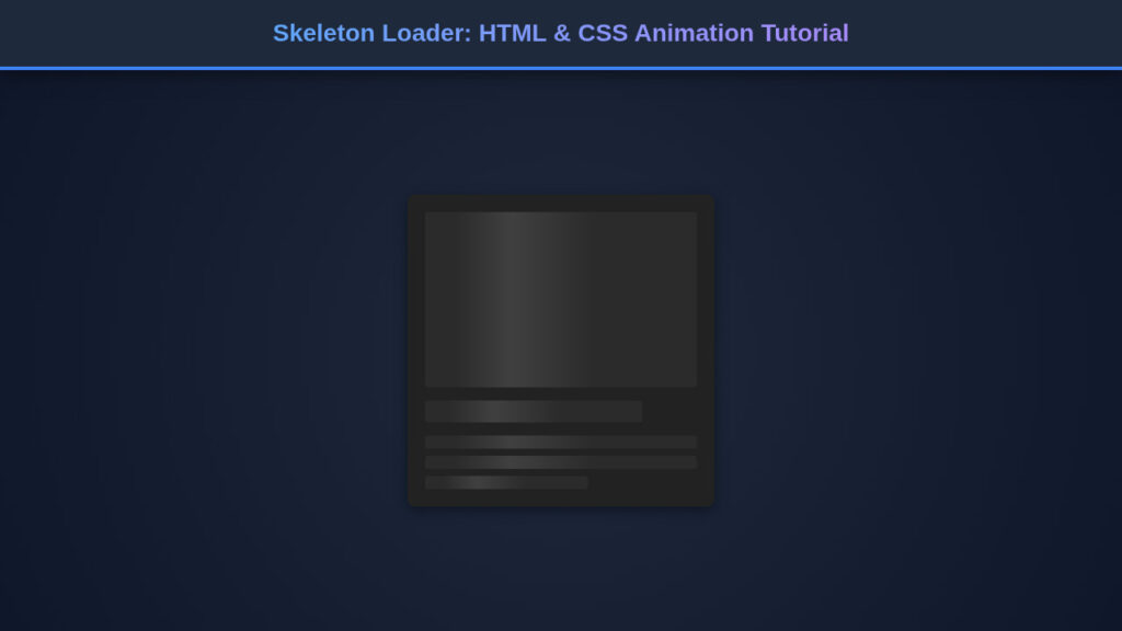
A Skeleton Loader is more than just a placeholder; it’s a critical component in modern web design that dramatically enhances perceived performance. As developers, we […]

A Skeleton Loader is more than just a placeholder; it’s a critical component in modern web design that dramatically enhances perceived performance. As developers, we […]
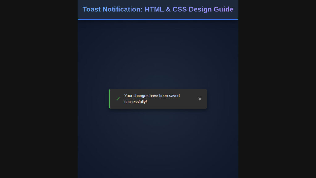
Ever noticed those small, unobtrusive messages popping up on websites to give you quick feedback? That, my friend, is a Toast Notification. These tiny, yet […]
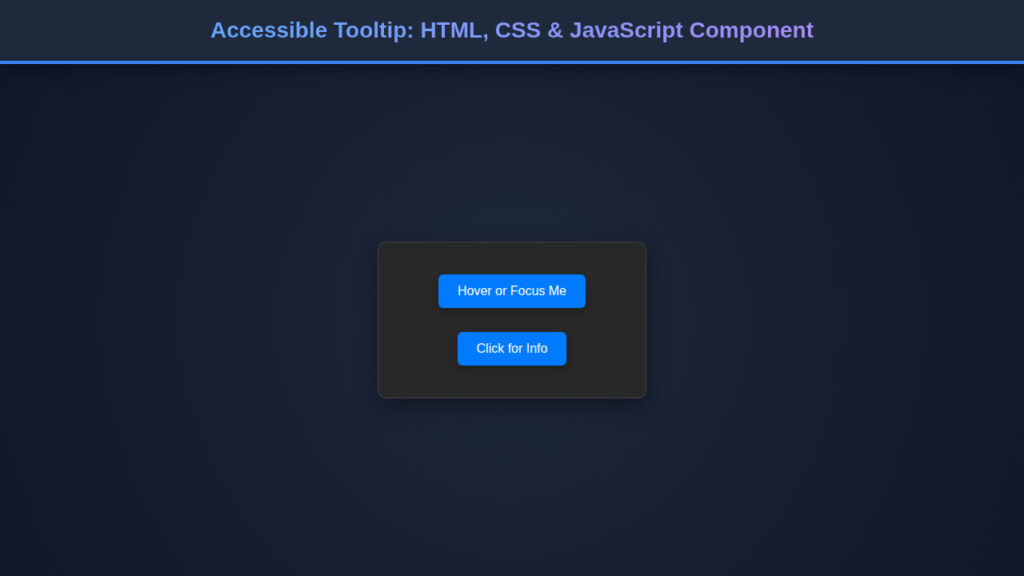
Building inclusive web experiences is not just a best practice; it’s a necessity. Today, we’re diving into creating an accessible tooltip component. This seemingly simple […]
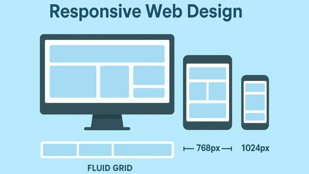
Make your site look great on any device. This Responsive Web Design primer gives you mobile-first strategies, media query patterns, and practical code so you […]
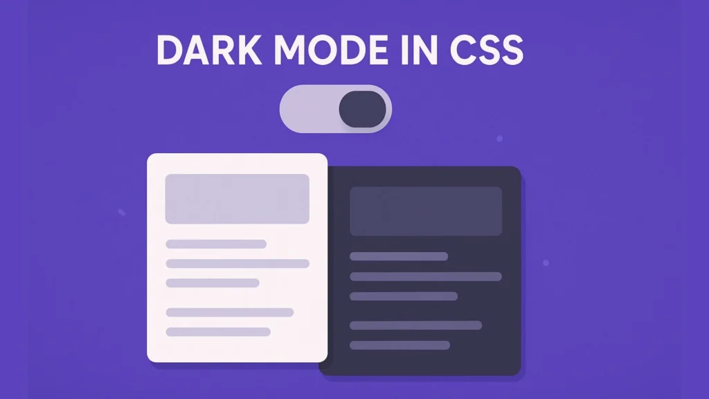
Make your site easier on the eyes and smarter about user preferences — implement Dark Mode in CSS with automatic theme switching. Introduction Dark interfaces […]
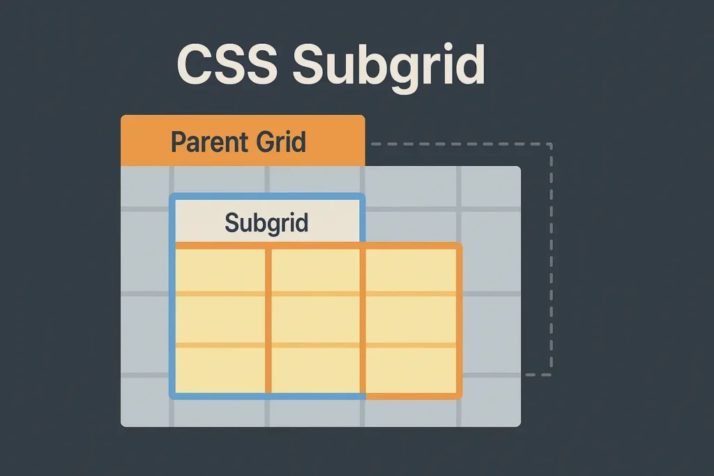
Learn how CSS Subgrid brings perfect nested alignment to your projects while reducing CSS complexity. Introduction Modern websites often combine cards, sidebars, and media blocks […]
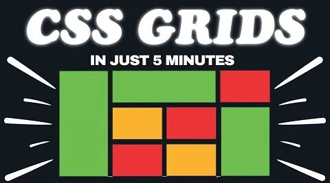
Want to Make Your Layouts Effortlessly Responsive? CSS Grid Can Make It Happen Introduction In the world of modern frontend development, CSS Grid has become […]
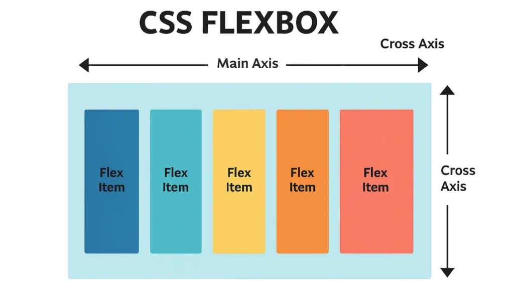
Introduction CSS Flexbox is a modern layout module that makes one-dimensional alignment and distribution of space simple across different screen sizes. In this beginner’s guide […]
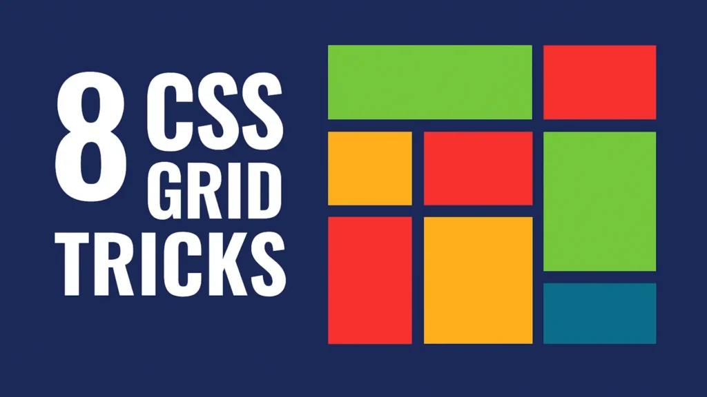
In today’s fast-paced web development landscape, knowing how to create dynamic, responsive layouts is no longer a bonus—it’s a necessity. That’s where CSS grid comes […]